Alice Marwick on Object Lessons

Alice Marwick is a freelance book cover designer based in London. Her work includes designing covers for Bloomsbury Publishing's Object Lessons. New covers for the series were recently introduced, including images for Traffic, Tumor, High Heel, Jet Lag, and Personal Stereo. Here she answers our questions pertaining to her process.


How many Object Lessons covers have you designed so far?
32! I had no idea how extensive this series would be when I was first briefed. It’s a delight that the briefs keep coming, with each choice of object as unpredictable as the last.
What methods do you employ to create your images for the series?
Every illustration is a ultimately a vector image that I’ve drawn but the process can vary depending on the requirements of the image. Tree, for example, began as a pencil sketch because I needed the intuitive spontaneity of freehand drawing to create the shape I wanted. The texture of Blanket was another one which needed some hand drawn input.
Where do you find your subject matter?
I do lots of image research before I get started, aiming to avoid cliché and find a fresh and intriguing way to present the object. Often the author or editors have specific ideas for the image that wouldn’t have occurred to me. The Roman statue providing a focal point in my collection of rubbish on the cover of Waste was a request from the author, based on his text. That kind of input helps to keep things unexpected.
How do you select your color palette?
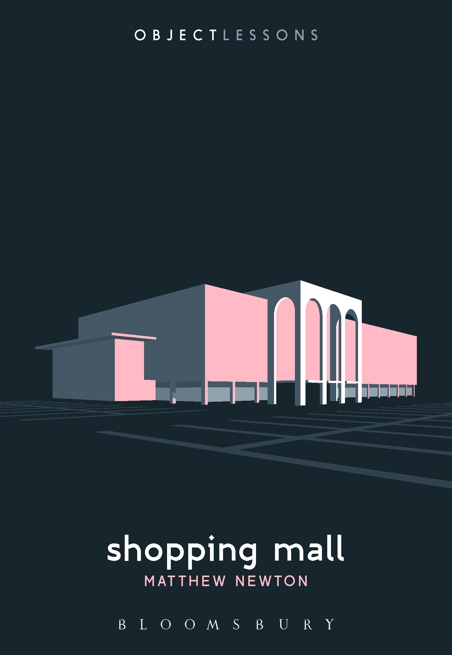
Each cover uses just two spot colours; the background black and a colour unique to each book. I spend quite a lot of quality time with my beautiful book of Pantone swatches. It’s a case of choosing the most appropriate and evocative colour for the subject, whilst keeping colours varied across the series and not having any repetitions. This is becoming a challenge now that we have so many titles! Also, you can’t know which colours you might need to save for future objects - so we just have to feel our way forwards. Again, often the author will have a colour request, which relates to something interesting in the text. The image for Hood, for example, could perhaps be read as sportswear but the author requested we use scarlet to give it some allusions to Little Red Riding Hood. We chose an icy blue for High Heel to give it a glass-slipper fairytale feel and to lead it away from the red leather cliché. The soft pink of Shopping Mall was my choice - I love the mid-century kitsch pastel aesthetic of old malls. The green of Golf Ball was another satisfying choice - I liked the idea of bright turf reflecting off its shiny surface. The purple options I submit never get picked - it seems it’s everyone’s least favourite colour! Who knows though, perhaps we’ll have an Object Lessons about bruises or blackcurrent squash, and then I’ll be relieved that purple is still available.


How difficult is it to maintain the entire look of the series from one cover to the next?
I have a set of rules in my head that I try and stick to but inevitably these have to be bent and stretched to meet the challenges posed by each new object. The underlying template and colour scheme is strong and distinctive though, so any minor flouting of my rules never disrupts the overall look too much. It’s certainly been a learning process though - I wanted to be rigid in my approach to the illustrations in the beginning, keeping them as pared back and simple as possible, and then titles such as Waste, Dust and Questionnaire come along, and the series editors and authors have often favoured or needed a bit more more detail and realism, and so you need to develop a more flexible approach. Ultimately I think the input of multiple people, and having to respond to the various challenges of each object, has resulted in a richer and more interesting overall aesthetic.