The Designer's Process: Craig Fraser On Darktown

Craig Fraser is a freelance graphic designer based in London. He is responsible for the cover of Thomas Mullen's Darktown for Little, Brown. Contributor Vyki Hendy contacted him about the design. He explains his process below.
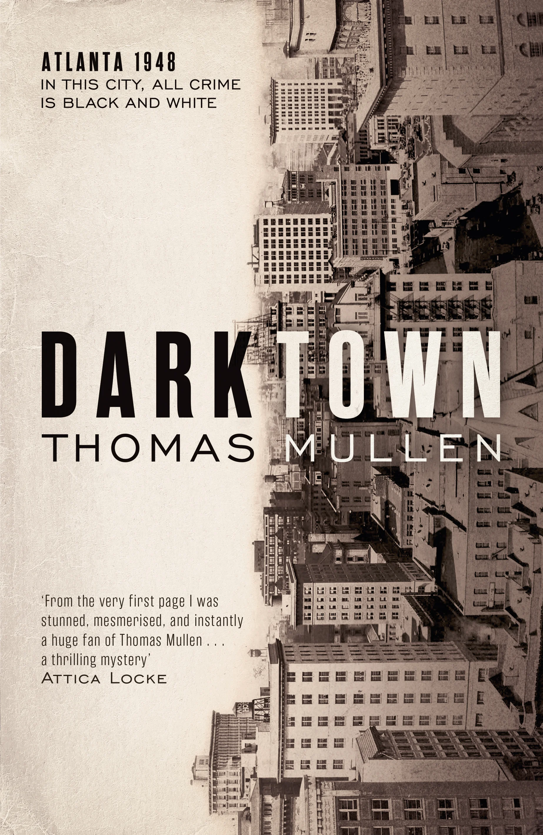
Darktown is about a city, and its police force, divided across racial lines in late 1940s Atlanta, USA. It’s a universal theme that has huge relevance and potency amid present-day world events. The brief set was pretty open and, ultimately, I interpreted it as trying to find a visually modern take on a period story drawing on influences like noir (both film and print) and vintage americana (the type styles and aesthetics of the day).
I was supplied with a couple of worn, archive images of mid-20th century Atlanta itself and it was these cityscapes that provided me with the most inspiration; they spoke to the scope of the story with a reverence and authenticity that would allow for a more engaging approach to their usage.
Encouraged by the natural break in the middle of the title – one of those serendipitous design gifts – I sought to characterise Atlanta’s racial divide by (and at the very high risk of stating the obvious here) splitting the cover down the middle, one half ‘black’ and one half ‘white’. Added were the sepia/brown tones and textures to convey a greater sense of period, as true black and white seemed harsh and uninviting.
I experimented employing the half and half approach more conventionally with one image, horizontally (the plan here was to create a wraparound effect) but this lacked subtlety. I returned to the vertical split breaking both title and author’s first/last names conveying the idea of a city turned on it’s head by the black and white divide. As most large US citys’ skylines are now dominated by high-rise structures (Atlanta included), this image lent itself particularly well to the 90º tilt and this again illustrated that bygone age.
It was great to get the opportunity to explore big, important themes in a more unorthodox visual style and I feel the cover is one that does this in an elegant, eye-catching and impactful way.
Editor, artworker and lifelong bibliophile.