Erik Carter Discusses Cover Design for Locus Solus
Erik Carter is a graphic designer based in New York City. Among his work is the cover for New Directions recent reissue of Raymond Roussel's Locus Solus. Here he details the process of its creation.
Over a hundred years ago, Raymond Roussel wrote a novel called Locus Solus—a mind-boggling and a wholly unique piece of French literature. The story centers on a scientist named Martial Canterel as he takes a group of colleagues around his estate and shows them rare artifacts and machines, each more incredible than the next: an apparatus made of human teeth, an electric-powered hairless cat, corpses reanimated with a special serum. It’s an extremely strange book, and a widely beloved one, praised by the likes of Duchamp, Cocteau and Foucault and other French intellectuals whose brains are surely more magnifique than mine.
When New Directions asked me to design the cover for their reprinting of Locus Solus, I jumped at the chance. As a publisher, they have a reputation for taking risks on authors who sometimes stray far from the mainstream and pair their works with equally experimental cover design. I have a long relationship with New Directions and their amazing art director Erik Rieselbach and I try to tackle whatever it is they throw at me.
After reading [a] few chapters of Roussel’s masterpiece, as well as the brief and some articles about the subject, I set to work. It is a widely espoused statute of book cover design that the first step in the process is to read the entirety of the material. Due to the deadlines in publishing (a couple weeks at most), this is often a near-impossible task made even more difficult when you’re assigned a book of this great magnitude and dense language, but I tried to make myself as familiar with the novel as humanly possible.
My first instinct for the cover was to go full-blown avant-garde; just explore form and try to push something out there that could stand out in the bookstore like one of Canterel’s crazy apparatuses. I spent a few days playing with shapes, type, and color trying to make something that would totally throw the reader for a loop, to make them want to pick this book up. Not the most logical approach, and probably more than a little bit naive, very symptomatic of being a graphic designer, but a fun way to do things nonetheless. I sent these four designs to the other Erik:


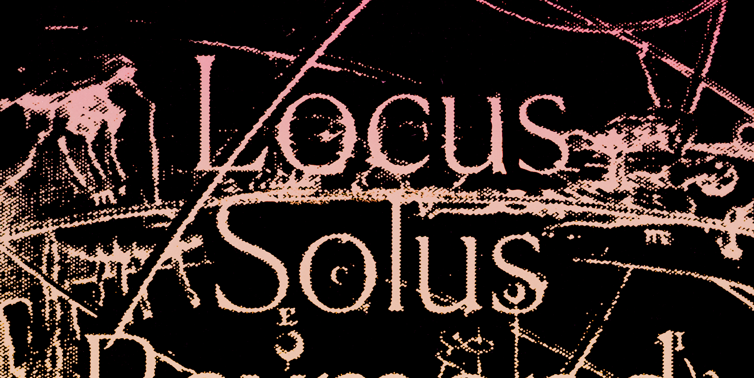
Sadly my typographic flights of fancy flew a little too close to the sun, and these four directions were shot down by the publisher. They liked the color scheme of the third and fourth and suggested keeping the type and colors but redoing the background, and making more like a “weird machine.” The turnaround was quite short for revisions—only a couple days—so I had to think quick as to how to make a background that would work. For instances such as this, I try to keep a folder of images I find in the public domain that I can use where appropriate, which made sense for this as part of the feedback of these designs being “too contemporary.” As I trawled through my archives (online, and in books,) I came across a few machines that could function on the cover: an illustration from 1775 of an Orrery, a model of the planet’s orbit around the sun, and another illustration of an “equation clock” from 1820 found in the famous Cyclopedia by Abraham Rees. These machines were not works of fiction, but they were bizarre to me and I felt they would fit right in the Locus Solus estate. They formed the basis of these two designs:


New Directions loved these two layouts, and there was some internal back and forth as to which one they would move forward with. Their fearless leader Barbara Epler preferred the first design and requested I throw in a few gear shapes, I was happy to oblige:
It was only after the novel had landed in stores when I began to realize how highly regarded this book was. A few friends reached out to me and said it was among their favorites; at parties when I’d bring it up, people’s eyes would widen and either lavish it with compliments or offer a dissenting opinion as to why it was so praised. This is one of the rare covers I’ve designed that has taken a life of its own since it’s gone to press, and I owe it to the crazed mind of Roussel and his weird world of mechanical oddities.
Sometimes falling in love with the material you’re assigned can be a limitation because you get too close and emotionally attached to the story and drive yourself mad trying to capture whatever it is the book is trying to convey. Or worse: on the opposite end of the spectrum, you have absolutely no idea what the book is about. With Locus Solus, I landed somewhere in between. There really isn’t a tried and true method as to how to make a good book cover. The only constant is the content of the book, all else is just wrapping paper.
Editor, artworker and lifelong bibliophile.