Helen Crawford-White, Creating The Summer Of Impossible Things
British book cover designer Helen Crawford-White has a number of incredible jacket designs to her credit. Among them, the cover of the recently published The Summer Of Impossible Things, written by author Rowan Coleman. Here she details for Spine her process for creating the cover.
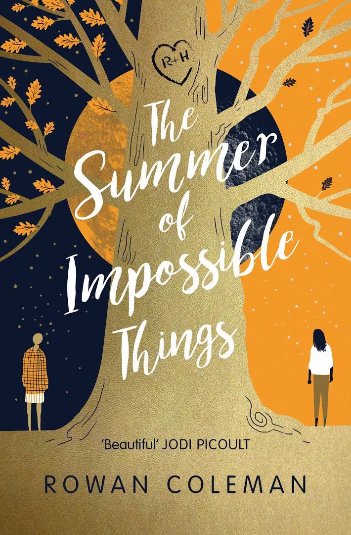
The Summer of Impossible Things is a high concept love story, not just about romantic love but about the love of a daughter for her mother. It’s also a book about sacrifice and a young woman who discovers she can slip through time. In doing so, she may be able to save her mother from an event in the past that scarred her, but in saving her mother she may negate her own existence. In a nutshell its a very emotional and magical read.
It was being pitched as a Time Traveller’s Wife for the 21st Century and so I knew that ultimately the cover needed to communicate the sense of wonder and magic that Rowan is so good at capturing in her writing.
Beautiful and epic was the order of the day and although it didn’t need to fully explain the time-travel element as such, it did need to say that something extraordinary happens. I also had to try to capture that balance of doing something clever and sophisticated for the Waterstones market as well as appeal to Rowan’s current fans and female readers of all kinds.
The cover had actually been through a few rounds with another agency before it came to me so that always adds a little bit of pressure to make sure you are including whatever was missing from the design before. Luckily there was lots of wonderful scenes and imagery that sparked off the initial ideas and there were many different routes we could have taken it.
There is a tree that is important in the main characters parents courtship. They carve their names into it and when Luna goes back to the 70s she adds her name to see if its still there when she wakes up back in the 00s. I always think trees are great devices for indicating time and wisdom and magic. And I loved the idea of carved lettering in wood as one potential route for the design.


There's also a lovely passage about the moon watching everything unfold, never changing. A moon is another one of those images that has a magical romantic wonder about to it so I knew it might feature in the design. Although I also felt aware and cautious that trees and moons had been used to great effect on other popular covers so didn’t want this to feel overdone. The Wonder, in particular, is a fantastic cover that has come out recently and features a central magical looking tree so I was really aware this cover had to look different and stand apart from the rest.

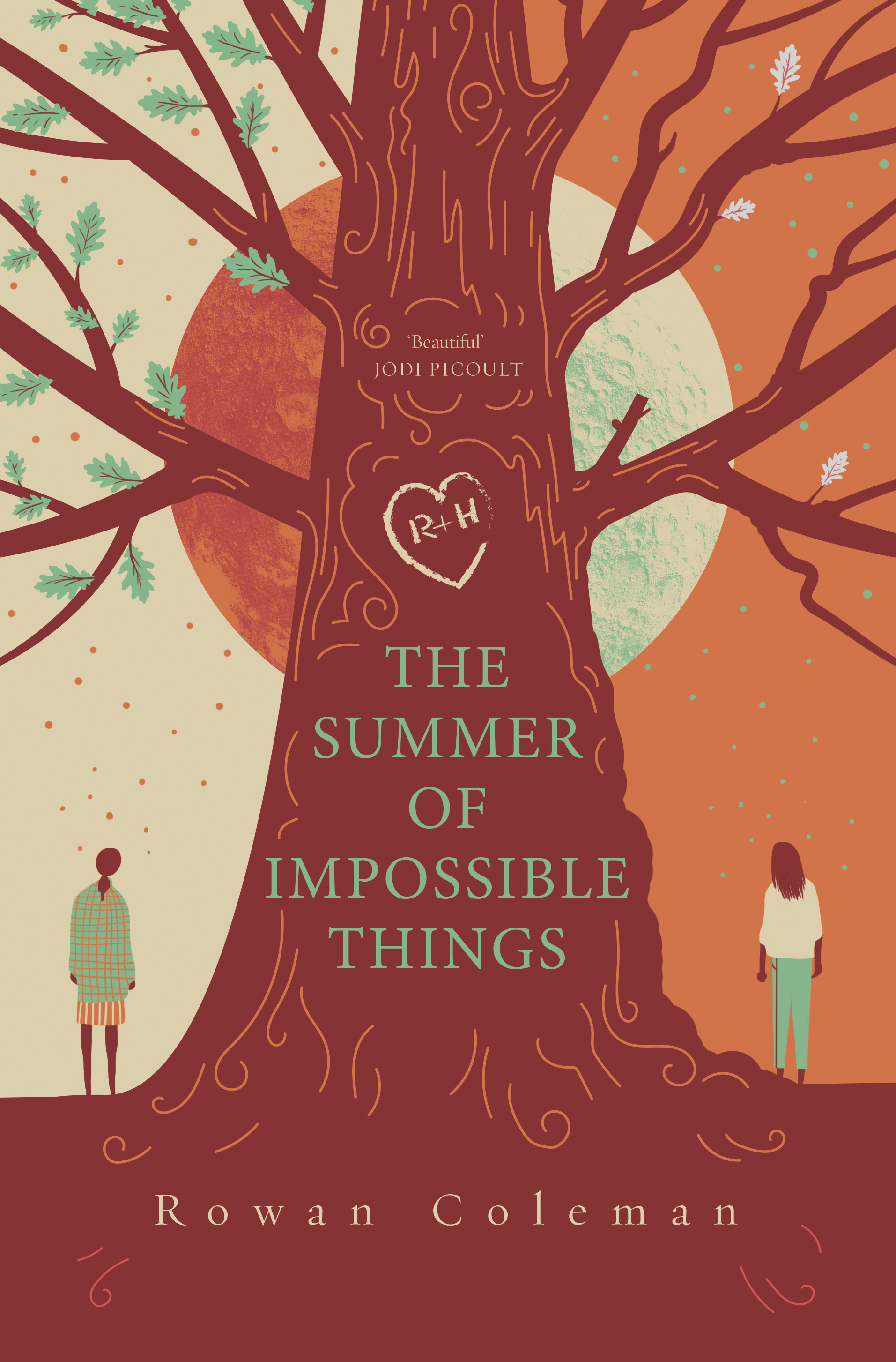
My other initial idea was to have a sense of duality within the design. Somehow showing the two women, or one woman in two halves, mother and daughter, 70s and 00s. Showing two lives in two times, a divide or transition of some sort as well as showing the connection between them.


Lastly, there was the mysterious sounding title, which is quite long so could make a great typographic focal point. There were some initial ideas centering around using this and creating something decorative and beautiful around the lettering.
The final cover didn’t deviate too far from one of the original visuals and ended up featuring a combination of all the above elements. The central tree is shown spanning the two time zones, one side more gnarled and old, and the colours help to differentiate the two sides more obviously to the viewer. The moon is spanning both sides and the title is still central and key.


It is quite a summery, vibrant book and it was publishing in May so that affected our choice of colours. We loved the bold orange though a rusty dusty pink was also in the mix. Orange had to be the winner as it is a Penguin imprint after all. We were able to use a limited colour palette of Pantones and do some nice finishes in the final production of the hardback. There's a gold pantone on the tree and subtle spot UV bark effect which you can only see if it catches the light. We did have plans for the bark texture to be an emboss or deboss but after some tests the results were not looking the best as the detail was too fine. But I hope the final finishes help to lift the cover and give the reader an extra bit of value when they notice the shiny bark.
Another nice part of the job was being able to design some endpapers. I absolutely love it when I get to do printed endpapers! For the design I created a large leaf pattern, echoing the leaves from the cover and we used some of the many wonderful quotes for the book within the leaves.
The book seems to be getting a great reception so I hope the cover somehow reflects some of the magic that readers get from the words.
Join us in celebrating the enormous talent that goes into book cover design. Consider a small donation to our Patreon fund. Your support helps us provide you with an in-depth look at some of the book publishing industry's most creative people.
www.patreon.com/spinemagazine
Editor, artworker and lifelong bibliophile.