Q & A with Cover Designer Jordan Wannemacher

Jordan Wannemacher runs a boutique studio in Montclair, New Jersey, providing services such as cover design, interior design, book composition and production work. Wannemacher is a graduate of the Savannah College of Art and Design, where she focused on graphic design and creative writing. She was kind enough to take some time out of her busy schedule to answer a few of our questions.
From where does your passion for cover design derive?
Like most designers probably say, it comes first and foremost from my love of reading. I read voraciously, around 50 books a year, and that doesn't include the ones I design. When I was in college, I was a Graphic Design major and Creative Writing minor, and constantly felt like I was trying to reconcile these two halves of myself into a career. Part of me loved reading and wanted to work in an editorial capacity somewhere, while the other half fell in love with typography and working with color. When I realized I could combine those two things, my passion has been fueled effortlessly ever since. As a designer, I also think a lot about the ethics of how we use our talents in this world, and I always want to use mine for good. Making beautiful books is something I can always feel good about.
How do you prepare to tackle a new design?
Since I work with a lot of University Presses, many of my cover design projects are academic nonfiction. Often, the book is about something highly specialized I'm not familiar with, so I usually begin by reading whatever materials they give me and doing my research in what I affectionately call a Wikipedia hole. I read up on the topic as much as I can and start to think about images that come to mind. I also like to talk about it with friends or family if I feel stuck. I find talking to people who aren't Book Designers make for the best brainstorming sessions because they aren't tainted by the sort of expectations and traditions we designers get stuck with from working on covers for so long, and in my case, looking at other people's book covers on Instagram all day! They get me thinking out of the box.
Can you walk us through your design process for the following…
Choreographies of Shared Sacred Sites
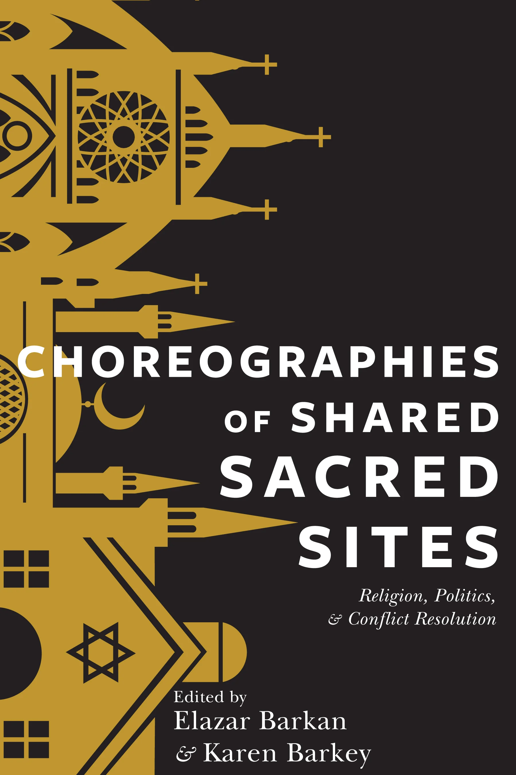
When designing academic books, you are sometimes asked to design covers for books that seem impossible to illustrate because they're so complex and conceptual. "Just do all type" is a popular solution in cover meetings when even the editors are stumped. I was an in-house designer at Columbia University Press when my Art Director (Julia Kushnirsky) assigned this book. The cover memo said they wanted the cover to reflect "something Judaism, Islam, and Christianity all have in common." This was a challenge because the book detailed how despite occupying the same city with many of their most significant sacred sites and layered origin stories and values, these religions are very different. When I looked for images of these sites in Jerusalem, it's hard to find one that encompasses all three religions, so I followed the strategy of just creating an image myself. Jerusalem is truly this superstructure providing a sacred space for all three religions to worship in. I wanted to illustrate exactly how layered and complex this sacred city is with simple bold graphic lines and shapes. We printed in two colors: black and metallic gold, a reference to the gold leaf on illuminated manuscripts popular in all three religions' ancient texts. Gold reflected light and was a reference to the divine.
For a Long Time, Afraid of the Night

When I get to design novels, I think of Kandinsky's synesthesia, and how he used color and texture to convey sounds and emotions. There is nothing more thrilling as a designer than trying to convey the mood and scenery of the world you just dove into using only two-dimensional visual tools. This particular story really tugged at my heartstrings as it was a translation from the French about a young Rwandan refugee. With the current refugee crisis, his story felt raw and immediate. Thinking of what the character did, traveling alone at night, sleeping in bushes, risking his safety to try to get to a safe place after the Rwandan genocide orphaned him made me think of how dangerous and brave refugee journeys are. I wanted to honor the gravity of that while evoking the feeling he felt at night sleeping in his suitcase, the one constant from the home he knew on his journey. It felt dark, unclear, emotional, yet still full of hope. I played with a lot of textures and different lettering styles to try to convey these complex feelings and after a few combinations, we settled on this one. I can't recommend the book enough, it comes out in the Spring from Schaffner Press.
Do you have a favorite cover so far?

My favorite cover I've ever worked on is not only my favorite because I'm thrilled with how it turned out, but also because of who it was for. Short Circuits was coedited by Dr. James Lough, a writing professor of mine at the Savannah College of Art and Design. He was the chair of the writing department when I attended and played an instrumental role in guiding me into my publishing career. After I graduated, he set me up with his publisher to do some freelance, so when his next book came along, they asked me to design it. I can't fully express the honor of working on a cover by someone I have looked up to for so long who has also been so influential in my career. It was so fun to work with him and I'm really proud of our collaboration.
What or who are some of your inspirations?
As I sort of mentioned earlier, I am constantly inspired by medieval manuscripts. My partner is a history teacher who teaches Medieval Studies so we bond over our love of them. I don't think I emulate the particular style of them that often per se, but I love that these early book designs wanted the book to be a beautiful object people were proud to own and collect. I want all the books I design to be so beautiful that people want to keep them forever, even if the writing is bad! As far as other designers go, I really love Kimberly Glyder and how incredibly diverse she is. She can do really graphic conceptual work, but then turn around and do beautiful illustrations, cut paper designs, and elegant hand lettering. My goal is to try to find that same balance and flexibility in my style. In the University Press world, I am obsessed with everything Issac Tobin does and love seeing how he has pushed the boundaries and potential of what academic books can look like. There are too many other amazing designers I love to name! I could write a paragraph about them all.
Find Jordan Wannemacher on Instagram @wannemachaa and on Twitter @wannemachaa.