Kimberly Glyder on Designing Dear Mrs. Bird

Kimberly Glyder is a designer specializing in book covers, illustration and lettering. Here she details her process for creating the cover for Dear Mrs. Bird.
Back in early 2017, Jaya Miceli, art director at Scribner, asked me to work on the jacket for Dear Mrs. Bird, a novel by AJ Pearce. The book takes place during World War II in England and centers on a young woman who answers letters at a newspaper as an advice columnist. These letters are addressed to “Mrs. Bird.” Given a great deal of creative freedom on this title, one of the challenges I had was to differentiate my design from the UK edition, which is a beautiful package featuring a bird.
My approach was to create a retro feel, suitable to evoke the novel’s 1940s time period, but not in a staid, cliché way. For my initial comps, I wanted to avoid an overly commercial, typical photographic approach. The letters are a central theme, so I used those shapes as a featured visual paired with a stylish vintage illustration, something you might see in a women’s magazine of that era.
I did try a photo of a woman on a train with a unique composition. I redrew the type to create more depth.
This was another variation from the first round, where I pair a dynamic vintage pattern with a shape meant to look like a pieces of paper as a background to hold a hand lettered script title.
Also, from the first round, I used typewriter keys (an ode to the main character’s profession) for the title type. The direction was liked in-house, but decided they wanted me to try illustrating a figure rather than using a photo or vintage illustration/print. I then began multiple iterations of the figure, including various outfits, color palettes, and profiles.
Here is another variation on the illustration with a more detailed figure and a brighter yellow background. We went back and forth multiple rounds finessing the figure until we reached a point where everyone was happy.
The final jacket printed with a matte finish, emboss and spot gloss on the typewriter keys.

A close-up:
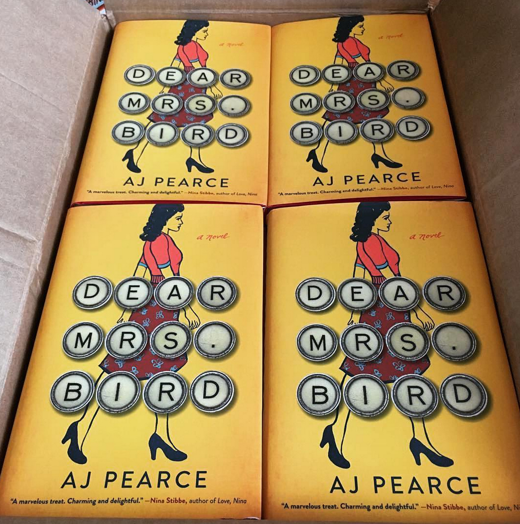
It’s always nice to see the author post their printed books when they arrive (I lifted this pic off of Pearce’s instagram account)! Thankful, once again, Jaya stuck with my design and managed to get this cover approved.
Editor, artworker and lifelong bibliophile.