Michel Vrana on Designing the Cover for Guy

Michel Vrana Is a book cover designer based in Toronto. Among his many works is his outstanding design for Jowita Bydlowska's Guy. Spine's Vyki Hendy contacted Vrana about the piece. Here is his process for the development of the cover, in his own words.
Guy, by Jowita Bydlowska, was only my second book cover project for publisher Wolsak & Wynn. My experience designing Death Valley, by Susan Perly, had shown me that they are a press that is open to some more unusual visual concepts. For Guy, the design brief was simple: it mentioned ‘text based, and a little jarring’ as one idea, and for another, to depict a particular image from the story.

When I was assigned the cover, the catalog deadline was quickly looming, and the publisher asked that I concentrate initially on just one strong concept they could use for marketing, and I would explore further once that was done. Once I had completed that first comp, it turned out that the publisher, editor and author all loved the idea (including my suggestion for a split run of pink and blue), so we focused on refining that concept.
The titular Guy is equal part misogynist and narcissist. He’s a successful talent agent, impeccable dresser, amazing cook, sex addict, and master of seduction. He rates women on a scale of 1-10, has a dog named ‘Dog’, and has very little in the way of a moral compass. He’s a walking talking men's magazine.
Reading the manuscript, I was struck by just how empty Guy seemed, and that’s what I wanted to evoke on the cover: an empty suit…the term ‘stuffed shirt’ also came to mind. A simple suit on a hanger wouldn’t work, though: there needed to be an indication of something ‘missing'. By removing the head, and more importantly the face, from the figure, Guy’s humanity has been replaced by his name. A name that’s synonymous with the generic. He’s no longer a man, he’s a symbol.
With the clean design and Bodoni Twelve type, I sought to evoke, without aping, magazines like Details or GQ, while keeping a literary fiction look. Initially, the cover also included a subtitle of ‘Or Why Women Love Me’, and I was fond of the asterisk treatment I came up for it (mostly because the Erler Dingbats asterisk is just so lovely).

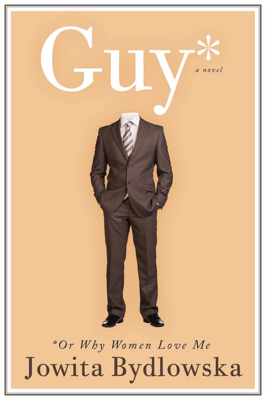
With the initial concept so well received, it was time to get to the devil in the details. The first major change was losing the subtitle (and the asterisk). The second was to address the suit. Jowita, who has much more fashion sense than I do, remarked that the suit was definitely not contemporary enough for Guy. It needed to be a more tailored, narrower fit, and the tie was all wrong. She sent examples she’d found online and I did my best to find a stock image that worked.

The revised comp took her comments into account, and I found a much more representative suit. But while I liked the suit, I have to admit that I missed the direct angle of the first shot. Fortunately, Jowita to the rescue. While I could have sworn I looked at every stock photo of a suit there was, she honed in on the absolute perfect one. As an added bonus, the photo was shot straight on, and the pose had much more personality than the previous two. It also sat almost perfectly centred under ‘Guy’’ overlapping the title very slightly, much in the style of a magazine cover.

Final touches. The belt buckle was toned down (too shiny) and the tie clip removed (superfluous with a vest). The publisher, bless her, ran with the idea of split run: blue for chain bookstores, special edition pink for direct sales and independent bookstores. I myself am proud to have one of the special edition pink versions. Guy would hate that one, I’m sure. And there’s definitely some satisfaction in that!


Editor, artworker and lifelong bibliophile.