Q & A with Cover Designer Sarah Brody

Sarah Brody is a book cover designer for Catapult and Counterpoint publishing in New York City. She previously designed for HarperCollins. Here she answers a few of our questions on her experience and process.
Can you give us a little bit of your background? How did you come to be a book cover designer?
Well, I don’t have a formal design education. I’ve always been “artsy” but I LOVE books and was actually an English major in college. I really wasn’t sure what I wanted to do until I was accepted into NYU’s Summer Publishing Institute. I entered the program thinking that I wanted to be an editor, but when the amazing designer and Art Director Lauren Panepinto came in to do a short presentation on book cover design, I immediately knew that that’s exactly what I wanted to do. I finally felt like I could find a way to meld my love of books and my love of art. After that a-ha moment, I put together a portfolio of personal projects, which included making book covers for classics or other books I enjoyed and was able to get an internship at Penguin, which really started my journey!
As someone who is very passionate about books, I find that my genuine love of reading is an important asset in book cover design. My education has taught me to be a close reader and I love pulling imagery straight from the text to incorporate into my designs.


What’s your process like with each book? How much time do you devote to planning each one out?
For me, starting work on a new cover is like receiving a gift. Seriously, I get so excited whenever I take on a new project. I always try to read the manuscript or reading materials if they are available because you can pull a lot of visuals out of the actual source material more so than just a synopsis.
I also love brainstorming and I try to spend a long time doing photo research or looking up relevant imagery. I make a lot of sketches and word association lists before I actually start designing. Staring at a blank page (or screen) is really daunting and I try to have a plan when I start, even though I may abandon it.
If I had it my way, I would have a lot of time to work on every single cover, but unfortunately, there are a lot of tight schedules in publishing and I might only have a week or two to read the manuscript and produce a first round of comps. Because of these tight deadlines, I sometimes have to condense my process, which, I begrudgingly admit actually works in my favor. I am a huge over thinker so having a short deadline forces me to make design decisions that I would normally second guess. I think that I have grown as a designer by taking the risks that come with not overthinking every little detail. I think some of my best work has come from feeling rushed!
What was your process for developing the cover of Feuding Fan Dancers?
Feuding Fan Dancers was one of the cases where we did not have a full manuscript yet, but I did have several pages of reading material. Since the book is nonfiction, I was also able to do some research on my own in order to find out more about the subject.
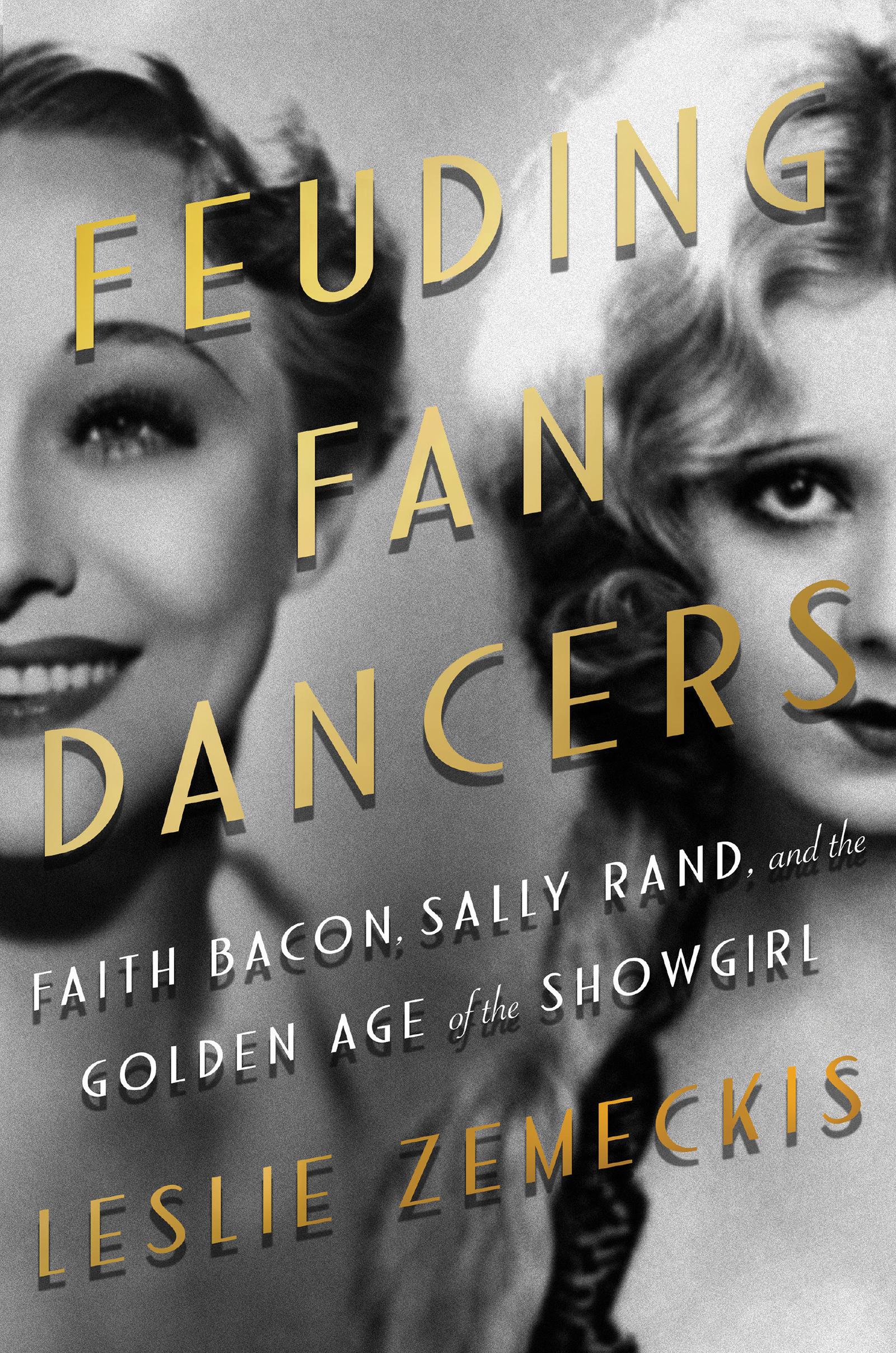
This book is about two women, Faith Bacon and Sally Rand, who were popular burlesque performers and both claim to have invented the popular “fan dance”. This cover had to look decadent but not gaudy and the publisher wanted a photo on the cover. Since there are no pictures of these two women together, it was obvious that I would have to somehow composite two photos together. After all, it’s easiest to convey a feud when both parties are pictured! It then became an issue of finding the two photos that would work for the front cover. I am very pleased with the photos that I ended up using because they both seem to capture the personalities of these women.
After researching type trends from that era, the rest of the design came very easily and I was thrilled when I learned that we would be able to use gold foil on the title and author name. I had designed it with that in mind because I knew that the gold foil would really push the design up a notch and bring some brightness and shine to the otherwise black and white cover. Thankfully, this design did not have to go through many revisions and I like it’s overall simplicity!
What project has been the most rewarding to date?
I’ve had multiple “favorite” projects, but one that I am very proud to have worked on is Michelle McNamara’s true crime memoir I’ll Be Gone in the Dark. I had been a fan of McNamara’s journalism and was aware of her research on the Golden State Killer so when this project came up while I was working at HarperCollins I jumped on the chance to work on it.

This book is terrifying (seriously, don’t read it when you are home alone), so I loved creating a creepy atmosphere for the cover. I was able to choose to print on lithofoil which was exciting as well and gives the jacket a nice shine. Seeing this book and it’s author get a lot of well-deserved attention has been a joy and I love that I was able to have a small part in getting this book out into the world.