Q & A with Designer Sarah Kaufman
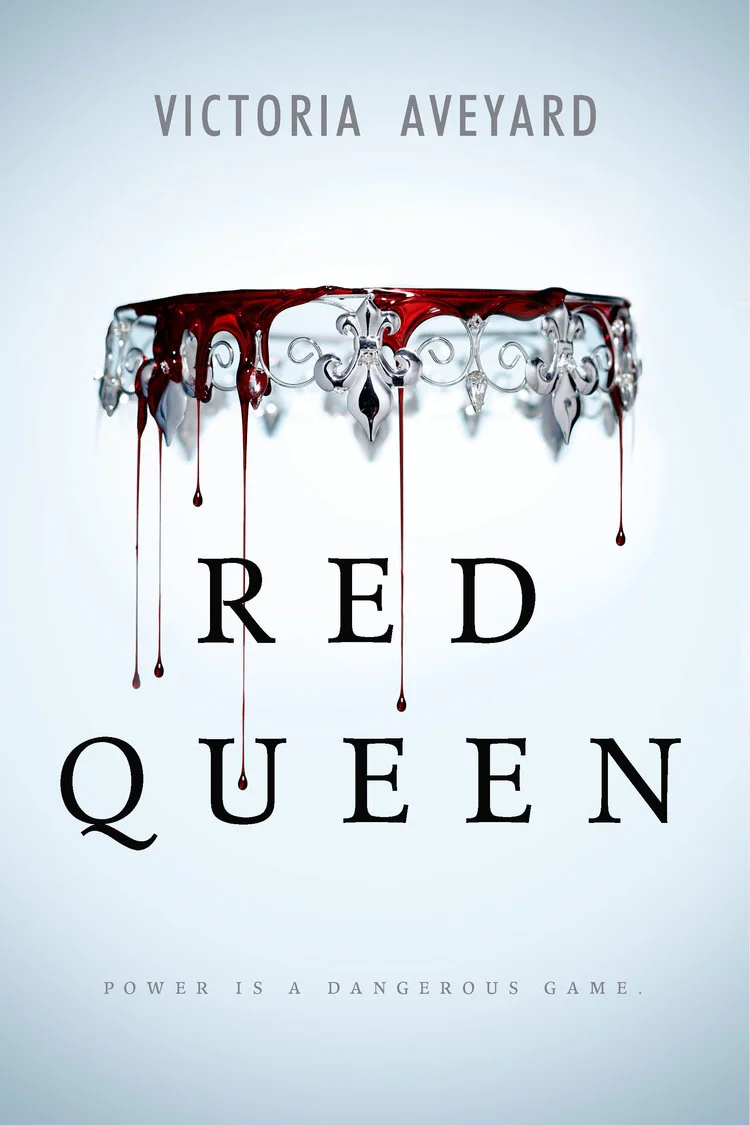
Sarah Kaufman is an Associate Art Director with HarperCollins Children's Publishers. She has created many notable covers for books such as the Red Queen series, and the Outliers trilogy. Kaufman was kind enough to answer a few questions for Spine about her design process.
First, could you tell us how you got into book cover design? And how you think this shaped your design process?
I love books and am an avid reader which is how I began my career—pursuing a career in publishing was a no-brainer. But I sort of got into book design on accident. My education is actually in digital design, much different than print. When I started in publishing I was a digital designer in the Marketing department. After a few years working on different campaigns, the opportunity came to design book covers and I jumped at the chance.
I think coming from a digital background helped shaped how I think about design. Digital design is instant while print design takes a lot longer to publish. Thinking about where trends and design interests could be in a year or so versus "right now" has been a very interesting pivot.

Do you have a general approach to designing a book cover?
Each book and project can be so different—but I do follow a basic process. First I read the summary, and whatever content is available. We work so far in advance, sometimes the book isn't finished before it needs a cover. So understanding the book's vibe is the most important thing for me. Then I play a lot. I come in with as many loose ideas as my Art Director will listen to and just start sketching those ideas out. Of course tapping into editorial's brain is a must! I really enjoy collaborating with where the storyteller is and how I can make those words into a visual representation.
Also, Pintrest. So many secret Pintrest pages of just weird or interesting visuals that might just help a small part of the story turn into a cover.

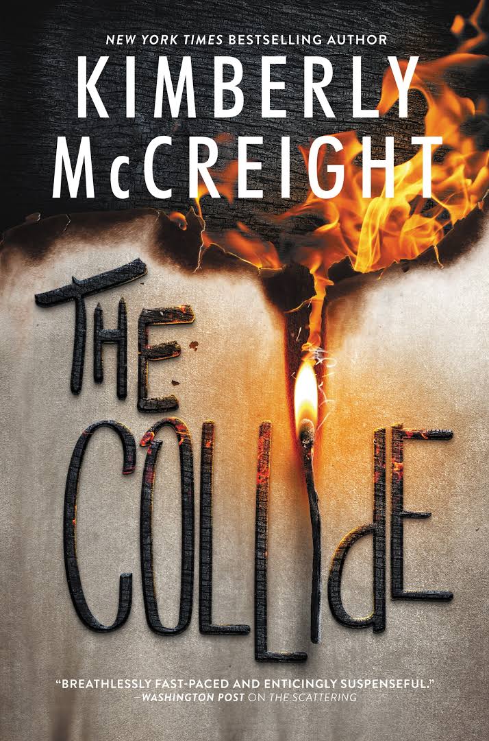
Tell us a little outline of the story The Collide by Kimberly McCreight and the Outliers trilogy. Where there any details that particularly influenced the design? We are interested in the significance of the match and how that alters through the cover designs of the trilogy.
Sure! So the Outliers trilogy was a super interesting trilogy that straddles mystery and a sort of fantasy rhelm. I don't want to give anything away because the story is very fast paced with lots of twists and turns. You're never really sure who to trust, what is real and what exactly is happening, Outliers #1 had so many visuals in it, we had a lot of room to explore. I was really interested in how we could show something that actually happened in the story without giving it away—which is how the match came into play.
I was really fascinated by the ending. It was so unexpected! And I just thought to myself, "what if we put a big thing that happens at the end of the story on the cover?" Again, without giving too much away, and because of this crazy scene, I had a loose concept of burning, burnt, extinguished. At first I wasn't sure how to implement it. It honestly took shape over time—but the whole imagery was really started by that final crazy scene in the first book and a strike of a match.
Can you give us a rationale for your design choices?
I guess the best rationale for design choices—is it cool? Is it sexy? Does it make sense to the story? And how can we continue this look over multiple covers and have it still look new, fresh and cool. We ended up really scaling back and letting the typography and match image speak.


In your experience, how did the process of designing covers for a series vary from a stand alone novel?
Stand alone novels are fun because you don't have to worry about what will come next—ha! You can focus on what's hot now, what works now and not be worried with what "could" happen. Series covers are tough. A lot of the time the outline of the story can change, and you have painted yourself into a visual representation that might not work anymore. Or worse, isn't as effective as you'd hoped. So it's important to come with a design that allows itself to grow and shift — because anything might come up. I find with series designs to really think big and loose so you can tighten as the series grows. Here, less is more.
How long was your design process? Did the appropriate solution come to you very quickly or was there a lot of different concepts and back and forth refinements?
Oh gosh! For the Outliers there were so many concepts! Usually I like to come to editorial with 5 initial ideas. After those meetings, which can take a few weeks, a few concepts are pitched to Sales and the publisher—where maybe one or two are pursued. Then, artists are contacted and that's really when the fun starts! Each artist will take an idea or comp and really run with it. So now the original pitch can really change. After working with an artist, his or her comps are presented internally, and refinements on those can continue for months. It's really a long time! And in the end, it's always, always a large group effort.
Here I think we had everything from photographers, illustrators, hand letters—it was a really rich world to explore. We kept going back to the match though. And how to make it strike, light on fire, and ignite ended up being our solution. This concept actually developed further and further as the series continued. So technically this took a few years.
Finally, how did this overall book cover design experience fare from the other experiences you have had designing book covers?
Hm, interesting question. I think this series design was a little typical of other series I've designed. Our original concept was working, which is nice! We just had to let it grow and shift so it could become what it was supposed to be. It was tricky to always have a match in the title! Luckily it worked out.
Join us in celebrating the enormous talent that goes into making books. Consider a small donation to our Patreon fund. Your support helps us provide you with an in-depth look at some of the book publishing industry's most creative people.
www.patreon.com/spinemagazine
Lucy Davies is a recent graduate with a Bachelor of Arts Honours degree in Graphic design from Falmouth University in the UK, where she focused on book and editorial design. She aspires to be a book cover designer.