Our Other Whitman: The Subversive Minimalism of a Boston Renaissance Woman
The spare, often floral, book cover designs of 19th Century Boston artist Sarah Wyman Whitman might conjure memories of piles of forgotten books at garage and estate sales. Think thin gold lettering on quiet green cloth. Think precious leaves and hearts. In a bookstore today, where slick, pyrotechnic covers compete for buyers’ attention, you might overlook Whitman’s designs for their antiquated simplicity. And you might regret it. Whitman, whose artistic career and social influence made her one of Boston’s most prolific and intriguing artists, may easily be considered the mother of modern book cover design. At a time when cover design was dominated by ornate flourish and, well, men, she ushered in a new minimalism that continues to speak for itself.

First, a quick biography: Whitman was born in 1842 in Lowell, Massachusetts and spent much of her early childhood in Baltimore. She returned to Lowell with her family in 1853 and married Henry Whitman, a well-to-do dry goods vendor when she was 24. Whitman took art classes from eminent Boston painter William Morris Hunt, then travelled to Europe to study architecture and the old masters under Thomas Couture, Hunt’s former teacher. Whitman enjoyed success not only in book cover design but also in painting, stained glass fabrication, art collecting, and art criticism. Her dedication to artistic and intellectual community led Whitman to foster a salon for Boston artists and thinkers at her studio, Lily Glass Works. Her passion for education and equality led her to give to such institutions as Howard University and Tuskegee college. She painted landscapes and watercolors deemed “too masculine” by her critics. She designed stained glass windows and fixtures for churches and Harvard alike. And by the 1880s, Whitman had become the only female premier designer at Houghton Mifflin, where she changed cover design from the inside-out.

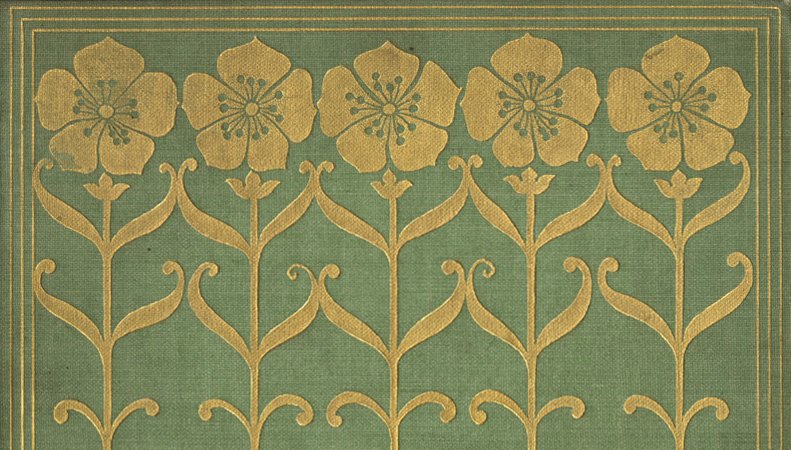
Before Whitman, American book covers tended toward Victorian aesthetics. Ornate patterns and story-related renderings dominated covers. Cover design belonged to die-casters and mold-makers, not artists. Whitman’s minimalism, which made nearly radical use of negative space, subverted such traditions. Consider the cover design for her friend Celia Thaxter’s An Island Garden: five slender gold flowers, stems interlocked, petals barely touching a delicate gold border. At first glance, the flowers seem identical, but upon further consideration we find delightful inconsistencies among them. Wary of anthropomorphizing, one might even say the flowers look like friends. Toward their roots, we find Whitman’s signature, a subtle heart design hidden between criss-cross graphics. The thin gold lines inhabit, but do not overpower, the green cloth binding on which they appear. Here, we find a new kind of book cover, one that champions artistic ability but eschews embellishment for embellishment’s sake.
Whitman’s affinity for minimalism can be linked to the American Arts and Crafts movement, an aesthetic attitude that challenged Victorian ideals. Discouraged by mass production, worker alienation, and the drab, uniform quality of manufactured goods, proponents of Arts and Crafts imagined a society in which artisans could find fulfillment in craft and creativity. Rather than mass-produced and poorly curated goods, the Arts and Crafts movement advocated for both utility and aesthetic appeal. What better embodiment of Arts and Crafts values than Whitman’s book covers? After all, they served as both art objects and consumer goods. Whitman understood that books, for all their artistic value, are also cultural objects and—like any other goods—part of a commercial landscape. As she herself expressed it, “You have got to think how to apply elements of design to these cheaply sold books; to put the touch of art on this thing that is going to be produced at a level price, which allows for no handwork, the decoration to be cut with a die, the books to out by the thousand and to be sold at a low price.”

Today, the cover design industry still aspires toward Whitman’s “touch of art.” Though technology has allowed for greater detail, cover designers will always reckon with the liminal space their work occupies. Designers and artists must, like Whitman, make beautiful-yet-marketable covers. They must be invested in bringing beauty to common objects, like books. Though Whitman’s 200-cover oeuvre of simple flowers, hearts, and leaves may tempt us to deem it quaint, we must remember that, like so many garage sale finds, her work carries unspeakable value. It reminds us to look a little closer, a little longer, for art and intention in the objects of everyday life.
This article appears in SPINE 7.
Sources
http://char.txa.cornell.edu/art/decart/artcraft/artcraft.htm
http://harvardmagazine.com/2008/01/sarah-wyman-whitman
http://bwht.org/sarah-wyman-whitman/
https://www.amazon.com/Studio-Her-Own-Artists-1870-1940/dp/0878464824
Join us in celebrating the enormous talent that goes into making books. Consider a small donation to our Patreon fund. Your support helps us provide you with an in-depth look at some of the book publishing industry's most creative people.
www.patreon.com/spinemagazine
Mary Ryan Karnes is a freelance writer and a Master's candidate in fiction at the University of Southern Mississippi.