Eric Wilder

Chapman & Wilder Create Cross-Continental Design Studio

Book cover designers Cherie Chapman and Eric Wilder have joined forces to create Chapman & Wilder, a new studio that spans specialties and, well, the Atlantic. Chapman, a Brit, and Wilder, an American, have gathered their collective expertise in design, layouts, and marketing and have enlisted the talents of photographers and animators. They have also created a new website where their passion project lives.

Chapman & Wilder Create Cross-Continental Design Studio

Sounds Like You Have It Covered: Eric Wilder’s Cover Design for Sounds Like Home

For the 20th anniversary reissue of Mary Herring Wright’s memoir Sounds Like Home: Growing Up Black and Deaf in the South, designer Eric Wilder faced the challenge of delivering Wright’s message to 21st-century readers. The memoir’s old cover, which featured a scripted typeface a sepia-toned photograph of the author and her brother, simply would not do for the much-anticipated reprint of Sounds Like Home. Instead, Wilder decided to play with elements of Wright’s Carolina heritage for a cover that subtly conveys the memoir’s strong sense of place.

Sounds Like You Have It Covered: Eric Wilder’s Cover Design for Sounds Like Home

Eric Wilder’s Dynamic Approach to Between Two Worlds

Designer Eric Wilder loves to take several visual approaches to a creative brief, hoping one will resonate perfectly with both publisher and author. Such was the case with Wilder’s design for Between Two Worlds, David Sorensen’s memoir about growing up as the hearing child of two deaf adults. When he received the brief from Gallaudet Press, Wilder decided to use both the abstract and the concrete in the cover designs he submitted. Ultimately, Gallaudet and Sorensen chose a design whose colors and shapes evoked the liminal space the author occupied in his formative years.

Eric Wilder’s Dynamic Approach to Between Two Worlds

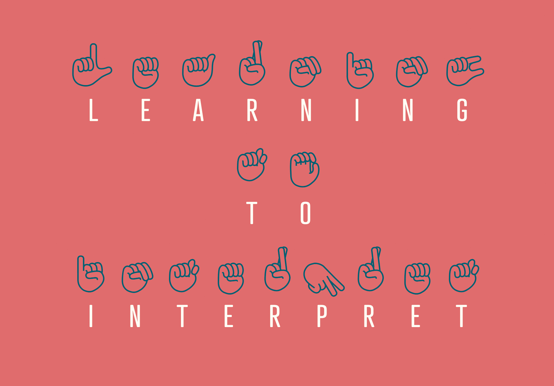
Eric Wilder, Learning to Interpret Cover Design

Eric Wilder, book cover designer and publisher of Spine Magazine, recently designed the dynamic-yet-pristine cover for Learning to Interpret: Working from English Into American Sign Language for RIT Press. The cover, which features traditional letters as well as ASL ‘glyphs,’ encourages anyone who picks up the book to begin the work of interpretation right away, which was exactly Wilder’s intention. “Learning to Interpret is academic in nature and deals with interpreting in American Sign Language. My goal was to come up with a very clean yet engaging cover for the subject matter. And by engaging I mean, I wanted readers on some level to have to interpret the cover for themselves,” Wilder said.

Eric Wilder, Learning to Interpret Cover Design

Emma Rogers on Lettering, and the Ludicrous Laws of Old London

Emma Rogers is a Graphic Designer specializing in book cover design and lettering. She is recipient of the prestigious D&AD Yellow Pencil Award for her cover designs in 2008. She also won an ABCD award in the Mass Market category for her design of The Scent of Death in 2014. Here she answers our questions about her work.

Emma Rogers on Lettering, and the Ludicrous Laws of Old London