Kimberly Glyder: Typography and Covers

Kimberly Glyder is a designer specializing in book covers, illustration and lettering. She answered questions in an interview for Spine issue 4. Below is that interview in its entirety.
“It’s been a nice change in the last few years to see a resurgence in hand lettering and illustration on covers.”
What inspired you to become a cover designer?
Like many designers, I have always been a visual person, painting and drawing throughout my childhood. At the same time, I was a voracious reader and loved perusing books at bookstores, not just because I wanted to read them, but because I was also intrigued by their cover designs and the specific visuals chosen to represent the writing. For every book report I had in school, I took the time to illustrate a corresponding “book cover,” (which may or may not have helped my grade).
I began art college as a painting major, but switched back to a liberal arts college and declared myself an English major for a year and a half. During this time, I was able to take some intense literature classes, something I may not have had the ability to do in art school. The pull of art was great though, and I transferred to RISD where I landed in the Graphic Design department. My most informative and engaging class at RISD was Poster Design, where I had the fortune of being taught by Nancy Skolos. Book cover design and poster design have much in common: the need for visual impact and strong conceptual information. I had been mulling over a career in book cover design, but out of school and in need of supporting myself, I had some brief stints at a couple print design firms, then a museum exhibit design firm. Eventually, I was hired at Da Capo Press by Alex Camlin, and finally began my career as a book designer, leaving a couple years later to strike out on my own.
Can you walk through your creative process from beginning to end? How does your artwork go from initial idea to final cover?
All of my projects begin by reading the manuscript (if available) and taking notes. I also look over the tip sheets that publishers send along at the beginning of a project. This helps to pinpoint the major themes a publisher wants to highlight in their marketing, and also what to avoid. My notes range from specific visuals that stand out (such as a hair color, or the color of a house) to “big pictures” concepts such as celebration or loss…anything that might give insight into the tone of the writing. Rarely, the author will weigh in and I’ll be passed along their ideas for a cover. After reading and note-taking, I’ll move on to sketching. This is an important part of my process as it distills my notes and allows me to begin translating the concepts into visuals. At the same time, I may be doing font and photo research. If appropriate, this might be when I begin painting letterforms or other visual elements. Finally, I open up InDesign and begin the process of piecing all of my research, sketches, and imagery together.

What unique challenges have you encountered?
When I first began doing freelance cover work, I did try to incorporate more hand painted elements, but it was tough. The feedback would be that the comps veered too YA. It’s been a nice change in the last few years to see a resurgence in hand lettering and illustration on covers. This has allowed me to present multiple directions and styles for comps than the more limited, photo-driven designs I was primarily working on before. Since it seems to be the norm to go through so many rounds these days, having the option to use hand painted elements opens up the possibilities for creative design solutions.
One thing I’ve noticed freelancing, is that it’s easy to be pegged for specific genres. I’m assuming in-house it might be easier to push to design for example, a thriller or a biography of a war general, but I tend to get the same kinds of books from certain publishers. Not sure if this is a product of art directors associating existing covers on my portfolio site to titles on their list, or if it has to do with assumptions about women designers being paired up with women’s literary fiction. Either way, I’m happy to get a variety of subject matters to challenge these norms.


There are a number of cover designs in which you have incorporated a use of hand lettering, such as The Empathy Exams and Friendswood. Can you explain how your determine letterform for each piece?
As I’ve created more and more covers using hand lettering and added them to my website, I’m increasingly asked to work on projects where the Art Director has hand lettering in mind for the cover they’re assigning. The Empathy Exams is an astonishingly intimate collection of essays. The rawness of the watercolor letterforms was a good match for the writing. Friendswood was a tough title to work on with sensitive subject matter….one of those books where you can’t really depict the subject successfully on a cover (in this case a town dealing with buried toxic waste), so you have to be more evocative rather than representative. My approach was to translate the emotional interactions of the characters into expressive hand lettering. In this case, something a teenager might be drawing (some of the main characters are teens) and the corresponding flower stems hint at the oil seeping down into the earth. The way the type decreases in size has an air of tension to it as well.
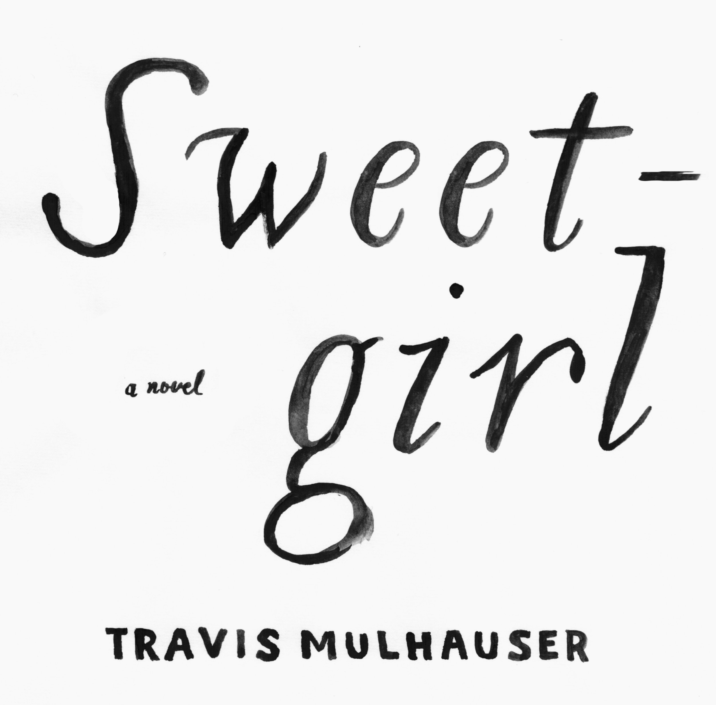
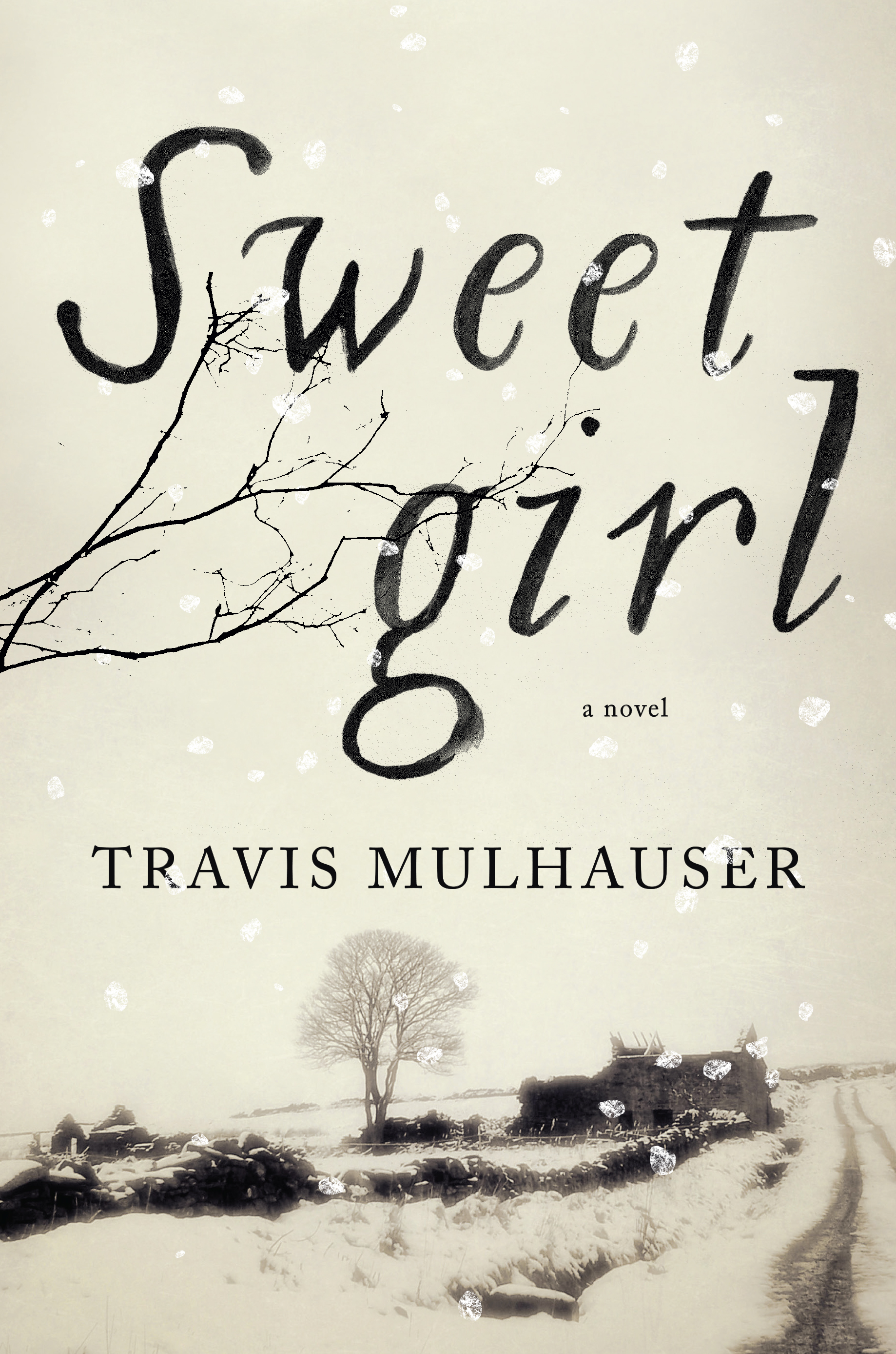
If I do use hand drawn type, I’m trying to do so in a more inventive way and hopefully, distinct from cover to cover. Like digital fonts, there are so many avenues to uniquely create letterforms for a book cover, so my approach is the same: I read the manuscript, get a feel for the setting, any cultural references, etc. and then do font research. From there I will begin painting various letterforms (over and over) until I feel I have enough to work with. I scan the paintings and begin to manipulate them, if needed. How they are used is dependent on the design. For instance, I broke up the painted type on Sweetgirl, which is integral to the design (and thankfully it was approved this way). The large, painted strokes of the letterforms create a bold pairing with the hushed stillness of the photograph. If I had kept the title on one line, the impact of the design would not have been as strong.


Can you explain your creative process for the development of the Stephen Fry series for Soho Press?
Soho Press contacted me to work on Fry’s backlist of titles. The Art Director, Janine Agro, had referenced a couple previous book covers I worked on (Woke Up Lonely & The Tin Horse) as a starting point for the style they were after. I focused on The Liar first and presented the comps, with caveats for how we might address future titles such as font placement, color palettes, etc. to make this a successful series design. The Liar came together very quickly and was approved in the first round. From there, I was able to continue the theme of the slightly irreverent series of designs using a flat, graphic illustration style. I use two fonts for each cover and the color palette is purposely limited to create uniformity across the titles.
What are you currently fascinated by and how is it feeding into your work?
Recently I decided to make more of an effort to focus on painting, something I’ve had less and less time for since I began freelancing years ago. As I’ve created more personal work and posted work online, Art Directors have approached me to use more hand lettering and illustration on book covers. It’s a welcome progression of my interests by combining design and fine art.
I’ve been looking through the work of Sonia Delaunay, an artist/designer who created inventive pattern designs. Also, the paintings of Hilma af Klint, a Swedish painter who created a series of abstract, geometric paintings, which relate well to graphic design. I’m particularly obsessed with the catalog for the Wm. H. Page & Co.’s type specimens. I began a series of type paintings after being inspired by the unusual letterforms and ornamentation showcased in this online collection.
What is your favorite cover that you did not design?
My “favorite” designs are constantly changing as my work has evolved over the years. Here is a current list of favorite covers and designers:
The Virginia Woolf covers illustrated by Vanessa Bell for Hogarth Press (The Waves, Mrs. Dalloway, and To the Lighthouse); Roberto de Vicq’s work (The Descendants is a favorite); Jon Gray’s body of work, often a mix of hand lettering, illustration and design is constantly fresh andinspiring; Jamie Keenan’s recent cover for Metamorphosis; Jaya Miceli’s work is incredibly varied and perfectly executed; Jenny Carrow’s smart designs (Against Happiness); Miriam Rosenbloom’s work (The Faber Poetry series designed in collaboration with British printmakers and Chronic City); Paul Buckley’s creative direction and the various illustrators whose work is featured on the series designs for Penguin Threads Deluxe Classics and Penguin Classic Graphic Deluxe Editions.