Catherine Casalino, Designing an Unmistakable Cover

Catherine Casalino runs her own multidisciplinary design studio, Catherine Casalino Design, based in New York City. Among her many creations is the book cover for Unmistakable: Why Only Is Better Than Best. We contacted her about the development of this piece. Here is her process, in her own words.
The most enjoyable part of cover design for me is coming up with something concrete and visual to illustrate an idea. If the idea is straightforward, the solution is usually pretty simple— if you want to say "love" in a visual way, you draw a heart— but when the idea is complex, like the idea behind Unmistakable (Portfolio Penguin 2016), you need an image that hits several notes at once.
“The most enjoyable part of cover design for me is coming up with something concrete and visual to illustrate an idea.”
For this project, the subtitle, Why Only Is Better Than Best, was my jumping off point. It's a statement that really makes you think. I kept asking myself questions like When would be beneficial to be the only one of something? and What's something visual that indicates uniqueness? One of the difficulties of finding a visual that signals "uniqueness" is that when an object stands out from the crowd it can look like that object is just different, or even lonely. The word unique connotes something special, so I needed to make sure the visual I chose communicated that idea.


For the first round of designs, I came up with a lot of visual ideas using animals— a yellow-colored sheep amongst a flock of regular-colored sheep (that said only, but not best); a white squirrel, and a unicorn. The closest idea was a pegasus breaking away from a pack of racehorses, but it was still not quite right— a little too magical.


For the next round of designs, I used the pegasus concept, but in a new way, going with a group of bikers and one Evel Knievel-type rider jumping over the crowd. I also worked up a concept where one dart hits a dartboard, but misses the bullseye—the idea being that even though the dart misses the bullseye (the best you could do in darts), it's the only one that gets on the dartboard.
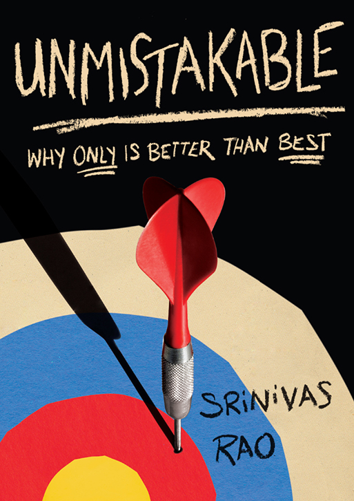
Everyone really liked the dartboard idea but they wanted a less sleek, more dynamic execution, so I used collage and hand-lettering to add more texture and after a few color and layout tweaks that ended up being our winning cover.

When it came time to do the entire jacket, the publisher wanted to extend the uniqueness of the cover to the rest of the package, and one of their editors hit upon the idea of doing a comic strip-style for the jacket flaps. In-house Portfolio Penguin designer Henry James Nuhn created those elements, adding a really cool layer to the cover. It's always really fun to give the reader a little something extra when they open the book, so I'm grateful that Henry went above and beyond when he put the finishing touches on this jacket.
Editor, artworker and lifelong bibliophile.