Dominic Forbes on Designing Mrs Whistler

Before going freelance in June 2018 cover designer Dominic Forbes was Managing Designer at HarperCollins, where he worked on a variety of titles for big name authors such as Robin Hobb and Stuart MacBride. Here he talks us through his process for designing Mrs Whistler.
Mrs Whistler is the story of American painter James Abbot McNeill Whistler, Jimmy to his friends, as told through the eyes of his long-suffering muse, Maud Franklin.
I was really excited to get this brief as I’ve been intrigued by Whistler’s work since learning about him in Art History lessons at college. As well as being notorious for his witticisms in social circles many of his works and his art philosophy were quite radical for the time.
The book starts off with the disagreement about the Peacock Room he created for his (soon to be ex) patron, Frederick Leyland and goes on to cover the infamous libel trial against John Ruskin. The famous critic had condemned his painting “Nocturne in Black and Gold: The Falling Rocket.” as “asking 200 guineas for flinging a pot of paint in the public’s face.”
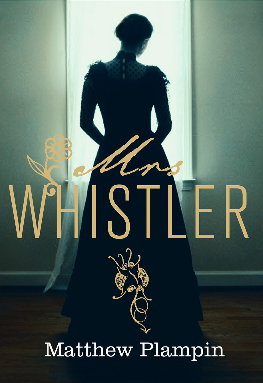
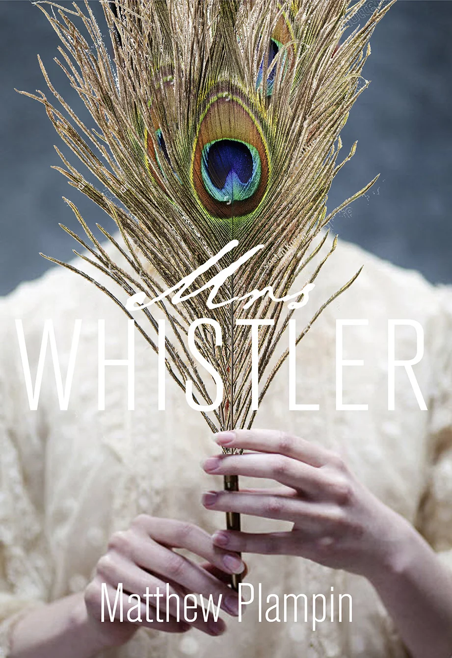
I came up with several initial approaches for the cover design. I liked the idea of trying to fuse a Victorian sensibility with a more modern fashion photographic style, to echo Whistler being ahead of his time. Using his paintings of Maud was considered but ended up looking a bit non-fiction.


A more traditional historical/romantic fiction look was also tried but felt to be more suited to a paperback.


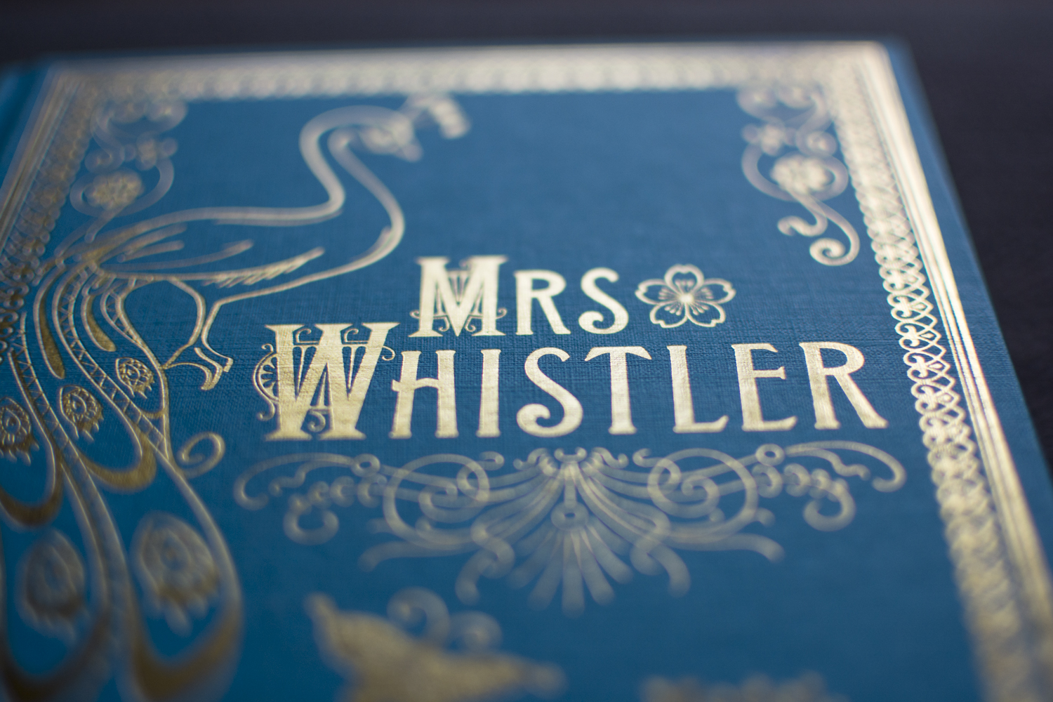
My favourite idea, and the one that was chosen to develop, was to treat the book as if it had been published in Victorian times. I really love those beautiful old gold foiled hardbacks with their intricate hand tooling and amazing typefaces. Several versions were looked at, one echoing the design of the peacock room as a framing device for a drawing of Whistler himself, another more type-led with a peacock frame. The favourite by far was the more ornately beautiful design with peacock. Most of the elements were created from old Dover clipart books of Victorian frames, borders and motifs. The peacock was from Shutterstock and is just perfect for the feel I was trying to achieve. Various Victorian style display typefaces were used. Fancy Celtic, Sheridan Gothic, Hogarth Antique, as well as good old Clarendon.


Whistler’s signature was a butterfly with a sting in its tail, so I used a butterfly on the cover to represent him, Maud is shown by the flower. The two motifs were carried through into the text design and I used Whistler’s actual signature on the back.


I really wanted this book to stand out as a beautiful object that people would want on their shelves. It was fantastic to be able to specify an unjacketed hardback with gold foil front, back and spine onto Kingfisher Blue fine linen textured Wibalin. The printers did ask for me to adjust the foil plate slightly when they first saw it, but I didn’t have to simplify much and they have done a fantastic job with all the intricate details.


Learn more about James Whistler.
Editor, artworker and lifelong bibliophile.