Freelance February: Emma Rogers on Designing Ready For It
Emma Rogers is a freelance book cover designer and art director with over 20 years experience in the publishing industry. Here she takes us through her process for designing Ready For It.
Ready For It follows two best friends, Natalie and Fiona, whose friendship falls apart when they approach 30. Fiona moves in with her long-term boyfriend, leaving Natalie wondering how on earth she is going to pay the rent on her own. Just as Natalie is at breaking point, she hears about her dream job and flying solo suddenly doesn’t seem so daunting, until she realises that Fiona has applied for the same role. Will their friendship struggle to survive as they navigate the tricky changes in life that they're not sure they're ready for? Ready for It is a book about not being ready for the next steps in life and having to either fake it or try and make it. It’s a warm, funny, hopeful and emotional read.
When I was approached to work on this brief, I had already had the privilege of designing Nicola’s first novel, Happy, Happy, Happy, and was delighted to be invited back on board to design her second novel.
Fortunately, Sr. Art Director Liron Gilenberg and the fabulous team at Amazon Publishing were once again spot on with their briefing. There was a clear vision of how the book should look and where it should sit in the market. They wanted a bold, colourful and commercial cover that would progress the style of Nicola’s previous novel and potentially even move away from it. It needed to feel fun and accessible but also clearly show an idea that all was not going as well as you might think.
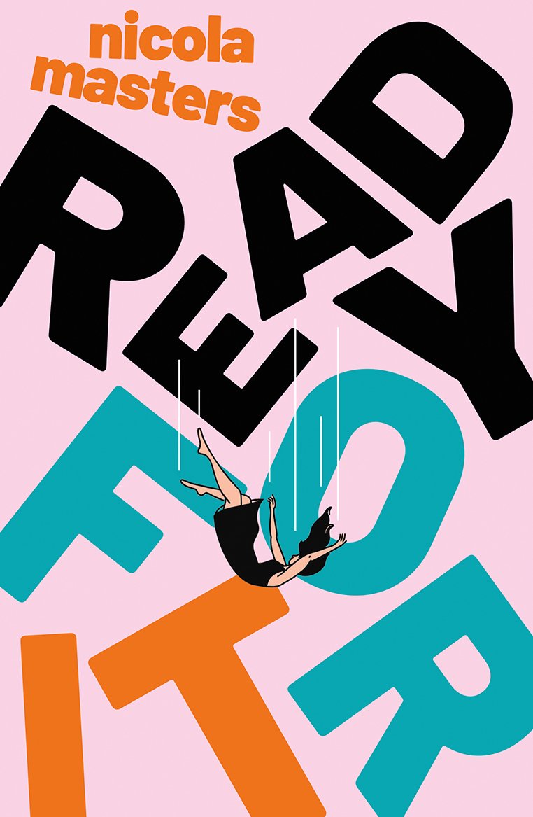
The brief was very obviously lending itself to a clever typographical design solution with the title being the primary focus and any illustrative elements coming second to this. It needed to be designed in a way that would encapsulate the idea of life falling apart without looking overly messy and complicated. It is (quietly) every cover designer’s nightmare to have to work with a long title made up of painfully long words. Although a challenge that we all rise to, it can certainly make things tricky. The punchiness of this title put a big smile on my face and having only three short words, made experimenting with the type much more exciting. I could play around with pushing sizing to the extreme and any typographical effects could be maximised.
In the first round of designs, I explored different ways in which to illustrate ideas of friendship and life taking a wrong turn. As an alternative design solution, the team were also keen to try an idea that would make a play on the phrase ‘when life gives you lemons’. Along with one photographic visual, I presented six initial designs that for the most part used sans serif fonts to keep them looking as clean and fresh as possible.


Feedback from the first round was luckily extremely positive and the selection was quickly narrowed down to three ideas. Looking back I think the team could already see the winning cover within this set of visuals as the changes for this round were very simple and easy to make. I was asked try a colour tweak on the lemon visual, some added sprinkles to give more fun and zest to the ice cream visual and a softened treatment on the falling movement of the figure on the pink visual. I had a few fonts in the mix initially, but Barlow Black seemed to be the clear winner. Its soft, slightly rounded edges threw a punch without looking too stiff, helping to add extra warmth to the cover.


Once this second round of designs was presented, the whole team rallied around the falling girl idea and were gunning for it to be approved. It was very obviously the route that everyone wanted to work and as luck would have it, it was also my favourite from the start as I felt it covered all bases in one simple, striking design. The only real concern was how to make the figure look like she wasn’t being beamed up into a spaceship. Trying an alternative solution with motion lines worked well as it also echoed the straight lines in the falling font and kept the design crisp. This change got us the approval we all hoped for, and I am incredibly happy with the final design.
Final cover
Editor, artworker and lifelong bibliophile.