The Illustrator's Practice: Keith Rosson

Courtesy Image
I’m a Portland-based illustrator and designer. Having worked primarily within the music industry – specifically punk - for years now, I’ve done album, merch and poster designs for groups as varied as Green Day, Against Me, Interpol, and Warner Bros. Records. I’m also a book cover designer, tackling John McNally’s recent story collection, The Fear of Everything, as well as the reissue of Kathe Koja’s classic Bram Stoker and Locus Award-winning horror novel, The Cipher, and my own upcoming magical realism/literary novel, Road Seven.
What sets me apart from most other designers and illustrators is that I’m also legally blind.
Having been born with optic nerve hypoplasia – essentially a severe shortening of the optic nerve in utero – this resulted in my field of vision being severely restricted. In other words, I have significant “tunnel vision,” or a lack of peripheral vision. However, growing up, neither I or the adults in my life ever let this stop me from creating art; by the time I discovered punk music at 13, I was already enmeshed in comic books and drawing every day. With this newfound exposure to a vibrant musical and visual aesthetic, I also discovered fanzine culture, and soon began writing and publishing my own zines.
In my late teens, I began creating shirt designs and album covers for bands. Digital illustration was far from ubiquitous at the time; the majority of my work at this point consisted of hand-rendered, Xeroxed illustrations coupled with a jagged, halftone-heavy, cut and paste aesthetic common with punk.


All this time, I was reconciling with my vision loss, and how it affected my work. Given the severe limitations of my peripheral vision, I’m unable to view the entire visual field of whatever it is I’m working on – either digitally or on paper. This provides me with a unique, individual style that I continue to explore to this day.
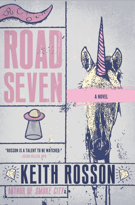
Road Seven, my newest novel, is my third book to be published by Meerkat Press, and I’ve been fortunate enough to be able to create my own cover for every book. Road Seven follows cryptozoologist Mark Sandoval—resolutely arrogant, covered head to foot in precise geometric scarring, and still marginally famous after Hollywood made an Oscar-winner based off his memoir years before—who has been strongly advised by his lawyer to leave the country following a drunken and potentially fatal accident. When a woman sends Sandoval grainy footage of what appears to be a unicorn, he quickly hires an assistant and the two head off to the woman's farm in Hvíldarland, a tiny, remote island off the coast of Iceland. When they arrive on the island and discover that both a military base and the surrounding álagablettur, the nearby woods, are teeming with strangeness and secrets, they begin to realize that a supposed unicorn sighting is the least of their worries.
For the cover, there were a number of visual elements that could be explored. There are references to a number of cryptozoological creatures throughout the book, as well as mentions of aliens, ghosts, and a strange, possibly haunted section of forest. And yet, as per my writing style, Road Seven isn’t a straight-up horror novel; like my other work, it’s more an exploration of character spied through the lens of genre fiction. It’s a novel with some fantastic elements in it, but at its core, it’s a novel about people. The cover would need to be multifaceted and nuanced, and couldn’t give everything away all at once.
I started, as I usually do with covers or merch designs, with a series of very rough, hand-drawn thumbnail sketches, along with additional notes of general descriptions and potential color or type treatments.


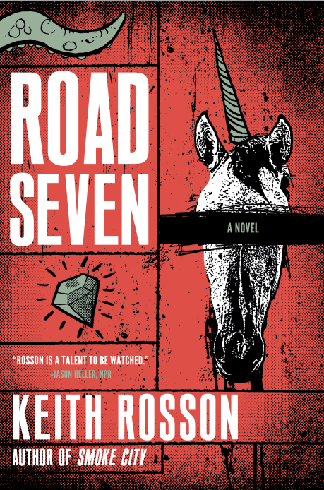
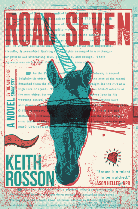
After some back and forth with Meerkat’s editor, Tricia Reeks, we chose the third of ten thumbnail illustrations, showing a floating unicorn head with a bevy of jewels falling from the animal’s neck (this is again a nod to the content of the novel.) With the design confirmed, I began using photographic and illustrative elements, coming up with roughly 15 different cover variants. I also expanded the use of “clues” in the cover – besides jewels, there were now tentacles, a unicorn horn, and a spaceship used as illustrative icons; these are breadcrumbs that readers will recognize as being relevant the further they get into the novel.


After a design was selected from that larger batch, I offered a variety of covers with minute changes to type and composition.


Reeks and I eventually agreed on a final, comprehensive design. Once that was done, I was also to design and lay out the spine and back cover.
Final cover
Having been born with a visual impairment that severely limits my visual field and oftentimes makes even walking in crowded places difficult, I remain steadfastly proud that I’ve found a way to continue making art and graphic design that resonates with people, in spite of what many would consider to be a limitation.
Editor, artworker and lifelong bibliophile.