Kelly Winton on Designing The Paper Wasp
Kelly Winton is a designer and artist based in New York working for publishers including Grove Atlantic, W.W. Norton, Farrar, Straus & Giroux. Here she takes us through her process for designing the cover of Lauren Acampora’s The Paper Wasp.
The cover design for The Paper Wasp came together very organically. I was hired as a freelancer by Grove Atlantic’s Art Director Gretchen Mergenthaler. The cover memo had some specific direction, but Gretchen always encourages original ideas and experimentation and it sounded like a great project. I was excited to work on it.
Upon getting the assignment, the first thing I did was read the manuscript — which I absolutely loved and read in one day. Lauren Acampora is an excellent and whip-smart writer, and the book was edited by the talented Katie Raissian. The novel tells the story of a toxic friendship between childhood friends Abby and Elise. After the two reunite at a high school reunion, Elise, who is now living in Hollywood as a successful actress, hires Abby as her personal assistant. The book morphs into a wicked David Lynch-esque story about dreams, ambition, and obsession, while capturing the dark cult aspects of celebrity, power, and art.
Initially from the cover memo, Acampora was interested in featuring the work of artist Henry Darger, whose fantastical paintings evoked the childhood and dreamscape aspects in the book. I liked these paintings, but licensing proved to be a challenge. There were also discussions to feature wasps on the cover, but ultimately that seemed too literal and took away from the larger themes in the book.
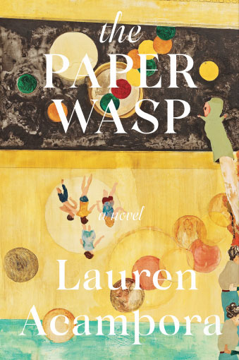
Because the novel has many twists and layers, I wanted a cover that conveyed something unraveling or being pulled apart. With that in mind I was interested in collage or creating a layered look on the cover. One concept I liked was the idea of a tangled web. I created this wormy image that I wove within the title. I thought it looked like a nest or perhaps a wasp buzzing around. I also liked the juxtaposition of this web in a soft color palette – something seemingly innocent but actually is quite menacing.
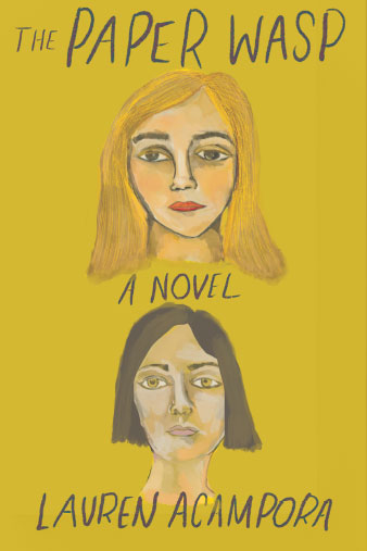
The novel also centers on the complexity of female friendships and I wanted to channel that on the cover by featuring two women and focused on figurative paintings. I did a couple illustrations myself and I purposely left their expressions dull, irritated, empty. The friendship in this book is one built on manipulation and I wanted that to be conveyed. I also love the work of Mamma Andersson and thought her feminine paintings worked well with the dark haunting aspects in the book.
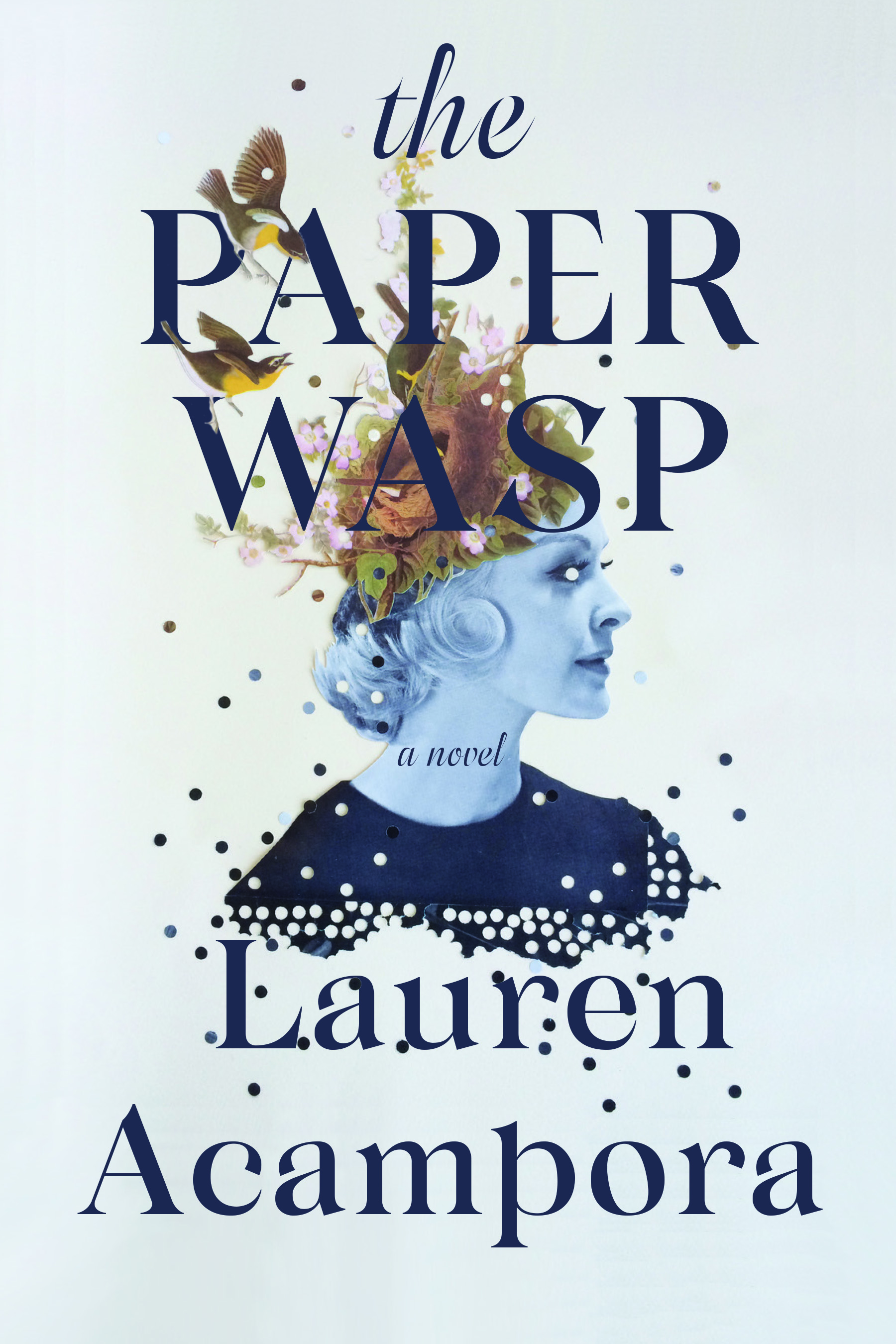
A big part of my design process is art research. I have a folder of various artists I admire and after reading the book I thought of Lizzie Gill. As soon as I found the exact Lizzie Gill artwork (titled Feed the Birds, 2014) – I knew I had something special. I love the intricacy of this collage and how it encapsulates so much in one image. The beautiful young woman, the nest of dreams in her head, the dots falling at the seams, the disguise of her eyes. It is twisted, beautiful, strange, intriguing. When Acampora saw the design – it became clear it was the winner. We moved forward fairly quickly with that design; and after playing around with a few different type treatments and formats – we landed on the final cover.
This cover has been one of my favorite projects I've worked on! The book was so up my alley and the project felt very organic and engaging. I was able to really experiment with this one and am so pleased with the final result! Big thank you to everyone at Grove for the wonderful opportunity.
Final cover
Editor, artworker and lifelong bibliophile.