Mark Read & Toxic People

Mark Read is a book cover designer and art director based in London. Among the incredible work in his portfolio is the cover for Dr. Tim Cantopher's Toxic People: Dealing with Dysfunctional Relationships. Here he describes his process for creating the design, in his own words.
This new book from Sheldon Press had an unusually punchy title for their list, I wanted to do it justice with a simple bold cover.
The brief was fairly informative regarding the content of the book but only gave examples of comparative titles which the editor didn’t like. I was left to my own devices… I didn’t want this book to look like a medical title, like many in the Sheldon back catalogue, this book was going to stand out from the crowd.
To begin the project I was supplied with the outline of the book: ‘Some people are so stressful, they can actually make us ill. Gameplayers, bullies, users and abusers – all pose a risk to our health and welfare if we don’t take action. This book presents the tools we need to deal with the toxic people in our lives who drain our energy. It explains how to make healthy relationship choices, set proper boundaries and recognize the red flags that should alert us to avoid certain people. If you’re surrounded by the takers of this world, read this book and gain the freedom to make your own choices and live your own life.’
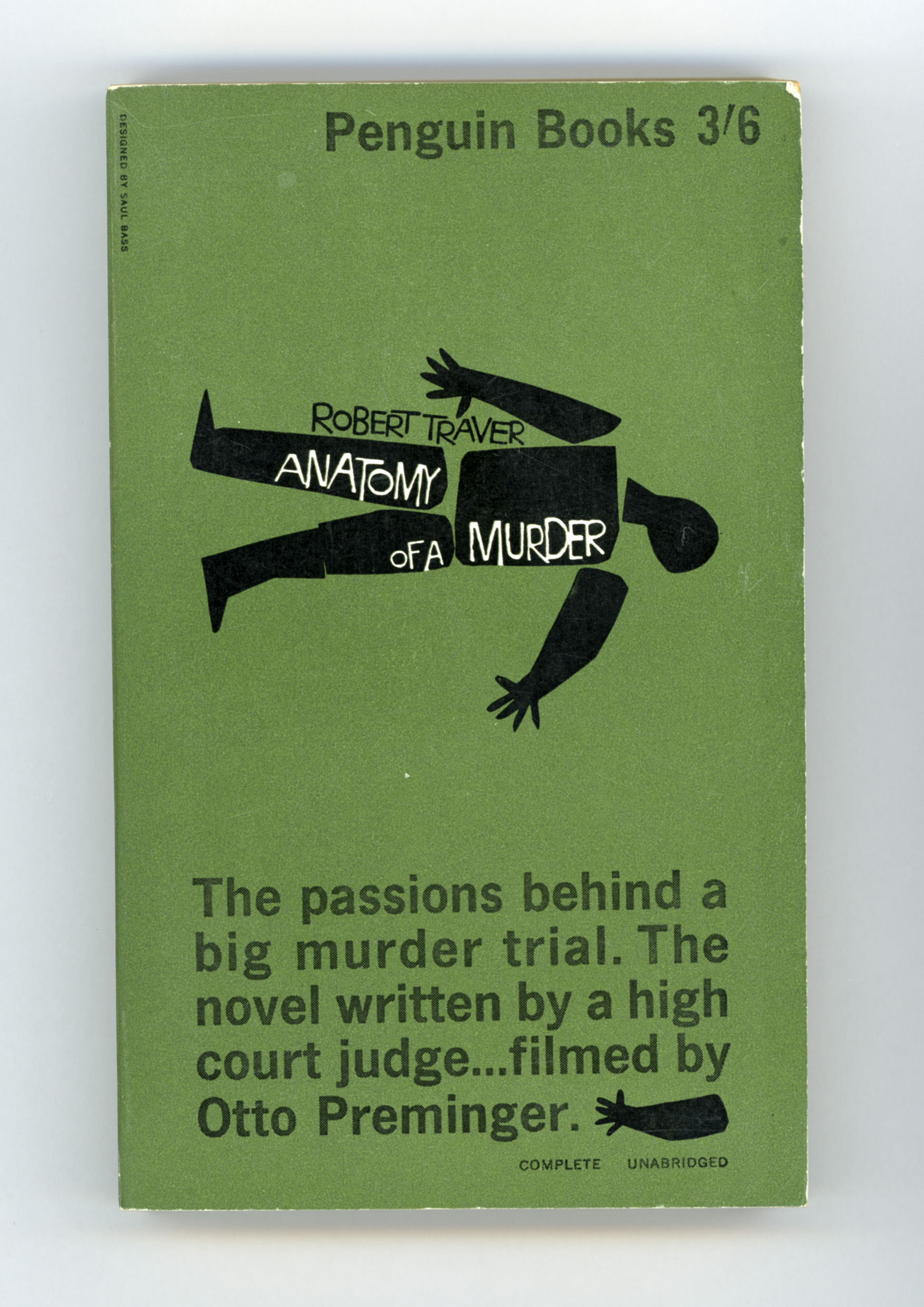
One of my design influences is the work of Saul Bass, with his simple graphic solutions, I also have a slowly growing collection of retro graphic book covers, this project was going to be perfect for this type of bold solution.
My initial research went around quite a few ideas including warning signs, poison bottles, medical masks, corrosion, nuclear and toxic symbols and even slime. I played around with doodles of quite a few of these ideas including toxic slime typography, holes burnt through the cover, and toxic labels, however when I landed on the gas mask concept using a friendly character rather than scary one I knew it was the winner. Obviously bright green was the only natural (or unnatural) colour to choose. The approval process was fairly swift which is always good, the editor said ‘This does make me chuckle every time I see it!’ and the author Tim Cantopher emailed back to simply say ‘It’s great! Very arresting; I love it.’


I wanted to print the cover in glow-in-the-dark green, I think my request must have been quietly laughed-off as I never received the costings. We did print the cover in Pantone fluro green though, with a matt lam and spot uv. I added a deadly X across the back cover with the spot uv which would have been surprise to the editor, but I never heard a complaint, phew!
Pantone Green
Spot UV
It wasn’t until the book was published that I discovered Tim Cantopher had made a rather unusual acknowledgement at the beginning of the book, which made me smile.

This was a fun project to work on and I was pleased with the final design, I’m looking forward to my next Sheldon Press brief, Taming the Beast Within, a book about personality disorder.
Join us in celebrating the enormous talent that goes into making books. Consider a small donation to our Patreon fund. Your support helps us provide you with an in-depth look at some of the book publishing industry's most creative people.
www.patreon.com/spinemagazine
Editor, artworker and lifelong bibliophile.