Matt Broughton on Designing The Bloater

Matt Broughton is a London-based book cover designer currently working for Vintage Publishing, part of the Penguin Random House Group. He here takes us through his process for designing the wonderfully vivid cover for The Bloater.
Lost classics can be a real treat to work on.
On receiving the brief for Rosemary Tonks’s spiky comedy, The Bloater, I was hooked (excuse the pun) for two reasons. Firstly, the title. It felt suitably intriguing, and visually incongruous, both repellent and playful. Second was the endorsement by Stewart Lee, not only the affirmed 41st best stand-up comic ever, but fellow Midlander and, in my humble opinion, all-round genius – of sorts.
I’d previously never heard of Rosemary Tonks, but a little research led me to a celebrated poet of the 1960s, who after a series of personal tragedies, within a decade had turned her back on literature and taken to living a hermetic lifestyle – going as far as burning her last unpublished manuscript in defiance of her literary past. Until now, The Bloater itself had been sadly out of print for half a century. Her life story reminded me of another forgotten heroine, musician Dory Previn – the acerbic wit, the cutting dialogue, equally tender and caustic in delivery. Both were strong women who struggled with their position in a male-dominated artistic society.
This is the beauty of reinventing classics - sometimes the context of the piece can change since you’re not only designing to sell the novel, but the cultural history surrounding the novel. I was as much fascinated by Rosemary’s story as I was the novel. The Bloater was at once likeable and biting and I immediately set to nosing through a little of the period background and Rosemary’s career, which in itself was instantly intoxicating.
This is 1960s London – a kind of pendulously-swinging 1960s. The Bloater of the title is an overweight opera singer who lodges with the main protagonist Min and her unremarkable husband. There’s a peculiar suspicion of infidelity between the married couple that plays out around the enactment of mundane household chores. Min is a Delia Derbyshire-style anti-heroine, a sound-engineer who spends her days seeking the sound wave to the perfect heartbeat, flirting with colleagues and debating whether to have an affair with her oversized lodger, whom she is both attracted and repulsed by in equal measure. What stands out in the novel is the grotesque – the book begins describing the smell of the Bloater and size of the Bloater. Min’s response to the situation is to manically polish the stool in the front room that he has been resting on – polishing away his odour and her guilt...
Visually, this is all wonderful but there is a challenge to portraying these ideas as a desirable cover. The book isn’t trying to define an era, so it would be a red-herring to follow the swinging-sixties route.
I’d like to say there was lots of research and technical wizardry thrown into the visual concept, but that would be inaccurate. The impetus for the design is entirely driven by the reaction to the writing. I decided I wanted an outlined form that somehow communicated the Bloater, but punctuated with odd detail - I didn’t want to resort to a full figure or caricature. The aim was to suggest fun and guilty pleasure.
Bar a few early sketches to get me moving, most of the work was done onscreen. I began drawing and redrawing shapes to get a sense of an overwrought, explosive dinner-jacketed Tenor. Firstly, I looked at describing the lettering through the contours of the collar and lapels, but I knew I was missing a trick.
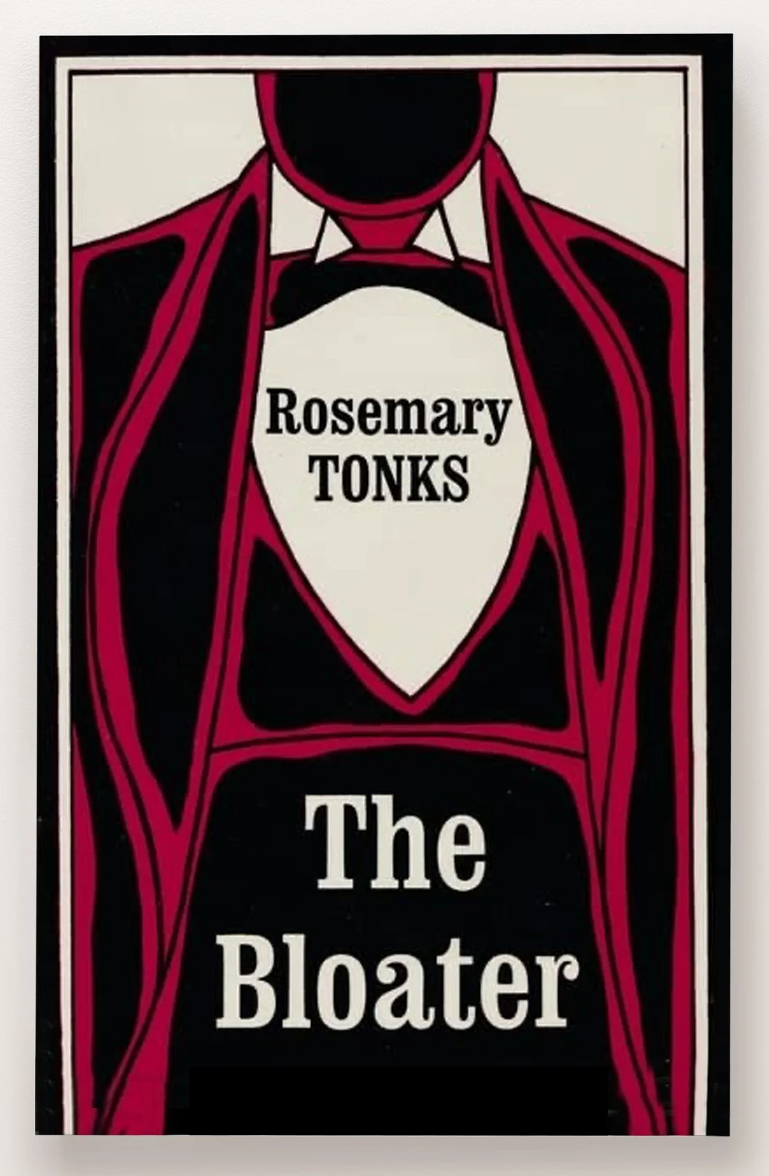


The title was so visually resonant that it made sense for it to define the figure - I gave the B emotive drips (operatic tears or sweat?) the O a bursting button, and the R as tails of a dinner jacket or the tail of a huge fish. I added a few other visual tics such as the heartbeat and the vocal soundwaves and lopped off the arm of an authentic singer to help communicate the idea of the titular Tenor in earnest operatic flow.
Finally illustrator Oli Frape supplied some suitably playful lettering to create a little added ‘bounce’.
The overall effect is intentionally playful, joyful and in parts grotesque. A larger than life graphic for a gem of a novel...
Final cover
Editor, artworker and lifelong bibliophile.