Melissa Four on The Killing of Butterfly Joe
Melissa Four is a book cover designer and illustrator who has worked on a wide range of books for adults and children. Her illustrations have also featured in magazines, album covers and skateboard decks. Here she talks us through her design process for The Killing of Butterfly Joe.
The Killing of Butterfly Joe is about a young man who meets a charismatic butterfly salesman, who takes him across America on a wild road trip. It's a coming of age story full of big, colourful characters, and it has a Gothic feel to it. 'The American Dream' is a theme - Butterfly Joe is always chasing a big deal.
I started by focusing on the road trip aspect and wanted to look at using the opening scene - Butterfly Joe first appears as a shadow cast over the protagonist while Joe's sister is swimming naked in the nearby lake.
These ideas didn't really get the tone of the book - there's definitely a darkness in the story which wasn't coming across. When I was speaking to the editor - Kris Doyle - we realised the cover needed to be more symbolic. The author himself had mentioned an idea - using the US flag with butterflies in the place of stars - I looked at developing this idea and liked the symbolism of the butterfly net (you could say Joe is trapped by his dream of making a life-changing deal).
I also looked at a Rorschach text idea - there's a tension between Joe's two sisters who are described as being as different as the sun and the moon, and they could symbolize good and evil too - so I started trying to make that idea work as a visual too.
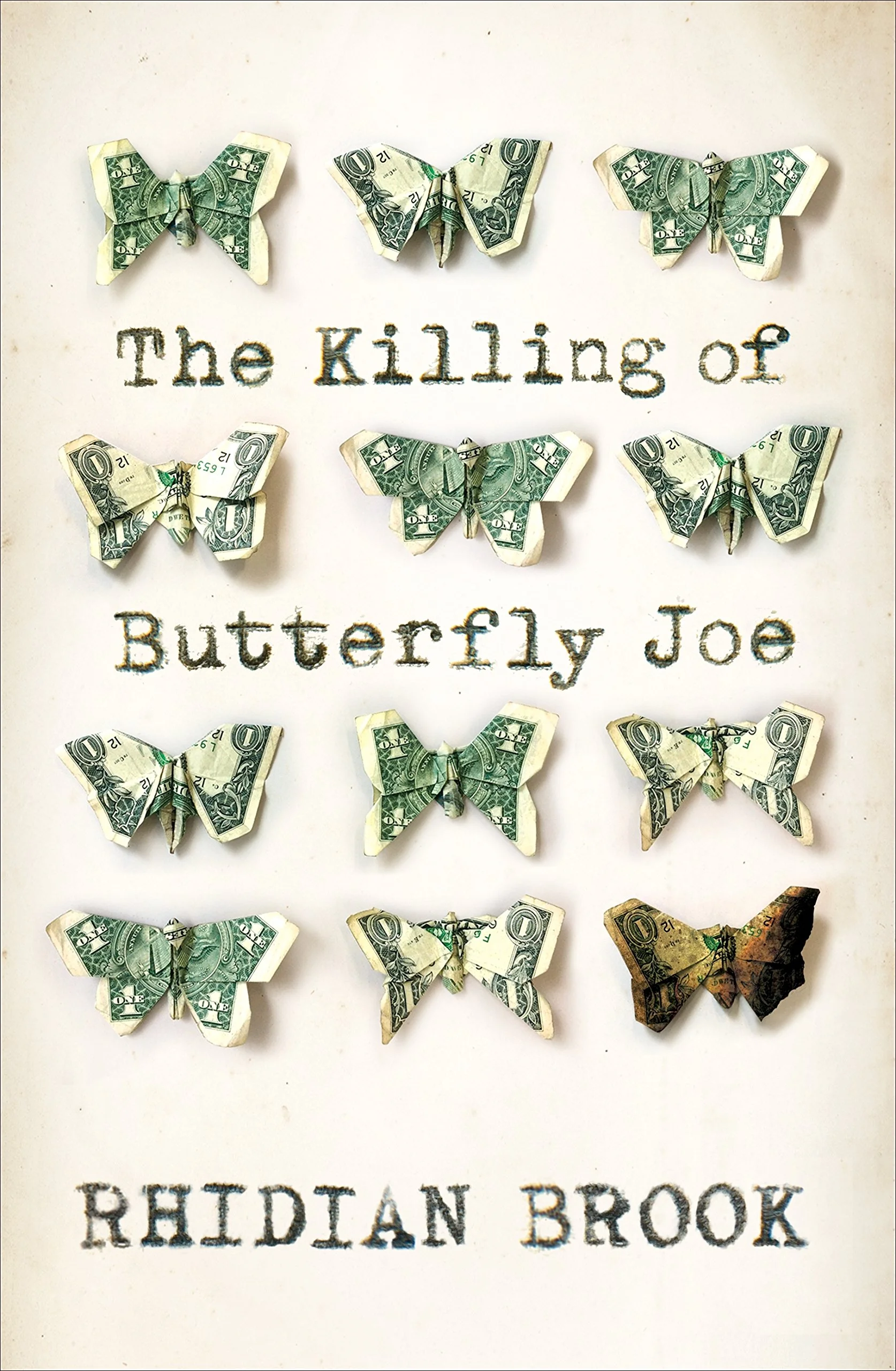
Finally, I tried this origami idea -American dollars and butterflies - I'm a bit of an origami fan, I even had a lunchtime origami club with designer Lauren Wakefield when we worked together at Cornerstone! So it was great fun to find some Youtube instructions and try lots of different origami dollar butterflies. I chose my favourites and photographed them. This was the most simple idea and worked best conceptually, which is probably why it was chosen as the one to develop further.
I tried several variations - I liked the flame shape with the cut out letters but they looked too young.
Here's the jacket we ended up with - with a singed butterfly on the front (fire plays a big part in the book) and a blue monarch on the back. It's printed on uncoated paper with embossed butterflies and clear foil on the text.
Final full cover
Join us in celebrating the enormous talent that goes into making books. Consider a small donation to our Patreon fund. Your support helps us provide you with an in-depth look at some of the book publishing industry's most creative people.
www.patreon.com/spinemagazine
Editor, artworker and lifelong bibliophile.