Potter Design Duo MinaLima Discusses Book Covers

The Marauder's Map. The venerable Daily Prophet and the gossipy Quibbler. Sirius Black's "Have You Seen This Wizard?" poster. Hogwarts textbooks, Horcruxes and packets of Chocolate Frogs. Harry Potter's universe, as portrayed in the film series, is littered in the loveliest fashion with graphic designs that at once stand memorably alone and belong to the same visual family as other visible elements, such as the costumes and Hogwarts' Gothic architecture.
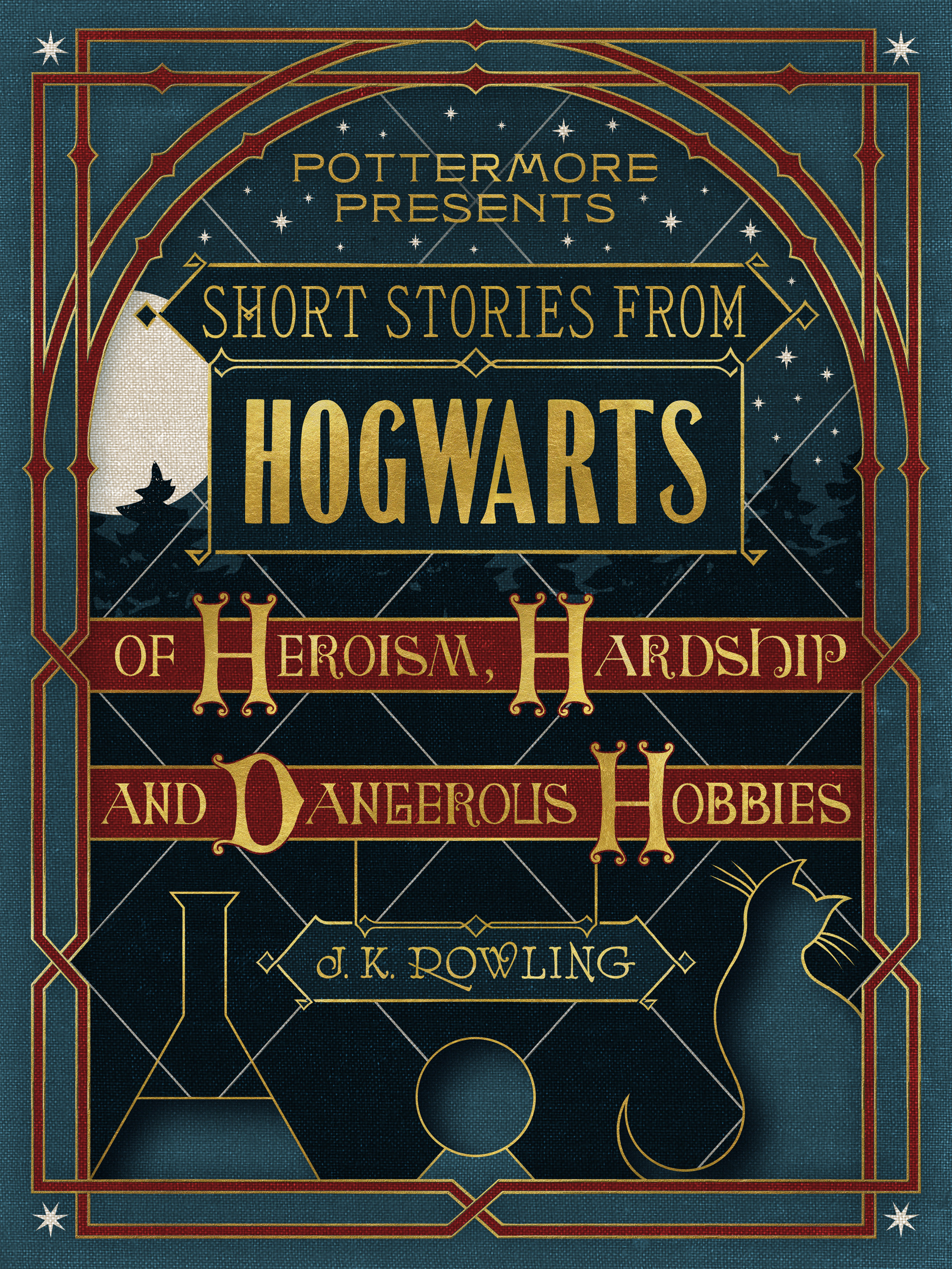
The creators of most of the franchise's art, Miraphora Mina and Eduardo Lima, met in 2001. Mina was already part of the film design scene in London, specializing in graphic and prop design, and worked on the original Potter film. Lima was new to the UK, having worked for several postgraduate years as a film editor in his native Brazil. Both were hired to design for "Harry Potter and the Chamber of Secrets," second in the Potter series, and have been collaborating ever since. Most recently they designed the covers for "Pottermore Presents," three eBooks offering readers more of J.K. Rowling's writing about Hogwarts and the wizards who teach there.
When creating the textbooks used on the set of the films, Mina and Lima expended great effort to make the books appear aged, as if they had been sitting on the Hogwarts shelves for decades. They began by inspecting real-world books. "We have a very lovely relationship with books," Lima told Spine. "We go to lots of secondhand shops."
Mina said being able to examine and touch old books was a necessary step in the creation of the props. "It's important to us to have this relationship, a physical one. To be able to hold a book and see how it's aged, where it's aged." Using what they've learned about old books in our world, the duo created new "old" books for Harry's.
Mina described the process. "We design it, print it, get [printers] to bind it, and then we age it. It's a process where you're convincing time, you're trying to speed up what would have been done over 100 years and figure out how those things happen."
That same knowledge – of how a book cover feels and looks and ages — served as basis for the Pottermore series. In creating a digital set of books that "exist" alongside the books they made for the movies, Mina and Lima faced a new set of challenges. "There's a limit because they are digital," Mina said. "We had to try to imbue the cover[s] with as much curiosity and interest as possible … ."
Both with the digital covers and the props, the team employed vintage typography and bits and pieces of manuals. "We have a huge library of old typographic rules and devices that we bring in as much as possible. If we have a straight line as a frame, it will very rarely be generated by the computer," Mina said. "This brings in the quirks that you get from printing. It makes you feel immersed in the period piece."
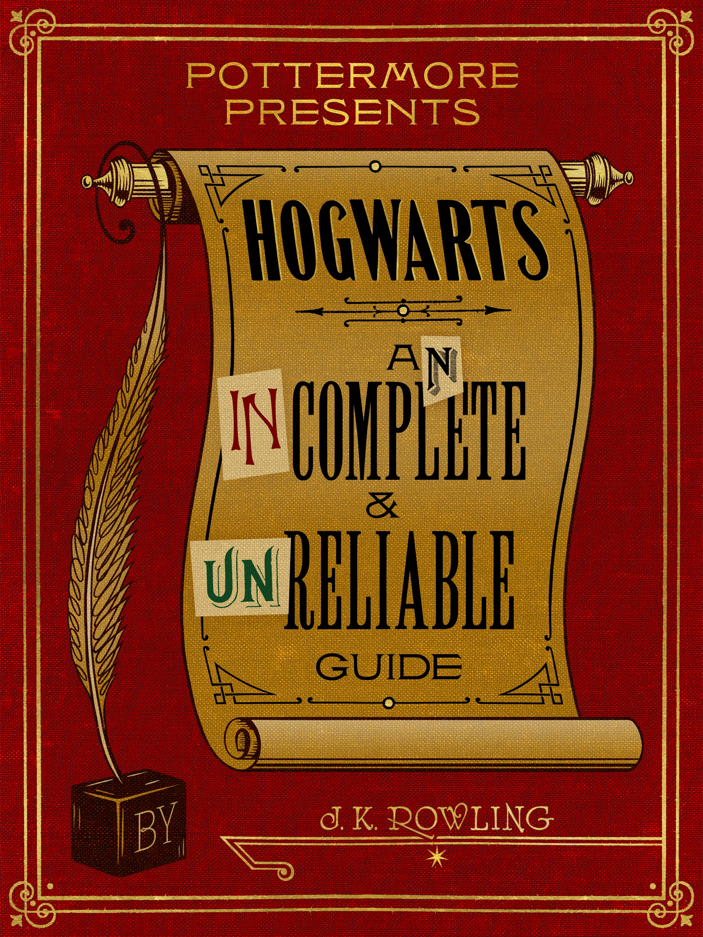
As example. the pair cites "Hogwarts: An Incomplete and Unreliable Guide." The "in" and the "un" that change the title's meaning are scans from vintage materials, as is the border.
In addition to ensuring that the three digital covers felt part of an unspecified, long-ago time period, Mina and Lima also needed these one-dimensional pieces to speak the same visual language as the three-dimensional Potter-verse props that preceded them.
The deep red cover of "Hogwarts: An Incomplete and Unreliable Guide" features gold borders and lettering. The color not only adds richness to the design, but also visually echoes the use of rich colors throughout the Potter films. Humor also ties the book to the movies and earlier books. The original subtitle appears to be "A Complete and Reliable Guide." Someone's tampering notes transform that to "An Incomplete and Unreliable Guide."
"I like that someone at Hogwarts wrote that message, but the students came in and … ho ho ho!" Lima said.
Pottermore released "Pottermore Presents" in early September. A few months previous, in conjunction with the London preview of the play "Harry Potter and the Cursed Child" in London, Mina and Lima opened "The House of MinaLima," a London-based exhibit inviting visitors to experience props from the Potter films.
When not immersed in all things Potter, the duo is working with Harper Collins to design a series of fairy tales. So far, they've released "The Jungle Book" and "Peter Pan," with "Beauty and Beast" coming out worldwide in March. The publisher has given the pair freedom to create complex pieces that employ their skills as prop designers. "Inside [each book] are a dozen or so interactive elements, little foldout maps or dials, little letters … ephemera," Mina said.
They aren't sure what title will come next in the series. Lima's hope? Pinocchio.
Spine Authors Editor Susanna Baird grew up inhaling paperbacks in Central Massachusetts, and now lives and works in Salem. Her writing has appeared in a variety of publications, including Boston Magazine, BANG!, Failbetter, and Publishers Weekly. She's the founder of the Salem Longform Writers' Group, and serves on the Salem Literary Festival committee. When not wrangling words, she spends time with her family, mostly trying to pry the cat's head out of the dog's mouth, and helps lead The Clothing Connection, a small Salem-based nonprofit dedicated to getting clothes to kids who need them. Online, you can find her at susannabaird.com and on Twitter @SusannaBaird.


