Samira Iravani on Creating the Cover for Dig

Samira Iravani is a New York native, NYU graduate, and designer with the Penguin Young Readers Group. Here she tells us how she created the cover for Dig by A. S. King.
The process of designing Dig started with all my favorite ingredients: an editor with a clear vision for the cover and a story I could really sink my teeth into. Dig, written by the brilliant A.S. King, is about five teens—The Shoveler, the Freak, CanIHelpYou?, Loretta the Flea-Circus Ring Mistress, and First-Class Malcolm. Confused? Good. The less you know about Dig the better. Let the teens help you tunnel your way out of the dark as they discover how their lives and the lives of millionaire former potato farmers, Marla and Gottfried Hemmings, intersect. The former title of the book, Blend & Strain, also tells you a little bit about what you’ll encounter in its pages. Blend your cast of characters together, then strain, to see what comes out of the chaos.
Sometimes designing a cover for a story this mysterious and abstract can be a challenge. You have to tread the fine line between keeping the book’s secrets but showing enough to intrigue the right audience. Other times, as in the case of Dig, it’s a design smorgasbord. With the blessing of the book’s editor, Andrew Karre, I had free reign to try some truly out-of-the-box things. Andrew gave me a great head start with these covers of Boy Erased and I Am I Am I Am as inspiration, as well as the phrase I used as the mantra for my designs: “botanical and unsettling.”


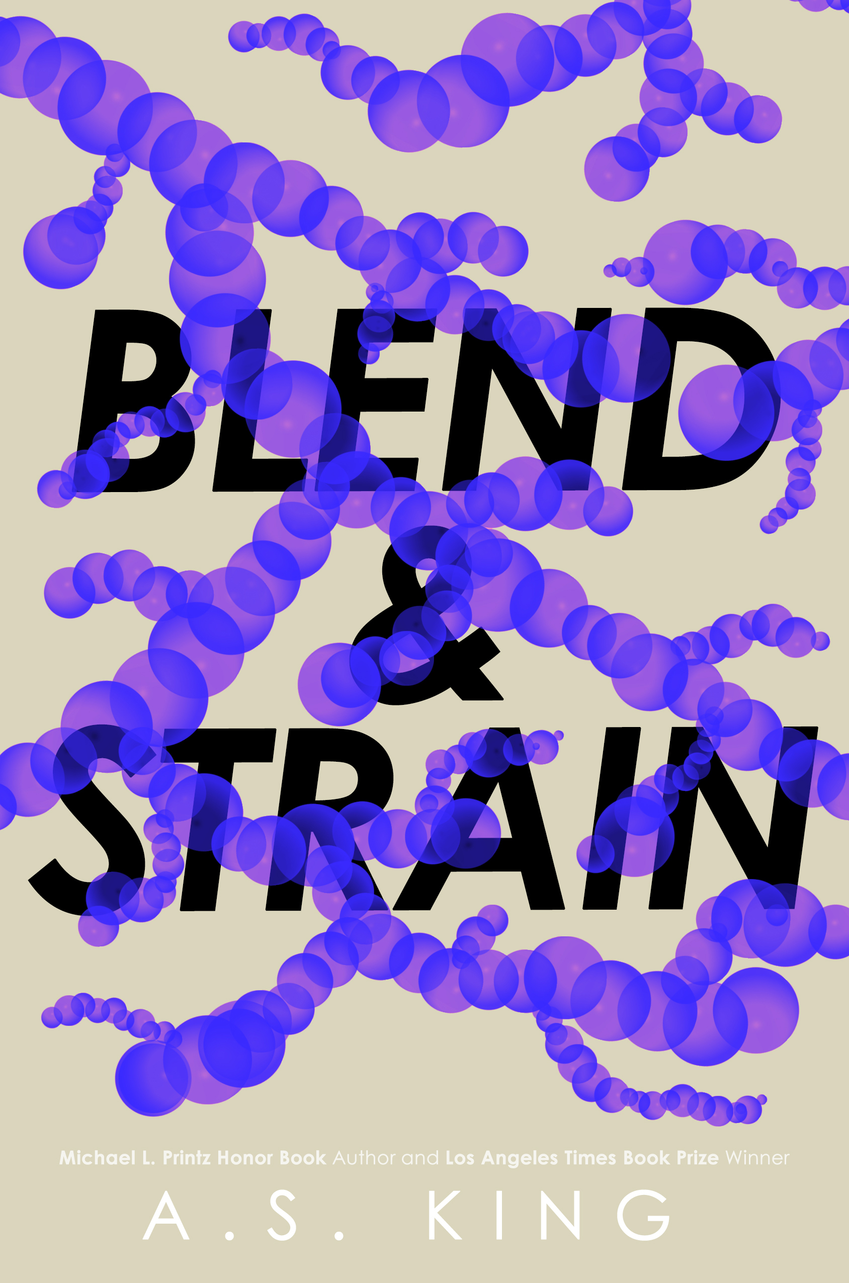
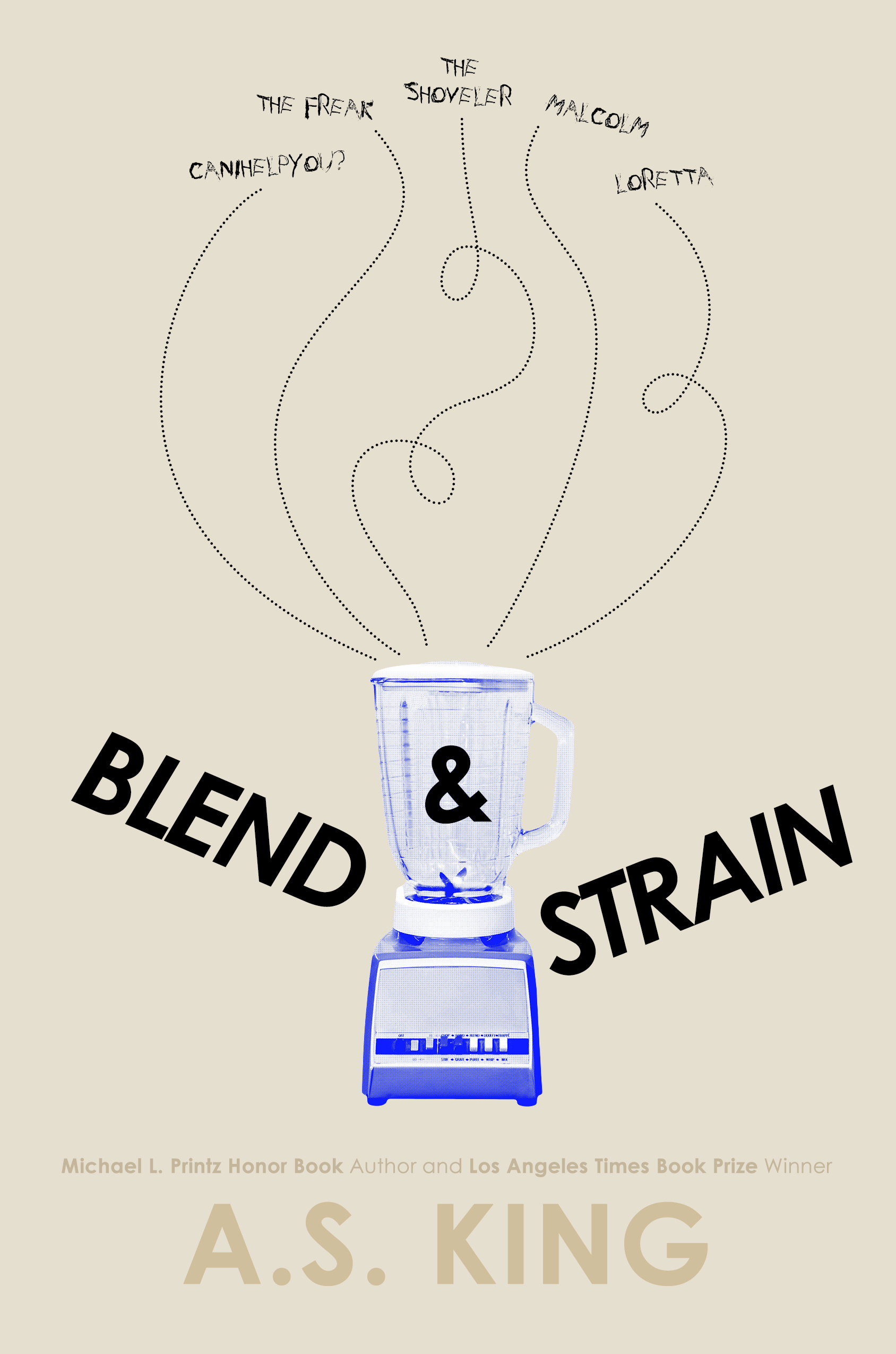
I centered my first designs around some suggested symbols from the story that were laden with meaning: eggs and nests to represent a family—an easy way to show how they’ve become isolated and torn apart; shapes reminiscent of tunnels, plant roots, or DNA strands; and, of course, potatoes, that mean so much to the Gottfrieds and represent all kinds of things buried beneath the surface. Secrets, truths, emotions.
That vintage botanical illustration of the potato plant is what resonated with Andrew and the author the most. Something about it was almost reminiscent of an anatomical drawing of a heart, and I was asked to push that connection even further. After trying a handful of color palettes and orientations, we latched onto the final coloring. Something that, at first glance, might actually be a heart or an organ, but upon closer inspection reveals itself. I added a soft texture so the overall look wasn’t so clean (we are talking about potato farming, after all!) and shifted the colors so they were slightly off register, adding to that unsettling feel.


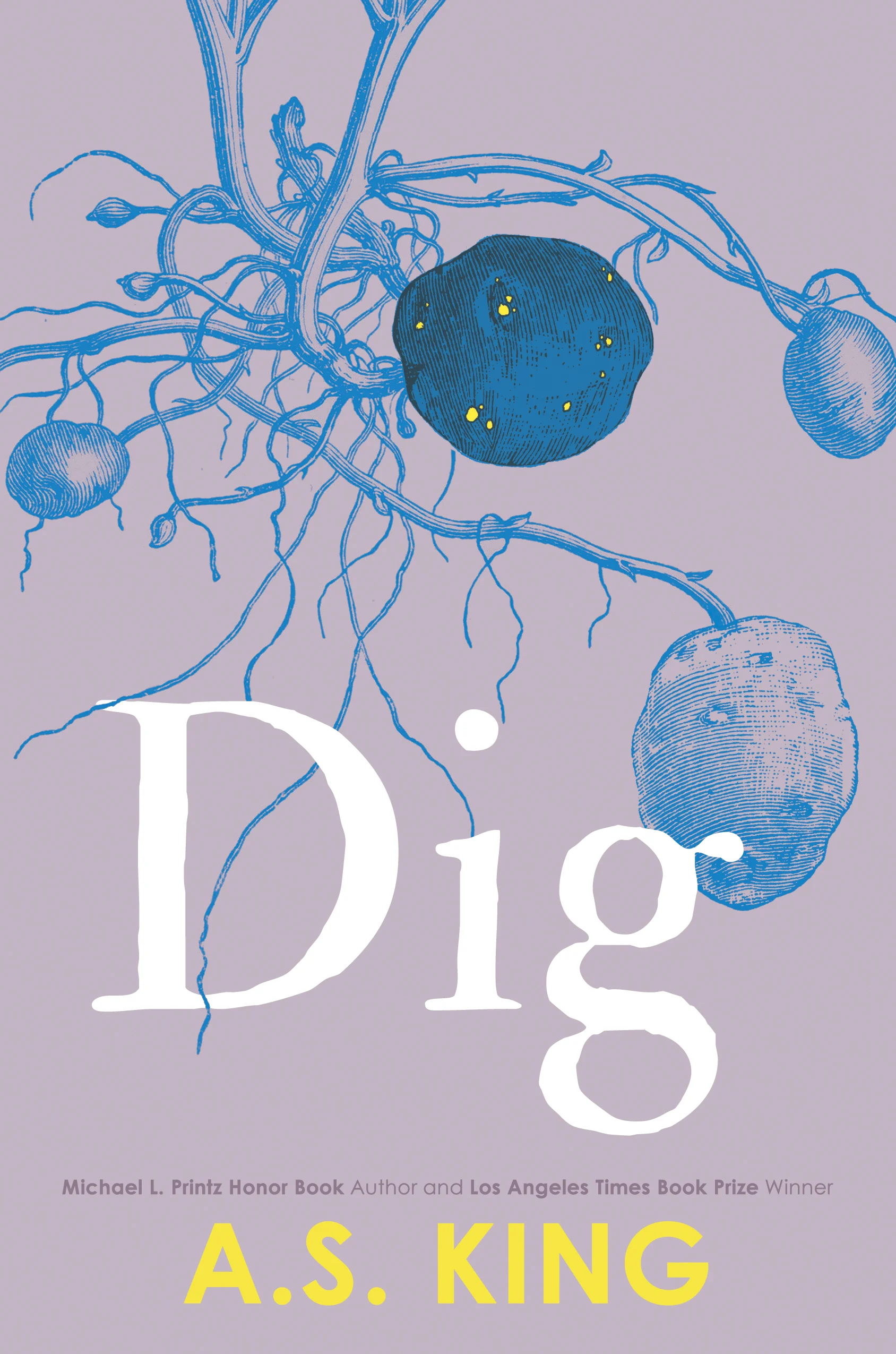
For the title, I wanted to choose a typeface with a little texture, almost like it was unearthed from the soil itself. And with such a short title too I knew it could have a great impact if it was huge. And, voila! There you have the cover in its finished form.
Final cover
Editor, artworker and lifelong bibliophile.