Sarahmay Wilkinson on her Incredible Design for the Cover of House of Stone
Some stories read like beautiful, bitter medicine. Novuyo Rosa Tshuma’s first novel House of Stone, a multifaceted and fragmented reflection on Zimbabwe’s harrowing past, is one of those stories. The novel oozes intensity, even terror. It’s magnificently composed, but it’s also so raw it might cut you. When designer Sarahmay Wilkinson, who currently serves as Associate Art Director at W.W. Norton, received the creative brief for the cover of House of Stone, she knew the project would be challenging. How does one wrap a biting story in shelf appeal?

Owen Maseko
Immediately, Wilkinson was drawn to House of Stone: “The novel was appealing to me as I have family that has lived in Zimbabwe and I have followed the issues in the news, as well as received first hand reports.” After consulting with Tshuma, who was involved in the House of Stone cover from start to finish, Wilkinson agreed to draft a few covers based on the art of Owen Maseko, a Zimbabwean artist and activist known for his disturbing designs (think Picasso, but with more righteous rage). “ I did my best with Maseko's work but it was, as the book is, quite disturbing,” Wilkinson said. “We ultimately decided that the book would be better served by a bright abstract cover, to offset the dark and vivid nature of the narrative.”


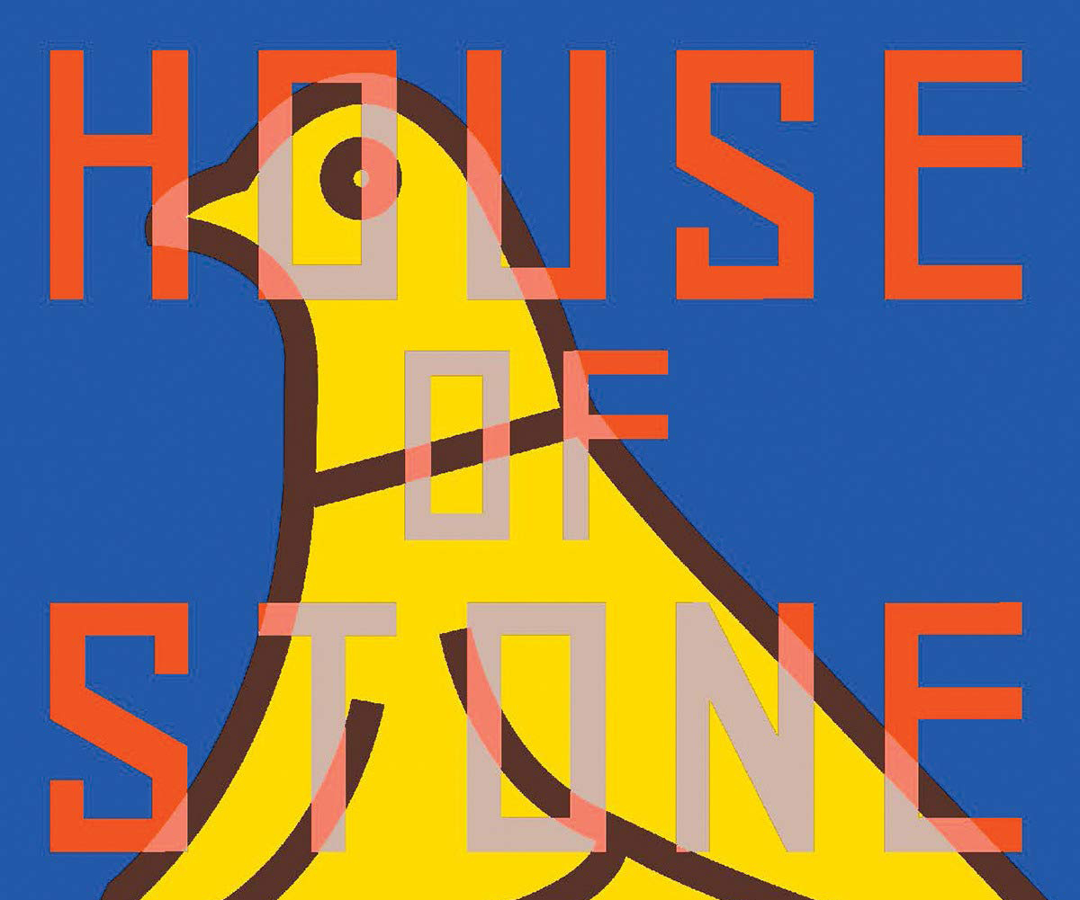
After Wilkinson and Tshuma decided on the aesthetic direction of the cover, Wilkinson locked down the typeface. The bold-but-not-too-bold, angular, all-caps font connotes a certain strangeness, while the erratic slices of color blend image and word in a way that captures the potential reader’s gaze. Then, of course, we can’t not talk about the bird with a secret in his wide, perfectly circular eye. “We explored a number of image/symbol directions before landing on the national symbol of the bird,” Wilkinson said. Among such motifs were shapes suggesting houses and trees. While each design is exciting in its own right, something about the frantic visage of the bird sings out ot potential readers: Yes, I am beautiful. Yes, I am terrified.

Final Cover
“Using several references I deduced the symbol to key lines, and we printed the job using multiple spot colors. Getting that blue was very important to me.” Indeed, the House of Stone blue speaks for itself. It amplifies every other color and shape on the cover. “What I keep coming back to with this book is: It's a hard read, but it's a must read,” Wilkinson said. “I really believe people need to, and should, read this book.” Wilkinson’s desire to create a cover that does the story justice is evident in each element of the cover. from color to typeface to motif. We all want a book that adds beauty and mystery to our shelves. We all need a book that launches us out of our comfort zones. If you’re looking for art and guts, look at House of Stone, and don’t look away.
Mary Ryan Karnes is a freelance writer and a Master's candidate in fiction at the University of Southern Mississippi.