Stephanie Ross on Designing The Party Upstairs

Stephanie Ross is a book cover designer based in New York City. Here she gives us a peek into her design process for The Party Upstairs.
The Party Upstairs unfolds in the course of a single day inside of an affluent New York City apartment building, and centers around Ruby and her father Martin, the super. Ruby is no closer to her post-college dream job of creating dioramas like the ones at the Natural History Museum, and has moved back in with her parents in the building’s basement. She’s back in the environment she grew up in: one that makes her painfully aware of being poor when most of the people she knows are not. Her childhood best friend who lives in the penthouse, Caroline, is hosting a party, which Ruby looks forward to and dreads in equal measure. She must face yet again the strange sensation of being included amongst the social and financial elite, a group she neither identifies with nor belongs to. When this novel was presented at a launch meeting, I knew I was interested in working on the cover.
I tried to think of the cover as a window into the genteel Upper West Side world that had been carefully constructed by the author. Even more so when the depictions of class and opportunity so closely mirrored the settings the characters inhabit. In my first few directions, I wanted to show a variety of options to the editor. Some that captured the darkly witty tone of the novel, focused on the ideas of class and feeling small in a big city, and others that utilized visual cues from dioramas, such as miniatures and shadowboxes.


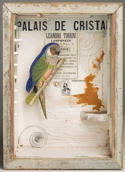
These two covers were selected to be sent to the author for approval. Everyone initially liked these but after some discussion, the author wanted to try a different approach: one that focused more on the father-daughter relationship between Ruby and Martin, while emphasizing the references to dioramas that appear throughout the novel. The author also mentioned Joseph Cornell’s assemblages housed in boxes as possible inspiration. The way forward was clear: I needed to build a diorama.


Making a diorama for a book cover! Not something I had done before, so it took a bit of planning. My research led me to artists such as Lori Nix and Kathleen Gerber, but I knew there was no way for me to construct something so detailed in the time I’d been given. Remembering the Cornell boxes, I decided to approach my construction in a way that would mimic the feeling of peering directly into a box.

Building it slightly smaller than what would be printed on the cover and deep enough so the viewer would get a strong sense of perspective, I hoped that its miniature nature would come across on the finished cover. I built everything out of easily accessible materials like illustration board, cardboard, and card stock, and then painted it.

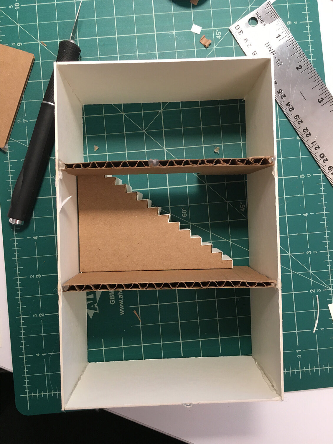
A tiny cut-out Ruby went upstairs, and a Martin cut-out downstairs in the basement. I wanted the type to be a part of the environment, so I constructed placards of the title and author name and “a novel” that could lean against the walls in the diorama. These were big enough to overwhelm the figures and fill but not obscure the space. After everything was in place, I photographed it myself in an empty corner office. Thankfully, everyone loved this final version of the cover.
Final cover
Editor, artworker and lifelong bibliophile.