Baily Crawford Tackles a Sensitive Subject for On a Scale of 1 to 10

Baily Crawford is a Brooklyn based illustrator and designer. She is also a founding member of Fem Foundry. Here she talks us through her process for designing the cover of On a Scale of 1 to 10.
On a Scale of 1 to 10 by Ceylan Scott gives us a look inside life in a psychiatric ward through the eyes of teenage Tamar. Based on the author’s true story, it is as poetic as it is unflinchingly honest. With themes of depression, self mutilation and suicide, the cover had to be intriguing while remaining respectful of the content. The read is deeply emotive, raw and beautiful; I wanted to encompass these qualities while also remaining accessible, considerate to the reality that a manuscript this dense with hard-hitting subject matter can provide important refuge to so many readers.
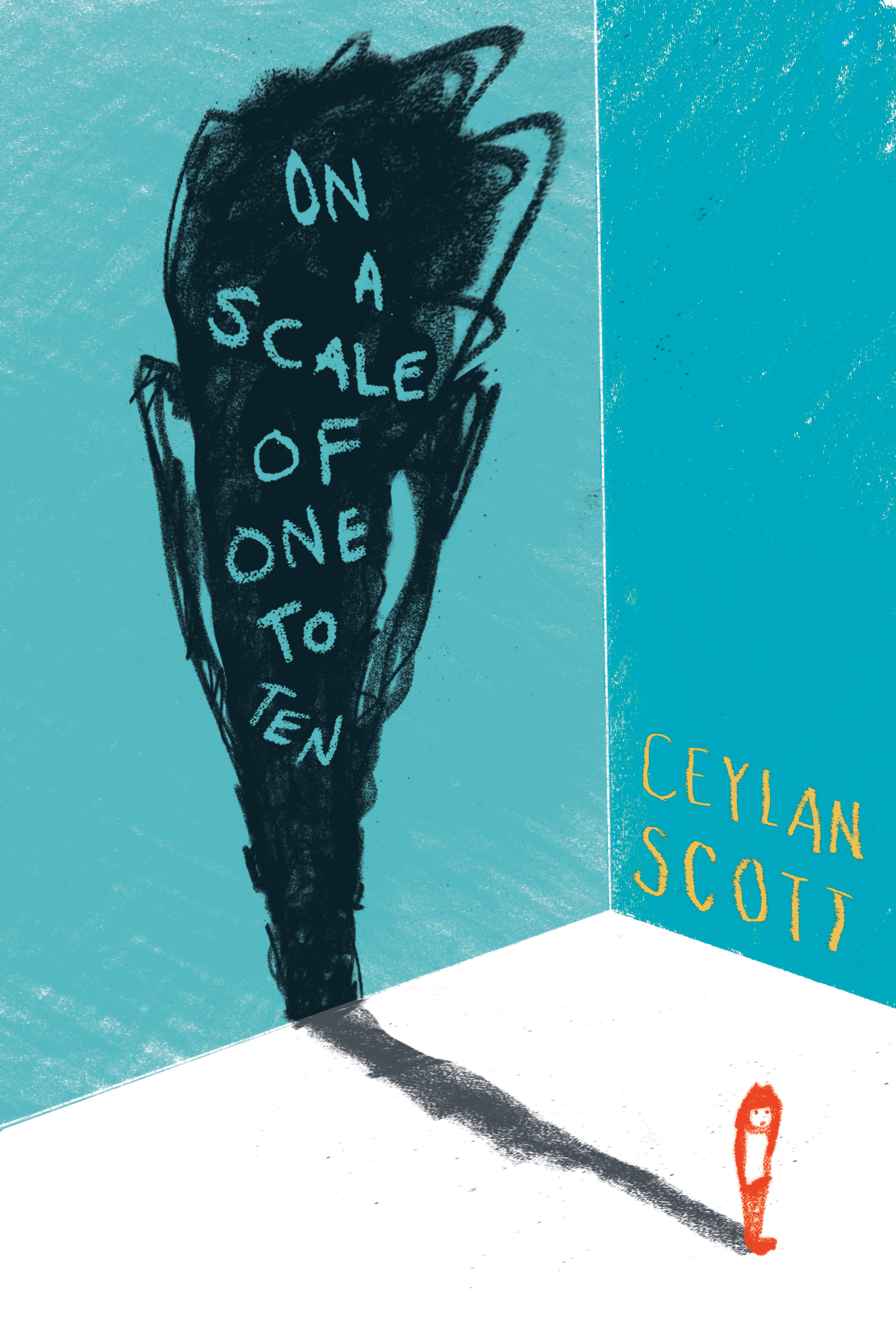
My initial thought was to achieve this balance through illustration. A rough and simple style could evoke the right feeling. It could also describe tough subjects while not getting literal enough to be off-putting. I tried sketching up some reoccurring images and themes throughout the book. The river is an important staple in the story, and I also thought that treading water was a good representation of depression, so I was partial to those options.


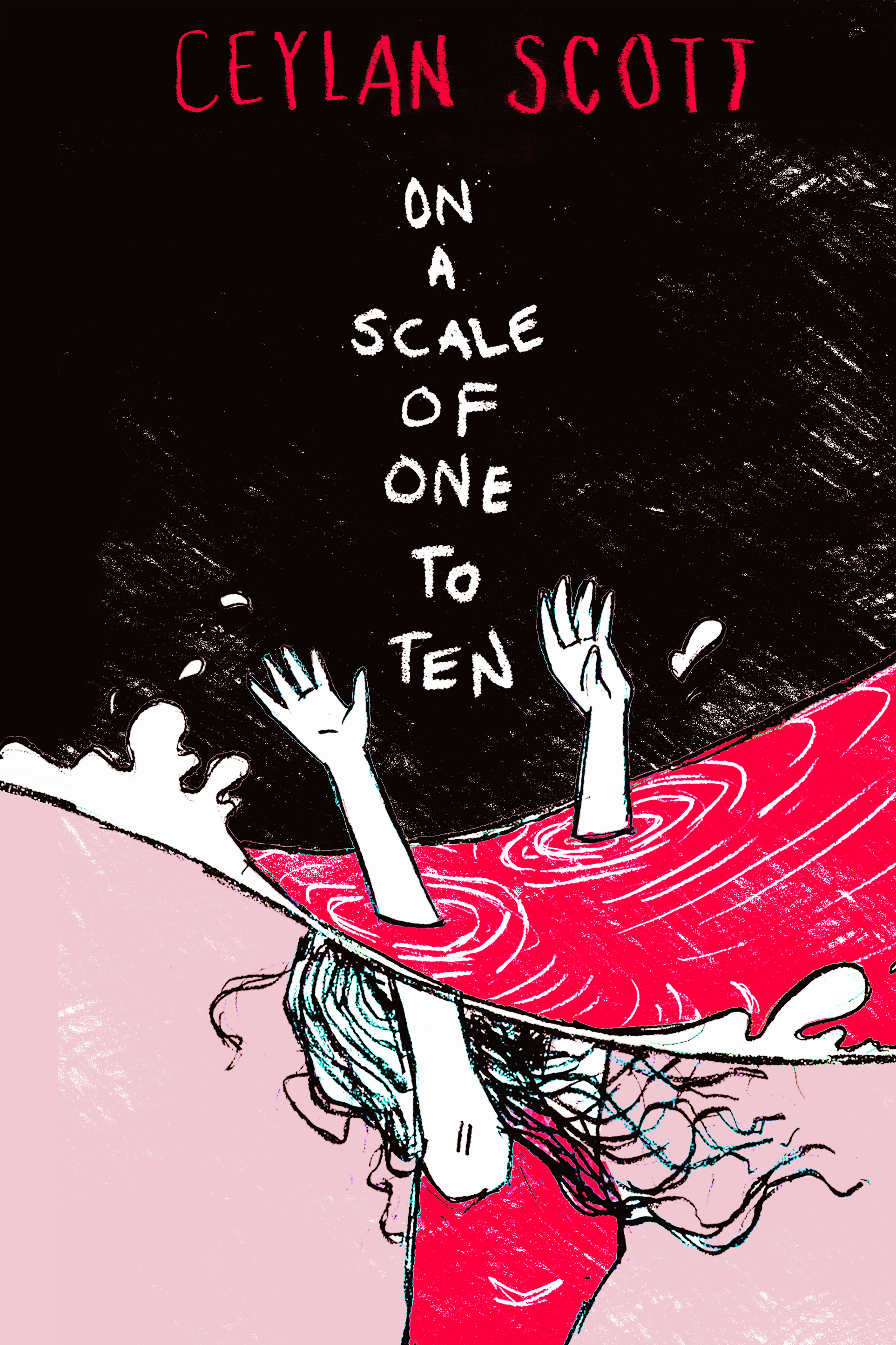
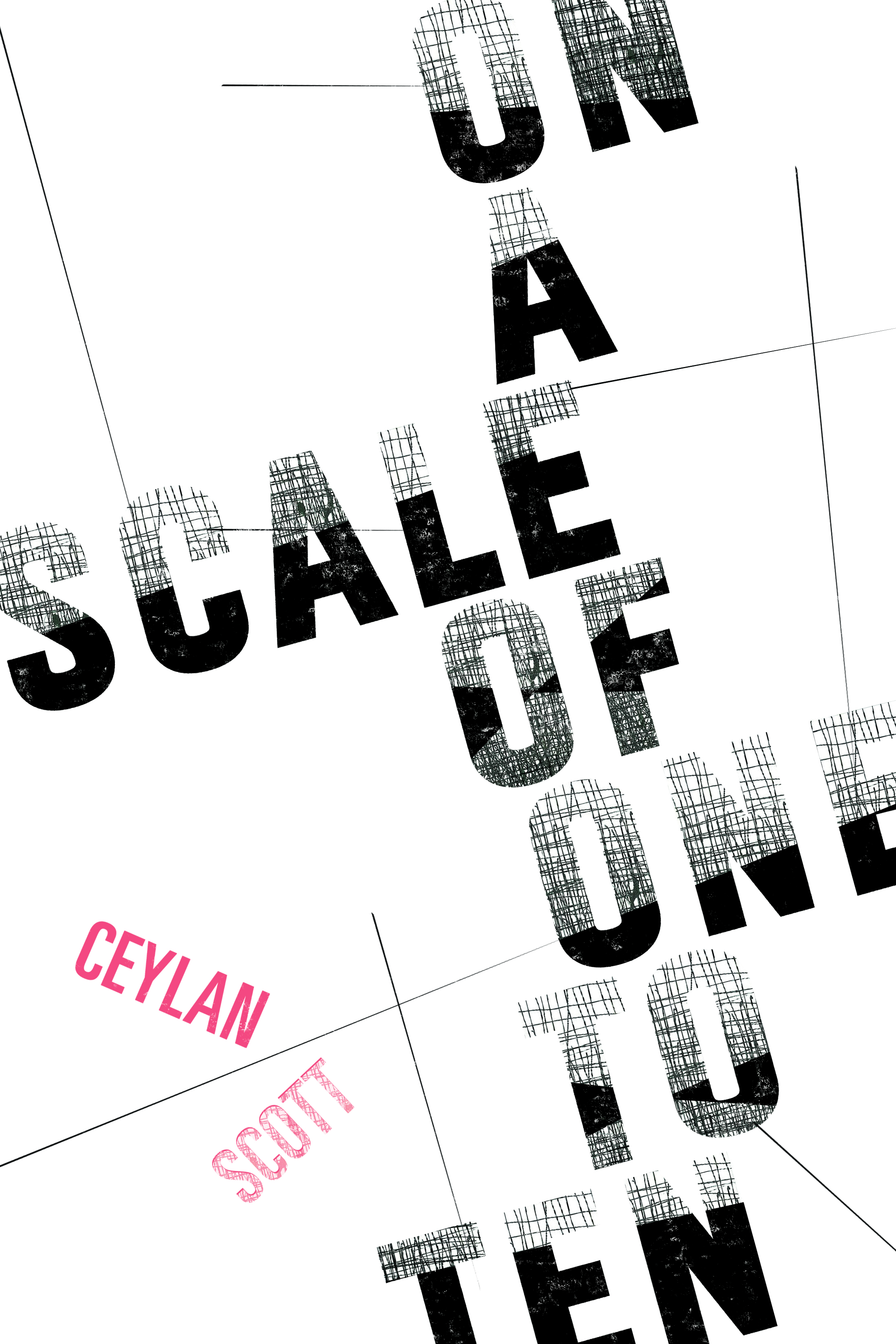
After a few rounds of brainstorming, it became apparent that the simple illustration style I had in mind was falling short in communicating the book’s heavy subject matter and its older YA age range. Something strong pulled from this round was the type treatment that evoked the 1-10 emotional scale. Showing the letters getting wilder and wilder was a good way to represent the theme without being heavy handed. I played with that for a while and tried to find other ways to incorporate that scribbly mark making into the title and cover.
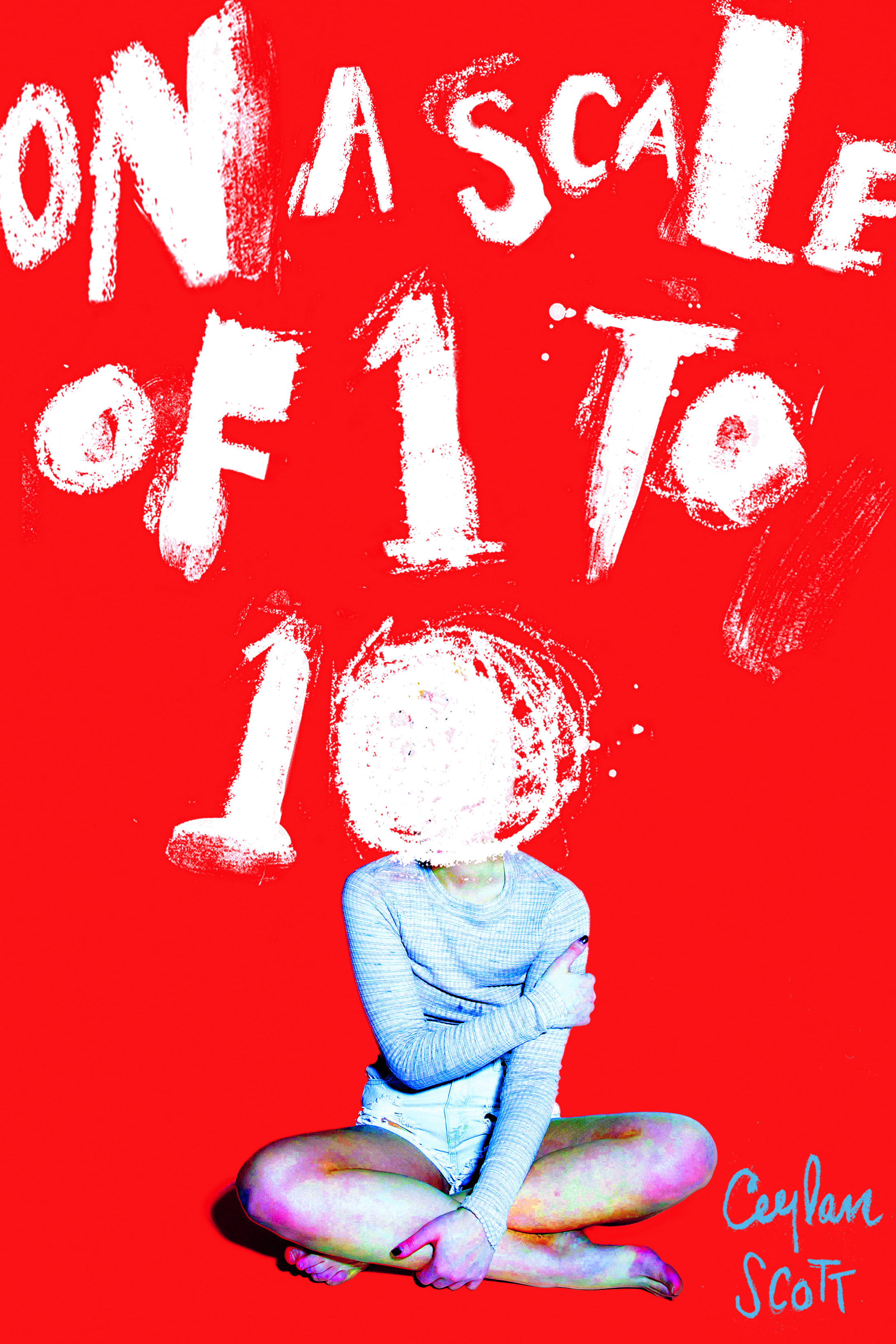
After this I realized the cover needed a figure. Tamar is such a strong character, I wanted her to have a presence that showed enough of her struggle. Even so, it was still important to me to leave room for interpretation and projection. With a book that could be so important to the readers that needed it, I didn’t want anyone to see a photograph of a girl and think ‘I’m not like her, this doesn’t pertain to me.’ There was also the challenge that this was based on a true story, one so personal that a photographic representation of someone other than the author felt wrong. With that in mind, I dabbled with different ways to include an image of a girl that in one way or another left her anonymous.


It was playing around with this concept that I came to the idea of combining the type I liked from the early illustrations with this idea that the girl should be faceless, and that quickly led to some powerful stuff.


Once I found an image of a girl I liked, it was a matter of playing with different hand-written fonts and color schemes. Ultimately, I strayed away from the type that got more scribbled as it went on for a drippier effect, as the smear across the girl’s face looked less forced. The discoloration on the girl’s legs is a slight nod to Tamar’s tendency for self-harm without being too forthright or disrespectful.


And that’s how we got here. I hope the design of this cover intrigues those in need to pick it up. And I hope the anonymity of the image will help them relate to Ceylan, and channel her bravery and her perseverance.
Final cover
Editor, artworker and lifelong bibliophile.