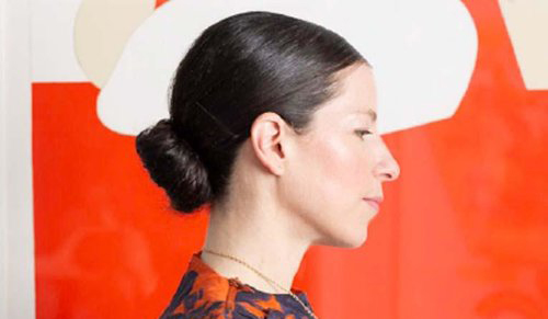
The Illustrator's Practice: Samantha Hahn

Photo: Dina Kantor
Samantha Hahn is a Brooklyn-based illustrator and creative director with an astounding body of work. She has hand-lettered magazine covers for Vogue and Marie Claire, done illustrative reportage for the likes of Marc Jacobs and Jonathan Simkhai, and produced beautiful book covers for Penguin Random House and St. Martins Press. They are just a few of her illustrious clients. Others include New York Magazine, Tiffany's, Conde Nast and Saatchi & Saatchi.
If that wasn't impressive enough, she is also the author of two books. Her first, Well-Read Women: Portraits of Fiction's Most Beloved Heroine's, was written up in the New York Times, while her second, A Mother is a Story: A Celebration of Motherhood and the accompanying keepsake Stories for my Child: A Mother's Memory Journal were reviewed as “magical” and “stunning.”
Here she gives us a peek into her workspace, her process, as well as her favourite projects.
“My working process varies from project to project. I love having a conversation with the art director at the onset to discuss working process. I don't often do pencil sketches. I usually submit concepts in written form and then upon approval of the idea I go straight to watercolor.
Photo: Tara Donne
I provide multiple options with variations for the editor/art director to look at. I work in layers in case they want to put a certain illustration with different hand-lettering. I'm always thinking about the revision process and working in a way that I can make changes and shift things around within the composition to provide multiple options. With covers I know there are often many cooks in the kitchen so I want to arm the art director with what they need when it comes time to present to the group.
Photo: Tara Donne
When a client comes to me because they feel my work is a good fit I always feel like a happy partner. As an author myself I know how emotional the cover process can be so I try to really get to the heart of the content. Hand-lettering and illustration add warmth and authenticity so I am always trying to intuit the soul of the book and think about what would be compelling for book buyers to grab on the table at their bookshop and also feel that the cover is in alignment with the content of the book. When an art director or editor comes to me, it makes me feel like a partner. One of the most moving experiences I've had as an illustrator was doing the cover for The Bright Hour by Nina Riggs. It was her terminal cancer memoir. Her agent Brettne Bloom showed her my work and she honed right in on my abstract watercolor circles that reminded her of molecules so she requested me to her publisher Simon & Schuster. Jackie Seow was the art director. I was so honored. At first I was scared to read it. Nina and I were both moms of 2 kids and I didn't want the book to make me sad. When I read it though my life was changed. Her view on the world was bright and optimistic and she made the absolute best with the time she had, leaving her incredible legacy in the form of the book with happy watercolor molecules on the cover. I went on to letter the cover in multiple languages for publishers all over the world. I couldn't stand the idea of a font replacing the lettering in foreign editions. I wanted Nina's vision and warmth to be conveyed on all the covers.
I use a variety of materials and relish the opportunity to step outside of the box when a client is down with that. I mainly use watercolor and inks with brushes and quills. I also love using thick marker, pencil and fine point pens for lettering. I want my lettering to look absolutely effortless and fast. I've done magazine cover line lettering, book titles and usually wind up writing words or sentences over and over again until they're just right. The final might take only a minute but I've likely written it 50 times or more to get there. I think my hand and brain are having a conversation the same way a dancer's muscle movements record the choreography in the practice room.
Photo: Nick Steever
Photo: Samatha Hahn
I often get hired to do fashion figures. During fashion week I'll work for Vogue Japan, The Cut or designers themselves to do illustrative reportage of the shows. I love it but also love working in other areas. There have been times when I was afraid that I'd get pigeon-holed but I have gotten special opportunities to work in new areas over the years. One example of that was when Charlotte Strick, one of the most incredible art directors and designers agreed to receive a copy of my first book Well-Read Women: Portraits of Fiction's Most Beloved Heroines (Chronicle Books). After seeing it, she and the EIC of the Paris Review commissioned me to illustrate Rachel Cusk's novel Outline that TPR was publishing in serial over the year. I remember the EIC sending me a note saying he liked the way I captured the "ennui of characters." I always strive to capture mood, whether it's an illustration of a fictional character, fashion figure or even a lettered book title.
To see more of Samantha's work, visit samanthahahn.com or find her on Instagram @samanthajhahn.
Editor, artworker and lifelong bibliophile.


