Sounds Like You Have It Covered: Eric Wilder’s Cover Design for Sounds Like Home

For the forthcoming 20th anniversary reissue of Mary Herring Wright’s memoir Sounds Like Home: Growing Up Black and Deaf in the South, designer Eric Wilder faced the challenge of delivering Wright’s message to 21st-century readers. The memoir’s old cover, which featured a scripted typeface a sepia-toned photograph of the author and her brother, simply would not do for the much-anticipated reprint of Sounds Like Home. Instead, Wilder decided to play with elements of Wright’s Carolina heritage for a cover that subtly conveys the memoir’s strong sense of place.
Wilder sent two rounds of potential designs to Gallaudet University Press. Originally, both client and designer had hoped to include the sepia-toned photograph featured on the memoir’s original cover, but in the end, Wilder’s work with color and motif eliminated the need for the photograph.

One of Wilder’s first designs for Sounds Like Home features a broad, swooping typeface in a hue that compliments the sepia treatment of the featured photo. The photograph itself lives in a small oval frame, which presents the image as heirloom. Such a cover suggests that the story inside is intimate and precious to both writer and reader. Additionally, Wilder used the small oval frame to help cover the physical tear in the top left corner of the photo.

Wilder’s second design features the interplay of serif and sans-serif typefaces. The featured photo still exists within an oval frame, but the frame blends with the rest of the cover. An expanse of Carolina blue harkens back to Mary Herring Wright’s North Carolina heritage.

Here, Wilder switched the hierarchy of visual elements. The photo takes prominence in the layout, while the entire cover is colored in soft tones. Wilder treats the central photo like art displayed in a gallery in hopes that potential readers will do the same. The cover feels quaint, but not anachronistic.
In Wilder’s second round of designs, he eventually stops incorporating the photo of the author and her brother. Less, in the case of this particular cover, definitely does more.
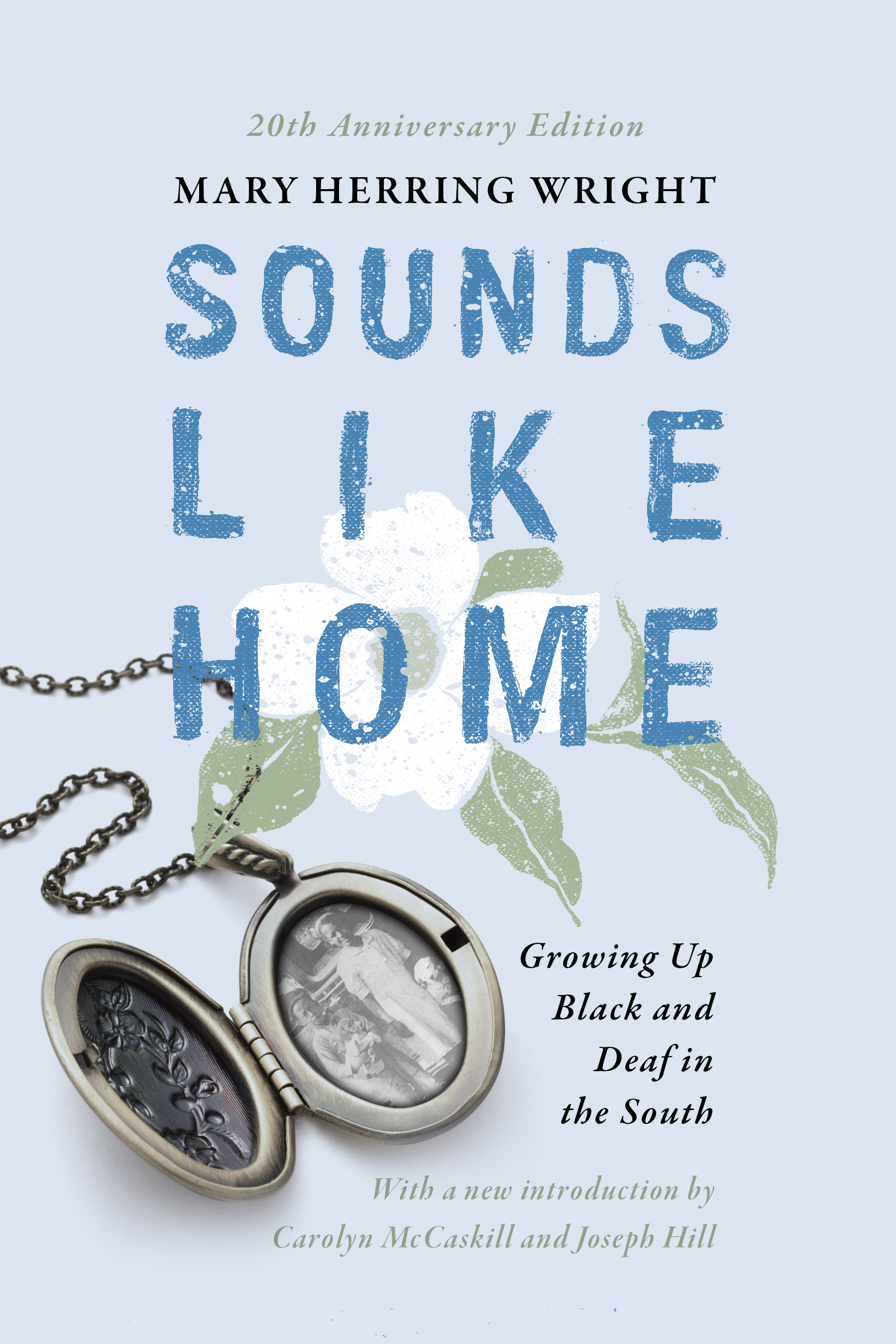
In the first option of his second round of designs, Wilder featured a bright Carolina blue type, which he hand-painted for an intimate feel. Wilder wove more Carolina heritage into this cover when he embellished the type with a hand-painted dogwood, the state flower of North Carolina. The flower also conjures ideas of growth and tethers itself to the book’s tagline. Wilder completed the design with a locketed photo of the author, an element suggesting this story lives close to the heart.

In a slight variation of the previous design, Wilder presented Gallaudet with the option of a more clean cover. Ultimately, this is what the client chose. A muted photo of the Carolina countryside stands in place of the locketed photo, a visual choice which gives the cover more thematic and visual continuity. The dogwood and the lowcountry, along with the incorporation of Carolina blue, help create a feeling of regional familiarity and pride. The cover plays with modernity all the while honoring the author, her past, and the place she grew up.

Here, Wilder continued to play with hand-painted type and imagery. Instead of the dogwood, Wilder incorporated the vibrant Carolina Jessamine. He completes the background with a few perfectly Southern baby blue stripes.

Wilder’s final design departs from all the others. The black hand-painted typeface here is softer and more topsy-turvy than the previous two. The lettering mingles with deconstructed elements of a house, leading potential readers to picture a home in their minds. The entire image sits on gray cloud puffs, an element that lends a more vague or mysterious tone to the story inside.
The road to a final book cover nearly never proves itself direct. Designers and clients must take pauses, detours, and several stops to smell the roses (or dogwoods or Carolina Jessamines). Such is art; such is life. It sounds like Wilder’s work has found a new home, as has Mary Herring Wright’s compelling story.
Mary Ryan Karnes is a freelance writer and a Master's candidate in fiction at the University of Southern Mississippi.