Jenna Stempel, Creating the Little House Trilogy Box Set

Jenna Stempel is a Senior Designer at HarperCollins Children's Books in NYC with work notably featured in the New York Times and the 2015 New York Book Show. Here she talks with Spine once more about her elaborate design process in creating the anniversary book covers for the Little House on The Prairie Trilogy box set - presumably no easy task!
Where did the idea for this book cover begin and can you lead us along the creative process from start to finish?
My first step is to always look to the marketplace, since our books have to share the shelf. We wanted to make these books very collectible, and to that end we looked to other classics editions to see the various ways that they were being published. I curated a moodboard of inspiring designs, from Jillian Tamaki’s Penguin Threads to Peter Mendelsund’s Kafka series.
Next came reading the books. I hadn’t read the Little House novels growing up (being too focused on Nancy Drew and Harry Potter), so once I finished the first three, I also read my former coworker Wendy McClure’s memoir The Wilder Life. It provided great insight into the Little House fandom and was a terrific companion to the actual books, adding both pop cultural context and historical background.
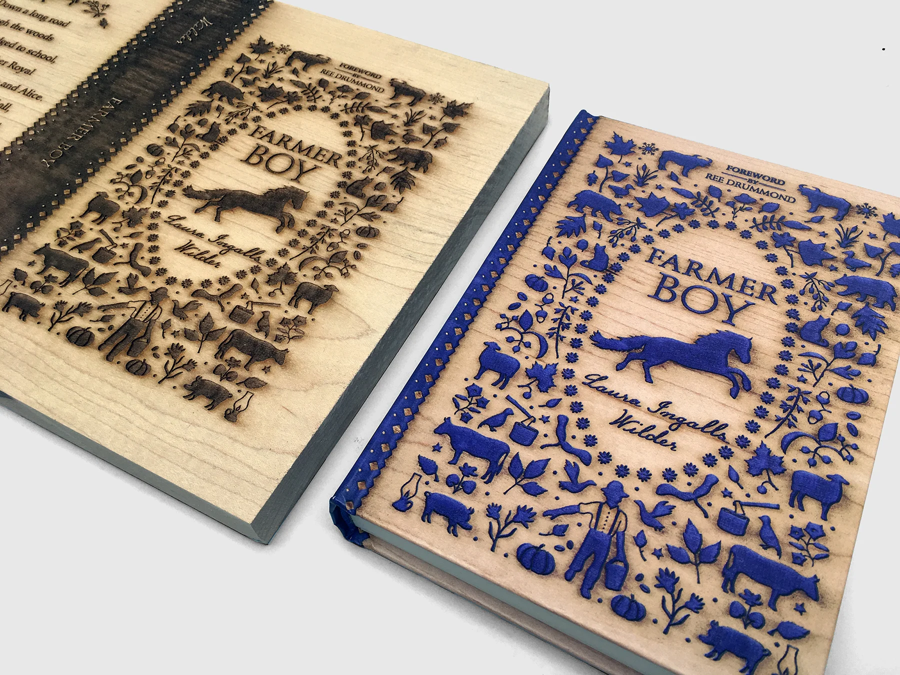
Wendy’s book convinced me that the best path forward would be to mine the pioneer way of life for the repackage and design something as charmingly handmade as possible. We looked at historic calico textiles and quilts of the era and also explored the idea of naïve illustrations, but in the end, our in-house team responded overwhelmingly to wood cuts.
The concept behind the series design was to get each book engraved with specific items from each story into different types of wood. We worked with the editors to pick relevant objects and to choose a main icon for each novel. The wood used for each book was native to the state where the Wilder and Ingalls families were living at the time. We commissioned Suzy Taylor, an amazing cut-paper artist, to create the art….and then I went a little crazy researching state trees.


This idea seemed simple enough! But right out of the gate I hit my first bump in the road. Both New York (Farmer Boy) and Wisconsin (Little House in the Big Woods) share the Sugar Maple as their state tree. It was so important to the premise of the concept that each wood was specific to the book, so I called in the experts at the Brooklyn Botanic Gardens library to ask about types of trees that were common in the state but unique to the other two. They sent me some helpful websites, and I was able to choose 3 trees I thought I could defend as “common but unique.” But then I realized I had to coordinate with our wood supplier (Lenoble Lumber in Long Island City) to see which types of wood they had…and whether or not they were from American trees. (Who knew most yew used was European! I do, now.) That first list was scrapped and with further research we settled on ash for Wisconsin, maple for New York, and red oak for Kansas. After a few confusing conversations about “rough hewn lumber,” my art director and I eventually went to the lumber yard ourselves to hand-pick the most visually interesting wood planks.


Then came the laser-cutting at Grand Laser in Brooklyn. This was a tri-borough job! We looked at a variety of sizes and eventually settled on producing the covers at the same size they would print. Oriana Siska in our Production department, along with our wonderful camera room, ensured that the final blocks were photographed carefully for reproduction.
Finally, we commissioned a typeface from Julia Sysmäläinen based on hand-written correspondence from Laura Ingalls Wilder to her editor at Harper & Row in 1934 and 1935. The typeface is called “Little House Script,” and we used it to set Laura’s name and all the chapter titles on the interiors, as if she wrote them herself. We also used deckled edges to add to the rustic feel. This was a true (manual) labor of love!

Hand-written letter, Laura Ingalls Wilder
How long did the book cover design take? (Between original assignment, brainstorm, drafts and finale).
These books definitely had the most extended production process of anything I’ve ever worked on. We started looking at other classics in November of 2015 and sent the files to the printer in November 2016.
Is it an easier task designing for a “classic” than new literature?
NoOoOoOoOo. No way! A repackage or new edition is always a challenge because there is no blank slate. The Little House books remain in our pop culture canon: as children’s books, a TV series, and a whole prairie aesthetic unto themselves. We felt a loyalty to the brand and knew we needed the new editions feel every bit as nostalgic as the ones we all grew up on.
What feelings did you want the overall design elements to convey to readers?
These covers were described as “homespun-looking,” in the New York Times Book Review earlier this month, and that has been the highlight of my career.