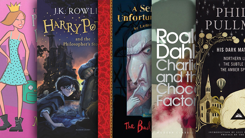
Cover Changes in YA/Children's Publishing

A book cover design often reflects the zeitgeist of design fashion; they need to look modern and eye-catching so lots of publishers work very hard to ensure that new editions really look new.
Because of this, I thought it would be interesting to take a look at how book covers have changed in my lifetime. So I took to my bookshelf and compiled comparisons of how the covers looked when I bought them, and how they look now.
I think it’s pretty interesting — also mildly embarrassing to look back at the kind of books I read, yes I did make it through the entire collection of The Princess Diaries series — a lot of my books had hand illustrated covers, and were boxed off for the type areas, or used heavy drop shadow effects. Now, however, most are full bleed and the covers look like they’ve been illustrated digitally, or use photos instead. The typography has changed a lot too, fewer serif typefaces and more hand lettering.
Disclaimer: I wanted to put the appropriate dates next to all these, but turns out Amazon & Waterstones aren't too reliable at linking up the correct cover with the correct edition's pub date...
then (left) and now (right)
The Princess Diaries:
I remember absolutely loving the covers of these books when I was about ten years old. The new one is definitely an improvement, but the old one's aren't too far away from some modern stuff that's being published for the age group.
A Series of Unfortunate Events:
In retrospect, the typography for the titles in this series were quite ahead of their time – they're in a cursive typeface that would fit right in at any hipster cafe these days. The new illustrations retain the integrity of the books nicely, whilst the new layout is much fresher and allows the the art and title to breathe a bit more.
His Dark Materials:
The old cover for this wasn't particularly pretty, but the new one really encapsulates the magic of Lyra's world.
Charlie and the Chocolate Factory:
This new cover caused quite the ruckus when it was released: is it a bit creepy? The book is kind of creepy when you think about it... Willy Wonka's not your average fairytale hero.
Harry Potter:
Of course I couldn't miss out HP. The new covers look great, and I'm glad the illustrator hasn't been tempted to make Harry look like Daniel Radcliffe – he still looks a lot like the old Harry we first met on the cover of J. K Rowling's first book, all those years ago.
War Horse:
Good ole Michael Morpurgo. The new cover is much more attention grabbing, and the illustration reflects the artistry of Morpurgo's writing.
Goosebumps:
Looking through the old Goosebumps books sent a shiver up my spine. The new covers seem to keep the basic typeface with drop shadow formula, but those new illustrations look digital to me.
Angus, Thongs, and Full Frontal Snogging:
This book is responsible for the horrendously embarrassing writing style I adopted in my pre-teens diary. Not sure what I think of the new one, neither of these covers seem to really portray the weirdness of this book, and if that's supposed to be Georgia Nicolson on the right, anyone who's read the books should agree that there's no way she would put up with being half cropped out...


