University Press Coverage, July 2025

The Uni-Press round-up is back! We welcome you to our ongoing feature, now penned by designer and photographer Giles Hoover, in which we periodically highlight a selection of recent university press cover designs, with commentary. Please enjoy this celebration of amazing work.
The selections are in alphabetical order by press. Where possible, credits are listed in the captions.
As with all cover designs we feature, we encourage you to head to your local library and/or bookstore to view the work in its full splendor.

Columbia University Press. Cover design by Milenda Nan Ok Lee.
Great art — Wikimedia Commons for the win — with an effective color block and subtle variations in title and subtitle color, repeated for author and translator. Bonus points for the inline title font.
The first of several examples of what I like to call “simply, elevated.”

Perfectly aged style through and through, with compelling color choices that perfectly compliment; from ship placement to the way the fire envelopes, “championed” is the correct term.

John Hopkins University Press.
The unusual choice of alternating color in type works incredibly well here — indeed, the limited color palette in general. And while we’re on the subject of perfectly complimented: the illustration leans into liberating the upper right corner in exactly the right way.

The Southern Review has been around for a minute — 1935, to be exact — but the Summer ’25 cover is really a celebration of the artwork: “anyanwu | Eye of the Sun,” in acrylic and ink on canvas. “A proud being caught in a moment of quiet grace and bold assertion,” the artist says.
Yes.

Melbourne University Press.
Works on several levels, but the northern-Australian-coast-as-beach (with its associated symbolism) sneaks up on you.
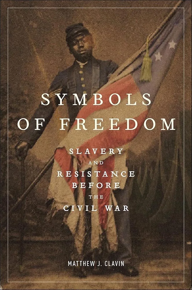
New York University Press. Cover design and art direction by adam b. bohannon. Photograph by Sergeant William H. Carney, circa 1864.
“Simply, elevated,” is perhaps an undersell here; the opposite of the above in that the best possible treatment is one of quiet respect.
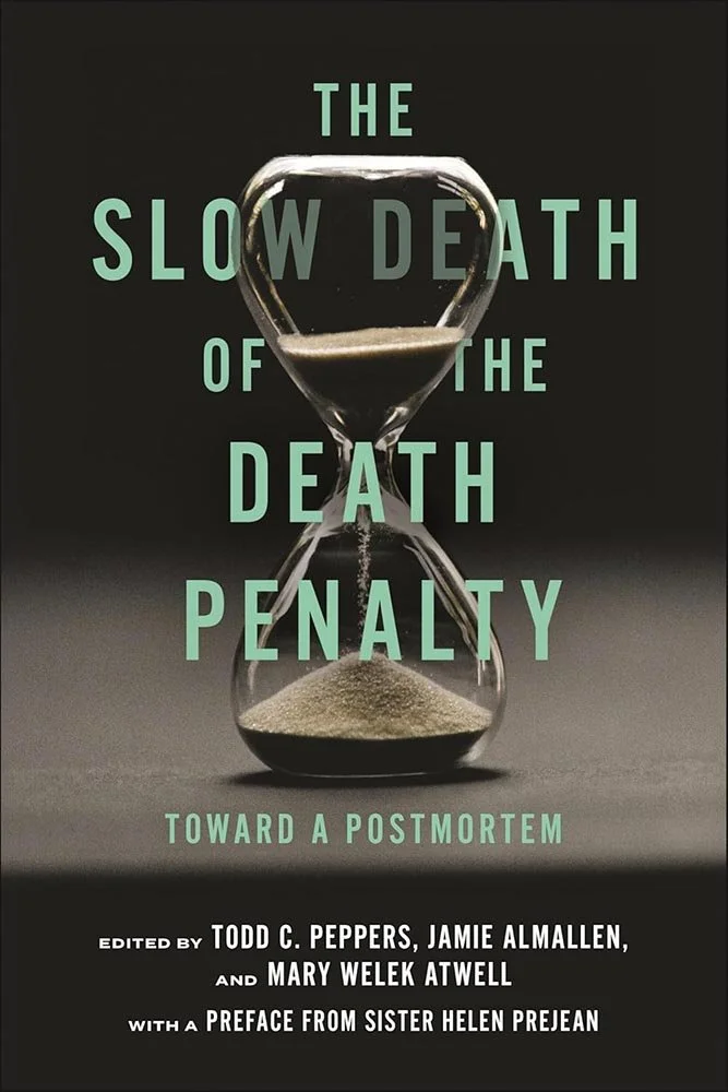
Another “simply, elevated” title, with just an image and effective title treatment. What gets this title into this post, however, is something often encountered in university press book design: an extensive list of text, handled with aplomb.
Aside from the several editors and a preface credit — a complimentary clump at the bottom, below the graphic “fold,” as it were — there’s the subtitle: unnecessarily clever, it’s been expertly de-emphasized in a way that most will never realize because they’re too busy admiring the title weaving around the hourglass.
Very nice indeed.
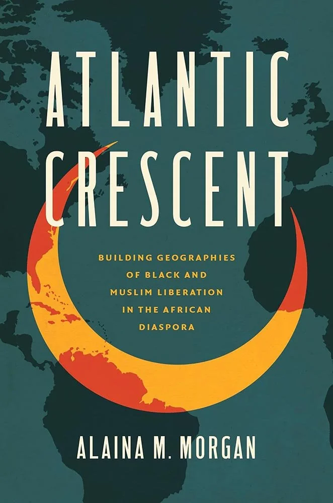
Great color choices and eye-catching crescent against a map of the appropriate location — it could be a cliché, but is just better. The last of this month’s “simply, elevated” covers.
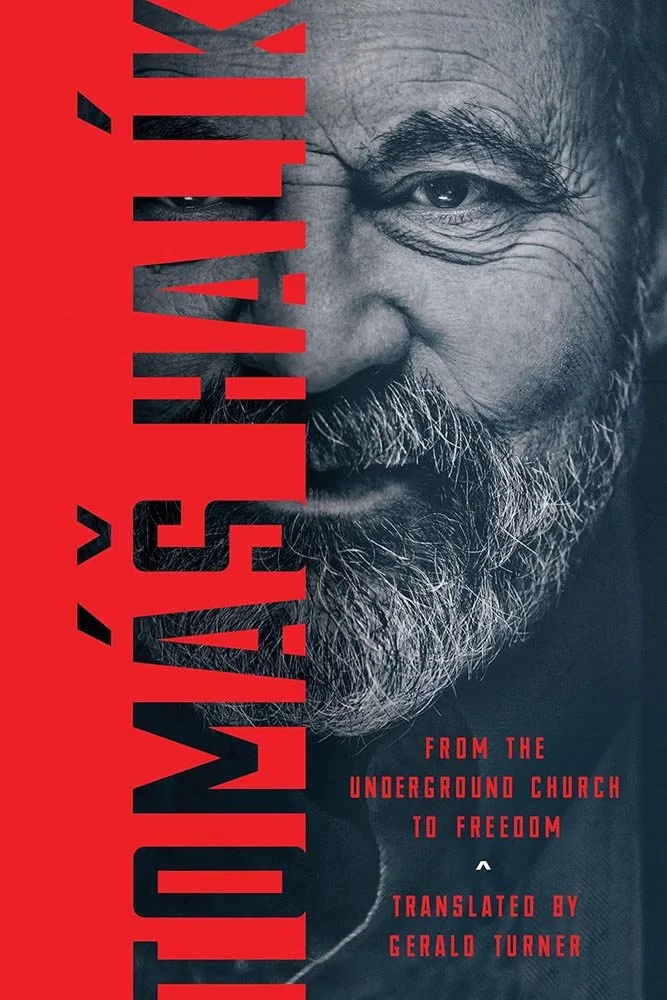
A fantastic portrait would do the heavy lifting in 90 percent of titles using one, but here the author’s name demands center stage … and gets it. In the age of needing-attention-on-the-socials, a home run.

The movie poster department called: they’re interested in your talent for dramatic style.
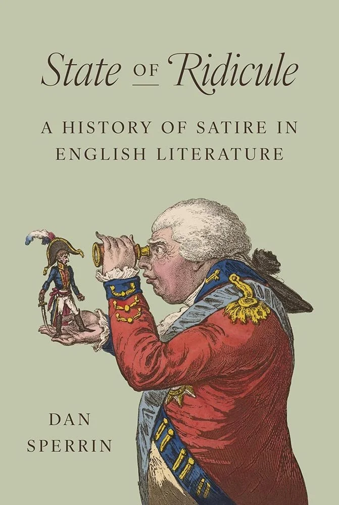
Princeton University Press. Cover design by Chris Ferrante, art director, Jess Massabrook. Art: The King of Brobdingnag, and Gulliver. Etching, aquatint, hand-colored, 1803; print made by James Gillray and published by Hannah Humphrey.
When you find The. Perfect. Artwork.
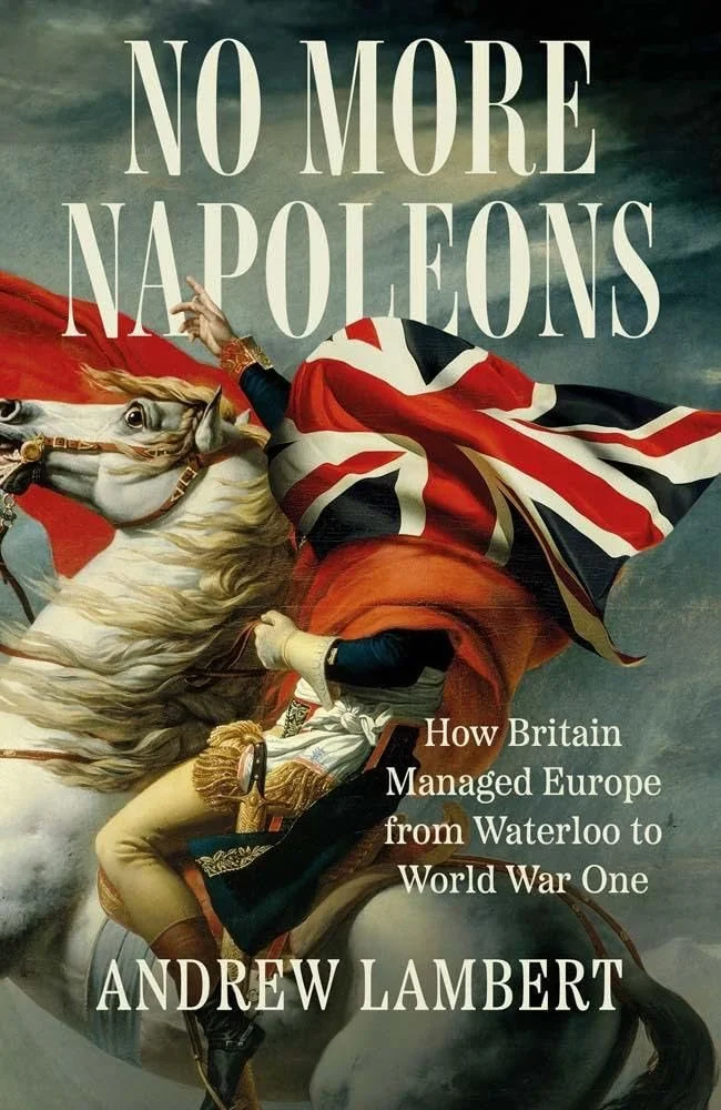
Yale University Press. Cover design by Jonathan Pelham, art director Rachael Lonsdale. Art: an adaptation of Jacques-Louis David's Napoleon Crossing the Alps.
The Photoshopped-classical-painting thing is on-trend — and thus, dangerous. But when you know you can walk that tightrope….
(Bonus points for the horse looking out at the viewer, too.)
Are you a book cover creative, art director, or publicist? If you want your work, or the work of your press, to be reviewed be sure to get in touch with us.
Please include the cover designer’s name, the art director’s name, any additional details like illustrator or photography credits, and the publication date. (Yet-to-be-published titles are welcome, with embargo dates if applicable.) Images should measure 1200-1500px on the long side, preferably in JPG format and the sRGB color space.
We look forward to featuring your work soon!
A freelance designer and photographer, Giles has been writing about book design for nearly thirty years. During his spare time, he walks, explores architecture, and enjoys music on a great stereo. He lives in Middle Georgia with a dog and cat.