University Press Coverage, December 2025
The Uni-Press round-up is back! We welcome you to our ongoing feature, now penned by designer and photographer Giles Hoover, in which we periodically highlight a selection of recent university press cover designs, with commentary. Please enjoy this celebration of amazing work.
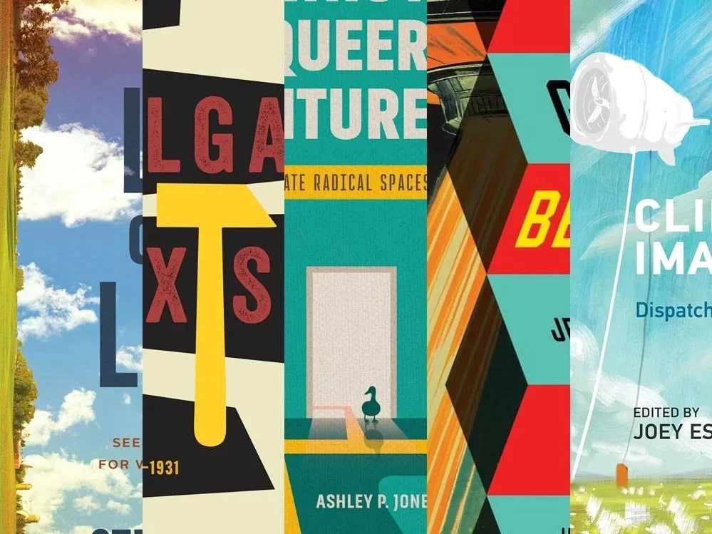
The selections are in alphabetical order by press. Where possible, credits are listed in the captions (often with links to the designers’ other work), and each cover includes a link to the University’s official page for that title.
As with all cover designs we feature, we encourage you to head to your local library, college or university library, or bookstore to view the works in their full splendor.
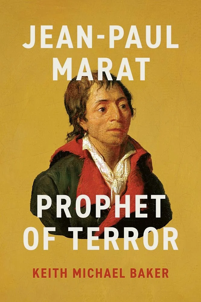
The juxtaposition of the illustration/art and the title/subtitle here is perfect. (Great choice of background color, too.)
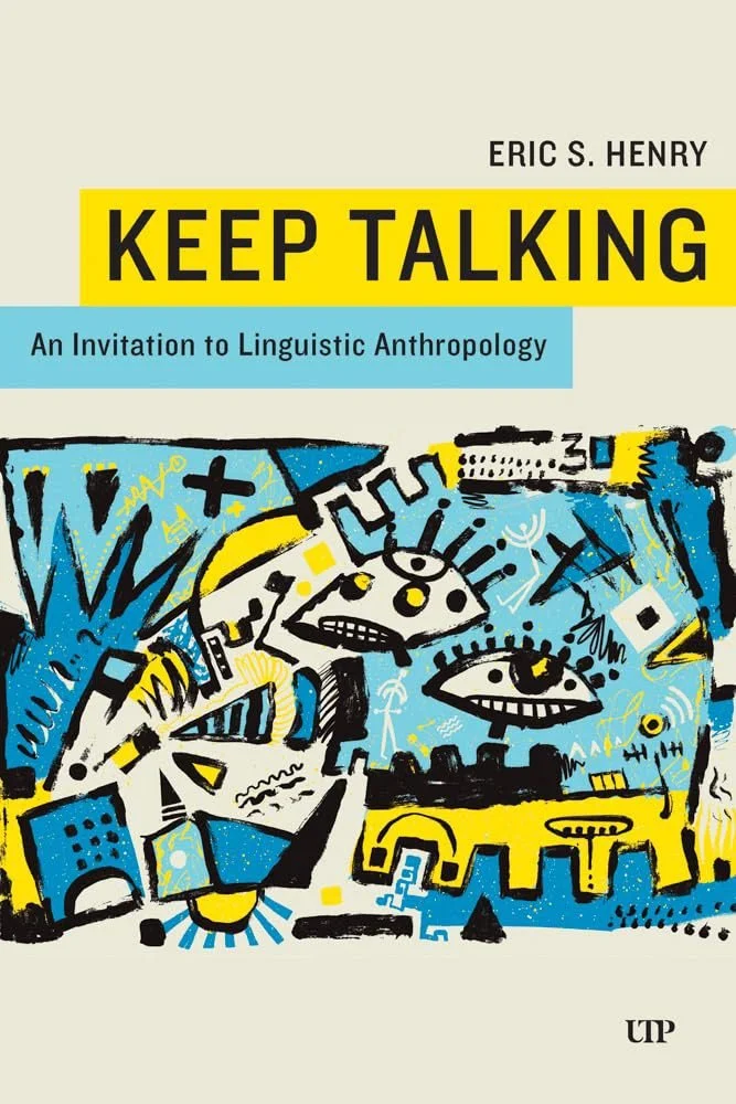
’Sides: look at that guy’s expression.
Note: This title is from late November, but it didn’t come to my attention until after last month’s column was published and was too good to ignore.
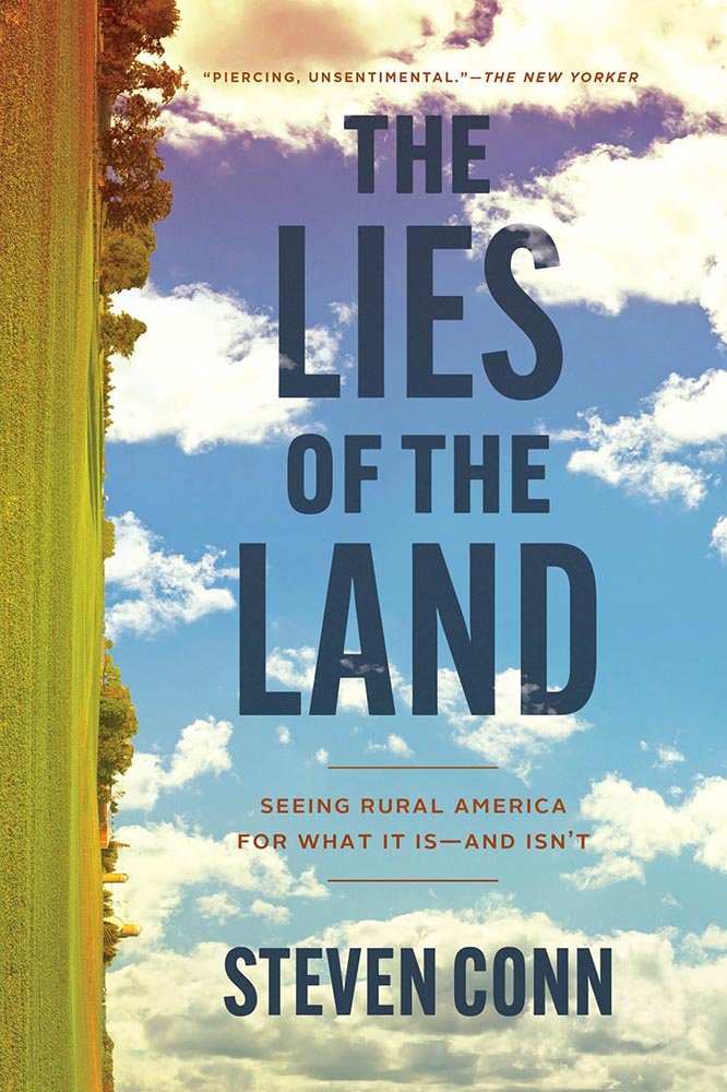
Released in paperback this month, this title uses the same great setup from the ’23 hardcover. Its green pasture, sunlit trees and siloes, and tinted sky — never mind arrangement — invite closer examination. (Bonus points for the smidge-o-clouds in the title.)
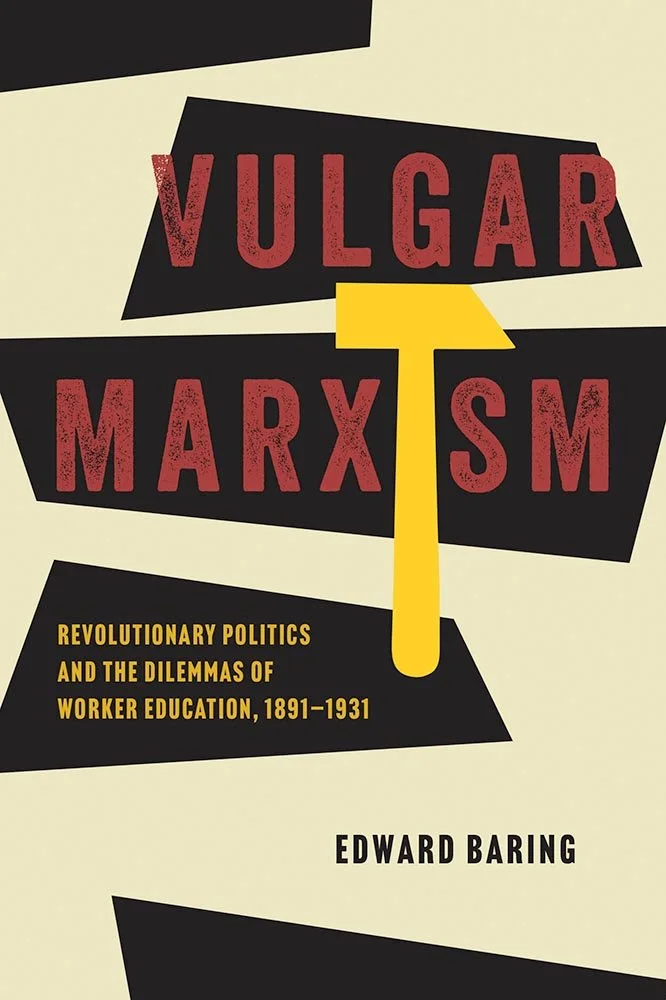
University of Chicago Press. Cover design by Ryan Li.
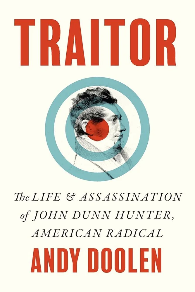
“Siccing the hammer on Marxist understanding” is a phrase I should probably stay away from when describing this design.
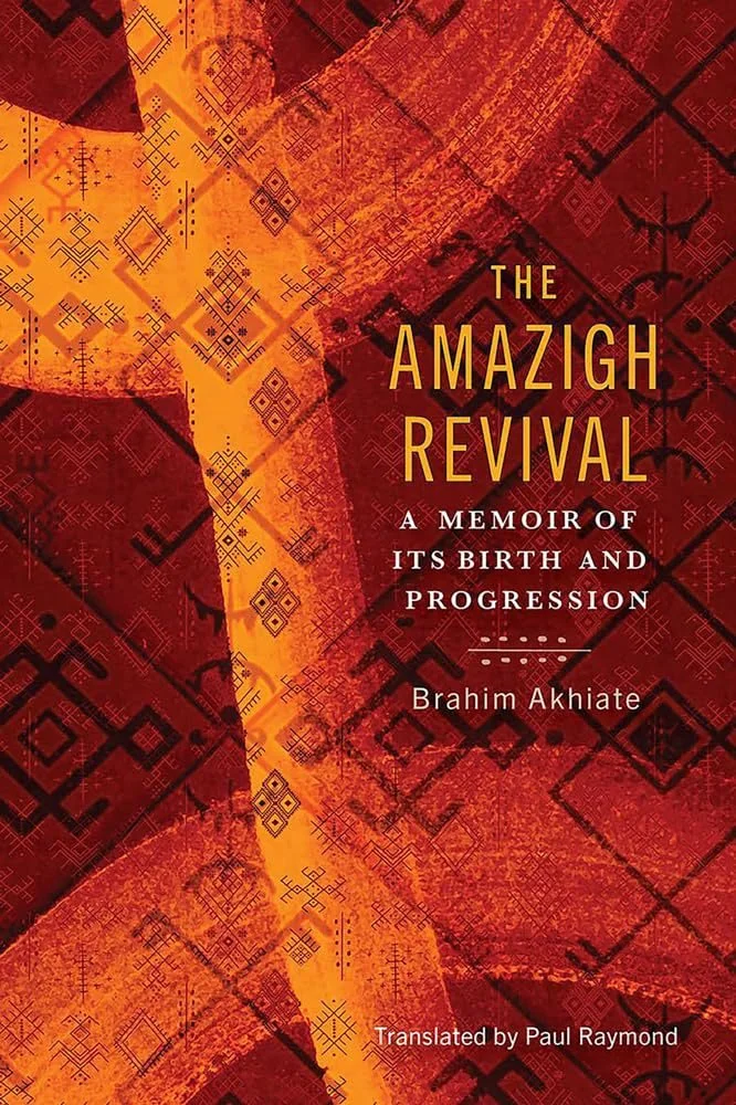
Georgetown University Press. Trudi Gershenov / TG Design. Production editor, Rachel McCarthy.
The background is all-important here: the color variations and traditional Berber patterns provide beautifully, the combination tasteful, appropriate, and approachable. The henna-like accent lines between subtitle and author add just the right touch, too. An exercise in subtle excellence.

University of Georgia Press. Cover design by Erin Kirk; art, The Gulf Stream (Detail), Winslow Homer.
The hint of cotton in those stormy seas….
That this cover uses part of Homer’s Gulf Stream, with its huge importance with respect to the movement of enslaved, is significant for those that recognize it and yet still works for those that don’t. Well done.
(Kinda makes mentioning the cool arched connections petty, but those work, too.)
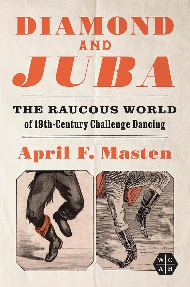
University of Illinois Press. Cover design by Jason Gabbert.
A handbill of the highest order, with perfectly-cropped illustrations, superb use of two primary colors, and just-right old-fashioned typefaces. Bonus points for the fold lines.
“Simply, elevated,” done just right.
Parenthetically, I’m generally not a fan of all-caps when it’s used for all of the cover wording, but the combination of typefaces, coloration, and spacing work for this one.
Louisiana State University Press. Cover design by Emily A. Olson.
From the background texture to playing off the title with the yellow to the doors’ reflection, this design refuses to duck the issue at hand — instead, taking something serious and relating it with just a hint of a smile. Kudos.
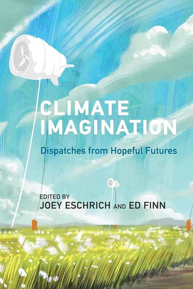
MIT Press. Artwork by João Queiroz.
“Dispatches from Hopeful Futures” also does an excellent job of describing the artwork here: a dose of needed optimism.
Collage done exactly right. Bonus points for what looks like a hand-lettered title, adding to the “folksy” feel.

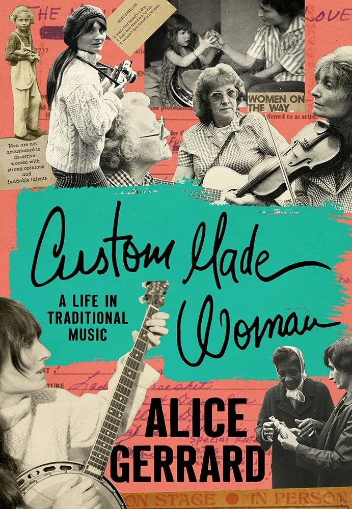
Rutgers University Press.
The “image of an aged book page” has been getting some play recently in book design (see October); this is a solid example.
Stanford University Press. Cover design by Jan Šabach; art director, Michele Wetherbee.
The illustration might have carried this title by itself — but no, here it’s been combined with this awesome holding shape/design for the title info ... stepping into greatness.
Stanford University Press. Cover design by Lindy Kasler; art director, Michele Wetherbee.
This combined illustration is done well; when combined with the type treatment, it feels elegant. Nice.
One of those covers where the illustration steals the show; pulling the colors out for the title and subtitle backgrounds, combined with straightforward typography, compliments. As do I.
Thank you for joining us to enjoy Spine’s revived University Press coverage in 2025. Special thanks to all the designers, publicists and ADs who answered the call to make this an ongoing feature that’s as much fun to put together every month as I hope it is to peruse.
Please have a safe and healthy holiday season — and New Year — and we’ll see you in ’26!
Are you a book cover creative, art director, or publicist? If you want your work, or the work of your press, to be reviewed be sure to get in touch with us.
Please include the cover designer’s name, the art director’s name, any additional details like illustrator or photography credits, and the publication date. (Yet-to-be-published titles are welcome, with embargo dates if applicable.) Images should measure 1200-1500px on the long side, preferably in JPG format and the sRGB color space.
We look forward to featuring your work soon!
A freelance designer and photographer, Giles has been writing about book design for nearly thirty years. During his spare time, he walks, explores architecture, and enjoys music on a great stereo. He lives in Middle Georgia with a dog and cat.