How an Art Challenge Became 31 Book Covers
Parisha Malik is a UK-based book cover illustrator working in a semi-realistic, whimsical style. Her work focuses on visual storytelling through illustration and hand lettering, often exploring atmosphere, narrative, and detail-driven design — particularly within fantasy genres. Here she details her experience of how art challenges can become rewarding tools for developing storytelling and cohesion in book cover design
October 2025 turned out to be a transformative month for me in the best possible way when I participated in the annual Lettering Style Challenge on Instagram, hosted by lettering artist, Aurelie Maron.
Each year, Aurelie releases a list of 31 lettering style prompts for October, encouraging artists to explore a new style every day. It’s meant to push your lettering skills further — but I decided to take it in a slightly different direction.
As a book cover illustrator, I used the challenge as a framework to expand my portfolio and create 31 book covers in 31 different lettering styles. And let me tell you, it’s called a “challenge” for a reason! It became an intense but incredibly rewarding month that strengthened my planning, pace, and storytelling decisions across an entire collection of covers.
I was also honoured to be chosen as one of the three official winners of the challenge and recognised as “The Most Engaging Artist” — an award given to the participant who best connects with the community, shares their process, and tells a story through their work.
So… how did I approach turning a lettering challenge into a month of book cover illustration?
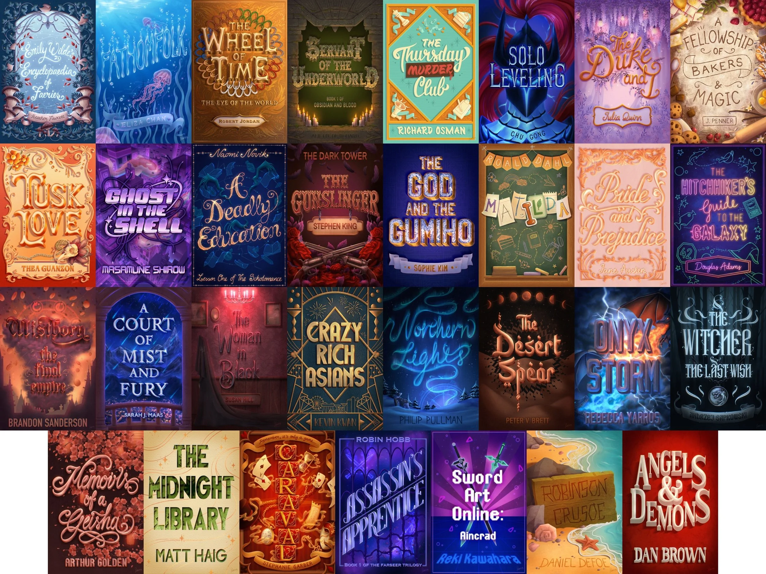
All 31 book covers from the completed challenge
Navigating a 31-Day Art Challenge
Being prepared is the kindest thing you can do for yourself in an intensive art challenge.
Aurelie released the prompt list a month in advance, but I only had about two weeks to prepare before October began due to other commitments. So I focused on laying down a solid foundation, starting with the research.
Lettering Style Challenge 2025 prompts list by Aurelie Maron
I wanted each cover to combine lettering and illustration in a way that felt intentional, and so, began by choosing a book for every prompt. My goal was to match the tone of each lettering style to the tone of the story. The lettering would set the personality. The illustration would carry the emotion and help tell the story on the cover.
To make things even more interesting, I deliberately included some books I hadn’t read before. The idea was to treat those the same way I would treat a real brief where only a synopsis is provided.
Once all 31 books were selected (including a few manga titles — because, why not?), I researched their existing covers. This wasn’t to emulate them, but to see what visual territory already existed so I could create something different. After that, it was time to collect reference images for each lettering style and for the props, motifs, and atmospheres I wanted to illustrate on the covers. Pinterest boards became my best friend.
When it came to compositions next, I turned to my sketchbook and paper, and created tiny thumbnail sketches — at least one for each cover — along with small prop sketches and rough lettering ideas, until I was happy with the layouts. Colour palettes were also finalised after this because those decisions save so much time later.
To keep everything accessible at a glance, I organised all of this into a simple Notion table. It became my dashboard for the entire month.
And then came the best part: the illustration.
The Illustration Process
Every day, I’d open Procreate, pull up that day’s thumbnail, and start building the cover from there. Getting the sketch right, with the main storytelling elements and the lettering in place, is the most important step in the process for me. Once that foundation felt solid, I would move on to colours, refine the lettering, and finish with rendering and details.
Step-by-step process showing sketch, flat colours and final rendering stages
It sounds straightforward when I write it out like this, but illustrating a full cover in a single day is no small task. Some lettering prompts came naturally to me; others pushed me far outside my comfort zone. On certain days, I had to simplify elements I would have loved to render more fully, simply because the clock was against me.
Of course, this isn’t what real client work looks like — we aren't expected to finish a final cover in 24 hours. But working at this pace forces you to be decisive and to trust your instincts.
At the end of each day, I posted the cover on social media as a carousel and a reel, sharing a glimpse of the process and showing the design in mockup form. It became a nice way to close the loop on each piece and move on to the next one with a clear mind.
The Key Elements of my approach to the Challenge
Using the challenge to explore the genres I love
One of the things I enjoyed most was choosing a challenge that naturally aligned with my goals as a book cover illustrator. The lettering prompts gave me an excuse to explore a wide range of genres, from fantasy to sci-fi to YA. By the end of the month, I had a collection that felt wonderfully varied but still true to my style.
Treating each prompt like a micro-brief
To keep things intentional, I treated each day’s prompt the way I’d treat a real cover brief. If the prompt was for a book I’d read before, it was approached with the idea of having been given the full manuscript. If it was a new book, I treated the synopsis as my guiding document. Adding my own restrictions too — specific props, motifs, or colour palettes — made each cover feel grounded in a clear direction.
Giving myself daily deadlines (and learning to work within them)
The challenge’s structure gave me built-in deadlines, and working at that pace was both demanding and energising. For such an ambitious project, I allowed myself the one-week extension Aurelie offered, but otherwise, stuck to the rhythm of the challenge. The time pressure taught me to commit faster and stop polishing beyond what the day realistically allowed.
How organisation kept everything moving
My preparation carried me through the month. Having all my references — lettering styles, props, motifs, and colour palettes — in one Notion table meant I didn’t waste precious time searching for inspiration mid-challenge. The thumbnails I’d sketched before gave me a clear visual roadmap for each day. Without that organisation, completing 31 covers in that limited amount of time would have felt impossible.
Consistency carried me further than motivation
There were days I was excited to illustrate — and days I absolutely wasn’t. But showing up consistently made all the difference. By the end, I wasn’t just proud of finishing the challenge; I was proud of finishing it with intention. Ending up with a cohesive collection of book covers that now sits neatly in my portfolio, ready for prospective clients to view, was the biggest motivating factor that kept me going.
Watching my natural style reveal itself
Working so intensively meant I didn’t have the luxury of overthinking my choices. Without realising it, I started gravitating toward certain brushes, colours, textures, and storytelling motifs. Those instincts became clearer with every cover. It’s a subtle shift you only notice when you look back at the full set — and it’s one of the most rewarding parts of doing a challenge like this.
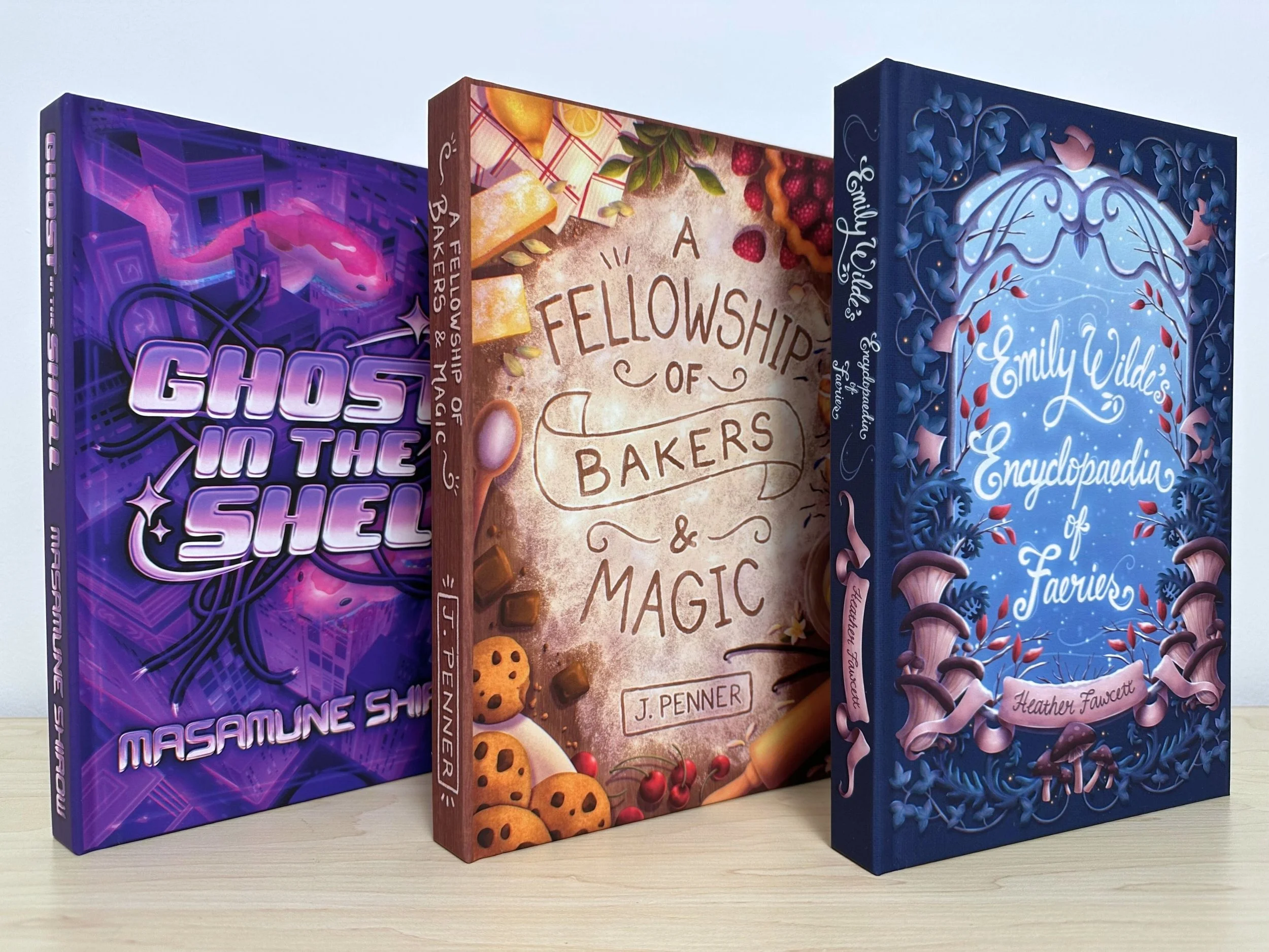
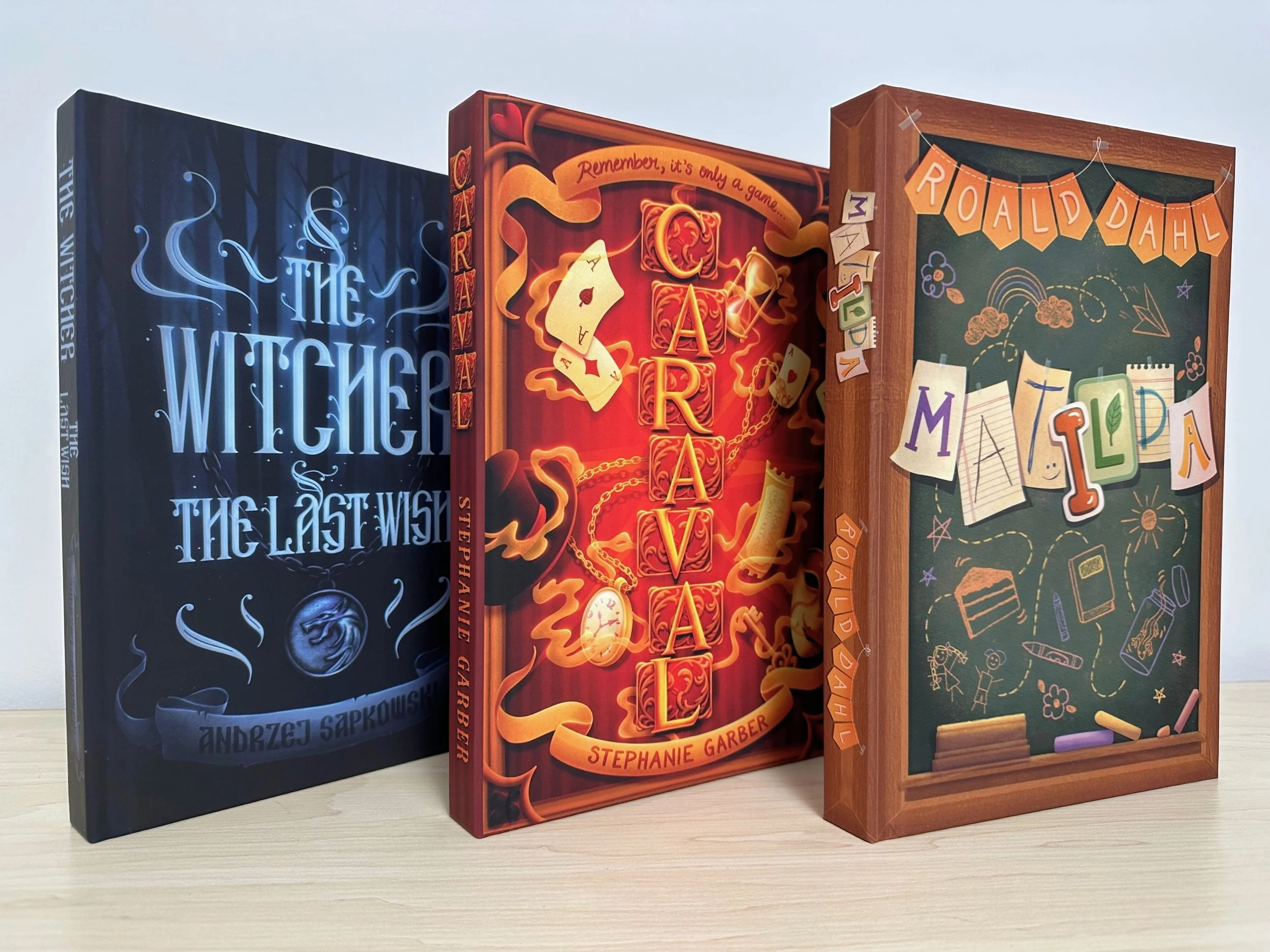
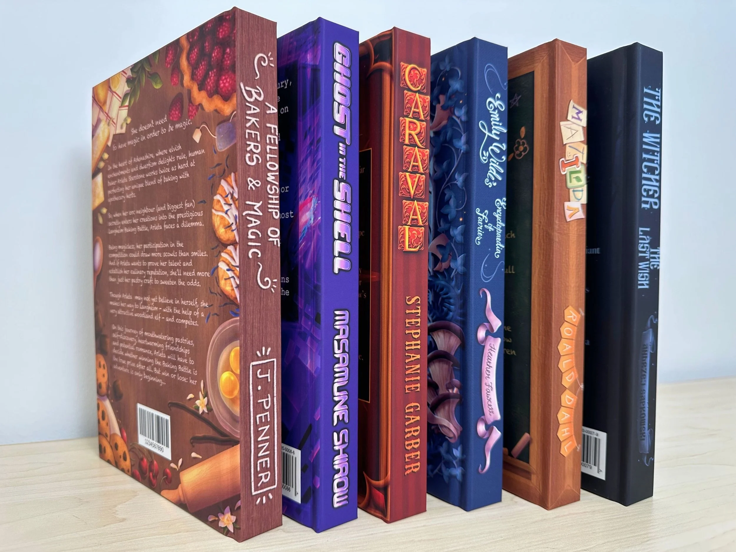
Creating something physical at the end
One of the highlights came after the challenge: printing physical copies of my favourite covers! There’s something incredibly satisfying about seeing your digital work become an actual object. And it also became a useful way to showcase how my designs translate to print, with proper proportions, spines, and back covers added.
Finishing the challenge gave me more than just a new set of illustrations for my portfolio. It highlighted how naturally lettering and illustration can inform each other, clarified the parts of my process I return to again and again, and reminded me how much creative momentum comes from showing up with intention each day. Looking back at the full collection now, I can see the effort of that month reflected across the covers — and it remains one of the most rewarding personal projects I’ve taken on.