University Press Coverage, October 2025

The Uni-Press round-up is back! We welcome you to our ongoing feature, now penned by designer and photographer Giles Hoover, in which we periodically highlight a selection of recent university press cover designs, with commentary. Please enjoy this celebration of amazing work.
The selections are in alphabetical order by press. Where possible, credits are listed in the captions (often with links to the designers’ other work), and each cover includes a link to the University’s official page for that title.
As with all cover designs we feature, we encourage you to head to your local library, college or university library, or bookstore to view the works in their full splendor.

Manga, an early-1900’s creation and the world’s most popular form of comics, is “a hybrid […] that crossed single-panel satirical cartoons popular in Europe and America with the Edo period’s artistic legacy.”
Here, those instantly-recognizable panels are crossed with understated-yet-just-right type in a clever manner that serves the style rather than trying to muscle it.

Brief: Make the history of the tomato in Egypt look stylish.
Designer: [Laughs.]
Wait, seriously? I mean, I know it’s about culture as told through food, but….
Challenge accepted.

Ghosts overflowing into our reality through the internet: this title “exposes the thin and increasingly blurry line between the physical and the digital, between the living and the dead.”
Something reflected in the cover treatment in a way that captivates … disquietly.

Harvard University Press. Cover design by Gabriele Wilson; collage by Arsh Raziuddin.
Fragmented colonialism in Africa, illustrated incredibly well.
An “absurdist office drama” in which “visceral chronic pain becomes a woman’s excuse for evading her problems,” complimented by an absurdist-yet-dramatic cover treatment that’ll get a handout face-out in every bookstore.

“Dry” and “uninvolving” this cover is not — instead opting for a cheerful, ’80s style and pastel colors, while still hinting at the science within. Nice.
Note: In August, I identified the institution as “John Hopkins” rather than the correct “Johns Hopkins,” an error I regret.
MIT Press.
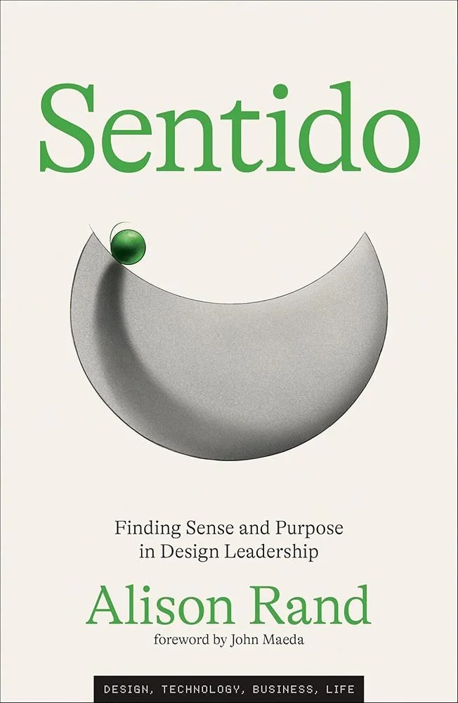
A book on design, naturally, has to have an eye-catching, even over-the-top cover. But bucking common “sense” is exactly what the author is after here, and it’s been completely embraced in the design: subtle, effective, yet casting a long shadow.
From screening to aging, suggestion to content, color to style, this one, put simply, gets everything right.

University of North Carolina Press.
Some journal excellence for you, this time from the University of North Carolina.
The cover image is part of the series “Right to Return,” by Chandra McCormick and Keith Calhoun, contemporary American artists and documentary photographers living and working in New Orleans. “As New Orleans recovered from Hurricane Katrina,” they write, “we took waterlogged negatives and made a new body of work that captures the moment when the levees broke. In spite of the horrors of this event, the colorful and wordless abstraction of this process suggests a way forward and a hope for the return of lost beauty.”
Read more about this title. (Also: the UNC page.)

Penn State University Press. Cover design by Amanda Lenig, art director, Regina Starace. Cover illustration adapted from “B. P. Ioannes de Matta,” Mattheus Borrekens, ca. 1630–60. Biblioteca Digital Hispánica, ER/1537 (número 13).
Relic theft!
Just your everyday UP title, folks. Nothing everything to see here.
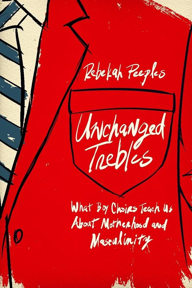
Rutgers University Press.
Boy’s choirs are necessarily made up of, as said, “unchanged trebles.” They aren’t often examined academically, but, hypothetically, if you were going to get readers attention with such a title, how would you do the cover?
This.
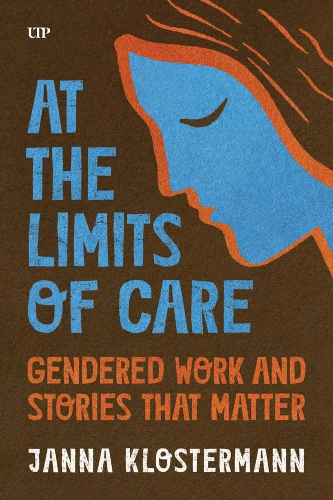
University of Toronto Press.
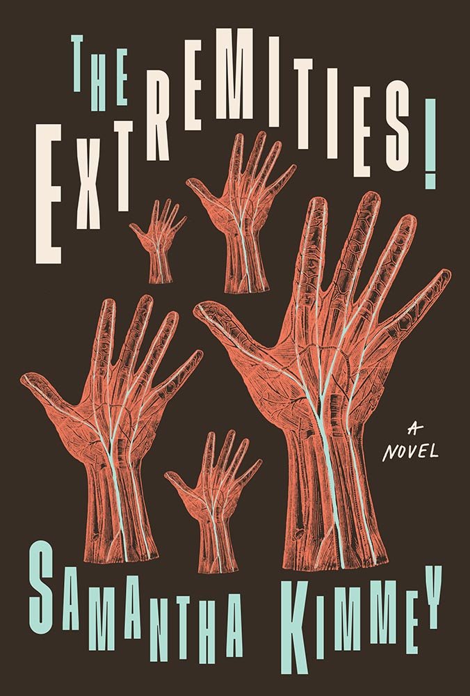
Women and care work and inextricably linked, but the question of what happens when those women reach the limits of their ability to care isn’t asked — let alone answered — often enough. That’s perfectly reflected with this cover treatment, speaking volumes before the volume itself is opened.

West Virginia University Press. Cover design by Kimberly Glyder.
Not an easy subject, surely, and something nearly impossible to do a cover for.
But.
We have a brilliant paper cutout, peeling, and leaving shadows, with, on the top and sides, notes on disheveled pages — each one potentially representing something important or even life-changing. It’s powerful and exactly what was needed.

Another example of book pages, this time appropriate for the time discussed, with a great illustration and just the right about of red. Bonus points for the string.

Mann did an about-face as WWI progressed into Nazism, reflected in The Magic Mountain’s progression from a short story to a two-volume “masterpiece,” detailed here — and reflected extraordinarily well in a detailed, unusual cover.
One that demands a second look, then a third. Well done.
Are you a book cover creative, art director, or publicist? If you want your work, or the work of your press, to be reviewed be sure to get in touch with us.
Please include the cover designer’s name, the art director’s name, any additional details like illustrator or photography credits, and the publication date. (Yet-to-be-published titles are welcome, with embargo dates if applicable.) Images should measure 1200-1500px on the long side, preferably in JPG format and the sRGB color space.
We look forward to featuring your work soon!
A freelance designer and photographer, Giles has been writing about book design for nearly thirty years. During his spare time, he walks, explores architecture, and enjoys music on a great stereo. He lives in Middle Georgia with a dog and cat.