University Press Week 2025: Special Coverage

Every year, the Association of University Presses (AUP) celebrates work from its member presses — and the wider academic publishing world — with University Press Week, this year from November 10–14. There are events, projects and more, all an official part of #TeamUP.
What we’d like to be part of the official agenda is an emphasis on design, an essential part of any publishing project in this age of visuals.
Our goal is to help highlight outstanding University press work. Since restarting the University Press Round-Up column this year, we’ve covered dozens of great designs; to contribute to University Press Week, we’re adding a special edition of 25 more great covers, all from 2025.
The selections are in alphabetical order by press. Where possible, credits are listed in the captions (often with links to the designers’ other work), and each cover includes a link to the University’s official page for that title.
As with all cover designs we feature, we encourage you to head to your local library, college or university library, or bookstore to view the works in their full splendor.
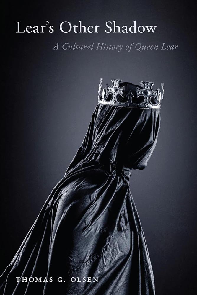
“Queen Lear regularly emerges from her shadowy origins to challenge how we understand the ancient King Leir/King Lear story,” we are told. The cover agrees — quite literally.

Duke University Press, August 2025. Cover design by Courtney L. Richardson; art director, Dave Rainey.
With a scholarly examination of politics and condition, it might be unexpected for the geography discussed to be represented by bright colors and indigenous patterns. But a step back encourages reconsideration; indeed, the design delivers the narrative in an understated, almost gentle way. Nice.
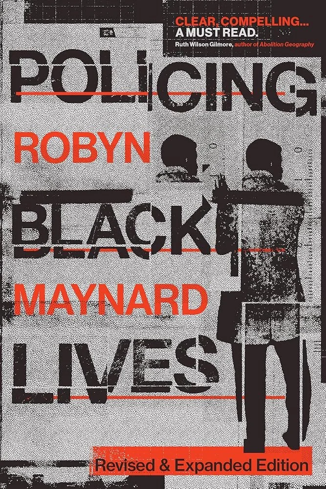
Duke University Press (co-published with Fernwood Publishing), October 2025. Cover design by Evan Marnoch.
A new edition of a widely-read, well-respected and comprehensive account of the “state-sanctioned surveillance, criminalization and punishment of Black lives in Canada” — something many might be surprised by, given the country’s reputation — is given exactly the right treatment here: edgy, stark, disjointed, and instantly understood.
Read an excellent interview with the author, or, Duke’s page about this title.

Georgetown University Press, March 2025. Cover design by Jeremy John Parker; production editor, Rachel McCarthy.
An unexpected flower, blooming in spite of the rubble: few things could better visualize the notion of a ceasefire. Well conceived, well implemented.

Georgetown University Press, March 2025. Cover design by Jim Keller; production coordinator, Elizabeth Sheridan-Drake.
Using the power of paper rarely works so well: that eye forces your attention. (The rest of the cover rocks, too.)

“Ebullient” is used in the description of this title, and quite frankly I can’t think of a better word to describe this text-only treatment: superlative work.
(In Miceli’s library, this would be shelved with Milk Fed and Joy of Consent instead of Big Swiss and Victorian Psycho — but it’s telling that she’s great at both styles.)
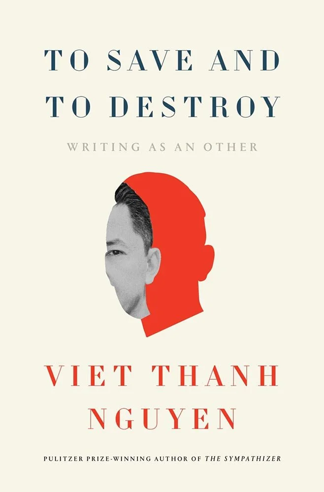
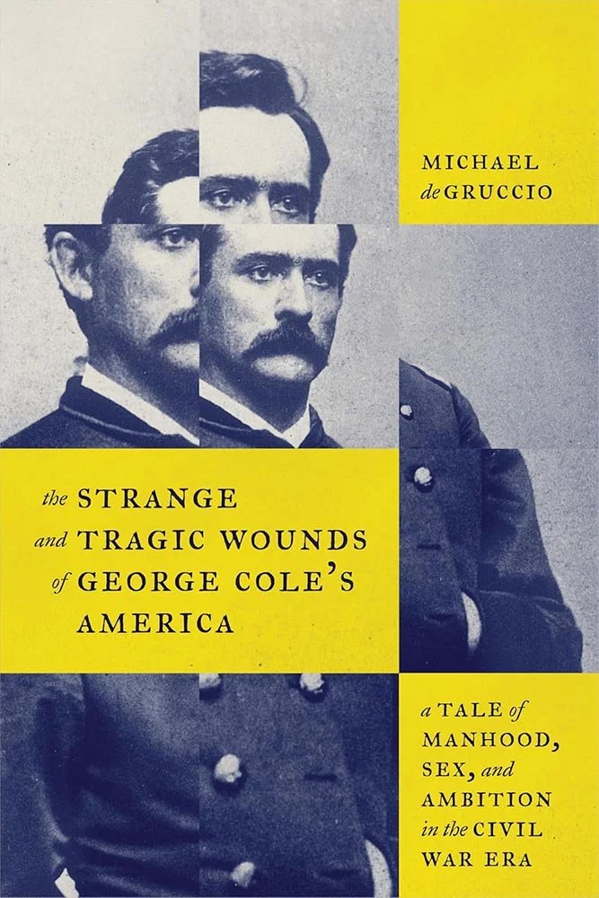
This collection of essays sports one of the best subtitles ever, topped only by the author’s portrait, whose eye we catch looking through his own silhouette. Excellence, demonstrated.
Parenthetically, when I first saw this cover treatment back in May of this year, the way the author’s neck was cut off annoyed. Coming back to it several months later, it not only doesn’t bother me, I’ve come to appreciate how that’s handled. First instincts, sometimes….
Johns Hopkins University Press, April 2025. Cover design by Kimberly Glyder; art director, Molly Seamans.
“Apocalyptic is all the right ways” seems like a cheat to describe a book cover, but it is, in fact, exactly right — from glowing eyes to titles askew.
Johns Hopkins University Press, April 2025. Cover design by Jenny Volvovski ; art director, Molly Seamans.
The multi-photo treatment works very well here, along with expert use of two colors. There’s a hint of mimeograph about the aging that’s just right.
Special mention of the type handling, too — the title’s and subtitle’s combined length could have easily overwhelmed but absolutely do not. (Bonus points for the raised baseline in the title italics.)
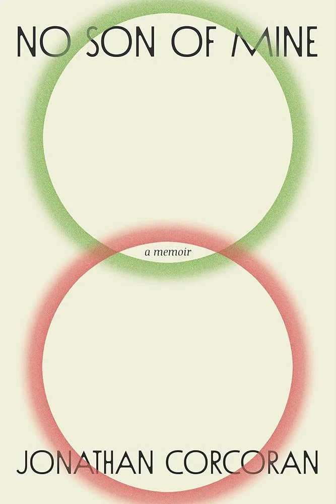
University of Kentucky Press, September 2025.
The Venn diagram that is this “biography nestled within a memoir” is perfectly illustrated on its cover: the “entwined yet separate histories” of a gay man and his evangelical mother, once close, then estranged, and eventually separated by the finality of death — but not quite.
Simple, understated, and yet remarkably effective.
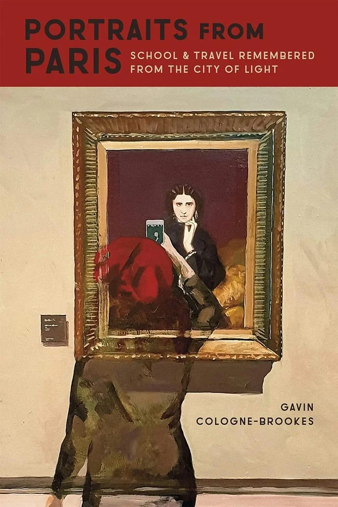
Louisiana State University Press, May 2025. Cover design by Michelle A. Neustrom; illustration, Smile, 2020, by Gavin Cologne- Brookes.
The author’s own work on this cover is perhaps only bettered by his self-portrait.

McGill-Queen’s University Press, April 2025. Cover design by Lara Minja; art director, Elena Goranescu. Cover photo by Shawn Kazubowski-Houston.
“Throughout Poland, tens of thousands of elderly people live with disabilities in four-story walk-up apartment buildings. In many cases their children have emigrated; they live with loneliness, a lack of basic amenities, silence, and the absence of care. They are known as ’prisoners of the fourth floor.‘“
Woven between interviews and reflections of the author’s own family, this title is honored with an equally quiet cover, one whose quality is appreciated more as you become more familiar with the work within.
Some covers fall into a category I like to call “simply, elevated”: covers that don’t get in your face or that are done by superstars but rather those that do the job well, often with subtle details that add to the whole. This is one.
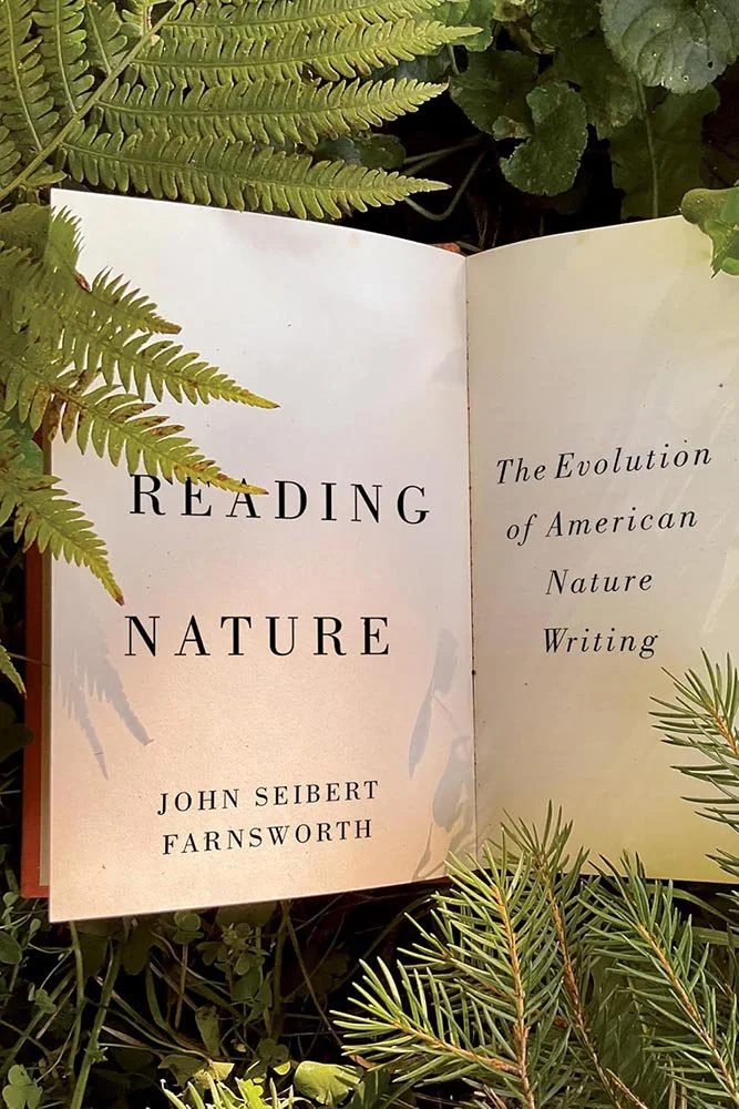
Michigan State University Press, March 2025.
Another in the “simply, elevated” category: this title, on “ten books that most influenced the scope and direction of literary natural history in the United States,” has a practically-photographed open book with the necessary text and some great shadows that’s eye-catching and conveys the contents well.
Michigan State University Press, March 2025.
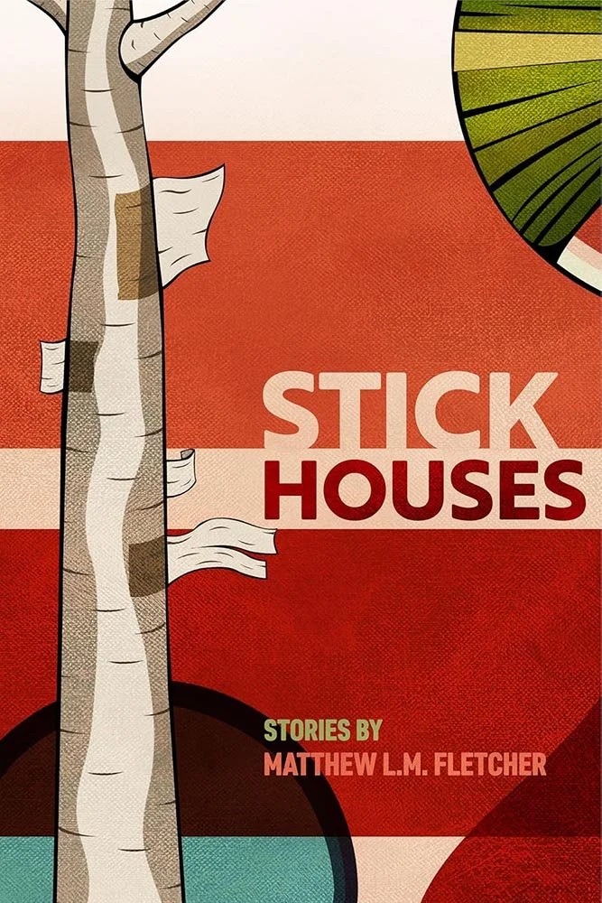
Textural, blocked, illustrated, colorful: excellent.
MIT Press, September 2025.
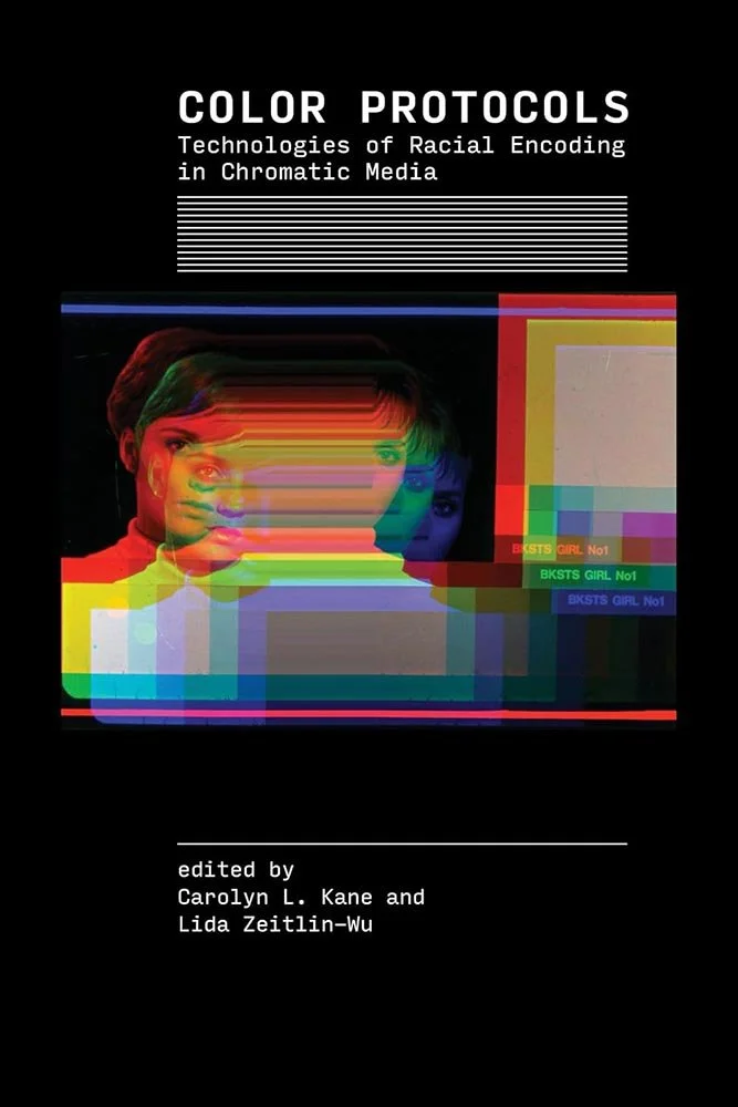
This title “begins with the premise that color is central to the history of systemic racism, and in turn, that the encoding of race vis-à-vis color is an intrinsic aspect of chromatic technologies.” Not an easy brief.
The results are interesting: technological, certainly, and yet suggestive that something is still off. Which, I suspect, is exactly what this collection of essays is about. Check.

University of New Mexico Press, March 2025. Cover design by Issac Morris.
The ayes have it.
Also, both the title type and color choices are out of this world.
(Not sorry.)

University of New Mexico Press, September 2025. Cover design by Issac Morris.
A “meticulously observed experience of one fire season chronicled in haibun,” a literary form combining prose and haiku that originated in Japan, this cover graphically weaves a similar tale: blocks of “prose” with wisps of rising “poetry” against a natural background. (One of those rare instances where no caps adds rather than subtracts, too.)
Just right.
“Elements, stacked” doesn’t sound like a super accomplishment, but — like in literature — it’s all in the composition. Here the grouping, white space, title treatment, and feeling applied add up to something, if you’ll forgive the cliché, more than the sum of its parts. Naturally.
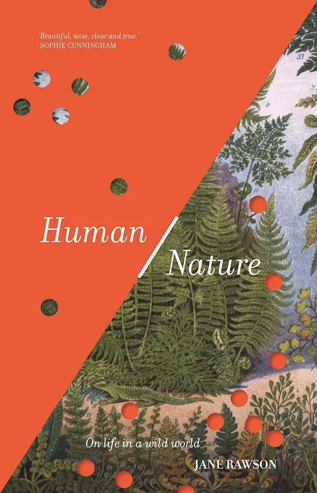
One of the reviews for this title uses the term “false binaries,” which is an interesting way to describe the cover: not quite nature yet not quite the built environment humans have created, aiming for a balance yet irregularly perforated with parts of the other, not quite intruding yet insistently reminding.
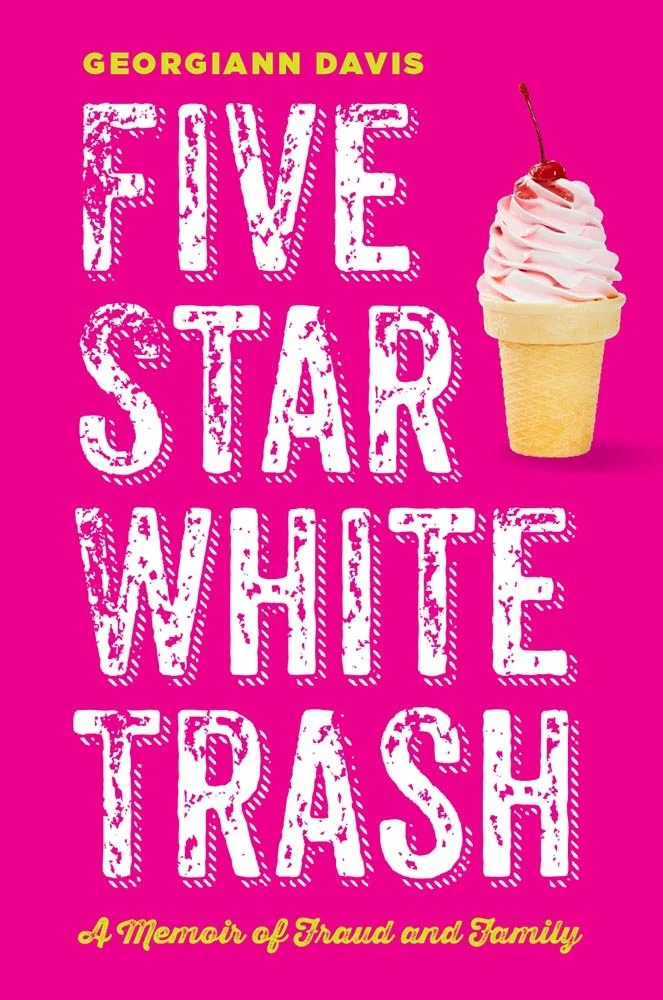
New York University Press. Cover design and art direction by Rachel Perkins.
Not your average biography/memoir cover, reflective of the “candor and dark humor” within in all the right ways. Oh, and…:
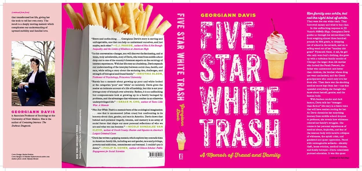
…the bag of fries! Awesome.

Another multi-photo item, this time silhouette-shaped and overlaid with great type work. (The eyes staring out through the title, too.)
The photos are worth an extra mention: top to bottom, they are
- Siberian prison camps;
- The author’s mug shot;
- The author; and
- The author’s arrest by plainclothes KGB men during a Baptist prayer meeting in April 1977. (Taking that photograph took serious courage.)
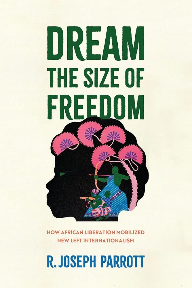
University of Pennsylvania Press, July 2025.
Africa in the ’60s and ’70s were fraught, to say the least — this title studies that by drawing on “more than fifty oral histories and research in government and activist archives on three continents.”
All of which is summarized in a deceptively simple cover that packs a punch: Stylized to just the right degree, with great type choices and color that works overtime.
Princeton University Press, February 2025. Cover design by Felix Summ; art director, Maria Lindenfeldar.
From the designer: “It was important that the cover conveyed the time and place of the subject matter: Midwest America in the mid 20th century. The solution was a custom typeface based on hand painted banners from the 1937 General Motors strike in Detroit—an event highlighted in the book. Paired with the type are images related to labor, country music, and automobiles.” (See page.)
Excellent.
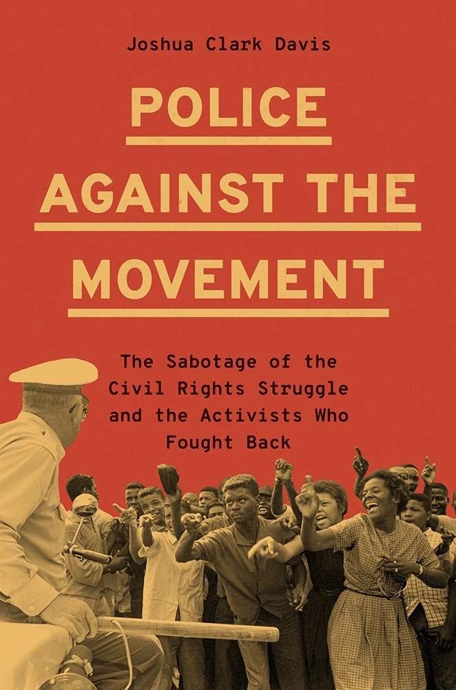
Princeton University Press, October 2025. Cover design by Katie Osborne; art director, Maria Lindenfeldar. Cover image from the Charles Moore Photographic Archive, The Dolph Briscoe Center for American History, University of Texas at Austin.
This is one of those covers where the photograph catches your eye, and won’t let go.
As it turns out, there’s a story: “The image, shot in Birmingham, was originally published in Life with the officer’s club cropped out and a caption that — as Joshua Clark Davis writes in the book — ‘dismissed the crowd’s ridicule of the officer as a disservice to the movement, an expression of Black rancor and disorder, not the justifiable resistance against police repression that it was.’
“So, the image on the book’s cover reveals context that was previously hidden with the inclusion of the officer’s weapon and the acknowledgment of the threat of violence from police,” the designer writes.
(Another fantastic use of duotone, by the way. The color choices are excellent too.)
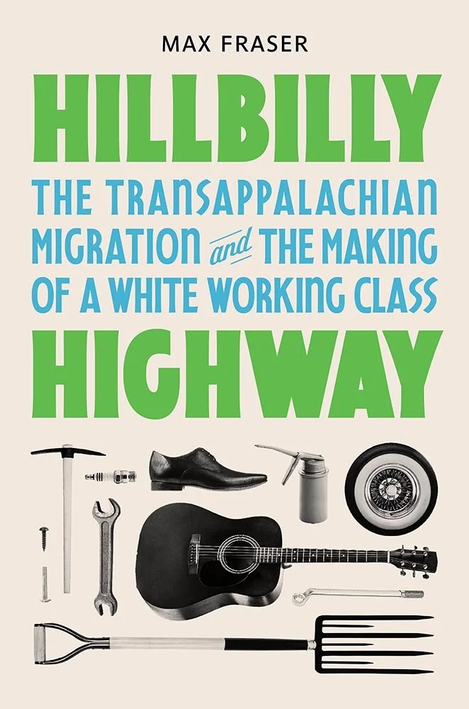
Wayne State University Press, January 2025. Cover design by Nathaniel Roy.
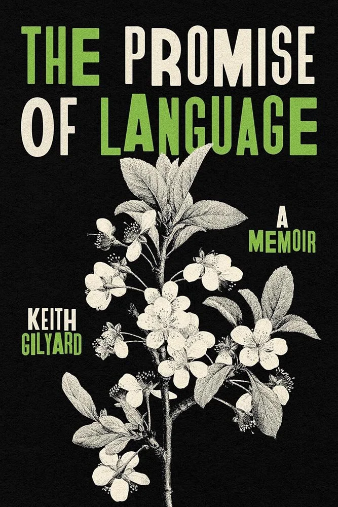
“Simply, elevated” closes us out — and might even be an undersell — with this two-color triumph of just-right typography, just the right dose of grain, and a just-right green that grows on you in all the best ways. Fantastic.
Special thanks to all of the UP offices, staff, publicists, and especially designers and art directors who supplied information to help this feature take shape. Be sure to tune into our regular University Press Round-Up column, monthly.
Thanks for reading, and thanks for supporting Team UP!
Are you a book cover creative, art director, or publicist? If you want your work, or the work of your press, to be part of our regular University Press coverage, be sure to get in touch with us.
Please include the cover designer’s name, the art director’s name, any additional details like illustrator or photography credits, and the publication date. (Yet-to-be-published titles are welcome, with embargo dates if applicable.) Images should measure 1200-1500px on the long side, preferably in JPG format and the sRGB color space.
We look forward to featuring your work soon!
A freelance designer and photographer, Giles has been writing about book design for nearly thirty years. During his spare time, he walks, explores architecture, and enjoys music on a great stereo. He lives in Middle Georgia with a dog and cat.