University Press Coverage, November 2025

The Uni-Press round-up is back! We welcome you to our ongoing feature, now penned by designer and photographer Giles Hoover, in which we periodically highlight a selection of recent university press cover designs, with commentary. Please enjoy this celebration of amazing work.
The selections are in alphabetical order by press. Where possible, credits are listed in the captions (often with links to the designers’ other work), and each cover includes a link to the University’s official page for that title.
As with all cover designs we feature, we encourage you to head to your local library, college or university library, or bookstore to view the works in their full splendor.

University of California Press. Cover design by Lia Tjandra.
“The biography of a man but even more so of a movement,” this title “reveals the underappreciated influence of a transformative Black solidarity project.”
With just the right amount of emphasis, style, and … roughness, for lack of a better term, a difficult assignment is transformed into something truly compelling.

University of Chicago Press. Cover design by Rae Ganci Hammers; map of Baltimore City, Bureau of Plans & Surveys, 1928.
Roads don’t actually need to be built for tragedy to befall a neighborhood — even plans can do the work — ripping asunder that carefully built, even (perhaps especially) in the face of the discrimination showed all too many in 1950s America.
Here, that rip is both literally and figuratively expressed; a redline if ever there were. With just-right type, a hint of aging, and mid-century colors helping out, this cover stands out.

Duke University Press. Cover design by Courtney L. Richardson; art director, Dave Rainey.
“From captive Africans’ first tentative encounter with the landless realm of the Atlantic to the ground on which black peoples still struggle to stand, the deep is what blackness has known throughout the changing same of [B]lack life and death.”
The cover invites the reader to experience “how the waterways of history provide fertile ground for understanding Black life not as social death but rather as deep living” — exactly in line with the concept of depth itself.

A few countries and territories — the U.S, Europe, China — dominate most discussions of the concept known as “international order.” But very much like this cover, there’s a system at work here: for those that aren’t giants, strategic positioning is everything.
Beyond-brilliant use of “simple,” taking my oft-used concept of “simply, elevated” and showing How. It’s. Done.

University of Georgia Press. Cover design by Erin Kirk.
Great colors! Perfect aging! Ticking stripes! Awesomeness!
…But, really, it’s the finger-pointing that does it. Chef’s kiss.

In the world of book design, perhaps uniquely, Oliver Munday has absolutely perfected the notion of supposedly simplistic juxtaposition that just … isn’t.
Beware his pen, ladies and gentlemen.
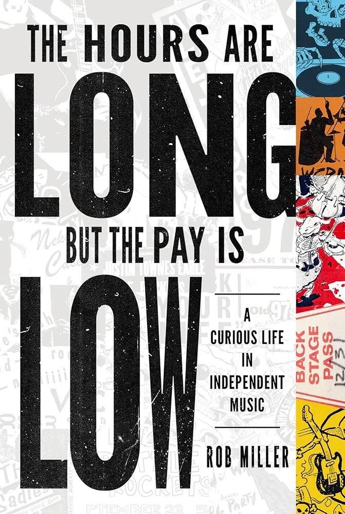
University of Illinois Press. Cover design by Jason Gabbert.
Rarely does a cover so completely personify a quote, but:
“The music business is not a meritocracy: it is a crapshoot taking place in a septic tank balanced on the prow of the Titanic, a venal snake pit where innovation, creativity, and honest business practices are actively discouraged.”

MIT Press. Cover design by Emily Gutheinz; art director, Yasuyo Iguchi. Super Mario Clouds, Cory Arcangel, 2002. Handmade hacked Super Mario Bros. cartridge, Nintendo NES video game system, artist software. Courtesy the artist. Historically accurate screen shot created using OpemEmu. Photo credit, Cory Arcangel.
Super Mario Clouds!

Cover design, art direction, and cover illustration by Rachel Perkins. (Fence illustration via Adobe Stock.)
First of two that totally win for visualization of a concept. Brilliant.

Princeton University Press. Cover design and illustration by Karl Spurzem; art director, Maria Lindenfeldar.
The second of two that put the ultimate spin on visualization of a concept, this title made the rounds last year in hardcover — but the new paperback version gives me the excuse to revisit this cover’s dynamite simplicity.
Rutgers University Press.
From the woodcut hall of fame, we have this.
I find myself perhaps over-using “brilliant” this month, but oh-so-very justified. (Typography pun not intended.)

Stanford University Press. Cover design by Michele Wetherbee; cover art, Bahar Demirtaş.
Excellence in illustration here, with the title and author complimenting rather than competing, and layering that just keeps going. Awesome.

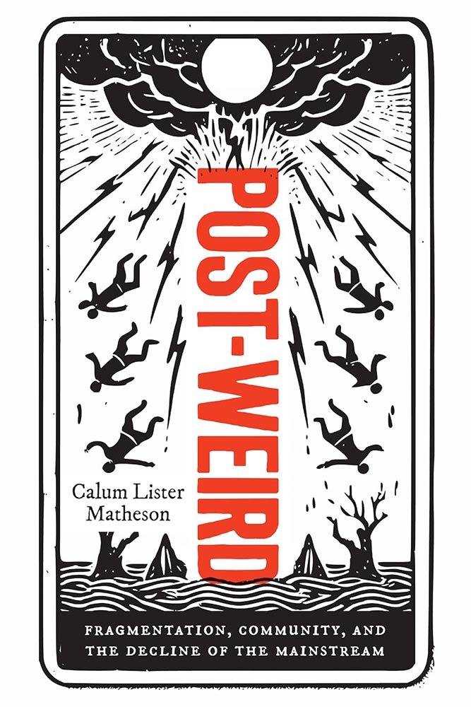
University of Toronto Press.
In the aviation industry, there’s something called “tombstone technology”: each life lost in an incident, accident, or crash results in a change in practice, whether equipment or operation, often mandated by worldwide authorities. As a result, flying, in the space of just a hundred years, has gone from incredibly dangerous to far-and-away the safest way to get from hither to yon.
Alas, in the wider world, such discipline, shall we say, lacks. This title looks at that.
So, the question: how to do a cover for such a title?
This.

Abstract doesn’t get enough exposure, but for this collection of poetry, it’s exactly what’s needed — with title and author just touching the edges, a ripple on the glassy surface of reflected lives.
Are you a book cover creative, art director, or publicist? If you want your work, or the work of your press, to be reviewed be sure to get in touch with us.
Please include the cover designer’s name, the art director’s name, any additional details like illustrator or photography credits, and the publication date. (Yet-to-be-published titles are welcome, with embargo dates if applicable.) Images should measure 1200-1500px on the long side, preferably in JPG format and the sRGB color space.
We look forward to featuring your work soon!
A freelance designer and photographer, Giles has been writing about book design for nearly thirty years. During his spare time, he walks, explores architecture, and enjoys music on a great stereo. He lives in Middle Georgia with a dog and cat.