University Press Coverage, August 2025

The Uni-Press round-up is back! We welcome you to our ongoing feature, now penned by designer and photographer Giles Hoover, in which we periodically highlight a selection of recent university press cover designs, with commentary. Please enjoy this celebration of amazing work.
The selections are in alphabetical order by press. Where possible, credits are listed in the captions.
As with all cover designs we feature, we encourage you to head to your local library, college or university library, or bookstore to view the works in their full splendor.
University of California Press. Cover design by Michelle Black. Artwork: Titus Kaphar, Jerome II, 2014.
Correct in every way: the subject, staring directly at the viewer, reminding of the (too) long history of the incarcerated and enslaved; the burned gilt; the hint of a shadow against a simple background, reminding you of dimension.
Yes.
University of California Press. Cover design by Michelle Black. Artwork: Excerpted from Kiwanis International brochure "Kingsport, Tennessee: The Model Industrial City" (1927).
I’m a sucker for one- or two-color covers — creative opportunities! — here so ably demonstrated with an attention-getting illustration and just-right color and type choices (author placement, as well). Plus that smoke trail.
Duke University Press. Cover design by Courtney L. Baker; art director, Dave Rainey.
Great color, a great illustration perfectly utilized, supporting text beautifully handled, and a subtle-yet-awesome dingbat. But it’s the title treatment that catapults this one out of the park: superlative, indeed.
If there’s anything I like more in cover design than restrained color, it’s text-only — and what we have here is nothing less than a master class. I try to avoid the use of “perfect,” but….
The blend here is just right, supported by eye-catching type and the hint of vignette — which, when thought about, is what this cover does so well indeed.
Louisiana State University Press. Cover design by Kaelin Chappell Broaddus; art director, Barbara Neely Bourgoyne.
Art-that-sets-the-tone, part one: a journey you don’t expect, personified. (Also: great color choices.)
Mercer University Press.
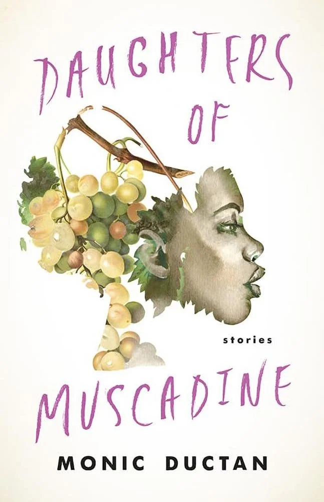
Art-that-sets-the-tone, part two: “lyrical ecstasy” defined in another unexpected way — cursive, indeed. (Great color choices here, too.)
Full disclosure: Despite being located here in Macon (Georgia, US) — right down the street, in fact — I’m not associated with Mercer and haven’t done design work for them.
University Press work often brings challenges in visualization of complex titles; every month, I try to highlight at least one design that succeeds despite those exact odds.
Here, the artwork celebrates the Indigenous while the design tastefully tucks the academic into a complimentary holding area, resulting in a cover that does so very much more than just lurk about the back pages of a catalog.
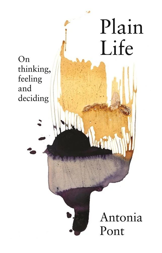
NewSouth. (That’s the University of New South Wales Press, not to be confused with the University of Georgia’s NewSouth imprint.)
A title like “Plain Life” could go with a plain cover, and this design hints in that direction with a simple white background and classic type … and then injects art that’s interesting, even provocative, inviting more careful consideration of the text within.
Web? Bullet hole? Perhaps “a world in metamorphosis,” which might both hit too close to the realities of 2025 and, in fact, be the point. But enough spinning: eye-catching and thought-provoking, the cover lives up to the title. Awesome.
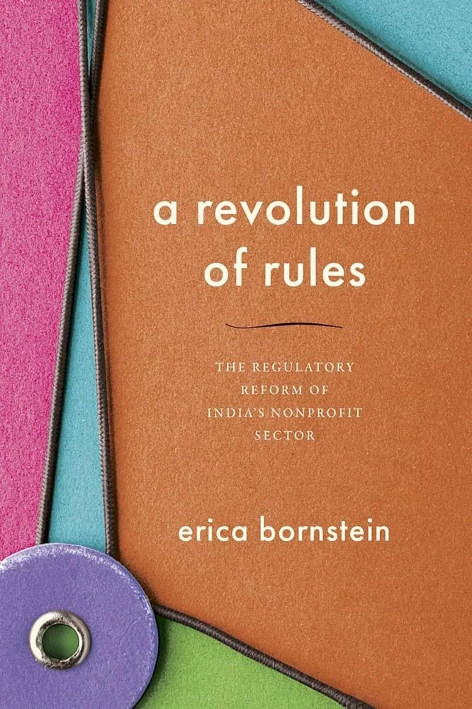
What could be a dry University Press title is given new life with compelling color blocks literally inviting you to open the envelope. Add in great type choices — and that line, with just the right hint of wave — and something that could languish is … here. Nice.
Another of the art-setting-the-tone items, this time with a simple pen-and-ink illustration that’s anything but simple, inviting deeper exploration. The title treatment is unusual, too: knocking out of something so busy rarely results in something so … well, knockout. The result is a complex interaction that does, in fact, tip the scales. Well done.
The brief was, I imagine, to design a cover that embodies this sentence: “From the 1940s to the 1960s, […] for the inhabitants of China’s countryside, conservation programs became part of an extractive mode of accumulation that intensified labor demands and entailed loss of control over resources.”
Expertly fulfilled. From the photograph to the coloration to the title treatment (and its coloration), the very definition of University Press design done well.
Are you a book cover creative, art director, or publicist? If you want your work, or the work of your press, to be reviewed be sure to get in touch with us.
Please include the cover designer’s name, the art director’s name, any additional details like illustrator or photography credits, and the publication date. (Yet-to-be-published titles are welcome, with embargo dates if applicable.) Images should measure 1200-1500px on the long side, preferably in JPG format and the sRGB color space.
We look forward to featuring your work soon!
A freelance designer and photographer, Giles has been writing about book design for nearly thirty years. During his spare time, he walks, explores architecture, and enjoys music on a great stereo. He lives in Middle Georgia with a dog and cat.


