University Press Coverage, September 2025
The Uni-Press round-up is back! We welcome you to our ongoing feature, now penned by designer and photographer Giles Hoover, in which we periodically highlight a selection of recent university press cover designs, with commentary. Please enjoy this celebration of amazing work.
The selections are in alphabetical order by press. Where possible, credits are listed in the captions (often with links to the designers’ other work), and each cover includes a link to the University’s official page for that title.
As with all cover designs we feature, we encourage you to head to your local library, college or university library, or bookstore to view the works in their full splendor.

“A more perfect union” as allusion — with just the right dose of “official” — to graphically make the point the essays present. Quietly brilliant.

Duke University Press. Cover design by Courtney L. Baker; art director, Dave Rainey.
How would you design for radical feminism? “Decolonial cross-border organizing and solidarity”? I’d argue that there are few better ways to approach this title; the designer (and art director) have, through stylized abstraction and multiculturalism, brought interest and appeal to a title that runs the risk of being unfairly marginalized.
Successful on many levels — in other words, excellent.

Duke University Press. Cover design by Courtney L. Baker; art director, Dave Rainey.
Baker and Rainey have taken a similar approach here as the title above — another in an area where the potential for marginalization is “an issue,” to use a gross understatement, yet is calmer, quieter: the “long slow time of granite,” through “rebellion and joy.”
It’s another that is, in its own way, just as successful.

Fonograf Editions (New York University Press). Cover design by Mike Corrao, with art by Kimberly Alidio.
Evocative of birds, maybe an arrow — maybe both? — the author’s overlay of this text-only cover defines “art writing” in a most interesting way.
Note: Fonograf is a non-profit based in Portland, Oregon, and distributed by NYU Press; the latter’s catalog is where I found the title. While technically tangential to a University Press rather than from one, I liked it enough to include it.

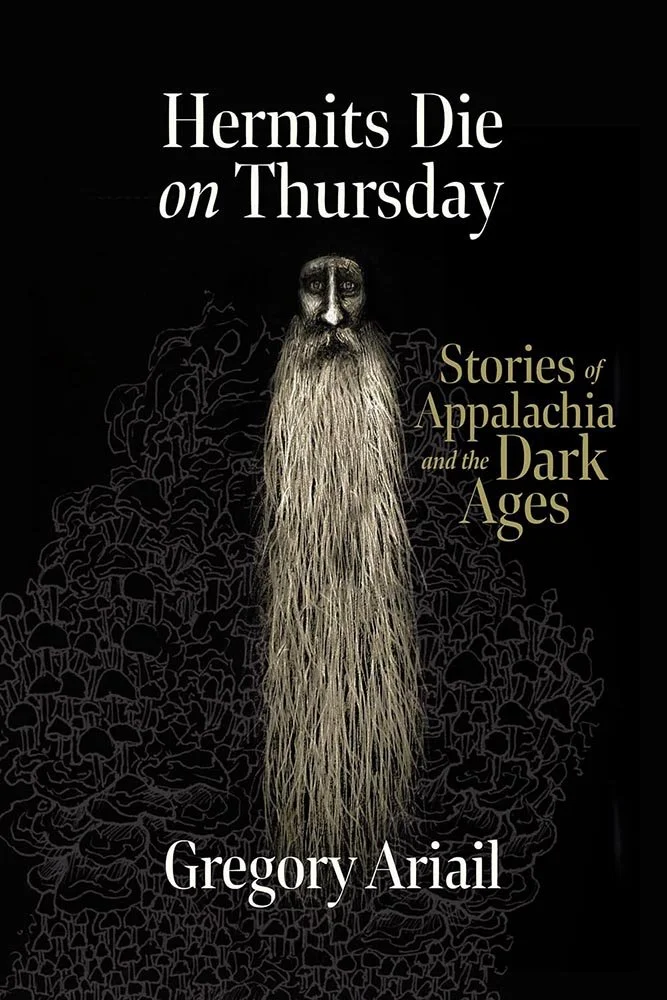
Fordham University Press.
In the Qur’an, between paradise and hellfire, are the Heights, whose denizens are “frozen in place.” The author argues that Islam can guide those — refugee and relief worker alike — by taking those first steps. By walking the road.
Not an easy design to get right. This combination of abstract and concrete (well, macadam, really) threads that needle with aplomb.

You don’t often see novels in the UP space; this one — the first of two this month — features aged everything, warm colors, and asks questions about what the bridge represents (see below); in other words, a compelling, on-trend cover.
Update, 29 September: From the author: “The main image is of the Roberto Clemente Bridge (or Sixth Street Bridge) in Pittsburgh, which is the scene of the novel's conclusion. The bridge connects the heart of Downtown Pittsburgh to the North Side where the Pirates and Steelers' stadiums sit. While City of Clans is in part about the 2009 G20 Summit protests, it also pays tribute to previous tribute to Pittsburgh's labor history and the radical novels of the early 20th century, so the protest art aesthetic of the cover reflects that as well.”
Mercer University Press. Cover design by Burt&Burt, with illustrations by Aleksandra Apoclisse and James Hutton.
At a distance, this reads as a face against a dark background; the closer you get, however, the more interesting it gets, weaving various elements from the stories within to form one all its own. (Great title, too.)
Full disclosure: Mercer University and your author are both located in Macon, Georgia. However, I’m not affiliated with Mercer and haven’t done work for them.

University of Nebraska Press.

University of Nebraska Press.

University of Nebraska Press.
A trifecta for the University of Nebraska, with three awesome covers on three disparate subjects, all tied together using one of my favorite methods: simple, practical photography creatively used to maximum effect. (Although, to be fair, Death looks like more than a little setup was needed.)
Read more about Character Witness, Death Does Not End at the Sea, or The Perils of Girlhood.
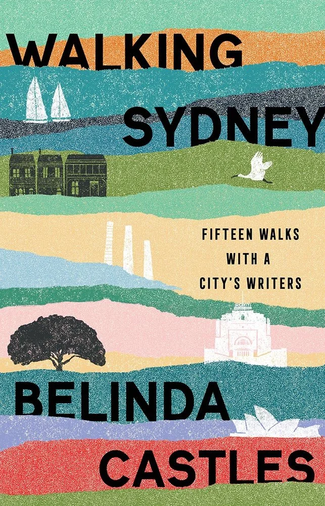
Fifteen walks, fifteen layers, stenciled illustrations and interwoven titles add up to something eye-catching — even worth going out of your way for.

New York University Press. Design and art direction by Rachel Perkins.
It only takes one glance to know what these buildings are and what the book is about, bolstered by a great title treatment and solid color choices. (Knowing the image depicts Boston’s Columbia Point, one of the very definitions of “failure” in public housing — since redeveloped — only adds to the impact.)

And on the jacket: I love the way the type works on the spine, with extra props for the way the photograph fades into both the back cover and front flap.

University of Pennsylvania Press. Cover design by Trudi Gershinov; art director, Nicola Ferguson.
Look at the expression on the woman’s face: the combination of mistrust and frustration — not to mention having to rely on the male power figure — expressed in a style that perfectly tragically reflects the times.
The cover art, by the way, “was adapted from the cover of Women in Trouble, published by Monarch Press in 1959. We tried very hard, but were unable to identify the original artist. Monarch Press has been out of business for decades.”

Wesleyan University Press. Cover design by Mindy Basinger Hill; project manager, Ann Brash. Art: Rayon, by Bensley and Dipré.
“Fierce, frank, witty poetry about cancer diagnosis, treatment, remission, and end-of-life.” Not an easy cover assignment, here handled with grace — excellent.

Let’s end this month’s selections with a fun one: post-modern, Memphis, call it what you will, it’s a map to something more — with a few stops along the way.
Are you a book cover creative, art director, or publicist? If you want your work, or the work of your press, to be reviewed be sure to get in touch with us.
Please include the cover designer’s name, the art director’s name, any additional details like illustrator or photography credits, and the publication date. (Yet-to-be-published titles are welcome, with embargo dates if applicable.) Images should measure 1200-1500px on the long side, preferably in JPG format and the sRGB color space.
We look forward to featuring your work soon!
A freelance designer and photographer, Giles has been writing about book design for nearly thirty years. During his spare time, he walks, explores architecture, and enjoys music on a great stereo. He lives in Middle Georgia with a dog and cat.