University Press Coverage, February 2026
Welcome to our University Press Coverage — known as the Uni-Press Round-Up on the right side of the Pond — a monthly feature in which we highlight a selection of just-published university and academic cover designs, with commentary. Please enjoy this celebration of amazing work.
The selections are in alphabetical order by press. Where possible, credits are listed in the captions (often with links to the designers’ other work), and each cover includes a link to the university’s official page for that title.
As with all cover designs we feature, we encourage you to head to your local library, college or university library, or bookstore to view the works in their full splendor.
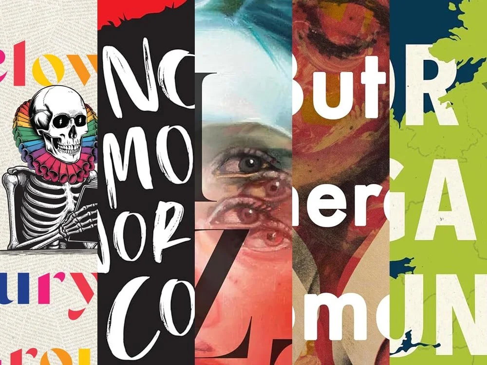
Duke University Press. Cover design by Courtney L. Baker.
The “Dead’s literary depth […] walks the line between creation and chaos,” Clowns says — helping us to appreciate that some of the lyrics we know so very well are, in fact, based on American and European literature.
But here’s the thing: this is the Grateful Dead we’re talking about. This cover can’t be literate. It’s can’t be an also-ran. “Normal” just won’t do.
Thankfully, skillfully, Baker nailed this one: literate and fun, colorful and illustrative, with a riff and a ruff. Awesome.
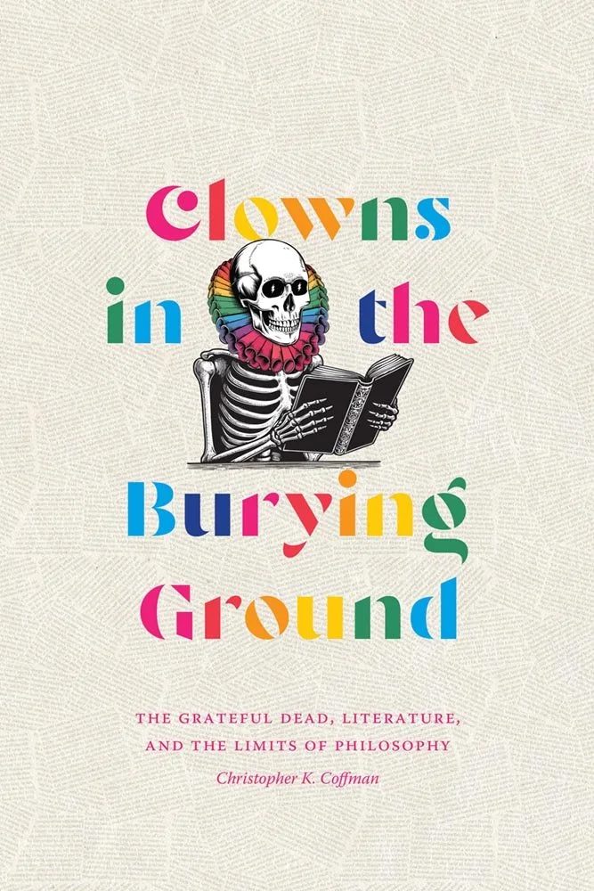
Georgetown University Press. Cover design by Jim Keller; production coordinator, Elizabeth Sheridan-Drake.
A simple silhouette and some cool type have great synergy here, suggesting more than simple meaning. “Washington, DC, has long been home to a dynamic and vibrant African American literary community,” the description points out, “despite often being overshadowed by the literary worlds of New York and Chicago.”
Of course, Washington has been a majority-Black city for a substantial portion of the last hundred years, peaking at about 70% in the 1970s (although this is waning due to gentrification). Arguably, that quote above could just read, “vibrant African-American community.” Thankfully the author — and Georgetown’s design folks — are putting the “literary” back into the picture.
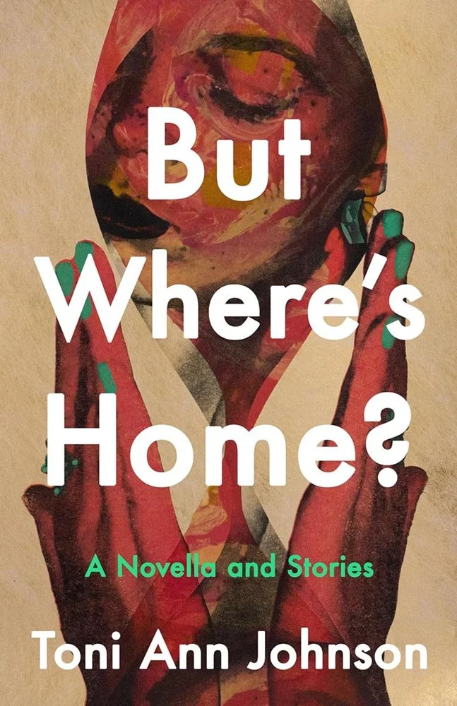
While we’re on the subject of “vibrant African-American,” this collection of connected stories is about a Black family moving to and living in a very white New York town — begging the question that is the title. This is supported by an absolutely superb cover, whose painterly qualities and expert composition evoke emotions and make potential readers want to seek answers.
There’s well-done, and then there’s next-level. This is definitely the latter.
Read more about this title. See also this article here on Spine about Dominique Jones’ Tiny Rep Books logo .
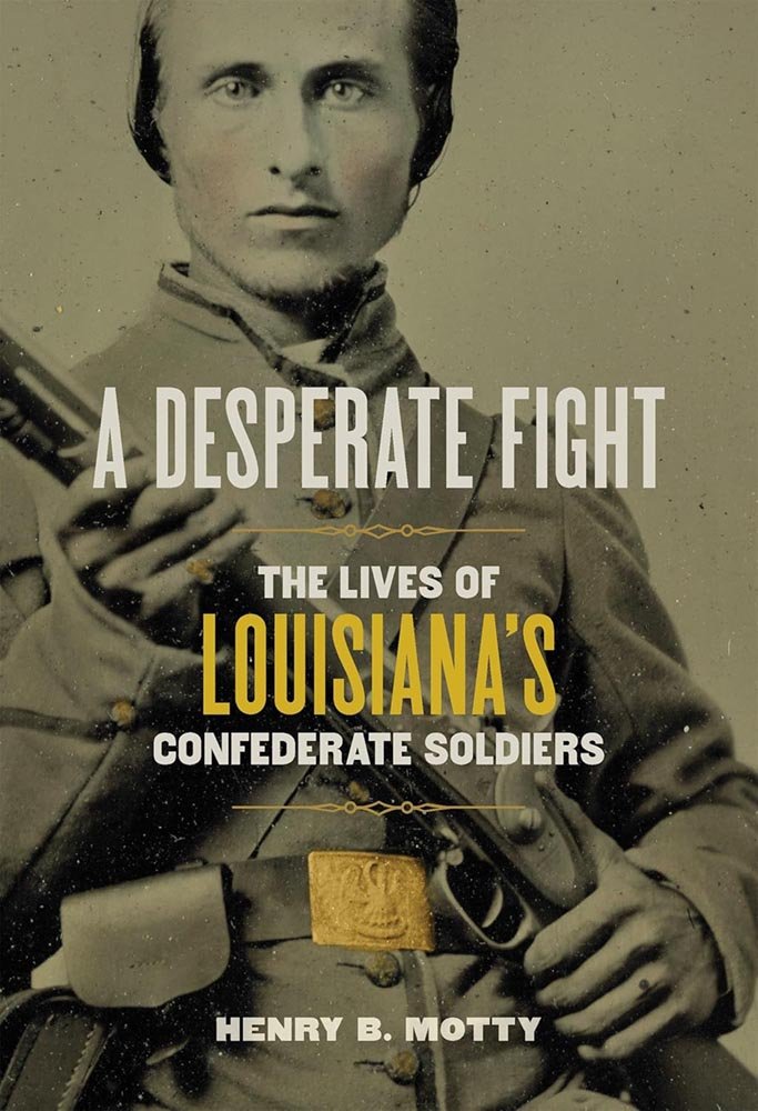
Louisiana Stata University Press. Cover design by Kaelin Chappell Broaddus; art director, Barbara Neely Bourgoyne. Image: Liljenquist Family Collection, Prints and Photographs Division of the Library of Congress.
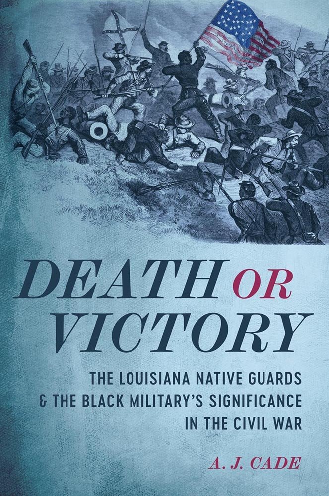
Louisiana State University Press. Cover design by Michelle A. Neustrom; art director, Barbara Neely Bourgoyne. Image: Assault of the Second Louisiana Regiment . . . at Port Hudson (Frank Leslie’s Illustrated Newspaper, May 27, 1863).
I couldn’t decide which of these two US Civil War titles from LSU to include this month — so I’m giving you both. You get to decide which you prefer.
The historical photograph of an “[u]nidentified soldier in Confederate uniform and Louisiana state seal belt buckle with musket” — with its highlighted buckle/seal — contrasts well with the illustration of Louisiana soldiers at Port Hudson, this time with the US flag getting the highlight.
Both are solid designs; the coloration of the first and texture of the second elevate.
Read more about A Desperate Fight, or read more about Death or Victory.
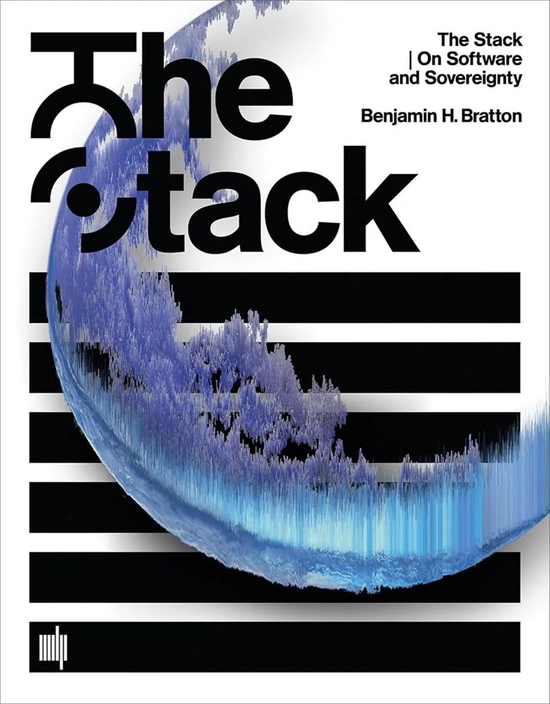
MIT Press. Cover design by Metahaven.
This cover isn’t new — it’s actually the original, from 2016, not the 10th anniversary edition (with a new preface!) coming out this month. Nonetheless, Metahaven’s cover still stands out: the blue “data” against the simple black-and-white background, the elements’ arrangement, and the T/S treatment in the title all work well.
In a sea of color-packed, Insta-friendly covers, sometimes bordering-on-stark is the smarter choice. It certainly works here.
Read more about the title at MIT, or read more on Metahaven in the Frieze.
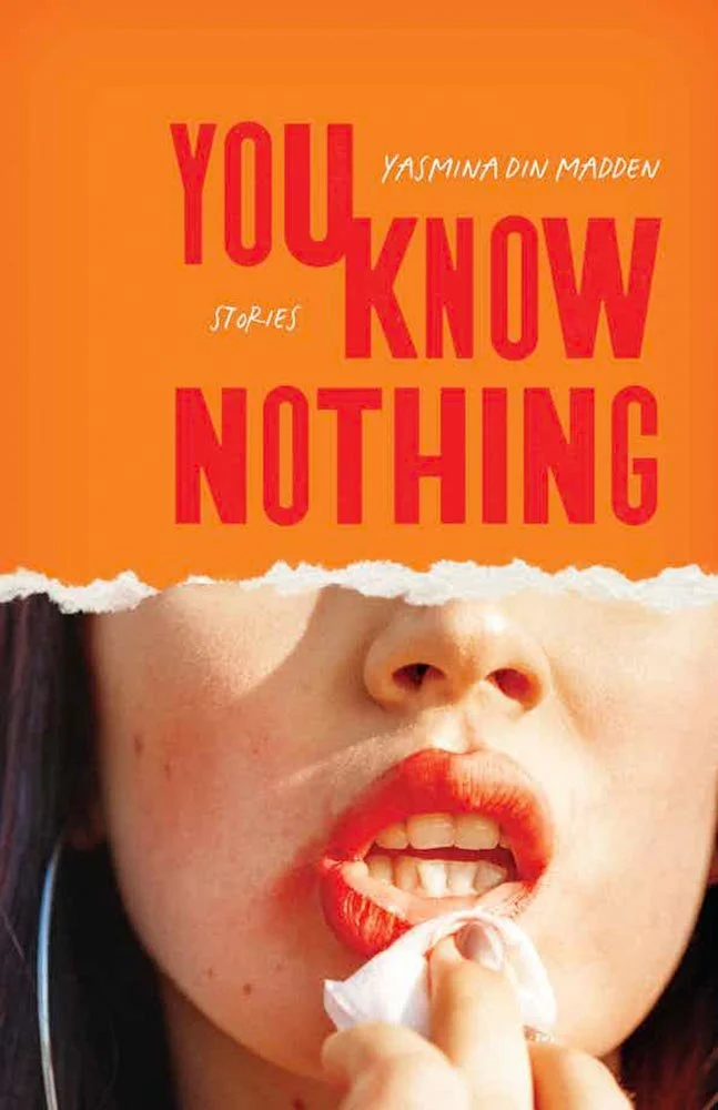
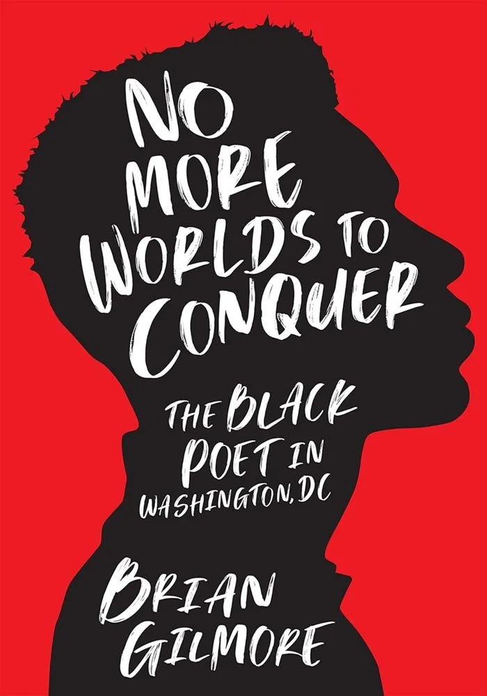
On the other hand, sometimes colorful, Insta-friendly covers are the smarter choice.
When you’re dealing with a collection of “bite-size stories of surreal revelation and inquisitive long-form explorations alike, leaving newfound clarity and hypnotizing carnage in [their] wake,” a cover that’s both approachable and hints at the lives of the women within couldn’t be better expressed.
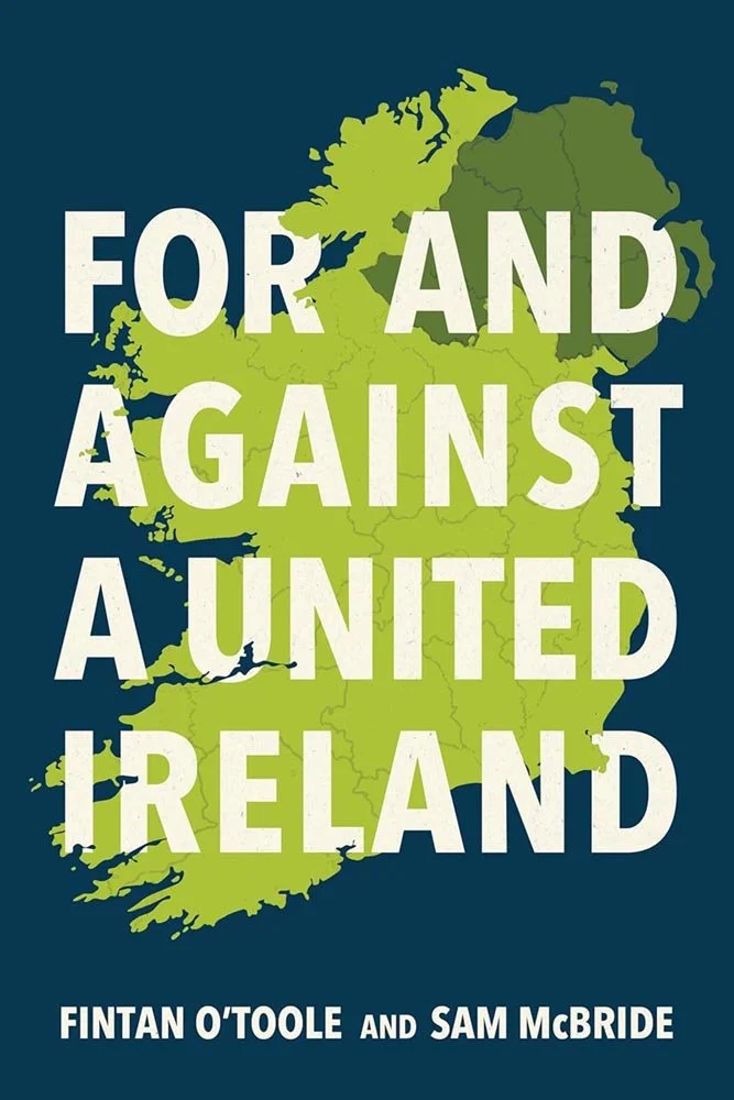
“Most of the arguments made for and against a united Ireland are advanced publicly by individuals or organizations with skin in the game,” the BBC notes; as an American, I can’t begin to approach this with the depth of knowledge or appreciation someone in that particular corner of the world might.
No, it’s just a good cover — a card-carrying member of the “simply, elevated” club, with strong colors and type woven through the contours of the island.
But it’s here for a reason. Like the content, it does its best work neutrally. It could be evocative, or even cause Trouble, but is stronger choosing to do neither: A+ for exactly the right level of restraint.
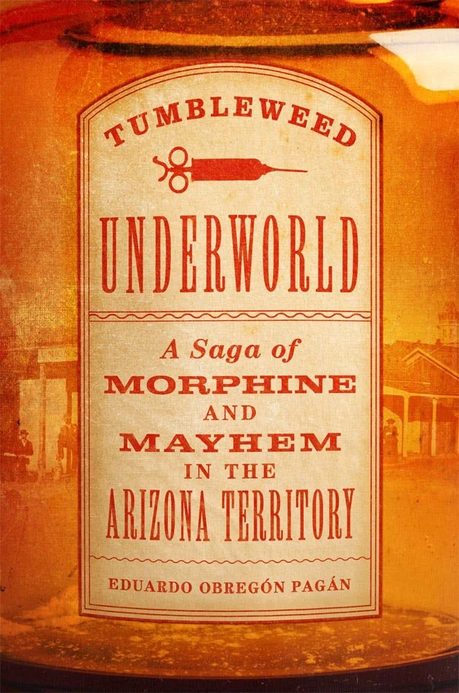
The University of Oklahoma Press.
A strong dose of old-fashioned, from type to photography, bottle color to aged label. A solution, one could say, that’s anything but jarring. (Bonus points for the choice of syringe.)
But this title isn’t all it seems: “Georgie Clifford began life as Minnie Eichler in the small mining town of Clifton, Arizona Territory,” someone whose life “amazingly always moved forward and hoped for better” despite astonishing odds — and is only able to be told because of “incredible sleuthing.”
In other words, interesting and worthy of a good cover. Delivered.
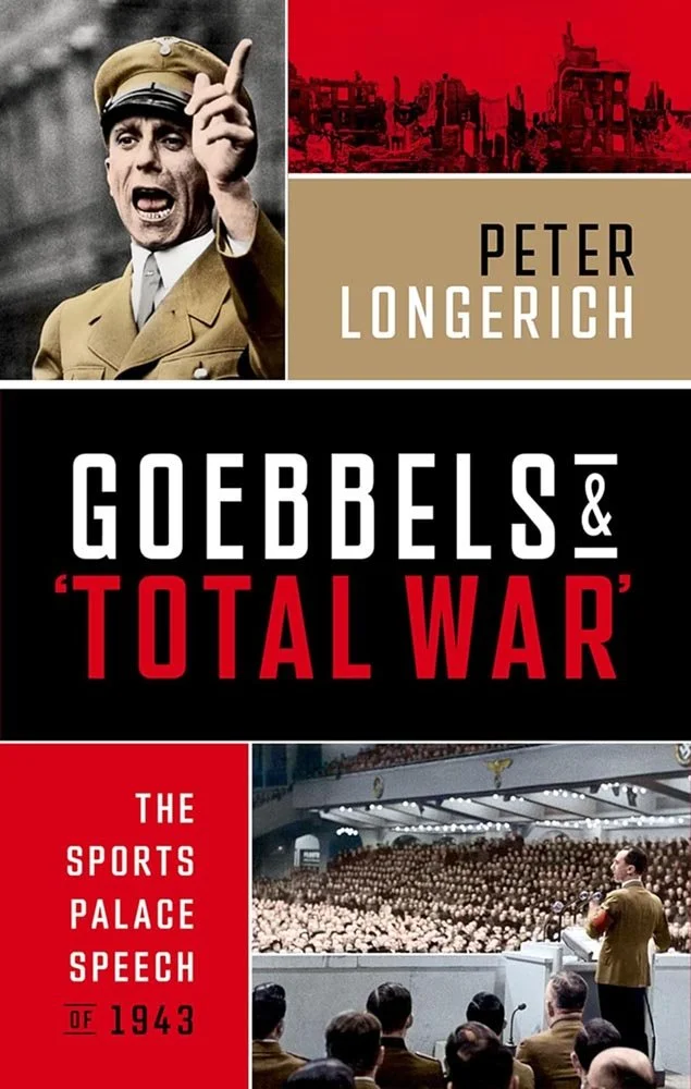
Oxford University Press.
This speech is considered by some to be the pinnacle of Nazi propaganda — “one of the most chilling, and at the same time most effective, rhetorical performances of the twentieth century.” In this title, the author exposes “the reality of the rally as a highly staged and prerecorded event, with a preselected audience and rehearsed reactions made to look spontaneous,” “demythologising it in a way that helps us to challenge conventional thinking,” according to one review.
Such a title — so very typical of University Presses — deserves something more than the standard photo-and-Helvetica treatment. And gets it.
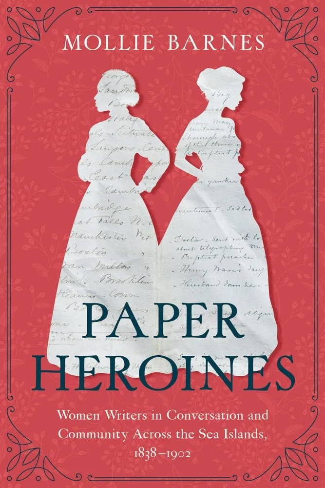
How do you illustrate “fascinating stories” that enable “re-narration” of “the complex nature of Black and white women's relationships with each other and the era's political upheavals”?
Well, this. Textural, textual, and contextual, yet feminine, multiracial, and historical — it’s all there.
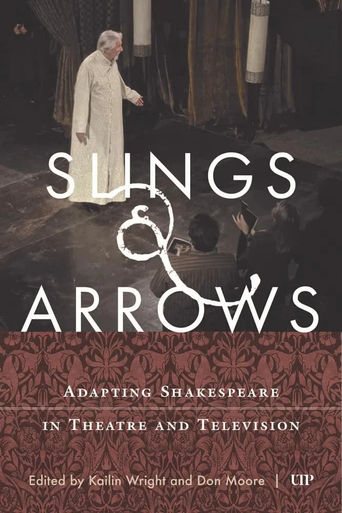
University of Toronto Press. Cover design by Alan Jones. Image: William Hutt on stage in an episode of Slings & Arrows, courtesy of Rhombus Media.
“The ampersand,” he said.
Which, as it turns out, is lifted from the Canadian television comedy of the same name — showing the backstage lives of a Shakespearean theatre company, and written by, among others, a former member of Kids in the Hall — which adds a layer of depth that a lightweight like Shakespeare could probably benefit from.
Arguably, you don’t need to know that to want to pick up the book.
Or appreciate the ampersand.
The University of Chicago Press (dist.) / Seagull Books. Cover design by Sunandini Banerjee, using sketches by the author.
“Written between the margins of news and national spectacle, these pieces are not topical commentary but something far more enduring: political satire that reads like poetry, reportage that mutates into parable, lament, and fable,” the description reads.
But it’s not the description that landed the cover here, it’s the illustrations: both gentle and not, deftly complimented with a solid background and simple title treatment.
So why lead with the description? The cover uses “the late author's sketches and drawings from his notebooks.”
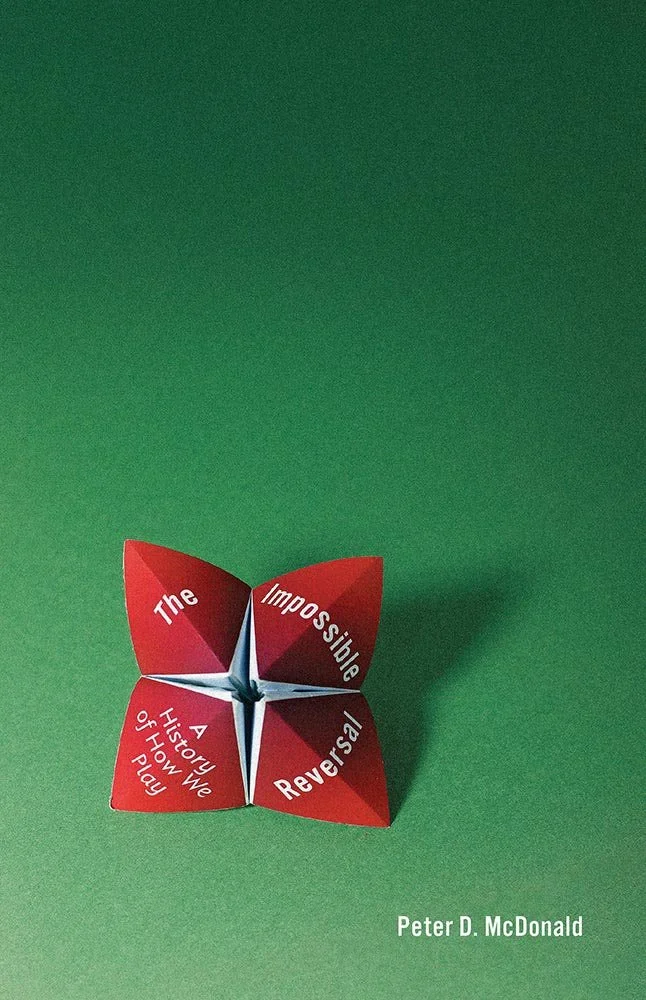
Art director Carla Valadez writes, "We wanted a cover that presented a game, game piece, or toy as an art object, highlighting the artistic and creative aspects of play while offering a hint of nostalgia. Our designer accomplished this goal beautifully” — specifically because, I’d argue, he created and then photographed the "fortune teller" used on the cover himself.
From the shadows and folds to the slight curling at the edges of the paper, there’s something about practical photography that no Photoshop or AI can yet match. Kudos: the effort shows.
Read more about this title. See also: Holy Boy, a recent Spine feature that discusses practical photography.
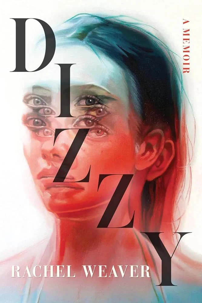
West Virginia University Press. Cover design by Michel Vrana; art direction by Than Saffiel. Artwork by Alex Garant.
Michel Vrana writes, “The design brief included a link to illustrator (and fellow Canadian) Alex Garant. After playing with a selection of her mesmerizing images that so perfectly encapsulated the condition of dizziness, we settled on the moody blue/red gradient version. With a few subtle tweaks to adjust the contrast of the text with the image, the final cover came together easily with the artwork informing design choices for the spine and back cover.”
The title is about chronic illness, by the way — a “landlocked seasickness” — written in a compelling, interesting way that is incredibly well-served by the cover.
Parenthetically, one of the reasons I enjoy writ this column is because of the little surprises that make themselves welcome — and this isn’t the first time West Virginia’s UP has accomplished that: art director Than Saffiel was also responsible for last year’s Softie, a highlight of the ’25 UPresses Show.
Read more about this title. See also this great NPR book review.
Update, 25 February: Alex Garant writes, “Fourteen years ago, I had a heart attack that shifted the way I looked at the world. It woke me up. I realized I couldn’t keep treating my life and creativity as something I’d “get to later.” I needed to choose my passion with intention, and chose art. I went on to pioneer contemporary figurative Op Art and develop Analogue Glitch Art, a visual language built on double images, optical illusions, and layered perception. Every piece I create is a reminder of that turning point.”
I’m very glad she chose to create — and believe that for this title especially, her talent and experience bring something extraordinary to the design. Thanks, Alex!
Are you a book cover creative, art director, or publicist? If you want your work, or the work of your press, to be reviewed be sure to get in touch with us.
Please include the cover designer’s name, the art director’s name, any additional details like illustrator or photography credits, and the publication date. (Yet-to-be-published titles are welcome, with embargo dates if applicable.) Images should measure 1200-1500px on the long side, preferably in JPG format and the sRGB color space.
We look forward to featuring your work soon!
A freelance designer and photographer, Giles has been writing about book design for nearly thirty years. During his spare time, he walks, explores architecture, and enjoys music on a great stereo. He lives in Middle Georgia with a dog and cat.