Samantha Hahn Leans into Rabid Fandom Culture to Design Holy Boy
Samantha Hahn is a Brooklyn-based illustrator and creative director with an astounding body of work. She has hand-lettered magazine covers for Vogue and Marie Claire, done illustrative reportage for the likes of Marc Jacobs and Jonathan Simkhai, and produced beautiful book covers for Penguin Random House and St. Martins Press. Here she takes us through her process for designing the cover of Holy Boy for HarperVia.
For this dark, literary thriller about a K-pop idol who consumes the thoughts of four wildly different women, Stephen Brayda, an art director whose work I have long admired, asked me to lean into the hyper-tactile miscellany of fan culture, so I assembled K-pop trading cards in using photo sleeves, stickers, and letter beads (some raided from my daughter’s stash).
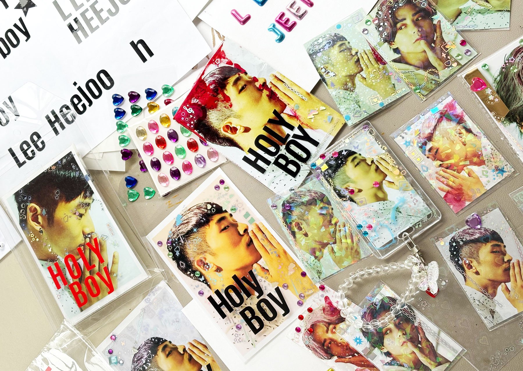
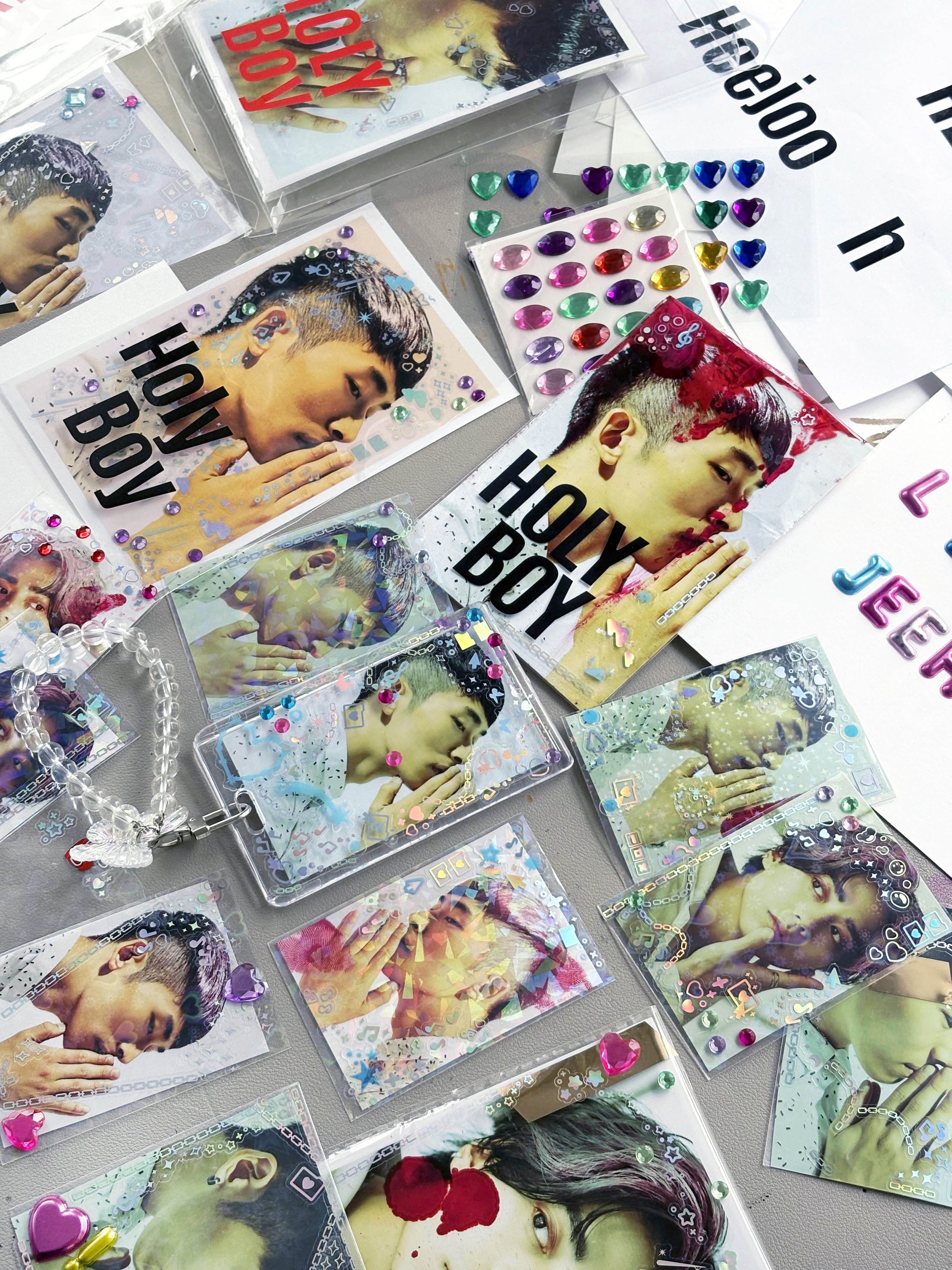
Putting myself in the mindset of a devoted fan, I decorated many different cards, imagining each one through the eyes of an obsessed creator. Finding myself drawn to the juxtaposition of cheerful materials against a creeping undercurrent of unease, I let my workspace get cluttered and chaotic, something I usually hate, but which helped inform the approach.
At the end of the creative process, I presented Stephen with two different approaches:
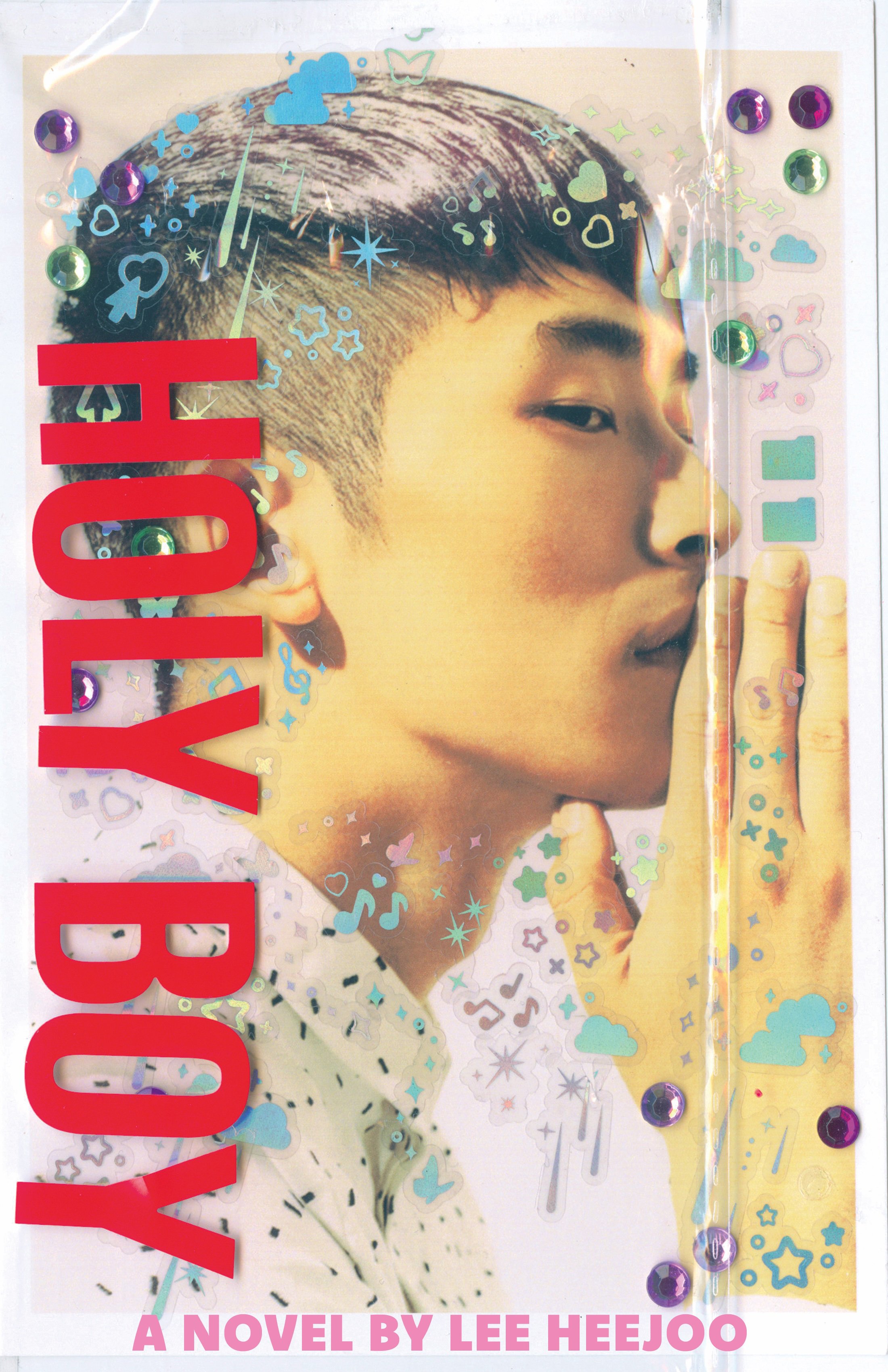
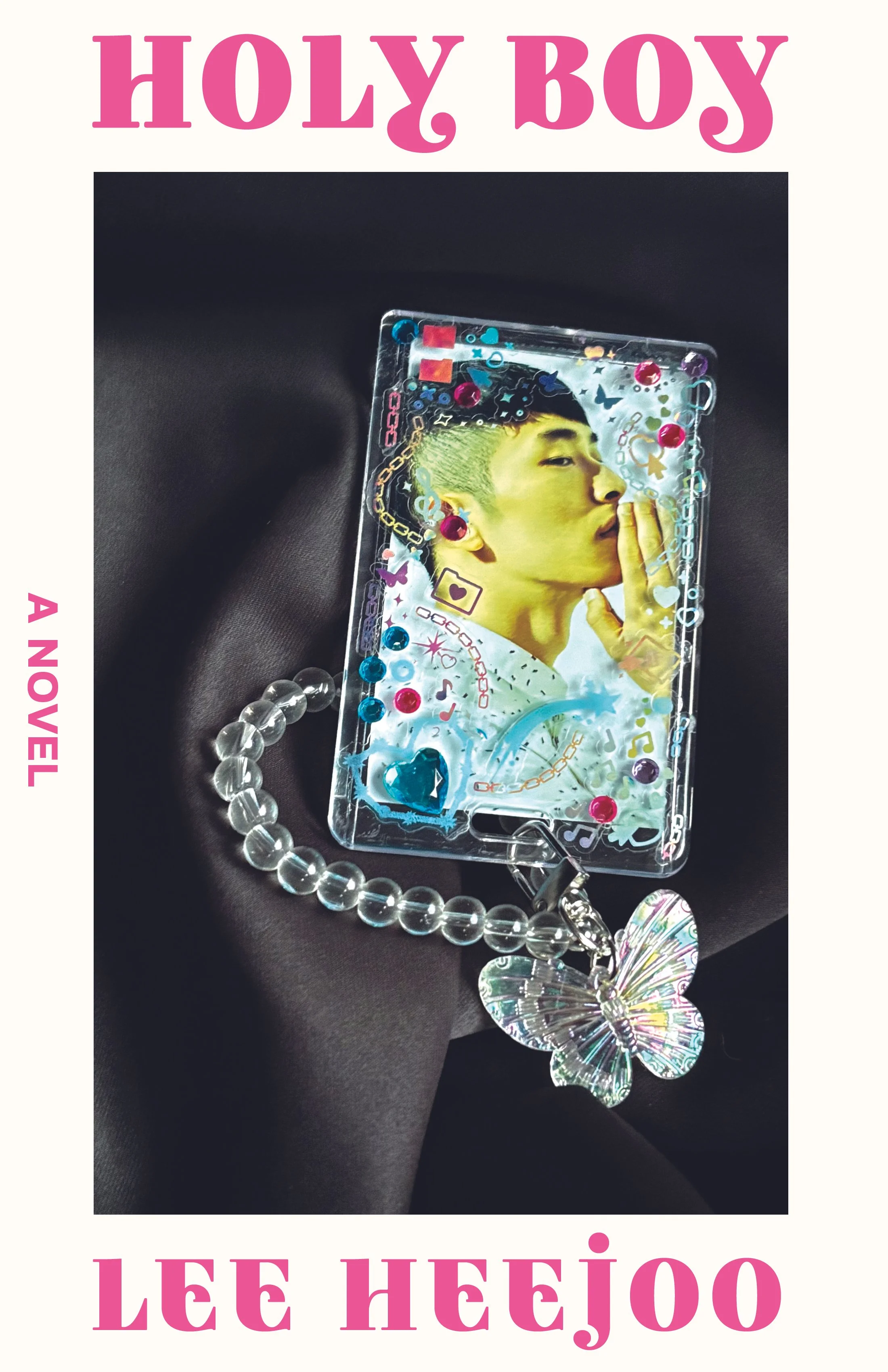
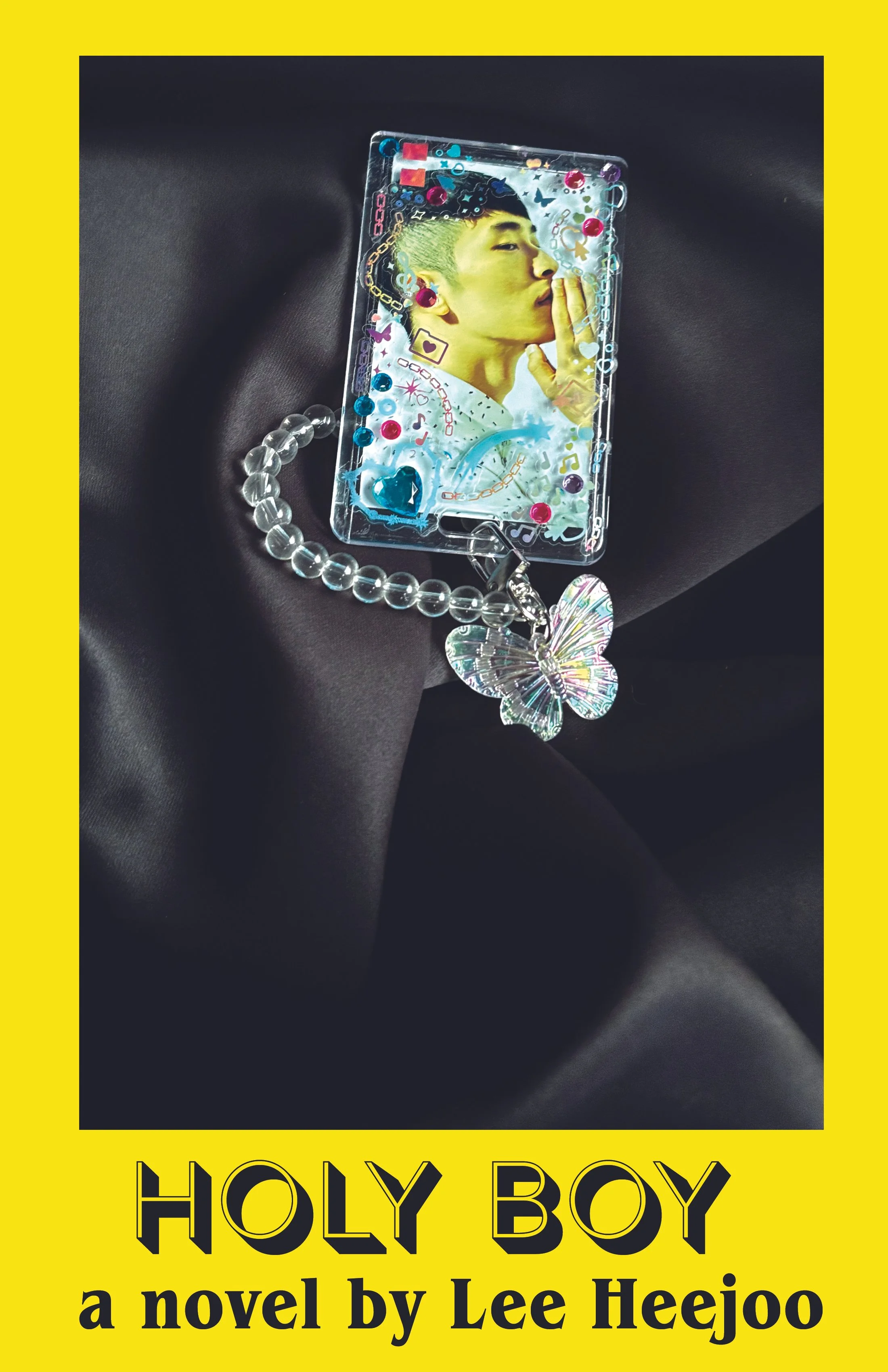
1. All analog, using crafting materials even for the text and photographing the cards on different surfaces, like satin pillows, to give them texture. Every iteration had to be created from scratch.
2. Analog and digital hybrid, photographing the cards but overlaying type and/or hand-lettering.
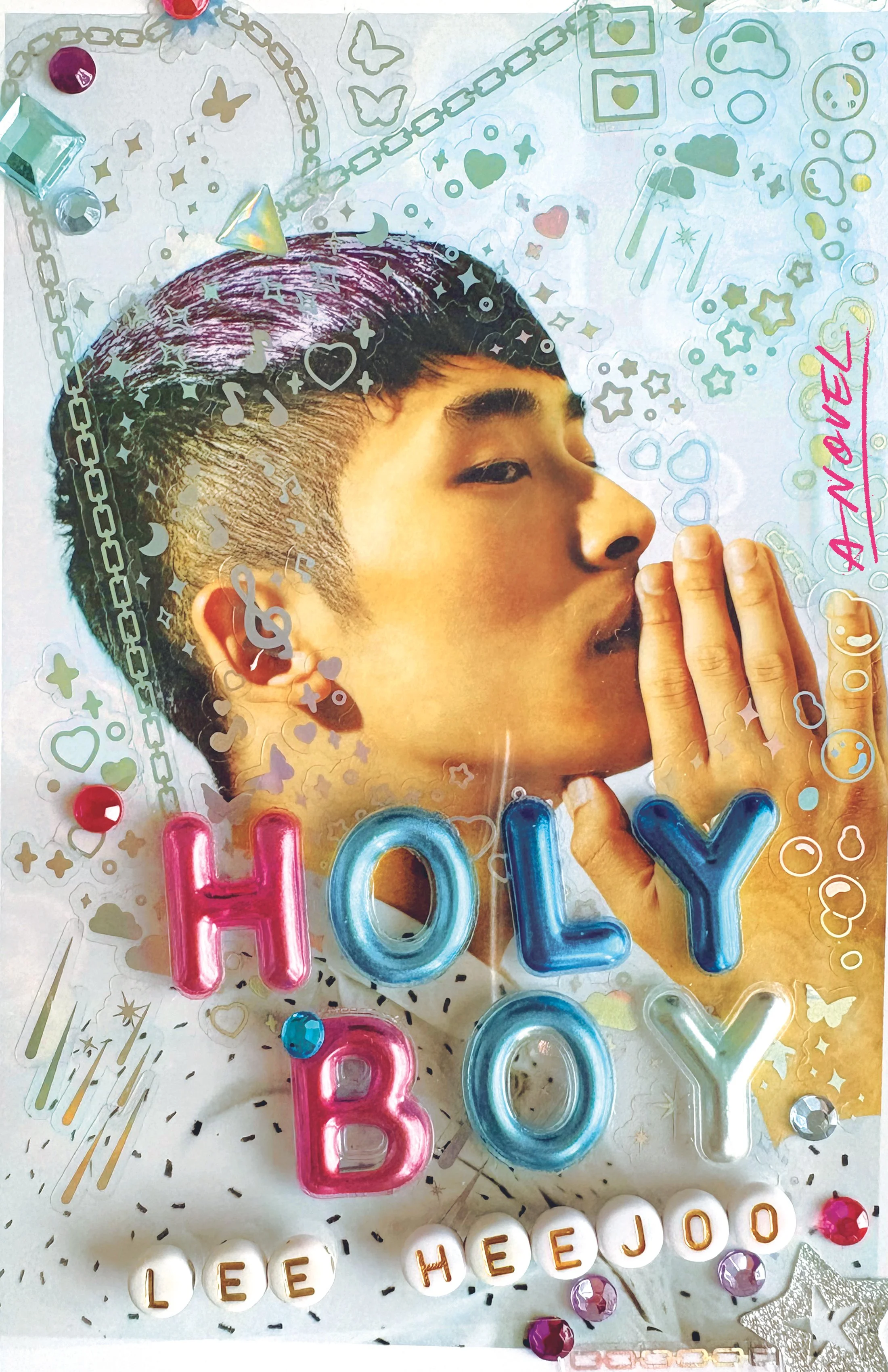
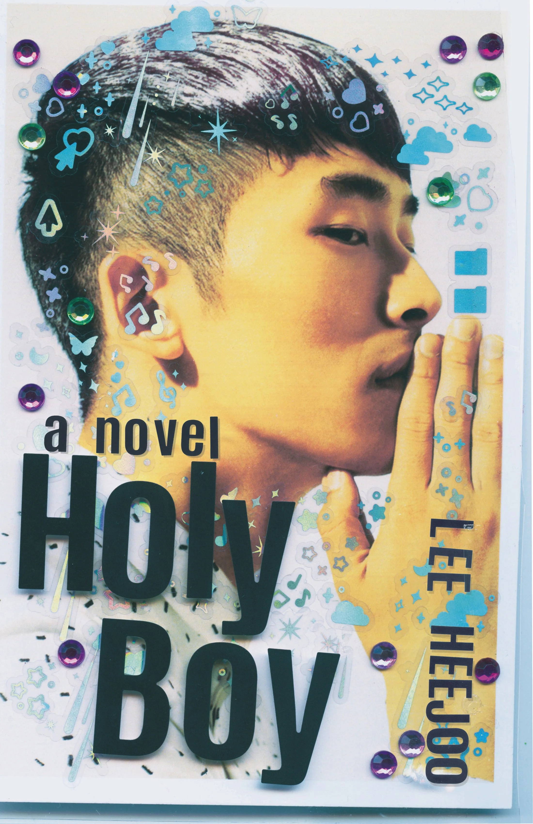

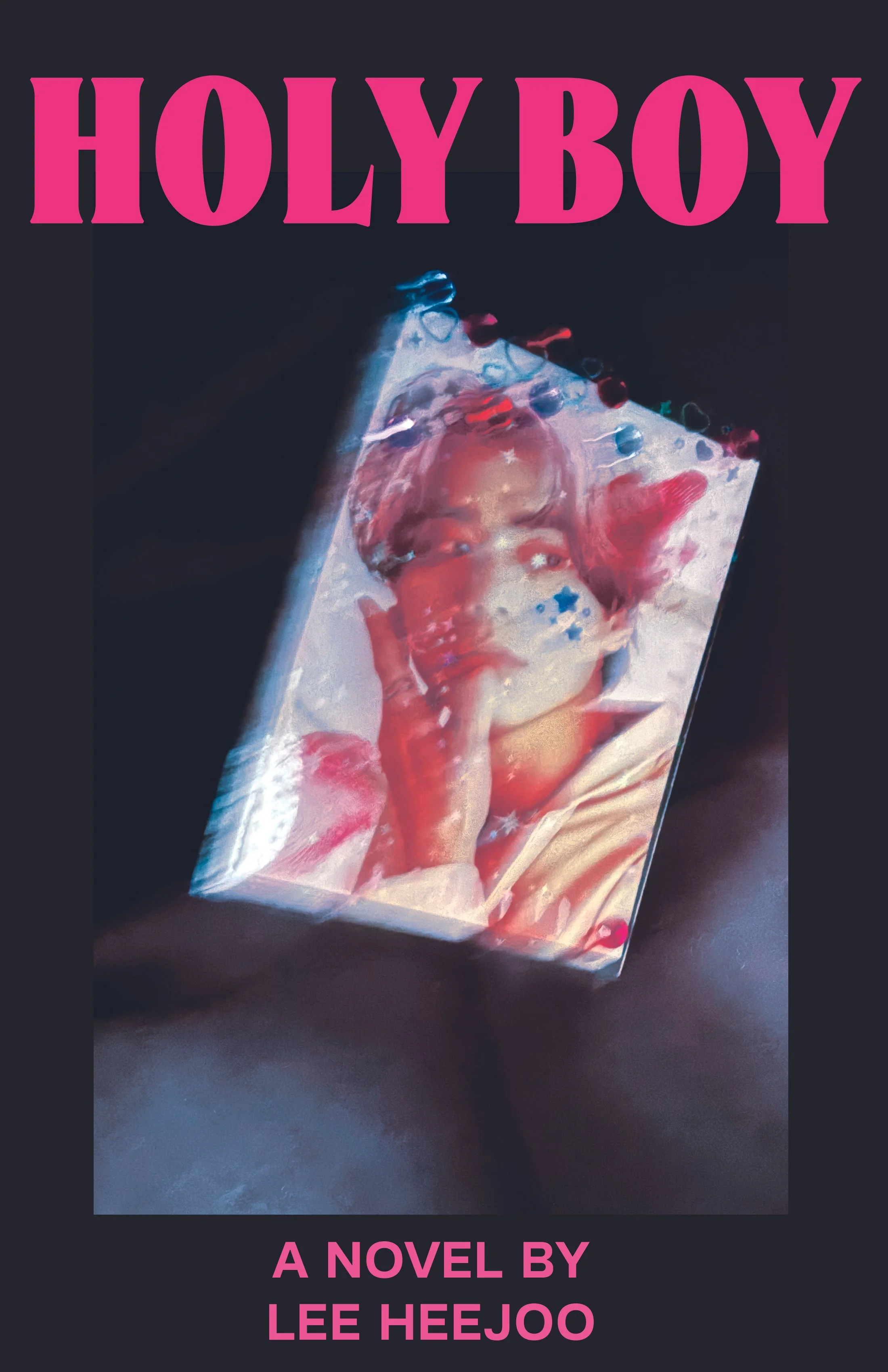
Since each iteration required decorating a new card from scratch, I had the opportunity to experiment with many different directions, from sweet to dark and suffocating. Personally, I preferred the moodier designs; maybe I'd become as fixated as the characters by that point.
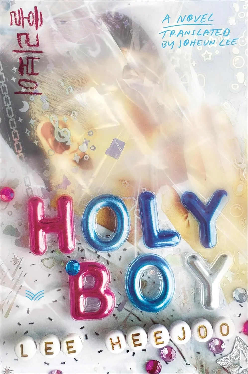
The team responded most strongly to versions where the trading card filled the cover, with the crinkled plastic sleeve catching the light, always reminding me of Laura Palmer from Twin Peaks. They liked seeing just enough of the subject's outline to recognize him as an idol while leaving his identity obscured. In the final design, the pop star isn't a person as much as an object of idolatry for the fans who claim him for themselves. For the text, they preferred a combination of stickers, beads, and hand-lettering.
Final cover
Editor, artworker and lifelong bibliophile.