Book Cover Design Trends in 2025 & Predictions for 2026
Book cover design and its changing form over the years is always a great reflection of the ever-evolving tastes of readers, the technological innovations shaping visual arts, and cultural shifts in society at large. Today, book covers aren’t just about looking good — they’re designed to stop the scroll, signal identity, and make a statement both in print and on digital screens.
So what worked in 2025 that may be on the way out as we storm ahead into 2026? What other trends seem to be here to stay? In this post, we’ll break down the standout book cover design trends of 2025 and make some predictions about what lies in our near future.
2025 book cover design trends
Last year, we saw many new variations of already-popular book cover motifs. From bubbly, animated romance covers to dark house-on-a-lake thrillers, genre trends largely persisted.
However, if we focus mainly on literary fiction and commercial fiction, a few things stood out especially. Let’s break it down.
Real art = high brow but effortless
One of the stand-out trends was book covers with lettering — often neon pink, yellow, or green — across handpainted artwork. We’ve already seen this trend going strong for a couple of years now (think My Year of Rest and Relaxation by Otessa Moshfegh). It offers not just a pleasing contrast of modern meets traditional, but it also persists because of what it communicates about people as they perform reading online and offline. Additionally, as people try to figure out whether what they’re seeing was human made or machine made, this trend pushes back on AI book cover design by emphasizing real brush strokes and lasting pieces of art.
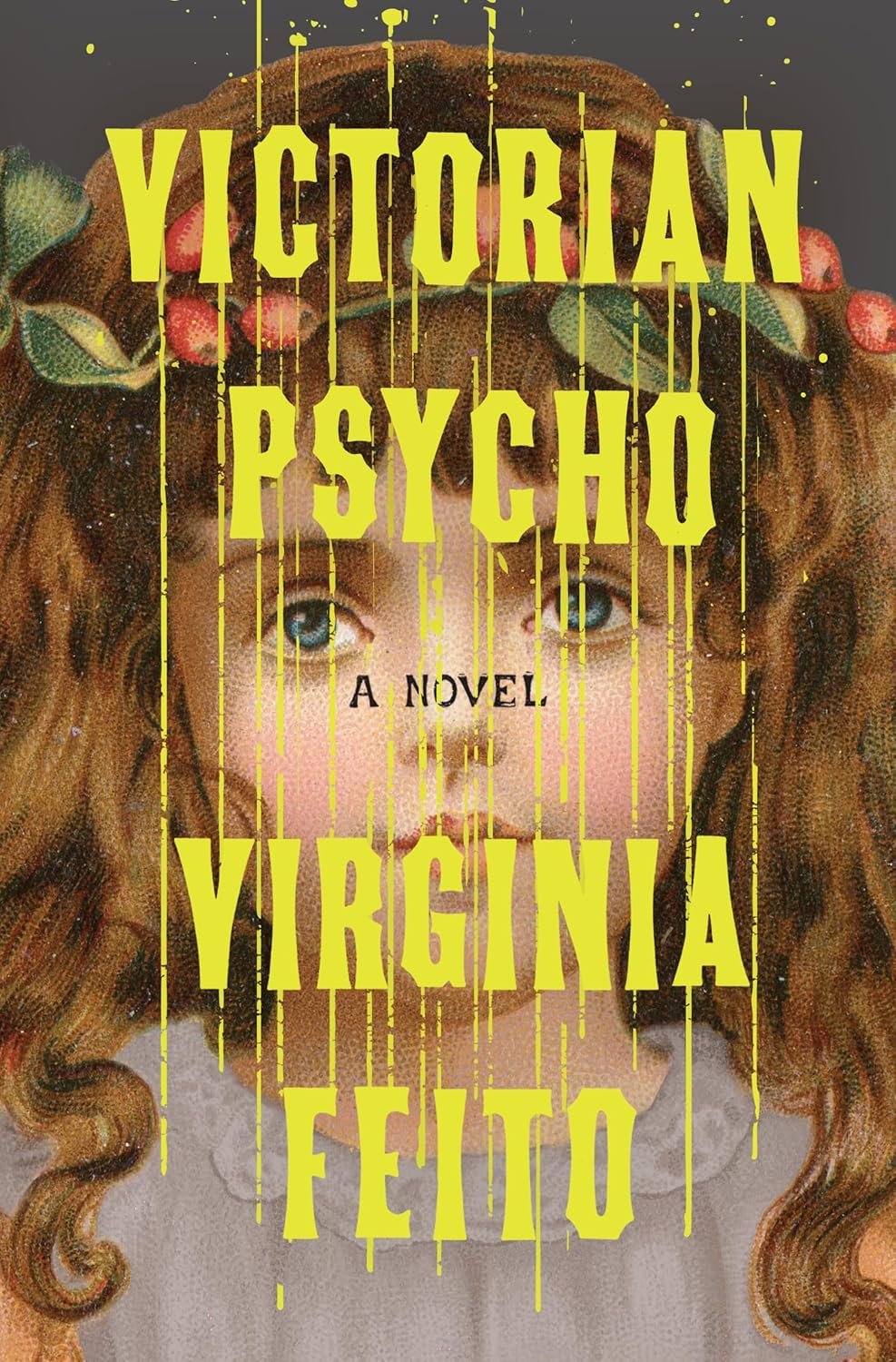
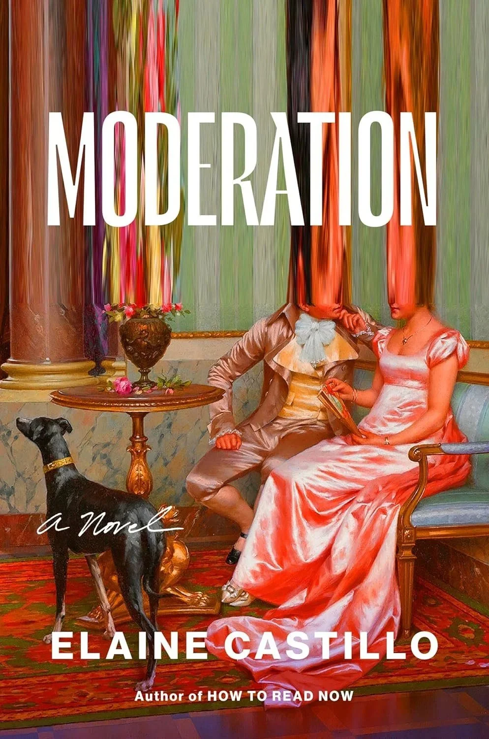

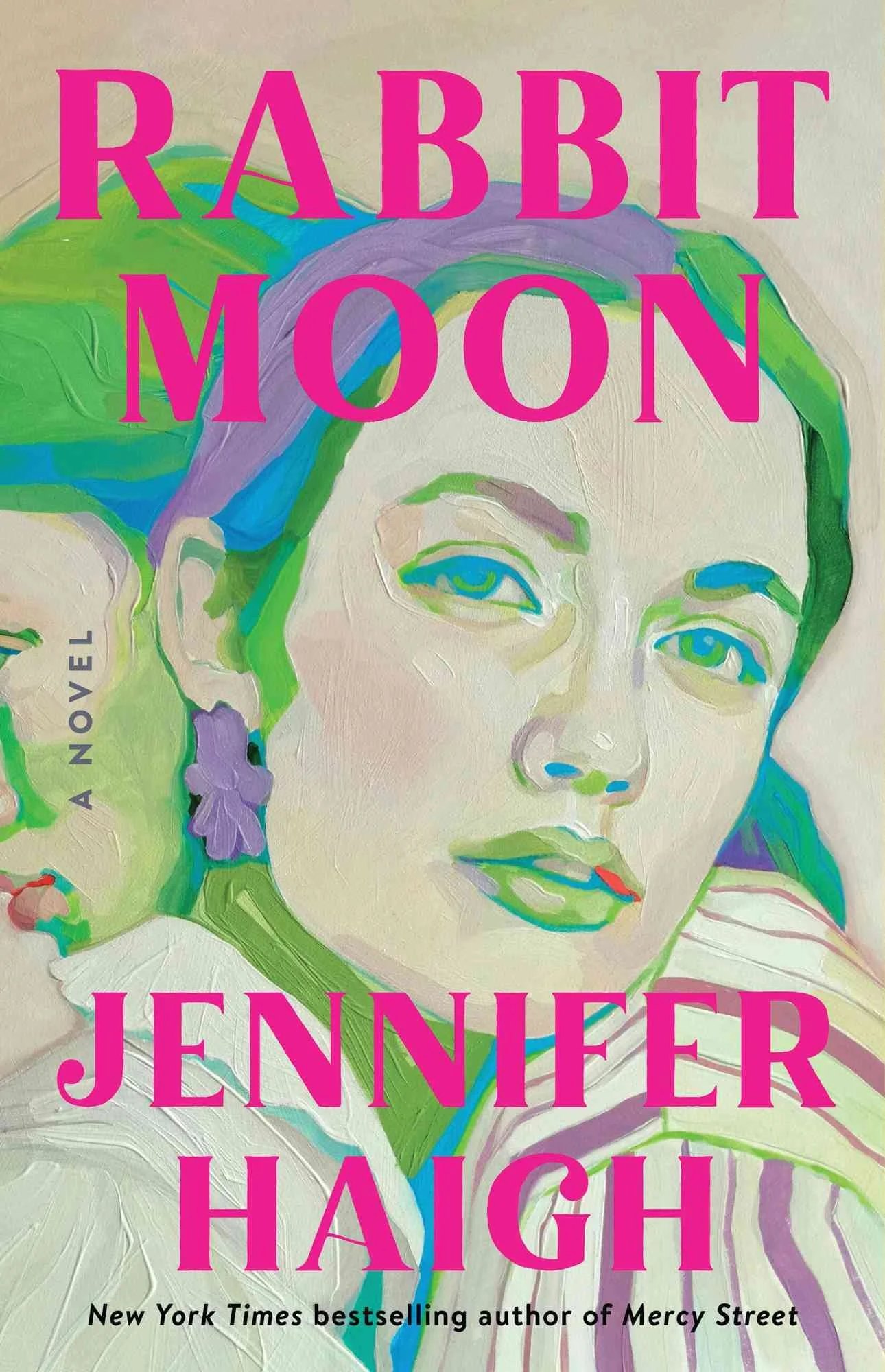
Compared to previous years, in 2025, the colors have become a little bit more muted. The motifs are also increasingly taken from the natural world, rather than focusing on Renaissance people and Victorians in distress (though there’s still some of that, too). The key here is the focus on texture and nod to real handicraft.
The effect is that these book covers act as identity markers. Stuffed into tote bags to be read on busy subways or at cafés while sipping matcha lattes, they signal to passersby and anyone perceiving the reader reading that they are “more city than suburb, more pét-nat than chardonnay,” as NYT’s Elisabeth Egan frames it. Simply put, these covers say both “I’m here, I’m now, and I’m modern,” as well as “I’m high brow, I care about substance, and I’m a potential future classic.” They’re not like other books.
The serialized standalone
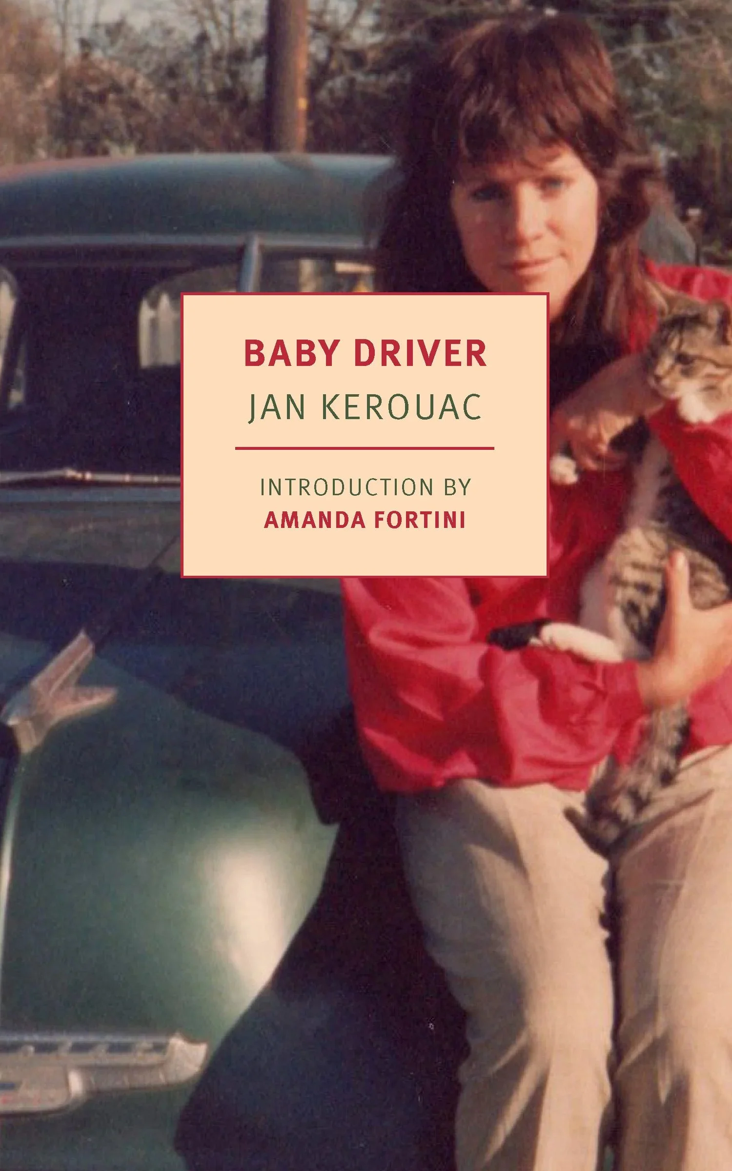
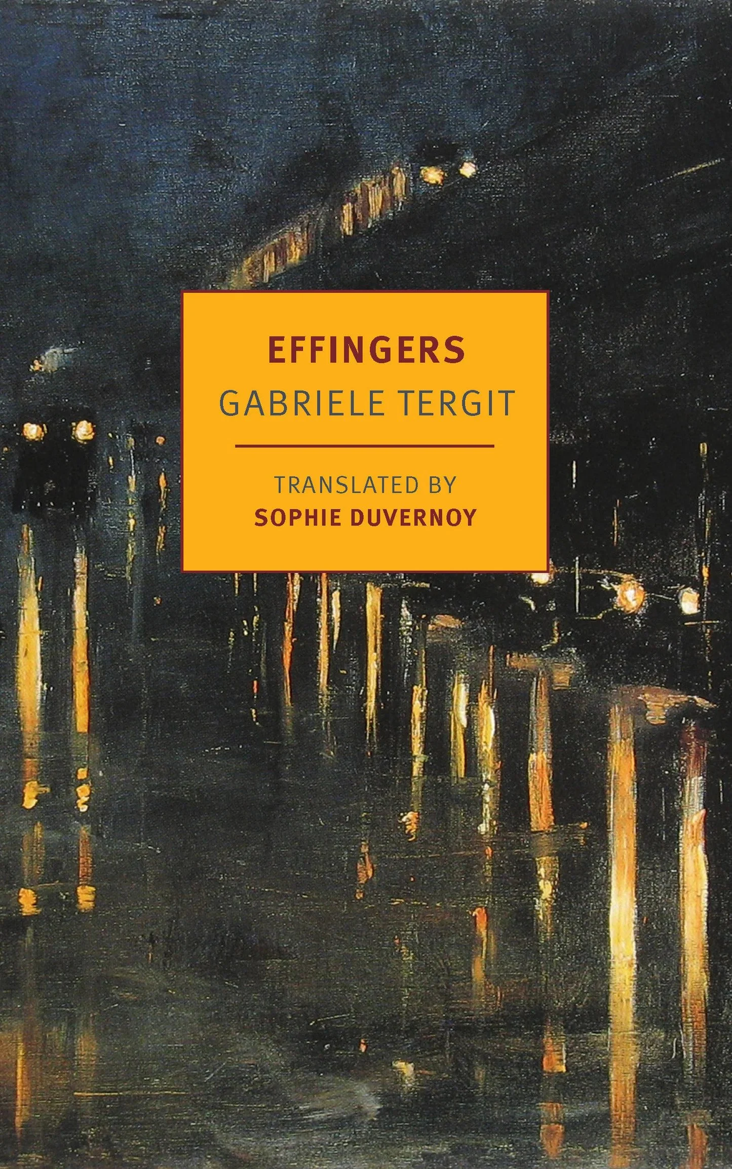
We’ve also seen an increasing emphasis on book covers that elevate an imprint’s identity by maintaining a consistent, instantly recognizable design across all its titles. From the unmistakable blue and white Fitzcarraldo Editions, to the timeless design of NYRB classics, these covers look fantastic as collections on your shelves and — perhaps more importantly — instantly communicate that the reader can expect a certain type of writing within its spines.


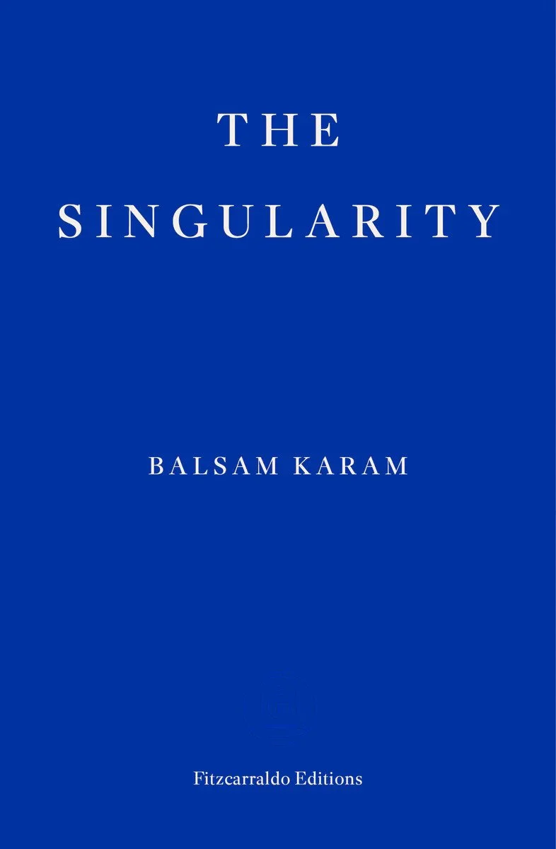
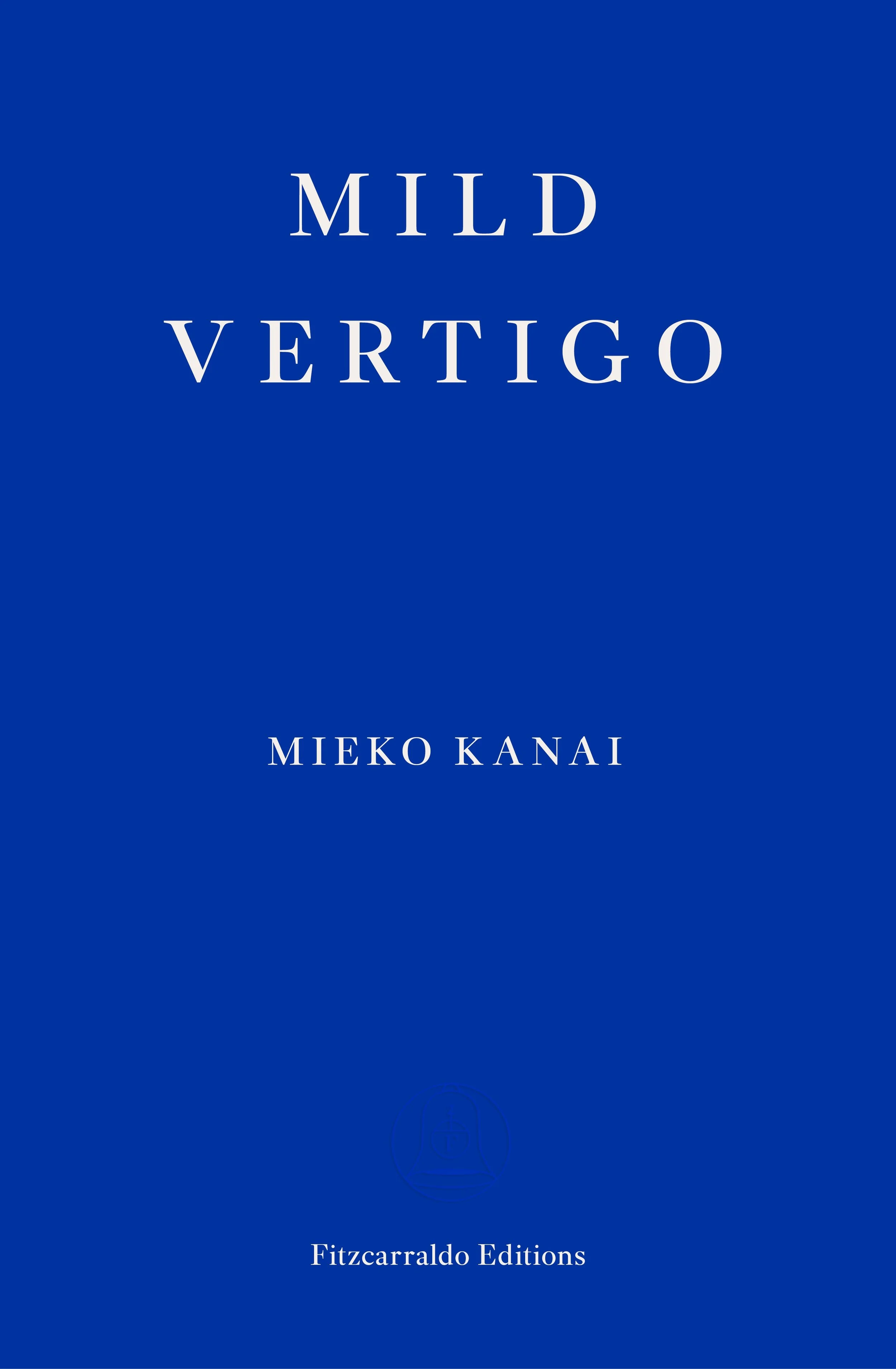

This is an incredibly clever marketing move. Without needing to see the same book each time everywhere, the recurring design produces the same effect; it seems like it has universal approval. And if you keep seeing these books in social media posts or in the hands of the people whose taste you explicitly or implicitly trust, the design itself becomes a guarantee of quality. Readers of Fitzcarraldo Editions or NYRB may take a chance on a completely unfamiliar author simply because they trust the imprint’s reputation for curation.
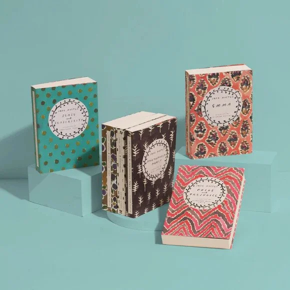
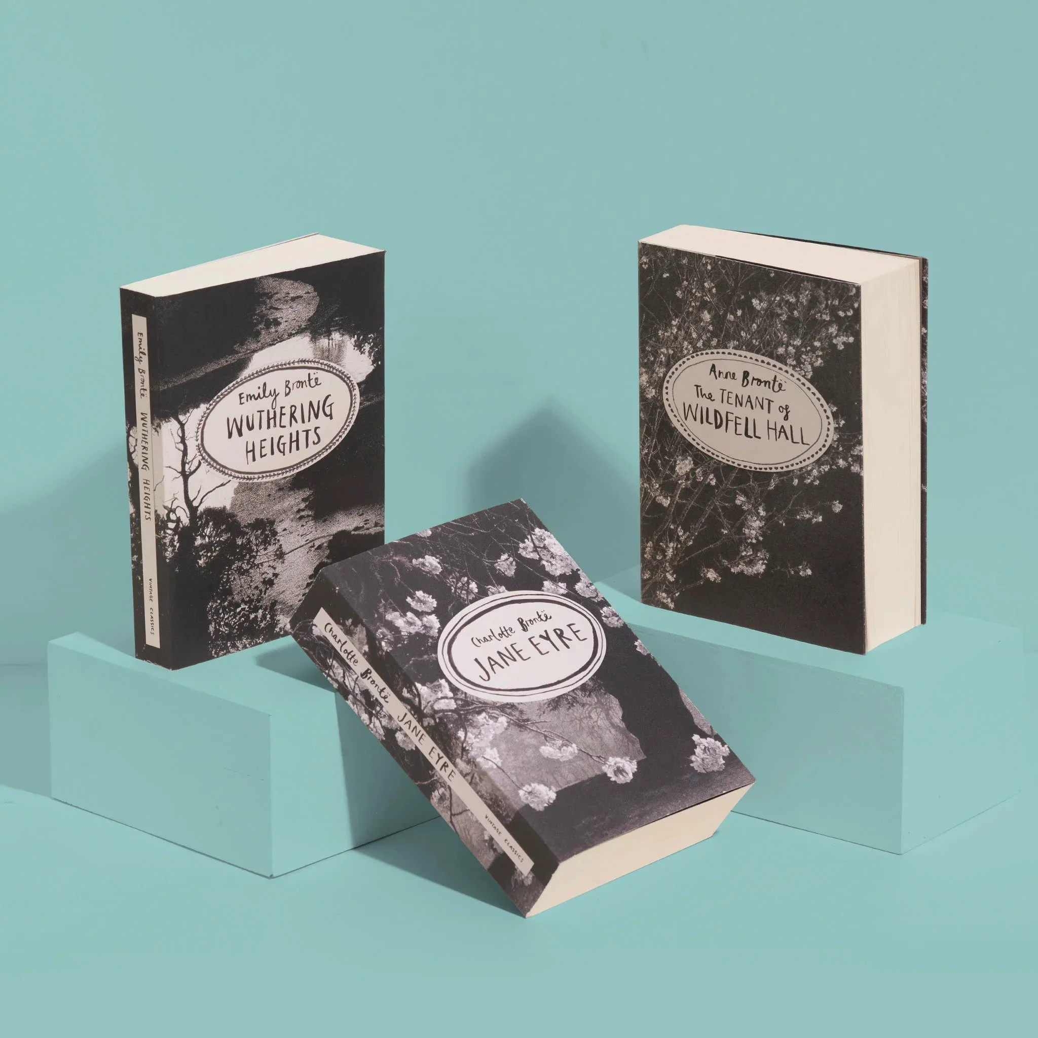
Neither is it a new design trend. Indeed, Penguin has been doing it for decades with their black spines and modern classics, not to mention their special Vintage Classics Brontë and Jane Austen lines. The difference is that we are now seeing this tactic cross over to contemporary fiction, and it is especially utilized by smaller presses trying to carve out their niche of the market to reach their target audience.
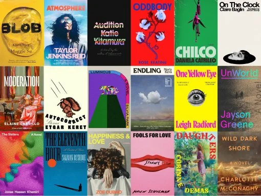
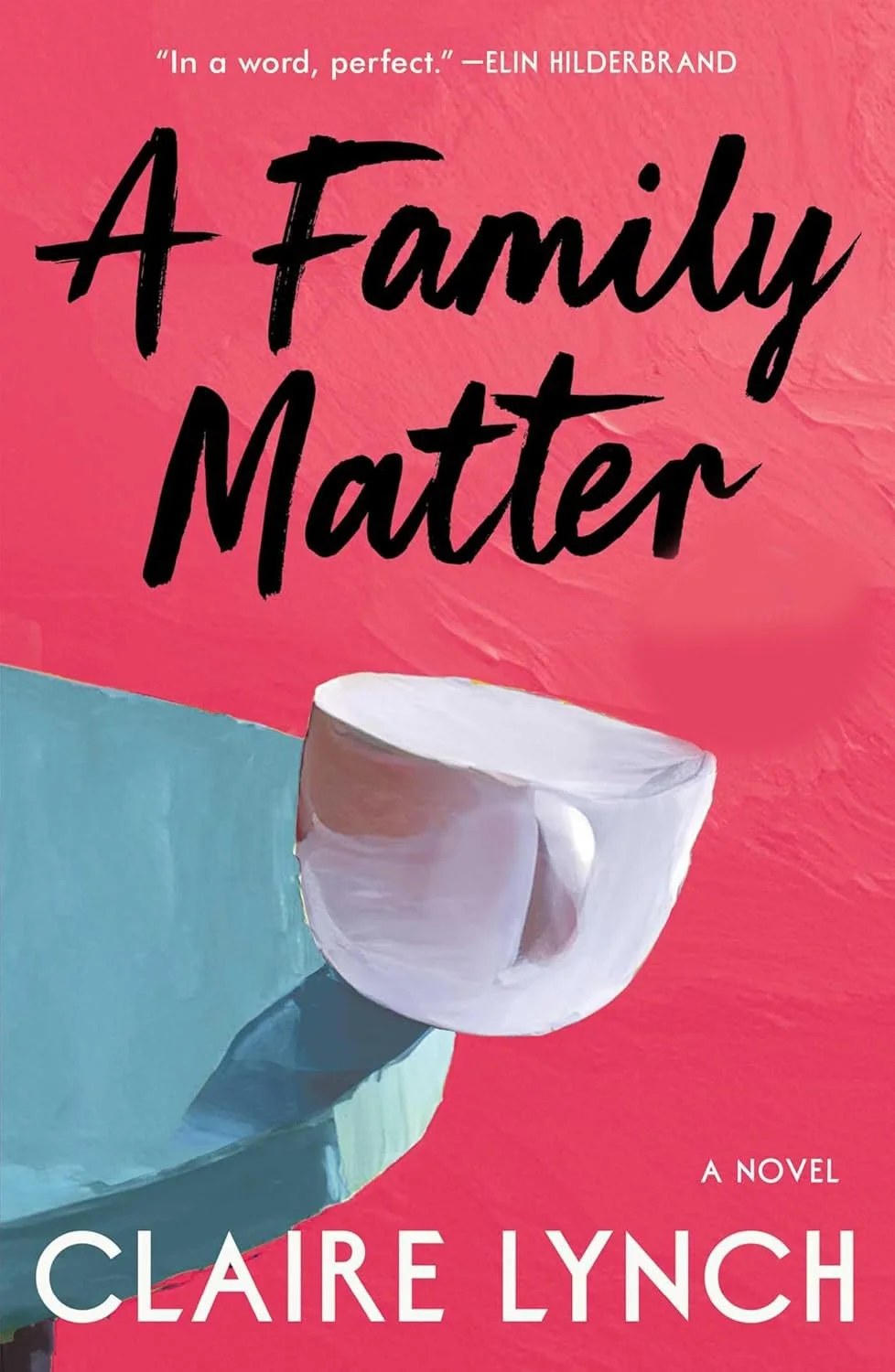
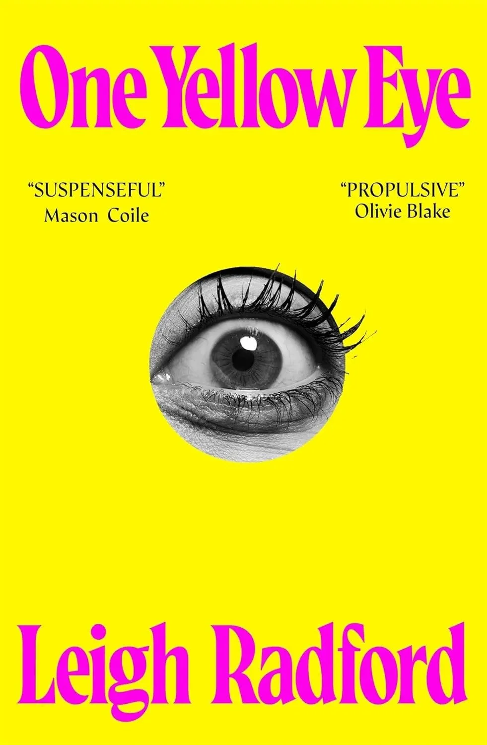
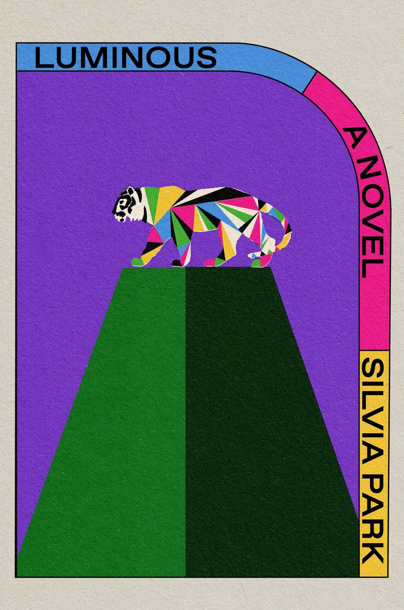
One-color covers with distorted objects
Another trend we saw amongst the best covers in 2025 was that simple, clean covers were able to cut through the noise. Think purposeful typography paired with a single motif or two on an otherwise flat, monochrome background:
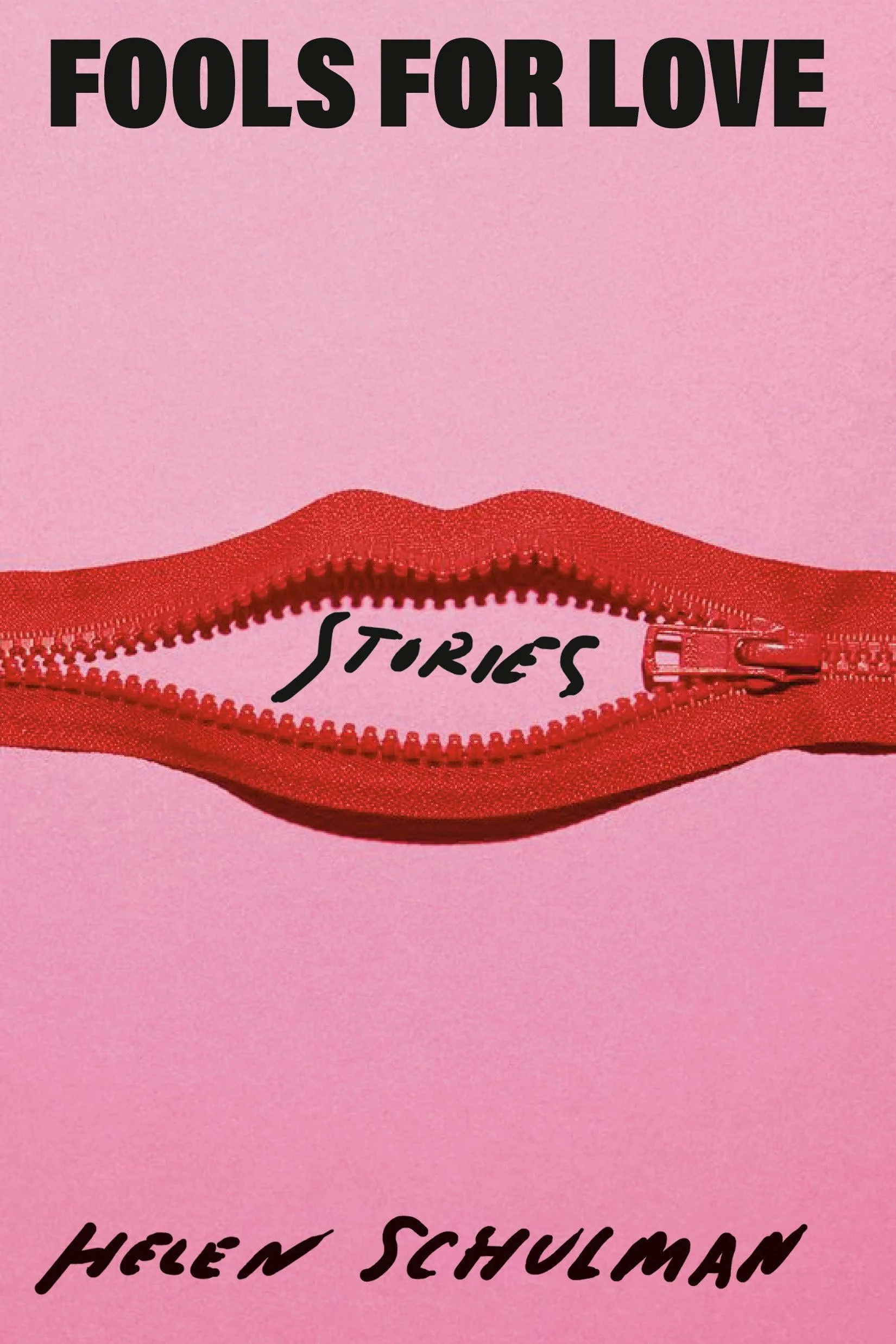
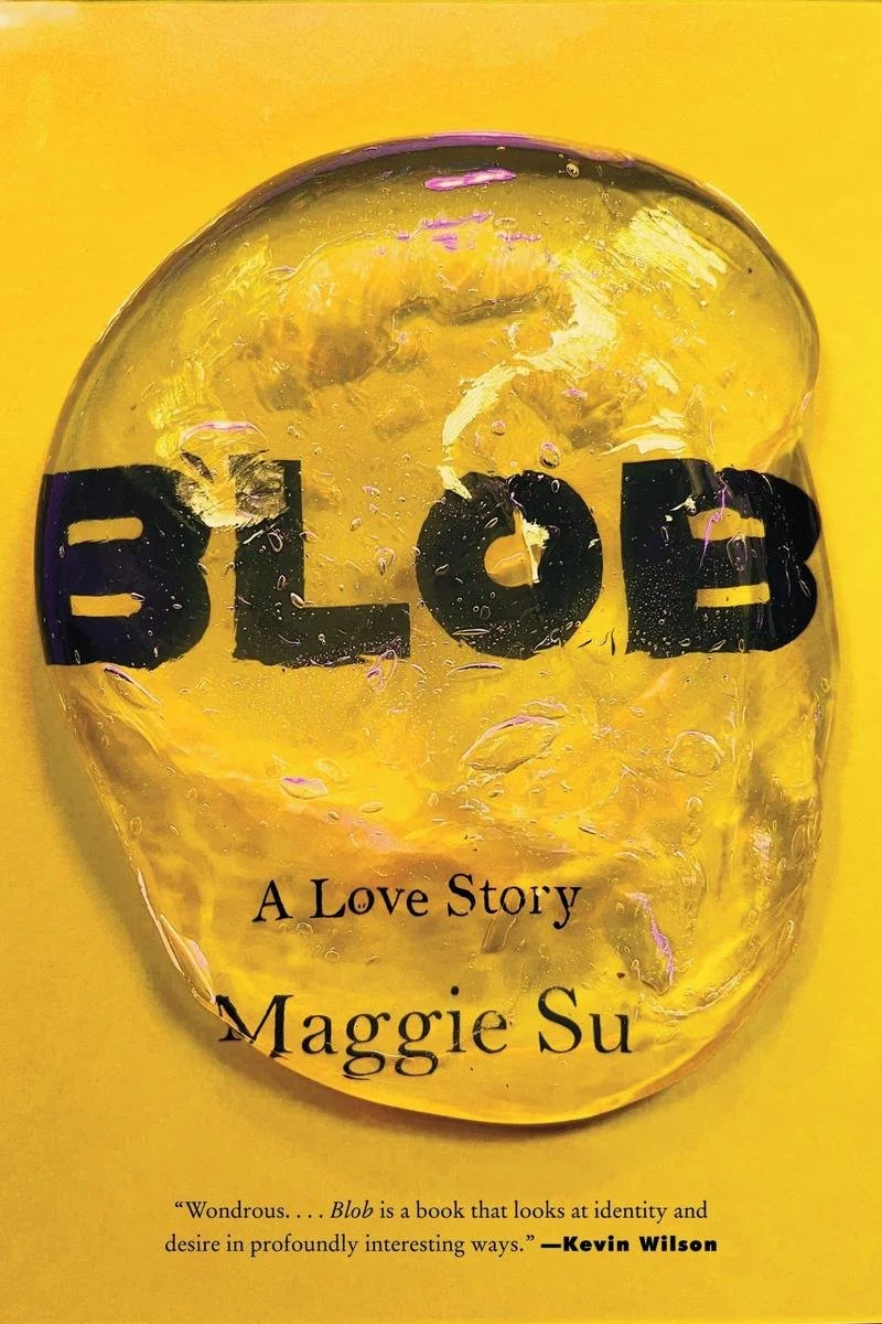
The simplicity of this kind of design draws the attention to the often distorted main motif, whether it’s a zipper that doubles as a mouth, a misshapen silicon-like blob. Notice how many of these covers also distribute the text to the top and/or bottom of the page, leaving huge swathes of empty space on the canvas to let the eye scan the page easily.
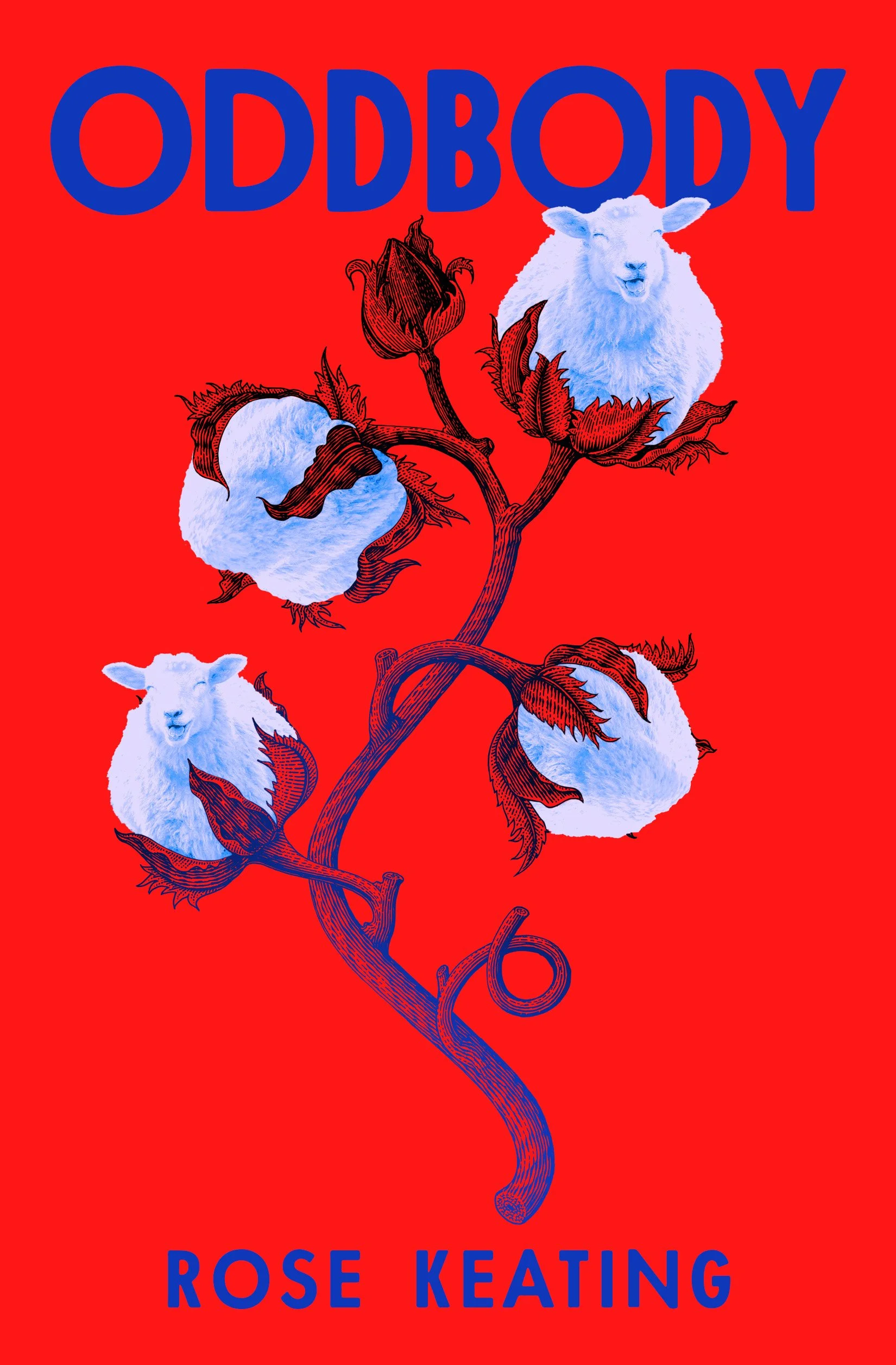
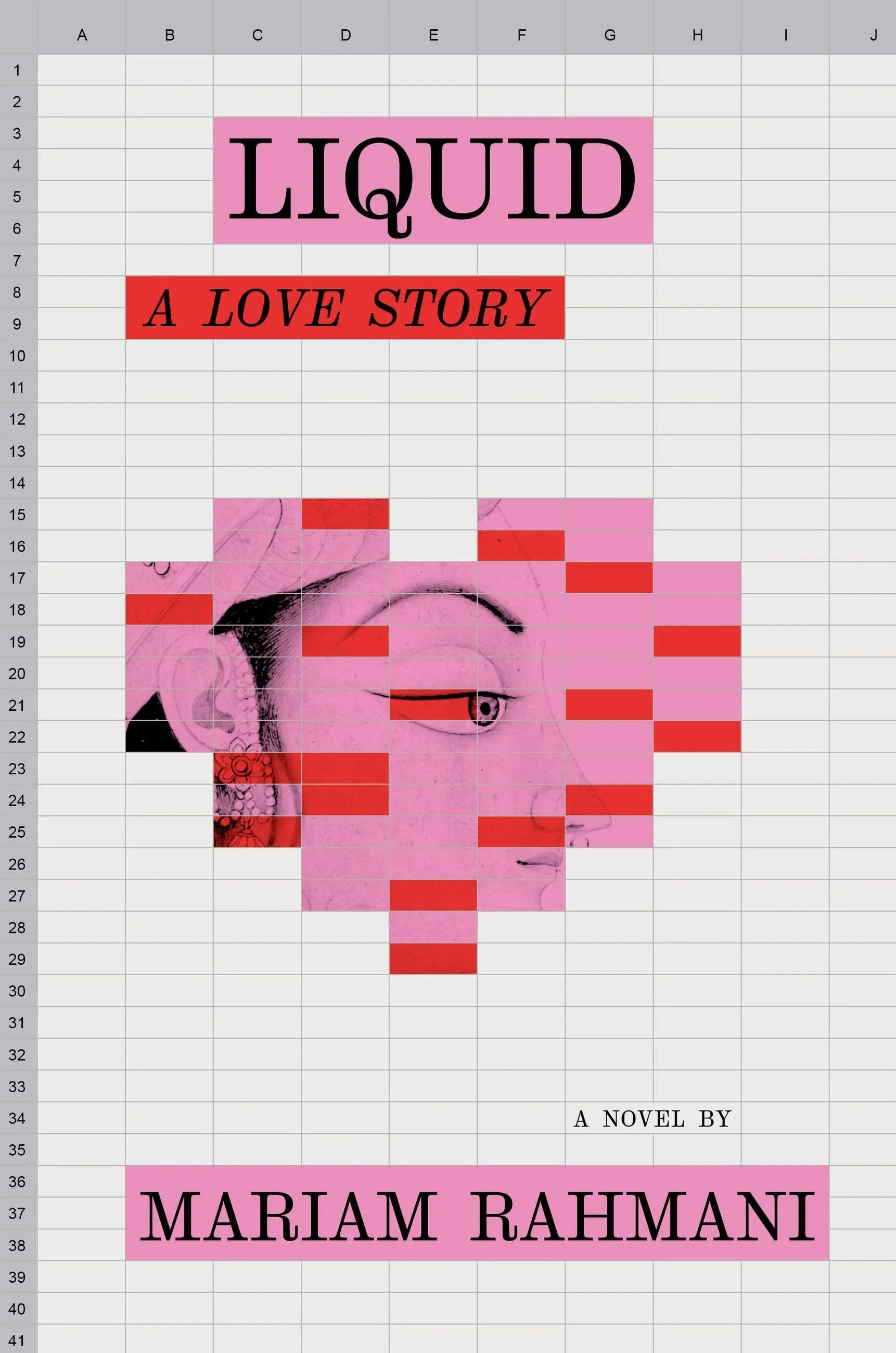
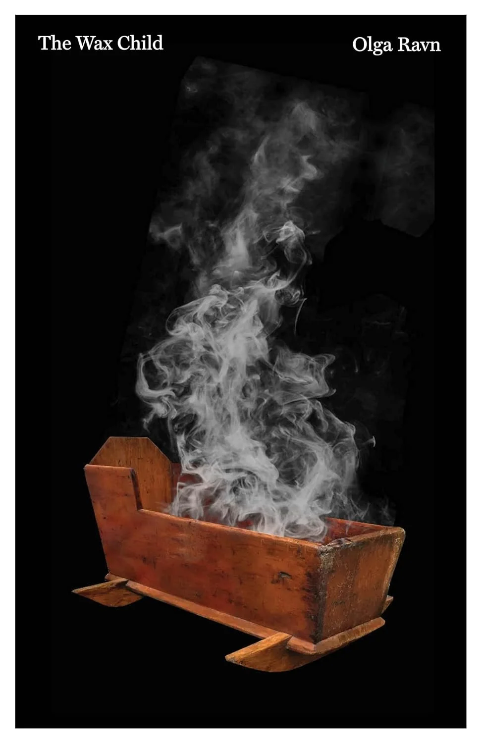
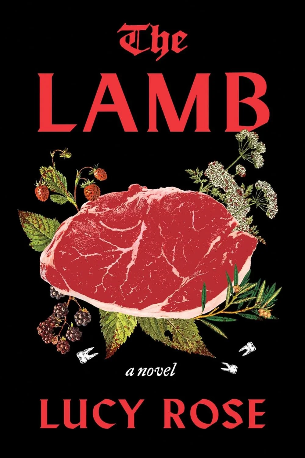
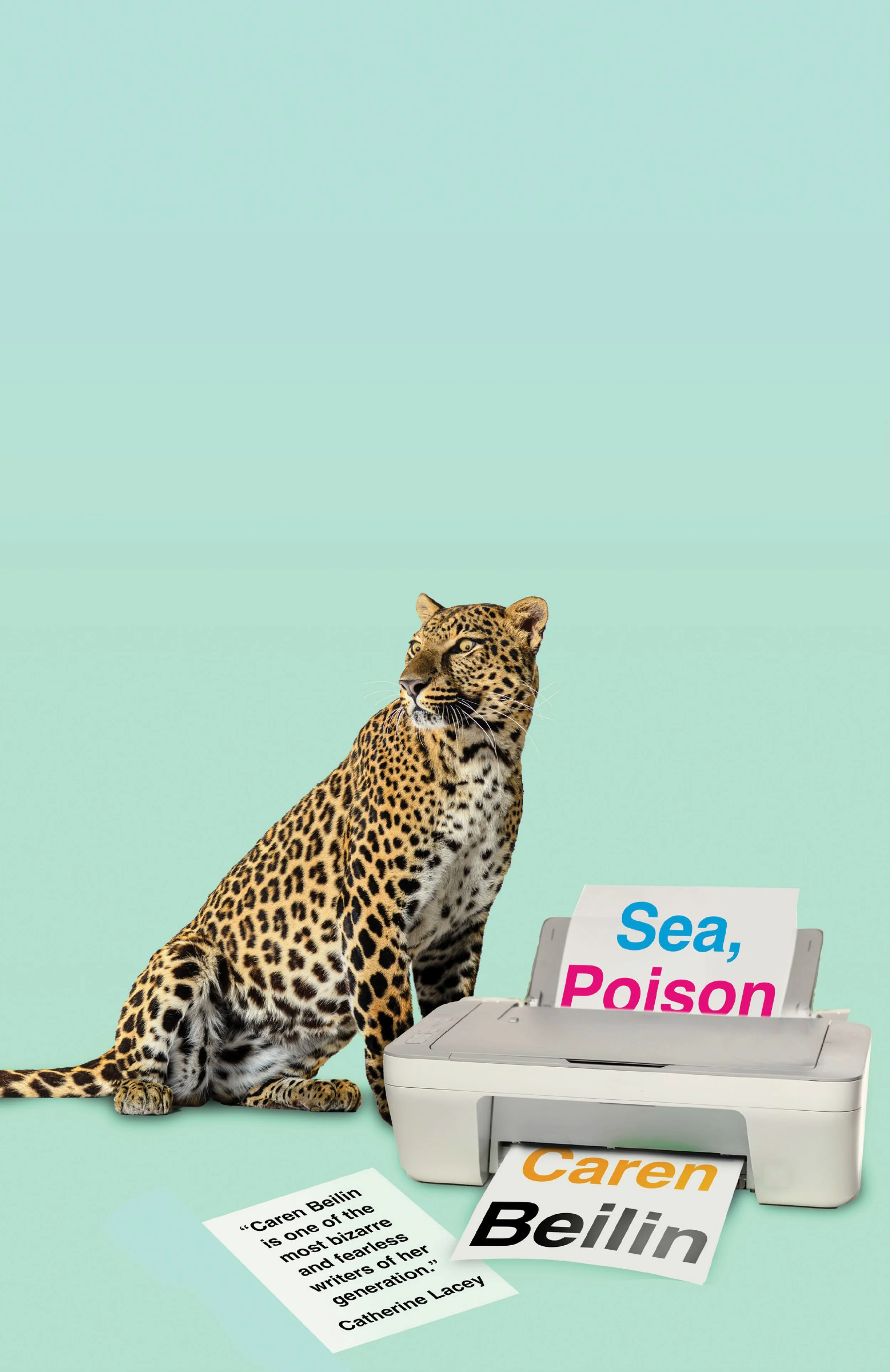
What’s the result? It’s simple: there’s less noise for the brain to process in an otherwise pretty noisy world. The swathes of color and empty space both call attention and offer some respite for the brain to focus on the few, central elements. Using few means, these covers are effective in communicating the vibe of the book, whether it’s tongue-in-cheek humor like on Liquid or Sea, Poison, or uncanny like on The Wax Child or The Lamb.
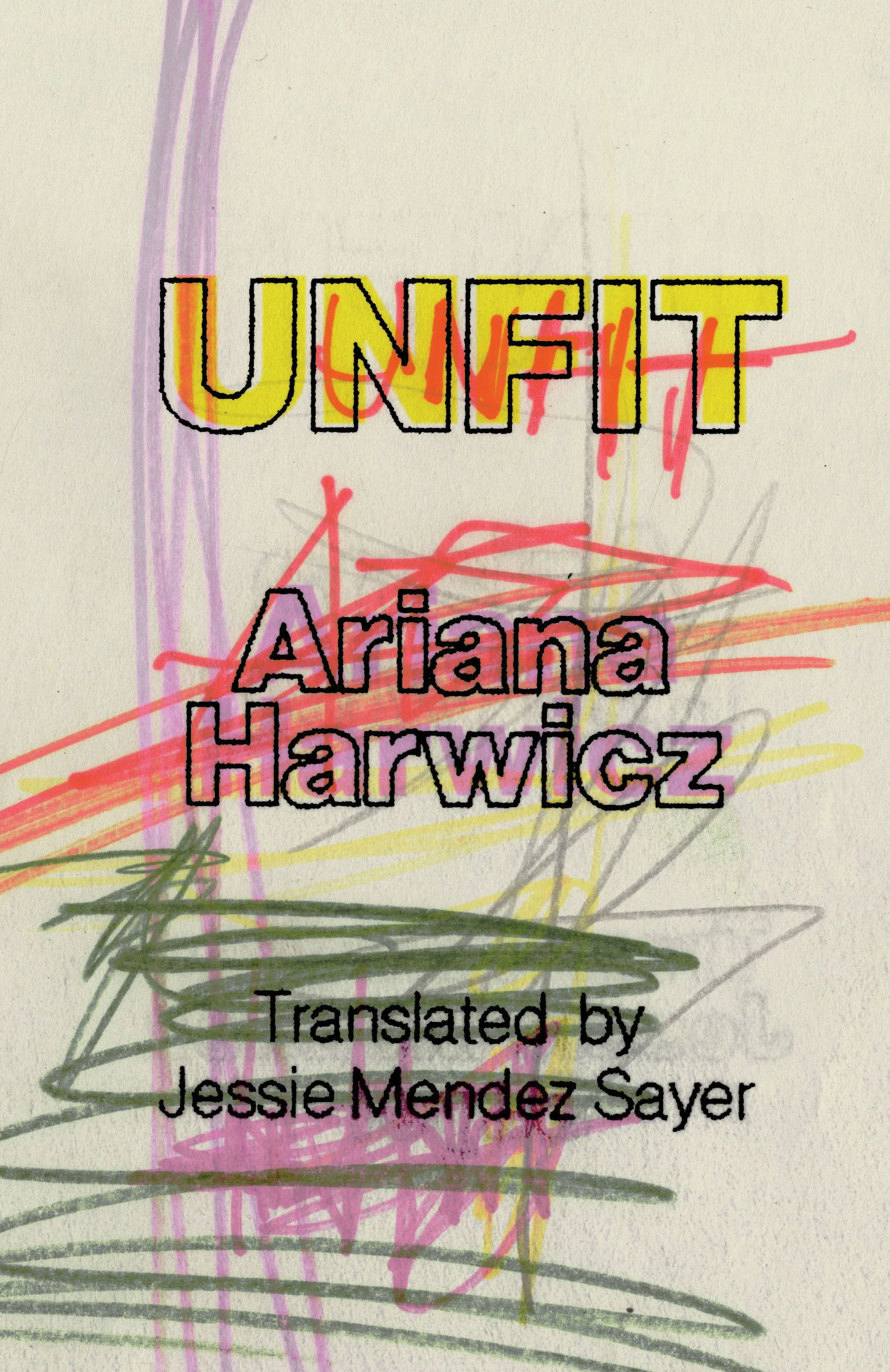
Creative use of fonts
That typesetting is a central aspect of book cover design is nothing new. In 2025, designers kept being playful with the placement and setting of their fonts.
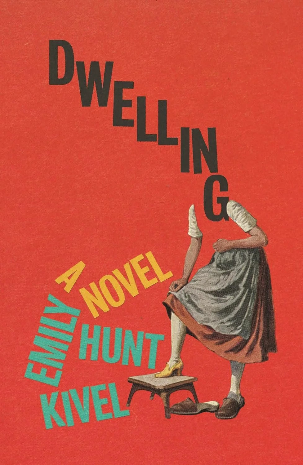
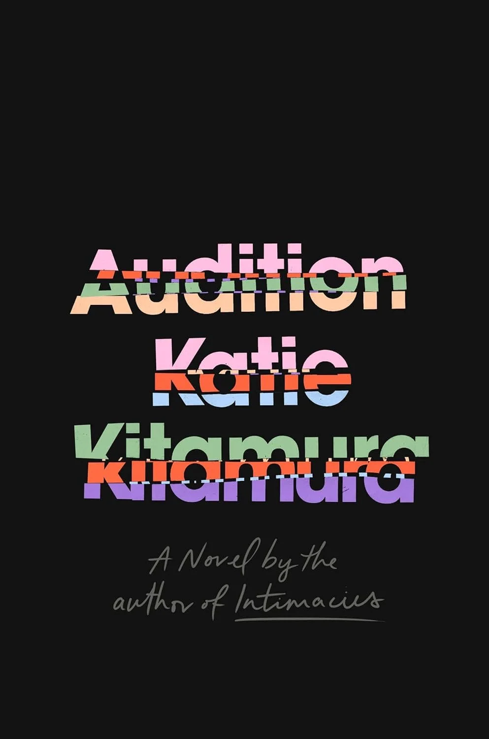
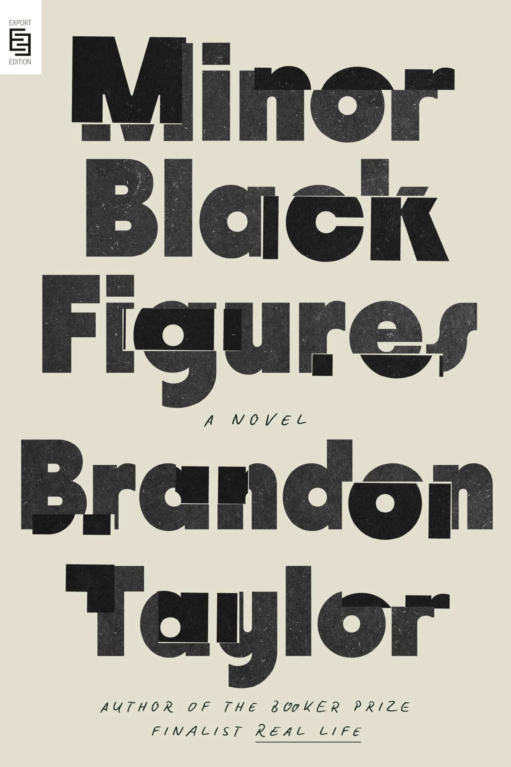
From letters that seem to have been haphazardly strewn across the page, as on Dwelling, to the wax-like dripping letters on Hot Wax, this clever use of misaligned and imperfect fonts is another quiet stance against AI art. By doing the unexpected, it does exactly the opposite of what large language models are built to do: predict the right answer by adding zeroes and ones together. These covers catch our eye because they intrigue and do something new, not because they are calculated to be visually appealing.
Prismatic 00’s nostalgia
On the other hand, we also see a nod to the early age of machine learning with retro covers in prismatic color schemes.


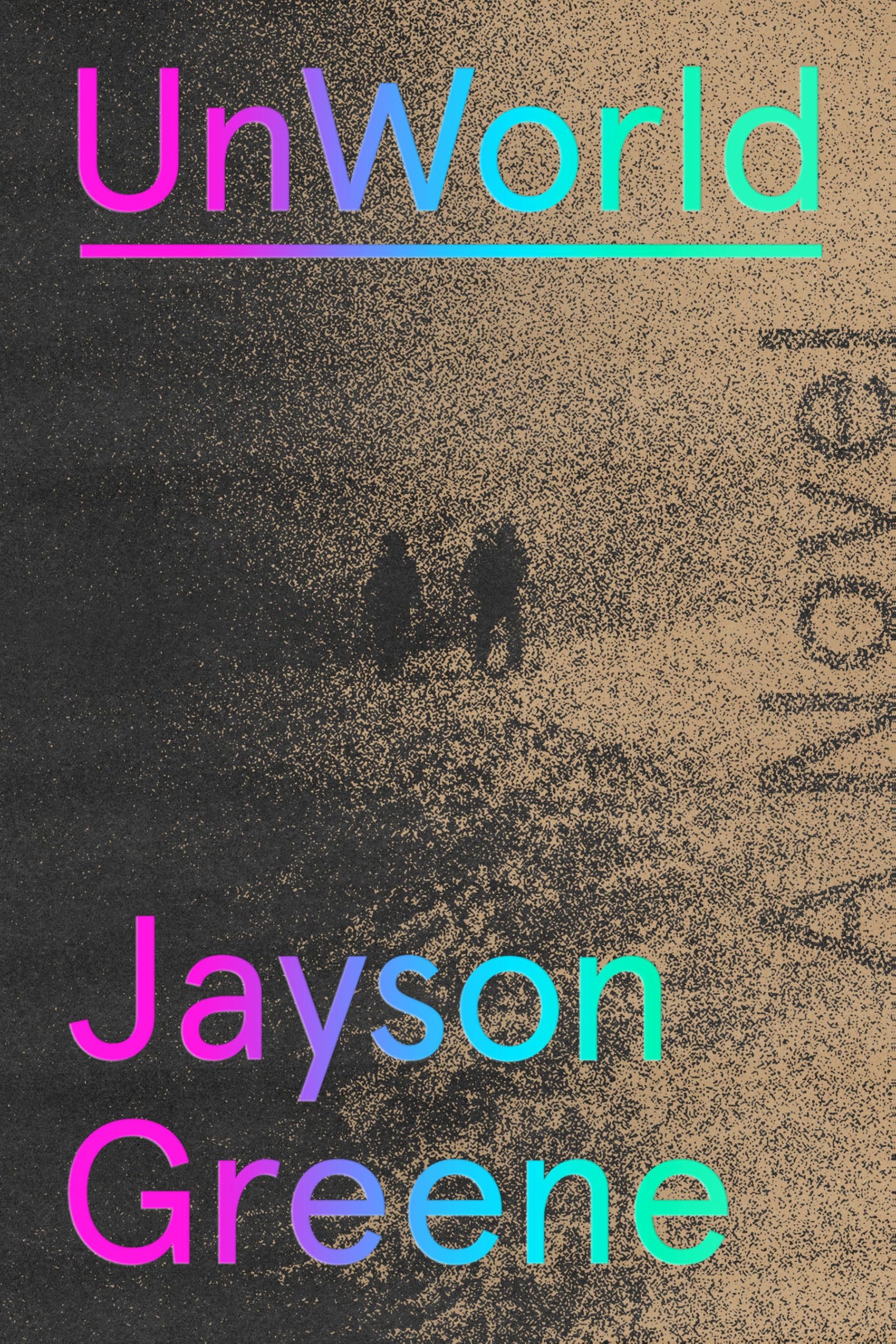
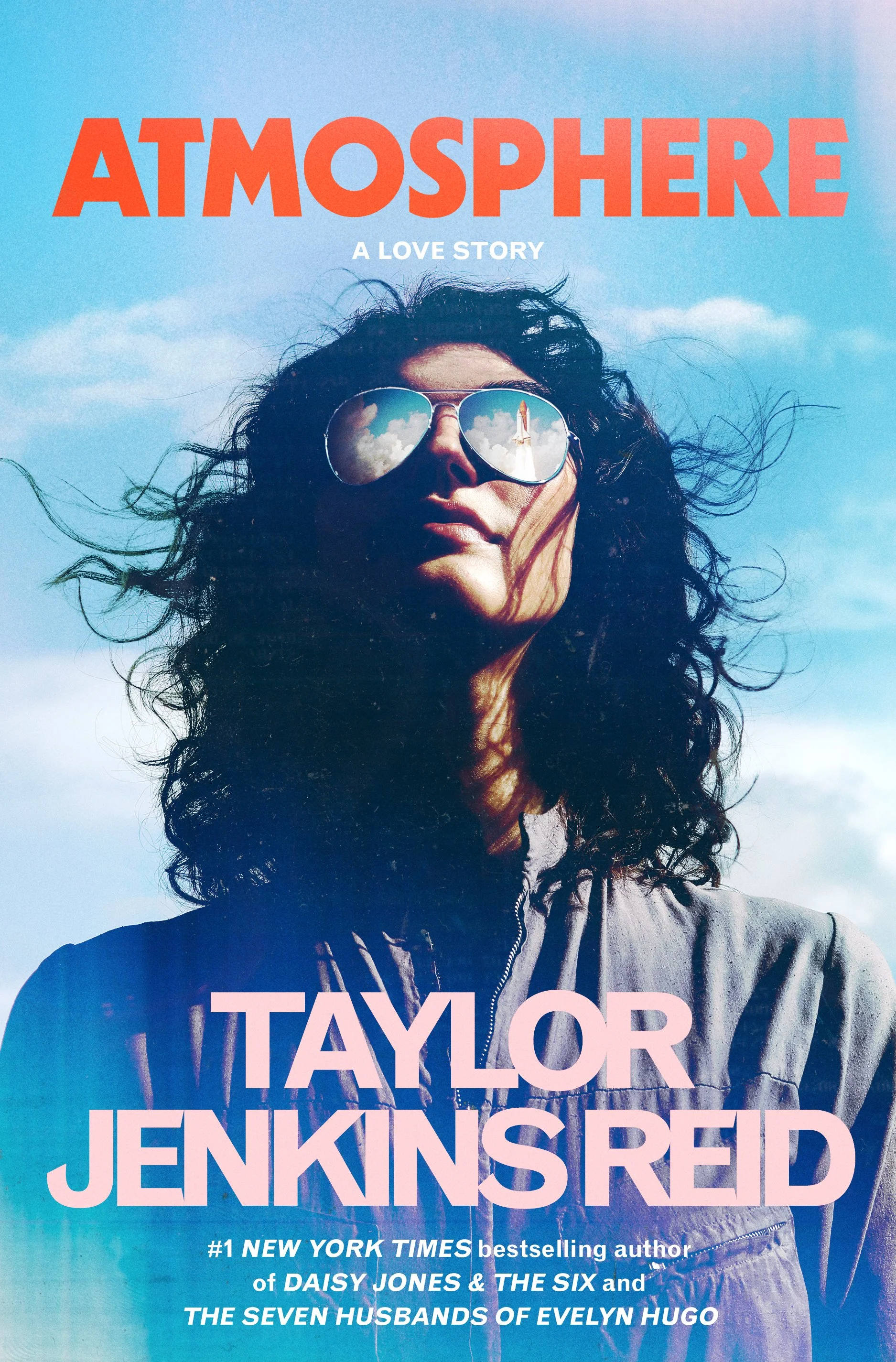
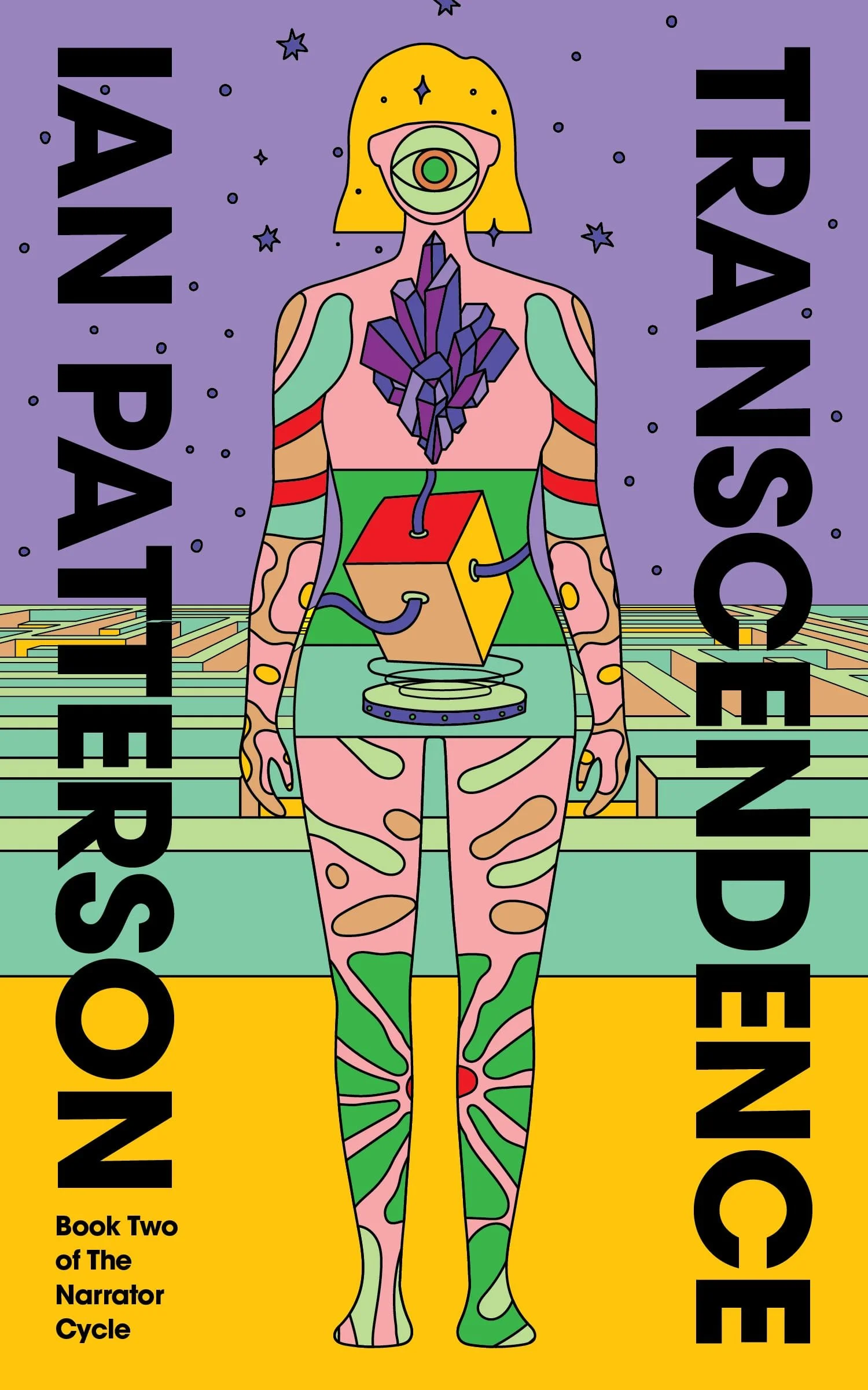
This palette is not just pleasing to the eye, but evokes the times of floppy disks and cassette tapes through their color scheme. They bring the reader back to a time when making a color gradient font was the height of innovation, and when computer graphics could only process so many pixels. From bestseller Atmosphere to the funky cover of Transcendence by Reedsy designer Barış Ş, it’s at once a reminder of simpler times and the hopes we had for what computers could do then, and a stunning design choice.
2026 trend predictions
What many of the covers in 2025 had in common is a sort of reaffirmation of creative, human design. At the same time, it was in constant conversation with the elephant in the room: machine design. And while this article focuses mainly on literary and commercial fiction, there’s no denying that AI we also saw more AI covers and AI design overall in 2025, especially in genres like romantasy, fantasy, and sci-fi.
So, what can we expect in 2026?
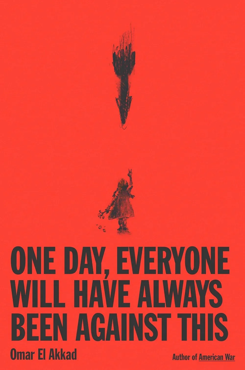
Anti-AI covers
In an age where supposedly anyone — including machines — can write and design books, it’s highly likely that we’ll continue to see similar trends as in 2025: design that elevates “the human touch” and rejects the modern machine world we live in. Think visible brush strokes, imperfect yet purposeful lettering, grain, noise, texture, and an overall emphasis on simple yet hardy and durable craftsmanship. The 2026 reader will want “anti brainrot books” that offer both substance and a respite from computerized information.
This will materialize in a continuation of some of the trends we saw in 2025. AI cannot reproduce real art (though it may try to mimic it) and the choice of what colors and type of lettering to use in conjunction with that art to communicate a message to readers are acts of curation that requires deliberate human design. Likewise, while the plain text on monochrome backgrounds of covers such as Fitzcarraldo may be simple enough for AI to reproduce, it’s the intangible aspects of these covers that it cannot capture: the slightly textured, thick, deep blue paperback cardboard, French flaps and elegant font, the absurd combination of a leopard with a typewriter, the way that text and objects are layered together, and so on and so forth.
We’ll also continue to see nostalgia for pre-computer times or the early internet era, though we may move away from prismatic colors and turn to other eras for inspiration. Why not a Microsoft Paint aesthetic or some domestic 50s and 60s motifs? Or something that recalls comics and Westerns from the 80s and 90s? We may also see motifs from the protest culture of the 70s emerge as books become more overtly political in response to geopolitical developments. Whatever it may be, past trends are bound to come back in modern reinterpretations.
AI covers
Try as we might, though, it’s also highly likely that we’ll continue to see a rising number of covers made by AI — either partly or entirely. Some publishing houses have already admitted to doing so, and it’s definitely a more accessible way for, say, self-publishing authors to get their books ready for publication.
This design will focus on generating elaborate, decorative covers with vivid colors and intricate patterns. Think of the sort of fantastical and kaleidoscopic covers you may expect on a fantasy or romantasy cover. Or visions of intergalactic spaceships and intricate Matrix-worlds on sci-fi covers. But it is also likely that these covers will lack a certain depth in the design. The motifs will feel flat and the font will be placed on top, not integrated with the design itself, unless a human designer intervenes.
As this type of cover increases in presence, we’ll continue seeing design in conversation with or opposition against AI. And so, book cover design in 2026 will remain rooted in the larger cultural shifts we may see in the year to come.
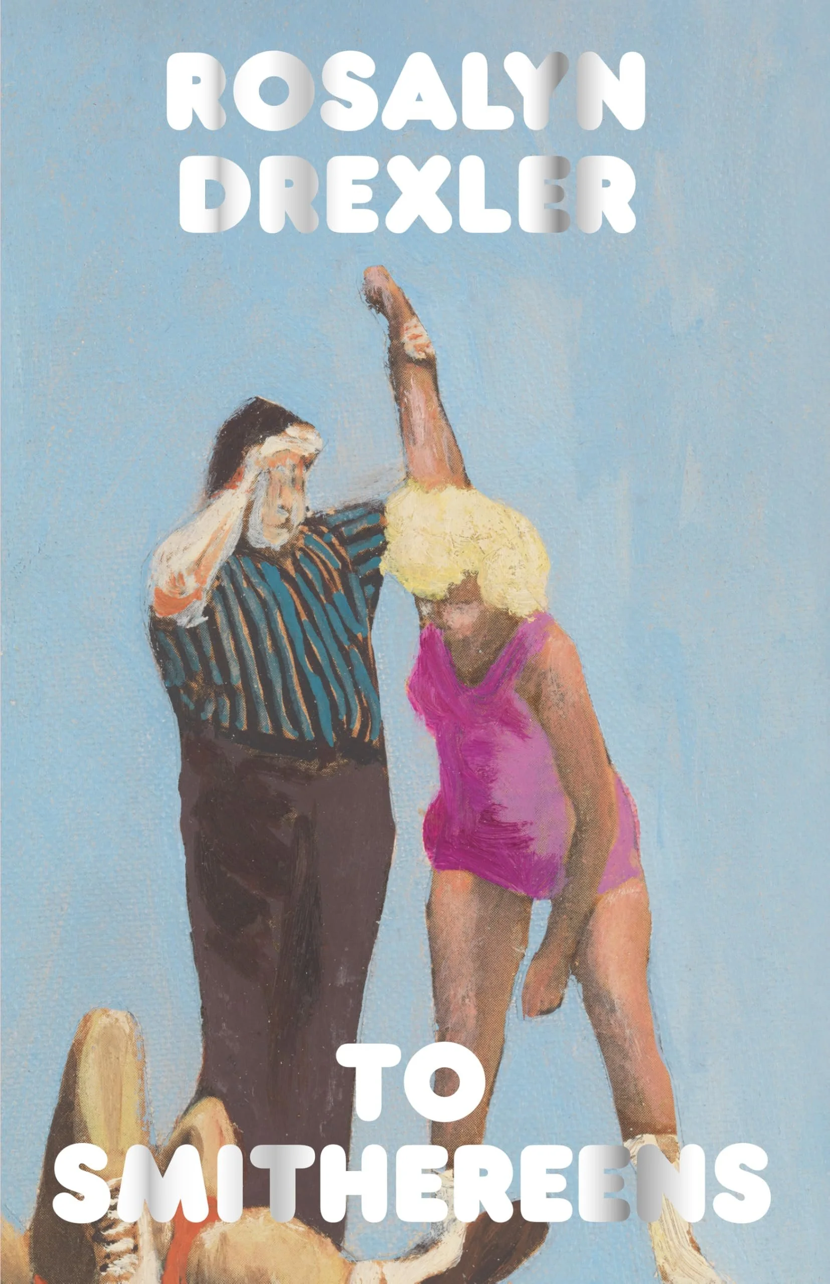
Some additional notes on designers and artists:
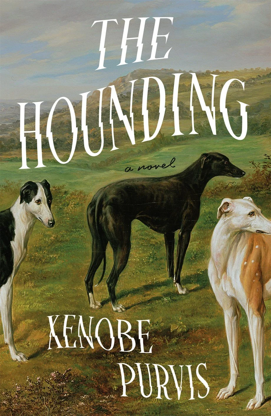
The jacket design for The Hounding was designed by Nicolette Seeback Ruggiero featuring a bucolic painting of hounds by Benjamin Cam Norton.
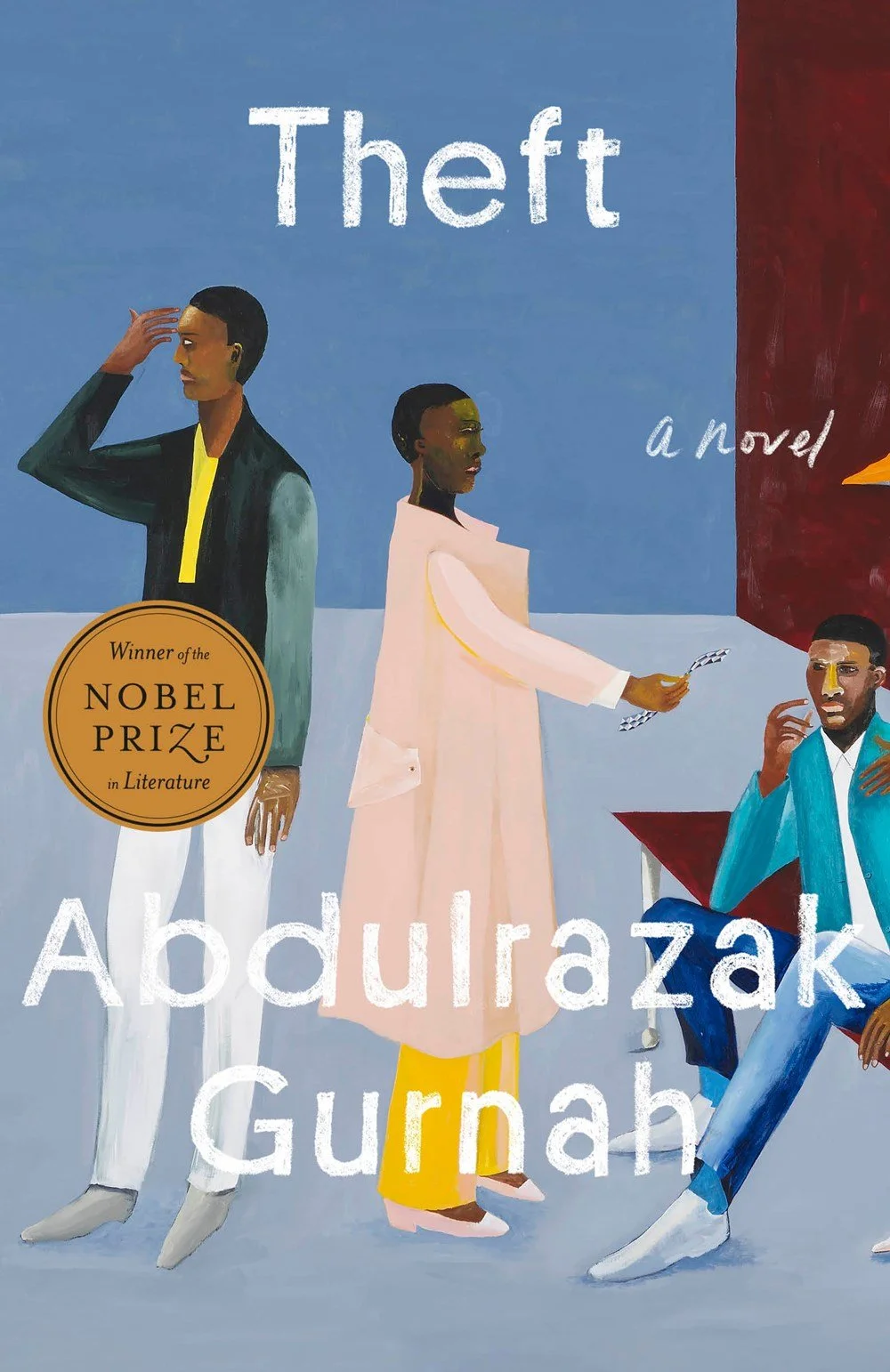
Theft features a painting by Lubaina Himid. This Riverhead cover was designed by Lauren Peters-Collaer
Lauren Peters-Collaer‘s Riverhead cover for Among Friends features the painting “Life During Wartime,” by Bo Bartlett (oil on linen, 2018).
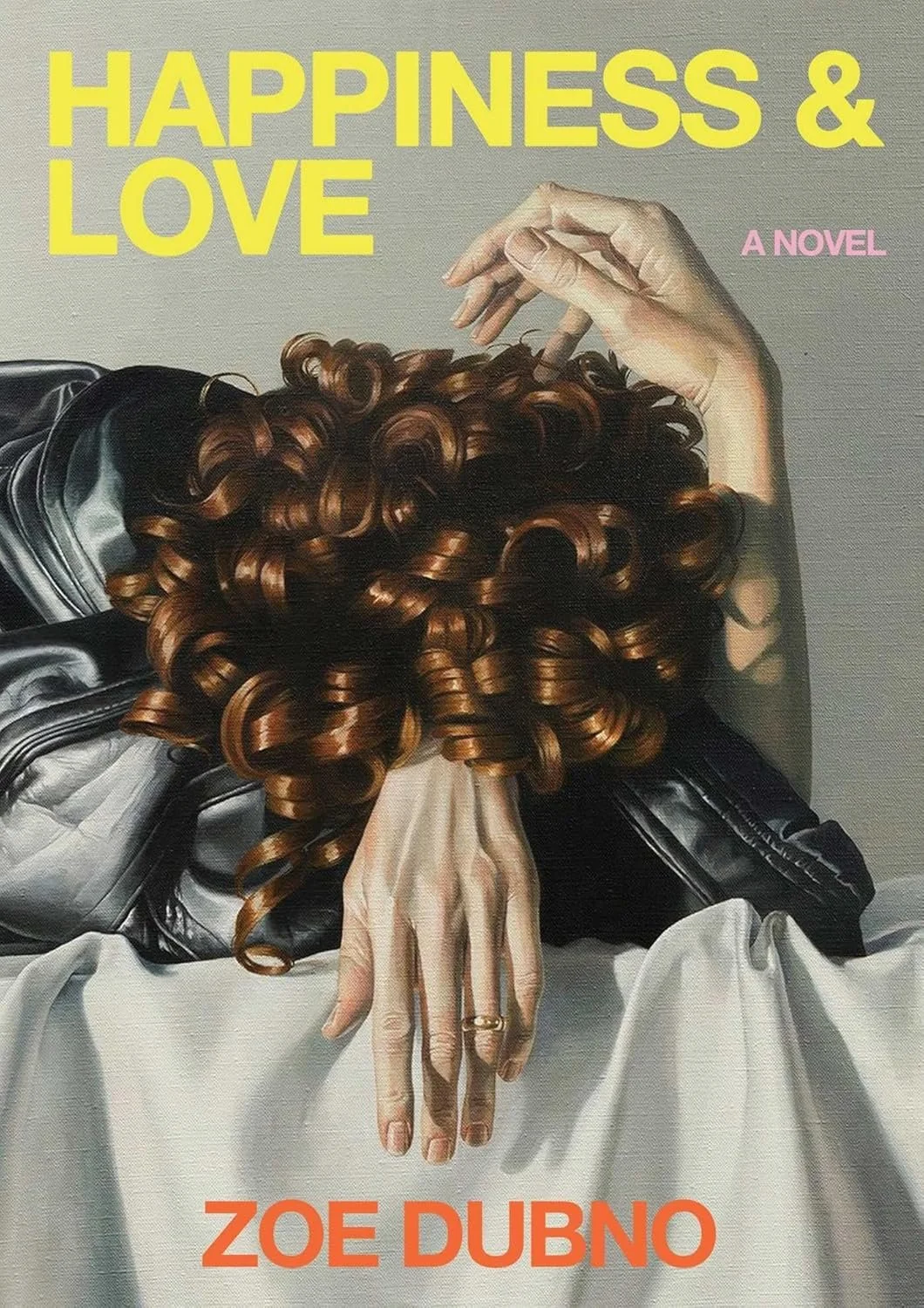
Happiness & Love by Zoe Dubno features a painting by Eunnam Hong.
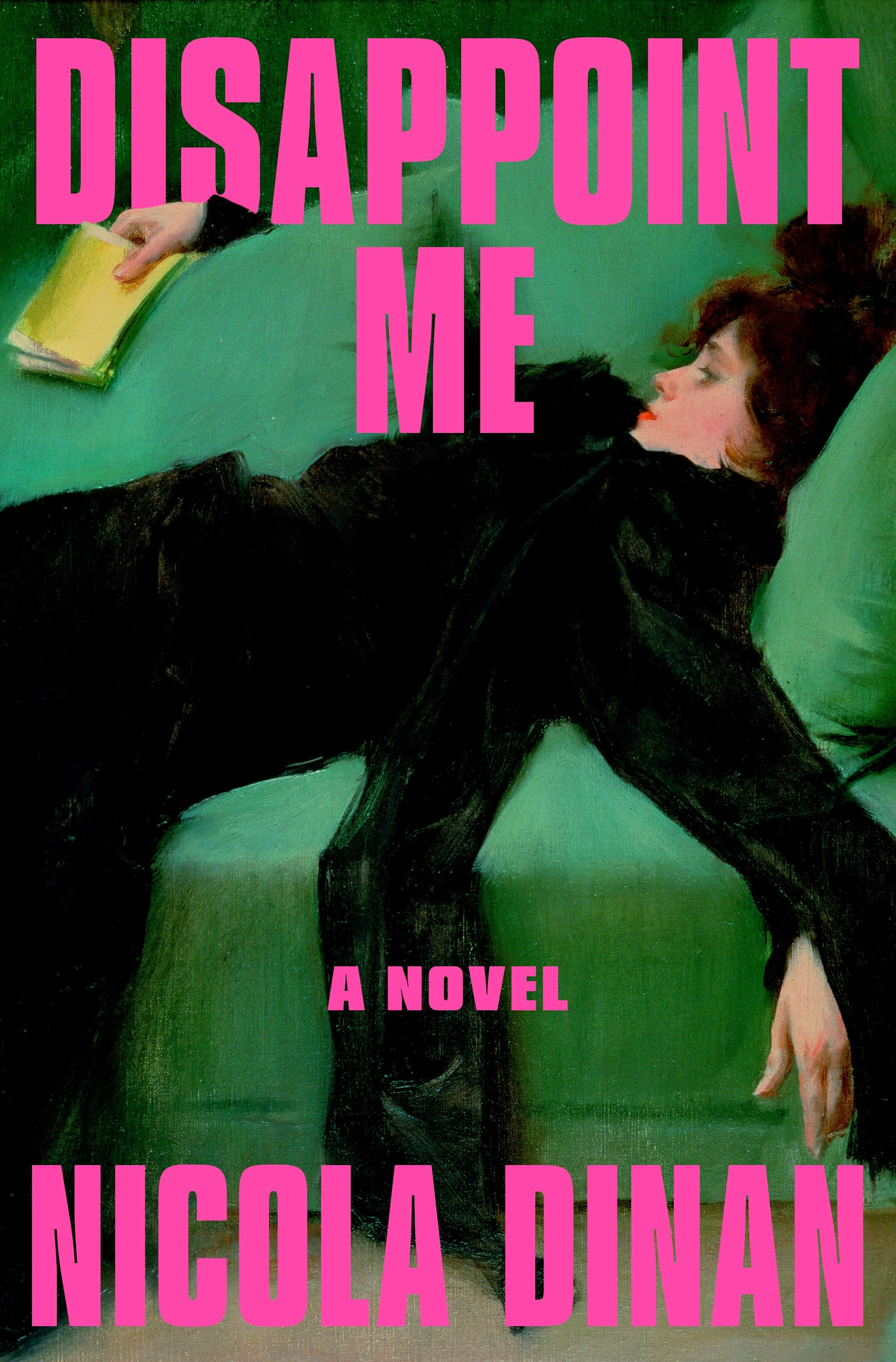
“After the Ball,” by Ramon Casas i Carbo (oil on canvas, 1899) is used on the cover of Disappoint Me, which was designed by Rachel Ake and published by Dial.
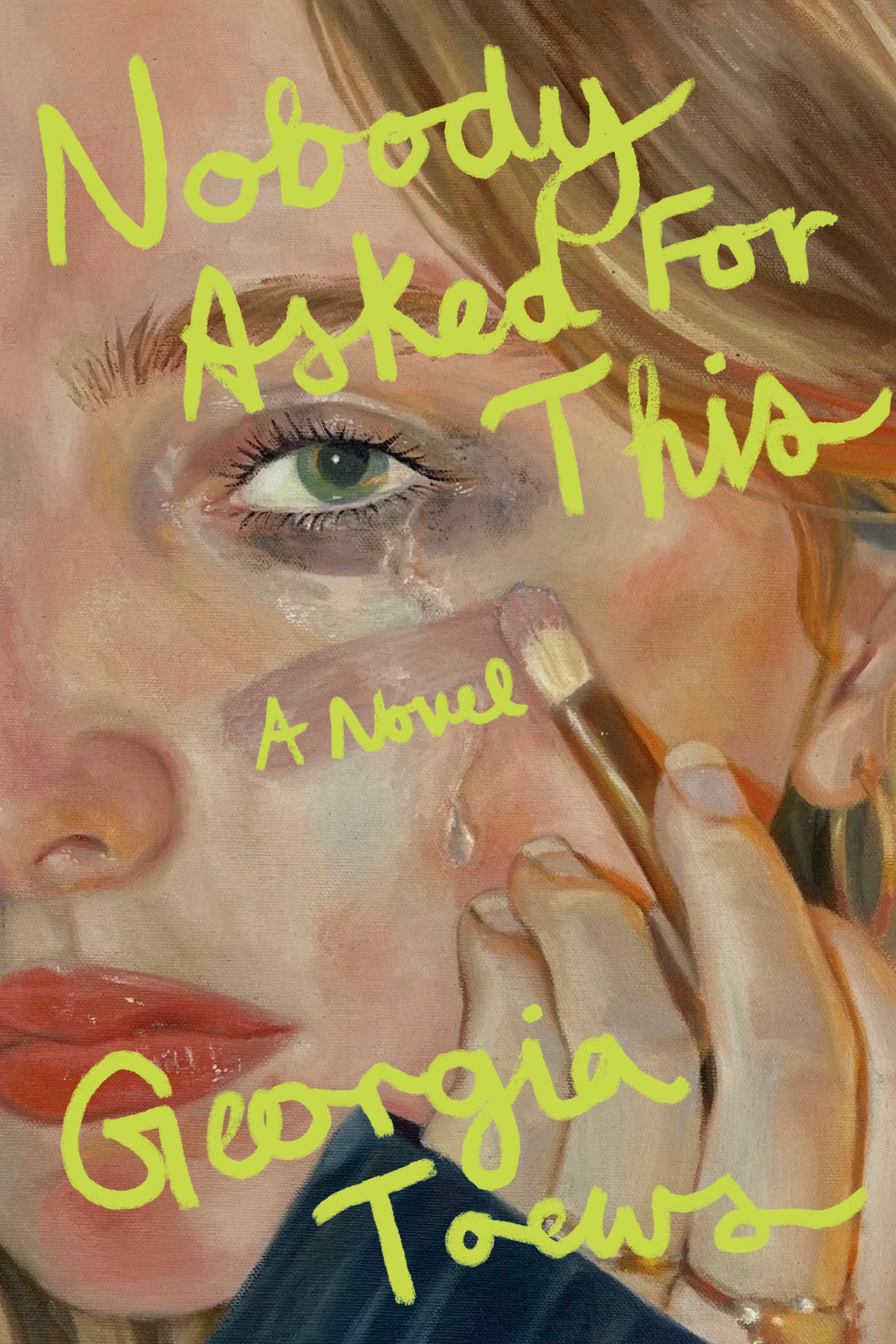
The jacket for Georgia Toews’ Nobody Asked For This was designed by cover designer Emma Dolan and features a painting by 20-year-old artist Ginna Nebrig.
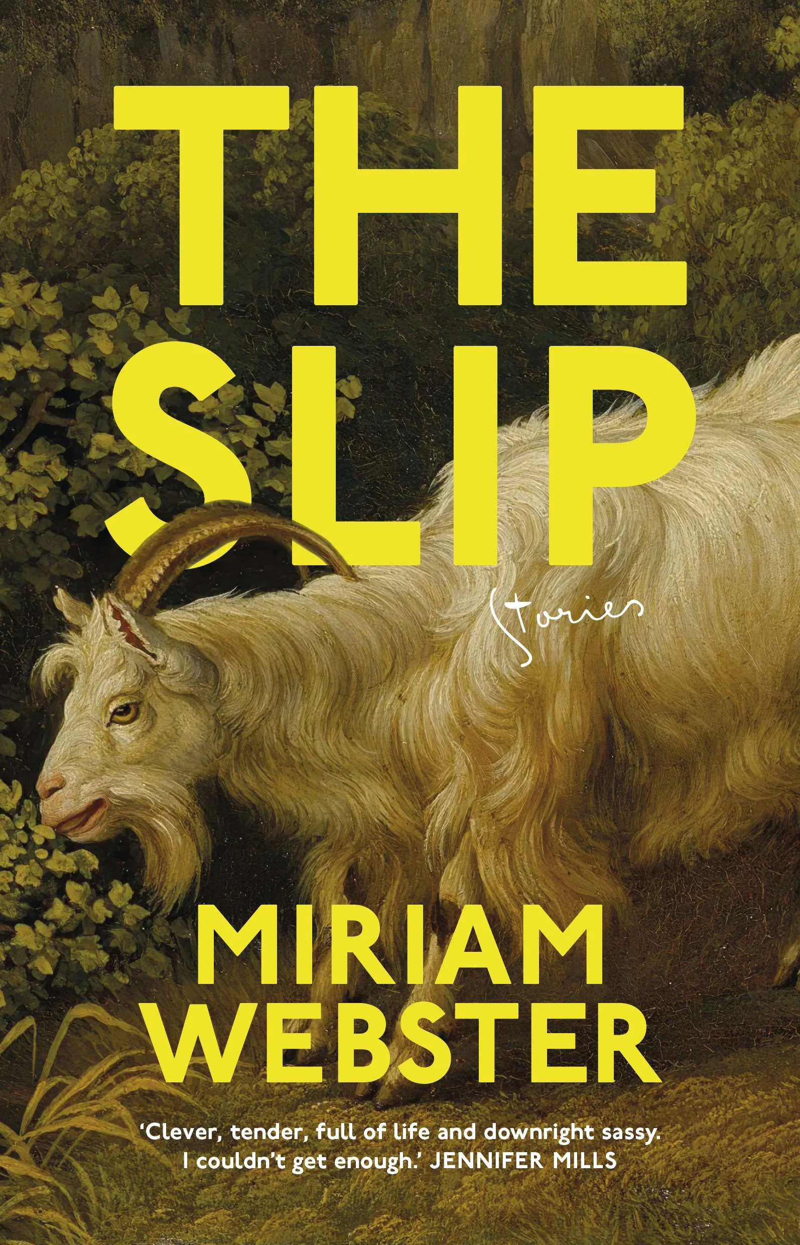
The Slip was designed by Duncan Blachford through the INABC Jobs Board. For a behind-the-scenes look at the creation of this cover, read this article from Spine Magazine.
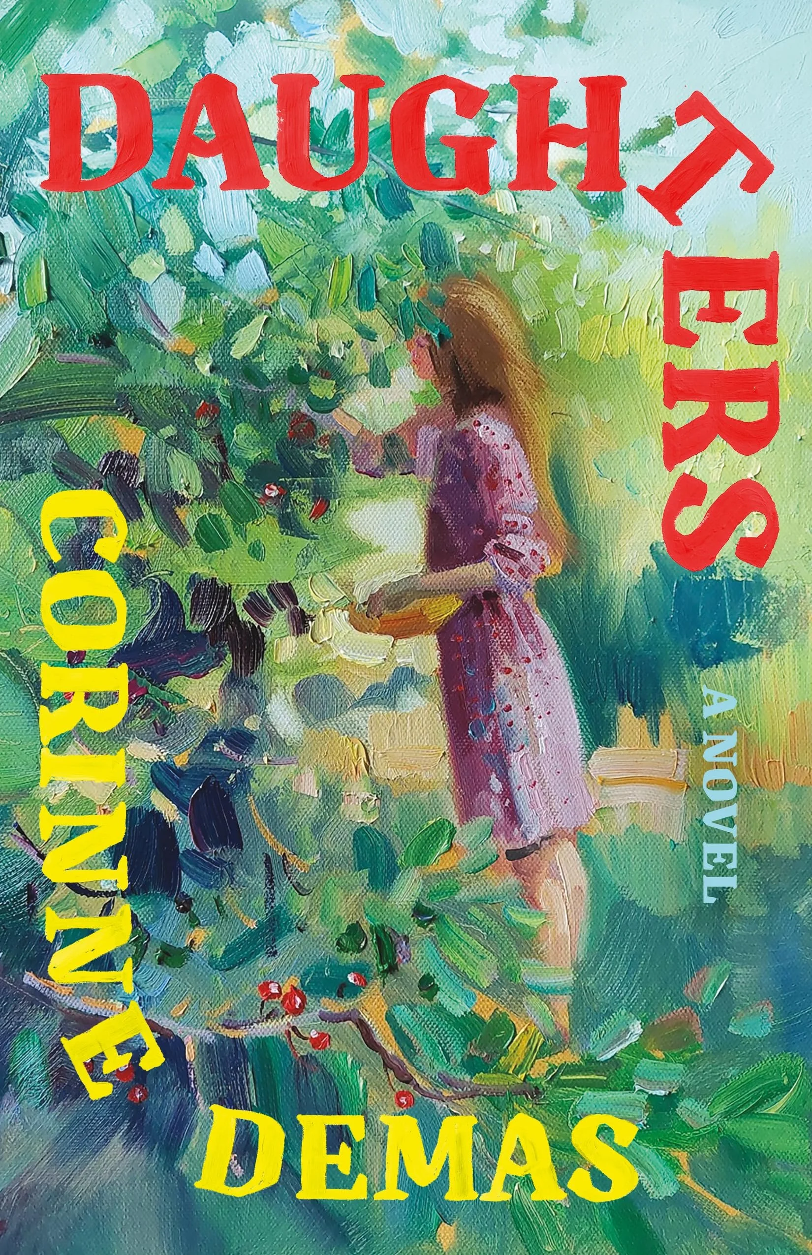
Published by Little A in 2025, Daughters was designed by Emily Mahar and features an oil painting by Katharina Valeeva.
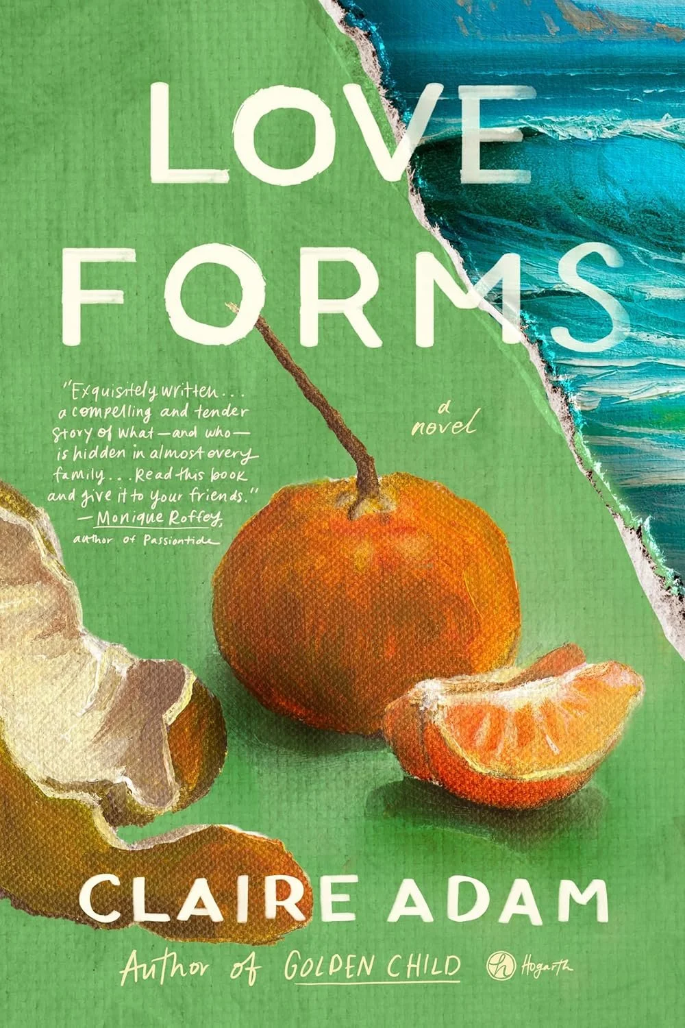
Love Forms (Hogarth, 2025) was designed by Cassie Gonzales Vu.
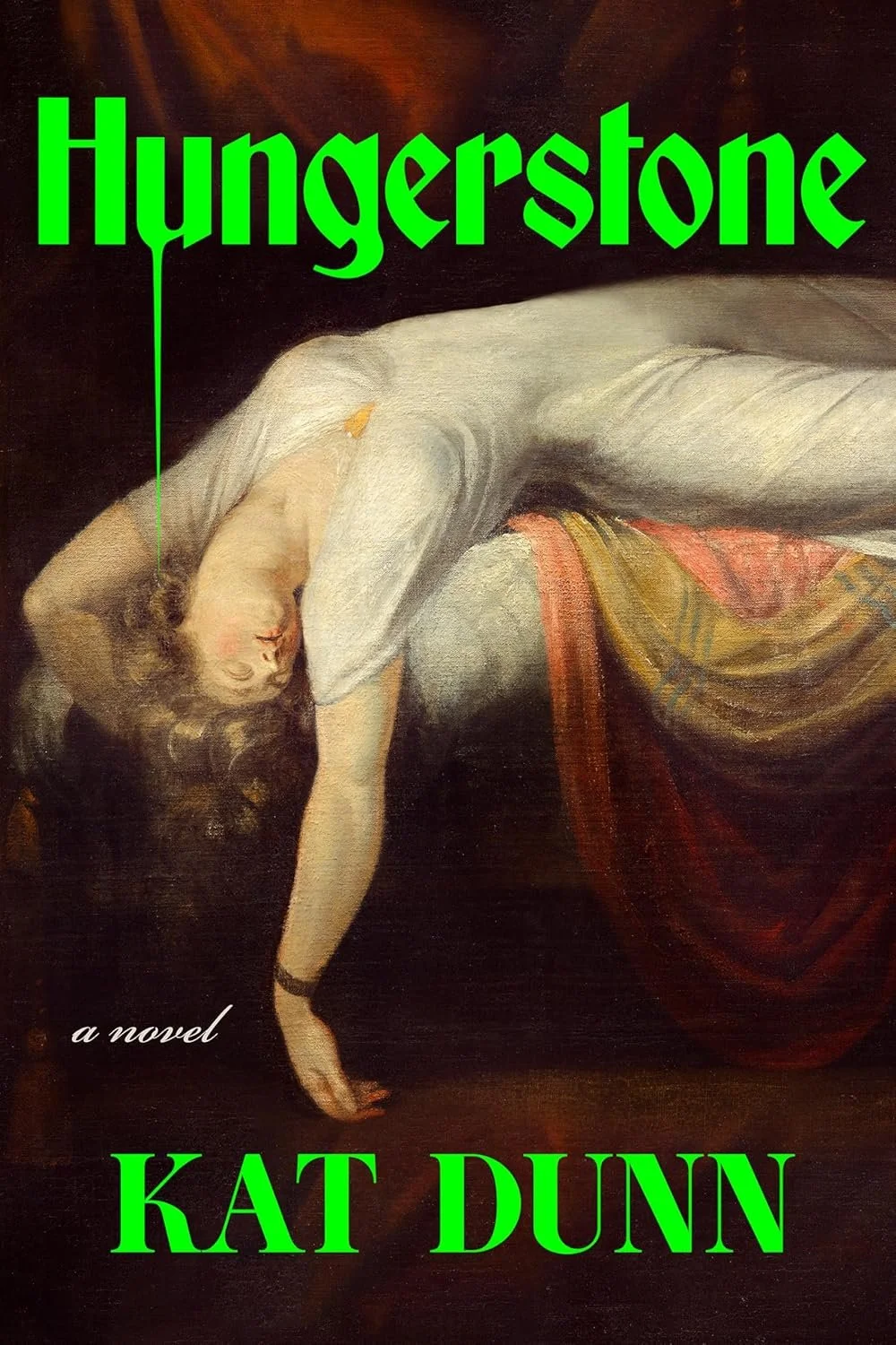
“The Nightmare,” by Henry Fuseli (oil on canvas, 1781) is used on Kat Dunn’s Hungerstone. Published by Zando and designed by Alicia Tatone.
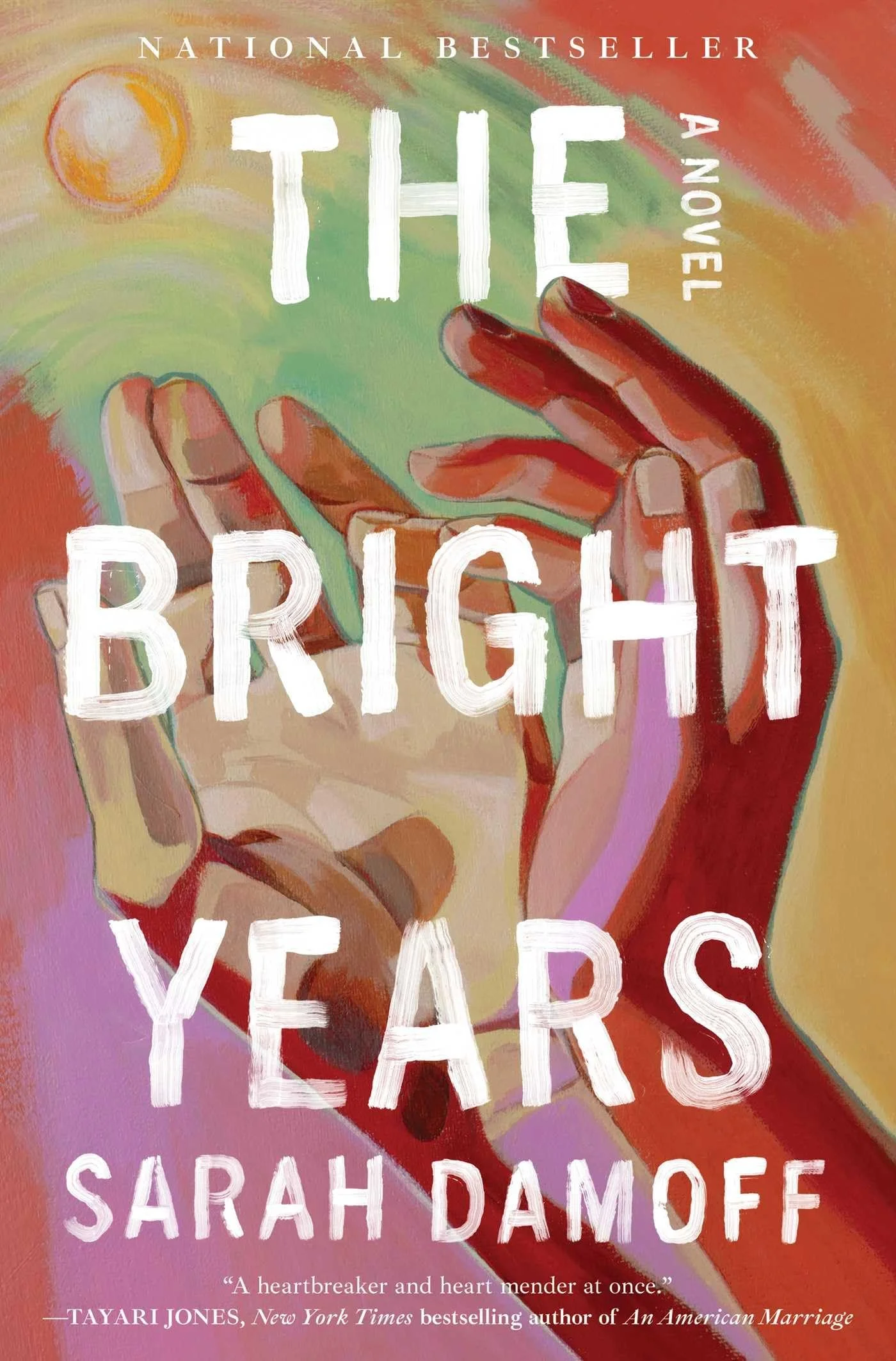
A painting by Young Park was used by cover designer David Litman for the 2025 edition of The Bright Years. Published by Simon & Schuster.
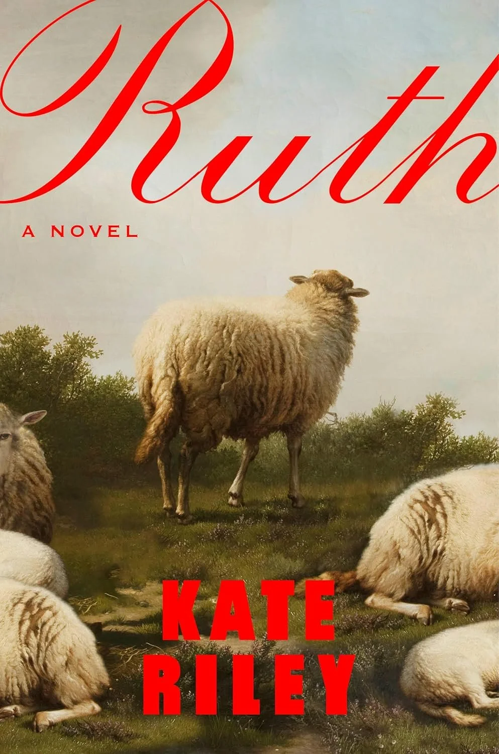
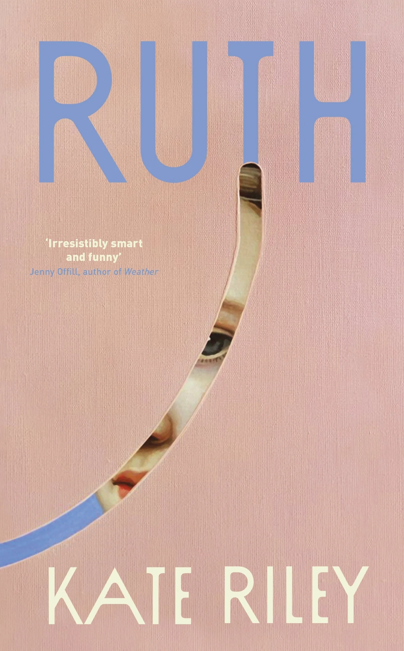
Kate Riley’s Ruth features a painting by 17th century Belgian painter Eugène Joseph Verboeckhoven and was designed by Lauren Peters-Collaer.
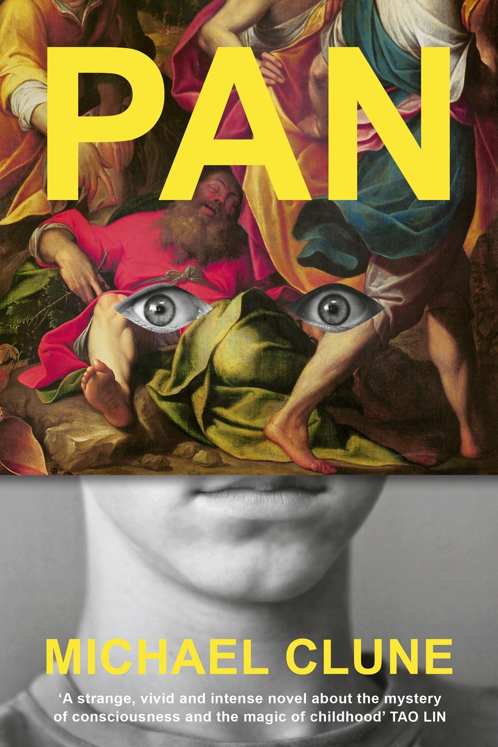
Pan was designed by Janet Hansen for Penguin Press. The top half of the cover features a painting by 15th century Italian painter Camilo Procaccin.
Linnea Gradin is a writer for Reedsy — a website that connects authors with freelancing publishing professionals and gives advice on everything writing and publishing related, and how to get into the publishing industry, from how to become a book cover designer to how to set your design rates, and where to find book design jobs. When Linnea is not reading, she can be found dribbling on the football pitch, dabbling in foreign languages, or exploring the local cuisine of whatever country she happens to be in at the time.