The Illustrator's Practice: Lynn Scurfield

Courtesy Photo
An illustrator’s workspace is both modern and anachronistic: it welcomes the design world’s most innovative trends, all the while honoring the human hand and the old-fashioned, often messy tools at its disposal. Such is the studio of Toronto-based illustrator Lynn Scurfield, whose life-affirming creations make use of both Macintosh and gouache, Adobe and acrylic. In a quiet corner of a quiet suburb, Scurfield illustrates for clients like Macmillan, The New York Times, and The Atlantic, just to name a few. Scurfield calls her workspace a “nice corner of shared living space where outside the window a squirrel comes by to visit often.”
Scurfield earned a B.A. in illustration from Sheridan College and has been working as a freelance illustrator ever since. As far as her creative process is concerned, Scurfield takes her ideas to paper before she tinkers with and perfects them on the computer. Like many of her cohorts, Scurfield uses the time-honored method of pen-and-paper before she moves to the many-marveled world of illustration software programs.
“I usually start my illustrations off by writing down ideas in a separate idea sketchbook and doing more research on the subject I’m drawing for. When I have 2 – 3 solid ideas down I bring them to the computer and really flesh them out,” Scurfield said. “Once an idea has been approved I usually work in a mixture of traditional and digital methods. Sometimes I’ll paint out the majority of the picture using ink on paper, then scan in and finish it on the computer.” The illustrator does, however, admit that close deadlines call for a more efficient process. “If the image is larger on a tighter deadline I’ll build the illustration entirely on photoshop using pre-scanned textures,” Scurfield said. Ultimately, though, Scurfield prefers to allow the errors of the human hand and the kinetics of the human mind to guide her work: “I enjoy having a fluid, spontaneous process because sometimes the little mistakes you make are what really makes the image pop.”
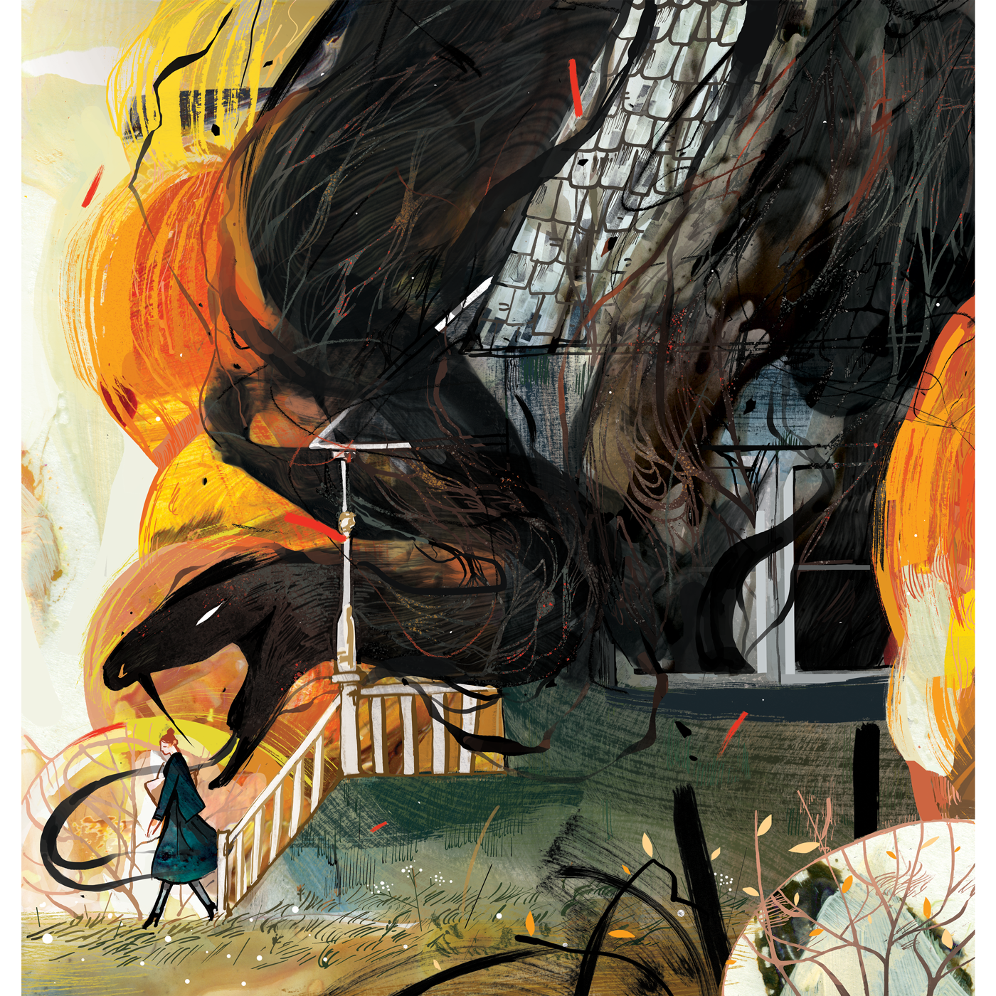
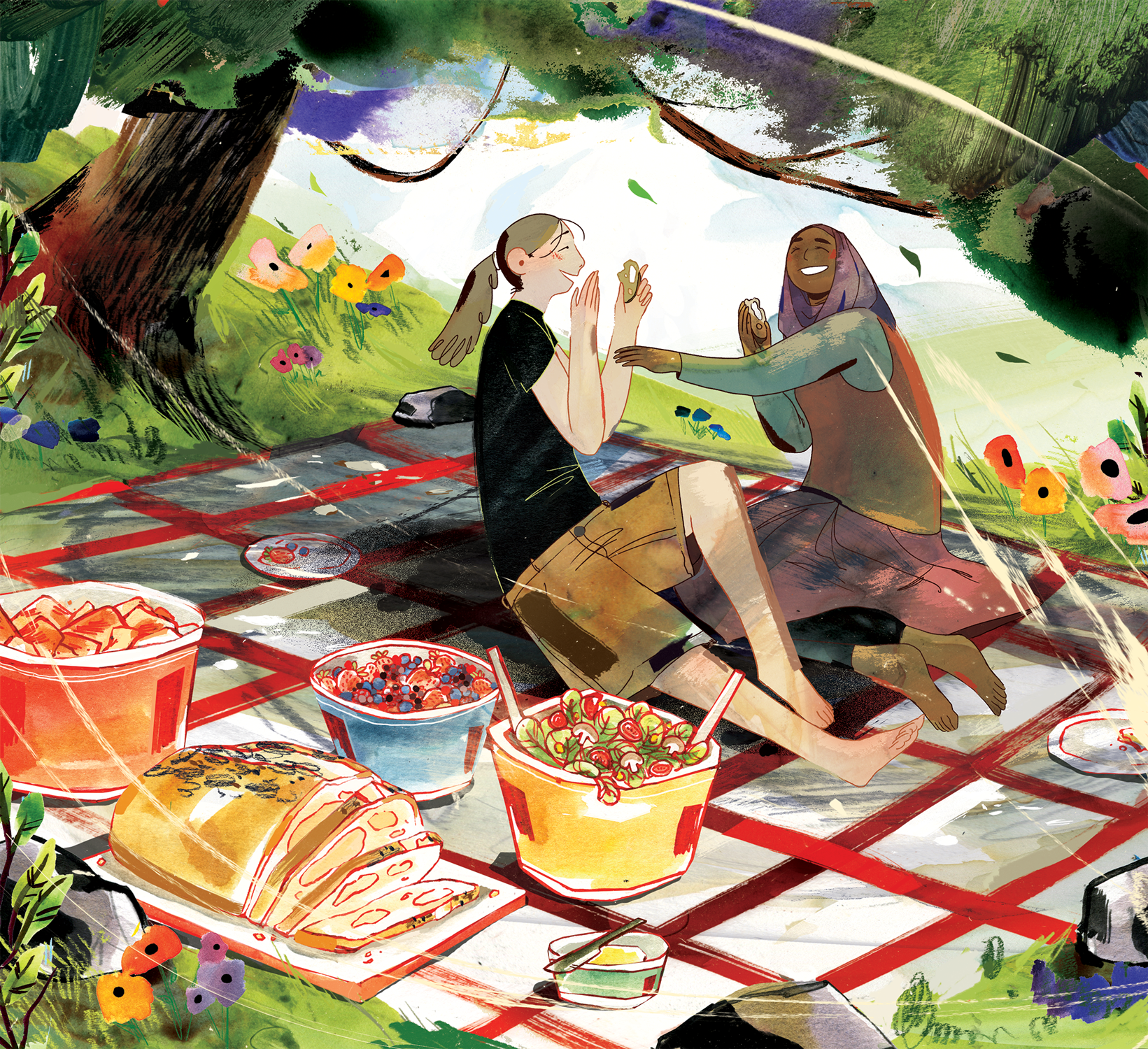
Scurfield describes her illustrations as “emotional, lush and flowing with beautiful colours and bold textures.” We wholeheartedly agree, especially with the word lush. There’s a certain generosity, an excess, a flourish to Scurfield’s work that invites us into the illustrator’s view of the world around her. And what a gorgeous view it is: swirling colors, images within images, and patchwork tributes to the glories of the natural world. “I love bringing a gentle hand to subjects that can be really hard to draw,” Scurfield said. “I’m most often hired for more emotional subjects such as topics on mental and physical health, family and mortality and when you’re making images about emotions you have to think about how will viewers feel when they see this piece. Will they be able to connect with it? Will they be offended by it?” said Scurfield. Maybe what we are seeing in Scurfield’s designs--more than anything else--is empathy, that pulsing, living emotion that says: I see what you see. I feel what you feel.
And it all starts with the squirrel at her window and the pasta sauce jar of blackened paint water sitting by her computer mouse. In this small, quiet space, Scurfield uses the old and the new, the unsettling and the beautiful, to illustrate empathy. Her paramount goal? “I’m always hoping with my illustrations people can look at them and take something personal away from the images.”
Mary Ryan Karnes is a freelance writer and a Master's candidate in fiction at the University of Southern Mississippi.


