Some Things Covered: What Fight?
One morning Eric Wilder sent me an email at 9:00 am. He asked if I had seen a new Guardian article about UK book cover design. Did I mention it was at 9:00 am? I'm not a rational person at 9:00 am, so I knew he had to be serious.
He sent the article, but I was mystified by his urgency, till I read the thing. It was extremely familiar. Some version of this article comes around every so often. To make a long story short, it claimed UK cover design was the envy of the world, and had always been better than US design. And Eric wanted me to pen a rebuttal. I read the piece and sent him my response. I wasn’t interested in getting in the middle of the old rehashed nationalistic argument.
But I was interested in how this article read in 2017. Not only was it outdated, but also more importantly someone outside the book business wrote it. In a time where so many designers are writing about design, this seemed ill considered and uninformed. The piece was reductive and partial. So I'm not linking to it, because they shouldn't get more clicks for trying to put that old wedge between designers already separated by an ocean.
The article was so off the mark that a U.K. designer quoted in the piece felt he was misrepresented. In fact he wrote a wise and illuminating piece I AM happy to link to here. Stuart Bache’s response tells a more nuanced truth about designing in the book industry. It is smart, well considered, and inclusive. It walks you through the variables of what all designers (not just stateside designers) go through to get their cover concepts approved.
The US book design community is small and tight knit. Some might even say it’s cliquish. Regardless, we have a strong affinity for our UK cover counterparts. Our Creative Directors and Art Directors hire UK freelancers. We feature and praise their work in our publications. It’s familial when they come and visit and speak at our design clubs. They are embraced like old friends.
Still we all know that there are differences in our markets and obvious cultural differences that get overlooked when we compare covers across oceans. As Stuart stresses in his piece, the US market are actually the US markets. It has many audiences. It is not one audience. And our designers have to contend with that multiplicity.
So what designers rely on is what we have in common. The majority of US readers are part of a straightforward and casual culture that reinvents itself every generation. We have less fondness for tradition than we do for innovation. And it translates to our design. So the message must be clear and in some way new and fresh too.
One of the unspoken biases in that old debate is that US design is seen as conceptually weaker and unattractive, because it's more commercial. I’m talking of design with lowercase d, commercial design. But commercial design can be many things. It can be conceptual, innovative, and attractive, while retaining accessibility as well.
This informal design is not self-conscious, and doesn't pride itself on being strictly conceptual. Instead it embraces even reluctant readers. Like the US at its best, it's egalitarian and meant for the broadest audience. And yes, it’s still related to conceptual design. In some ways it’s like a hard working more popular cousin. And a good designer is fluent in both design languages and uses them interchangeably. And yes, some of us lean more toward concept while others to accessibility, but no design career is exclusively one or the other.
There is a strong bond between commercial and conceptual design. Despite what some think commercial cover designers are well schooled in iconic and conceptual design. Commercial designers are often the folks that introduce conceptual trends to the mass market. They do this patiently and in small digestible doses, till the entirety of the landscape has taken a step forward in visual expression. It’s not a fluke that commercial covers these days are so damn attractive and more like art objects.
A clear example of the interconnectedness of the conceptual and commercial design is visible in our typography. We can easily watch as it continues to evolve.
Remember how around 2011 covers started to feature more hand-lettering? Pssst, it's actually a nostalgic revivalist trend. Anyway, It was due to a specific generation of experimental cover designers that broke around 2011. That year a lot of the literary and conceptual covers still had digital typefaces. But soon literary had embraced the new “hand-made” look. Here are a few books that show that progression.
Very literary and conceptual in 2011
(Note the san serif digital typeface)

The Pale King
Jacket design by Karen Green
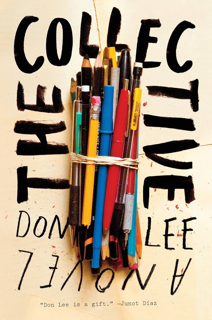
Very literary and conceptual in 2012
(Note the hand-lettering switch)

The Collective
Jacket design by Ben Wiseman
Very commercial and partially conceptual in 2013

Dad is Fat
Jacket design by Michael Nagin
Commercial, less conceptual, and very attractive in 2017
(Note the hand lettering for esthetic only)

The Mystery of the Blue Train
Cover design by Michael P. Correy
By 2013, a few of the most commercial covers (aka celebrity biographies) had taken on the trend started by conceptual covers. But a design like Jim Gaffigan’s cover could still claim the crayon lettering as its “concept” because someone specific (kids) could have written the title, it wasn't just an esthetic choice. And this makes the cover a hybrid of commercial and conceptual.
But now in 2017 you can look at any category and see the purely esthetic influence of the 2011 hand-writers. And how did this happen so quickly even as far back as 2013? It happened because US commercial designers found the trend attractive and started pitching options with hand-lettering right away.
They were then, the same as now, on the cutting edge of what's happening in design.
Join us in celebrating the enormous talent that goes into making books. Consider a small donation to our Patreon fund. Your support helps us provide you with an in-depth look at some of the book publishing industry's most creative people.
www.patreon.com/spinemagazine
Maria Elias lives and works in New York City. Before falling in love with book design she worked in news and magazine. Her work has been recognized by AIGA 50 Books/50Covers, the Type Directors Club, and the New York Book Show. You can read more by Maria Elias on her blog Book Design Heroines.