Steve Attardo on Designing Nicole Dennis-Benn's Patsy

Steve Attardo is Design Director for W. W. Norton. Here he details his process for creating the cover of Nicole Dennis-Benn's Patsy.
I wasn’t in the office when the finished jackets for Patsy arrived. The first time I saw them they were stacked neatly next to my keyboard on top of a few other hot-off-the-press jackets. I immediately inspected every line, felt the paper stock, ran my hands over the surface and exhaled in relief. Then smiled and wrapped every book on my window ledge with them. A wall of Patsy! This one was special for me. I started drawing its roadmap years ago, navigating conversations about race and sexuality, and sketching ideas that would be creatively challenging to myself and potentially for the company. I know I’m not curing cancer behind my iMac over here, but as I held this piece of paper soaked with vivid violet, orange, and red inks, I felt the weight of holding something I knew would be important to so many individuals. A portal to transport them into an imagined world where they would meet people whom they needed to meet. People who would help them find some inner peace and a place to channel their emotions, suppressed and otherwise. A tonic, in some ways, to the insensitive and close-minded chatter that serpentines it’s way through our society. When the design process began, I knew I needed to work from a place of authenticity and acuity for how we currently talk about love and equality. When the process ended however, I wondered, did any of that even matter?
Nicole Dennis-Benn first came to Liveright with her Debut novel, Here Comes The Sun. Right away, I knew she was a special writer. While I am not even close to an expert on the art of writing a novel, I do read a lot. I've trained myself to pick up on important details within the first few pages of a manuscript. With …Sun I was transfixed immediately. Intertwined within the fluid yet textured dialogue was a vivid description of details which gave me a picture of Jamaica you don’t see in the ads. The color, pattern, emotion, and heart of Nicole’s voice reverberates in a similar way that a beautiful photo stays with you in your mind or a great song sticks in your head. My editor believed in her and the story she felt compelled to tell. What Here Comes The Sun did, and what Patsy does to the next degree, is tell a story that is intimidating to tell and does so with the eloquence and composure that can only be described as a gift. I really wanted to impress her.
Patsy sparked a creative energy in me that challenged me to think outside of my comfort zone. The work is vivid, yes, but the content of this book is bold and I knew it would reach people in a very meaningful way. I thought about this jacket for a very long time before the actual work even began. In fact, as soon as we acquired the book, I talked with my editor at length about the importance of a writers second novel and the challenges we would face in the marketplace publishing a follow up to a debut charged with questions of race, sexuality, and motherhood. Does the jacket tell a story of both abandonment and deep love? Should we aim to portray sexuality and heartbreak? Do we emphasize two worlds colliding? Just how much of this story we should tell? Time would answer these questions.
One of the first design decisions I had to consider was how this jacket would connect with Here Comes the Sun. We didn’t want to go straight for a “series” look but we had already built up so much equity with her first novel that it made sense to see how close we could get without feeling lazy or too derivative. I happily went back to Jen Heuer, the designer and artist I collaborated with for …Sun and she got to work making more masterful art. I also tasked a designer in-house to read the manuscript and come up with something completely different than the first book. Fresh eyes! Around this time, Sarahmay Wilkinson joined my team at Norton so I thought, why not ask her to work on this too? And finally, I had so many ideas at this point that I worked on my own designs. All told, there were easily over a hundred covers I looked at to present. With prose that had so much life I wanted to embrace as much diverse creative energy as possible.


I was all in on experimentation mode. Beginners mind. If the work felt like something we’d done or seen before, we’d save it, put it aside, and kept going. Fast forward a few months and we started to dial in on a few basic directions which were mostly by Sarahmay and myself (and one butterfly direction from Jen that I couldn’t stop thinking about). Eventually, I booked a conference room one evening and we filled a giant table with print outs of our work to present to the editorial and sales teams. They said some things and we went back to our desks to keep pushing. The challenges I anticipated from day one of working on this book had come into view, but it was exciting. I knew I was working on a book that had potential to be on thousands of bookshelves across the world and if it meant keeping the motor running a little longer, then, that’s what we had to do.
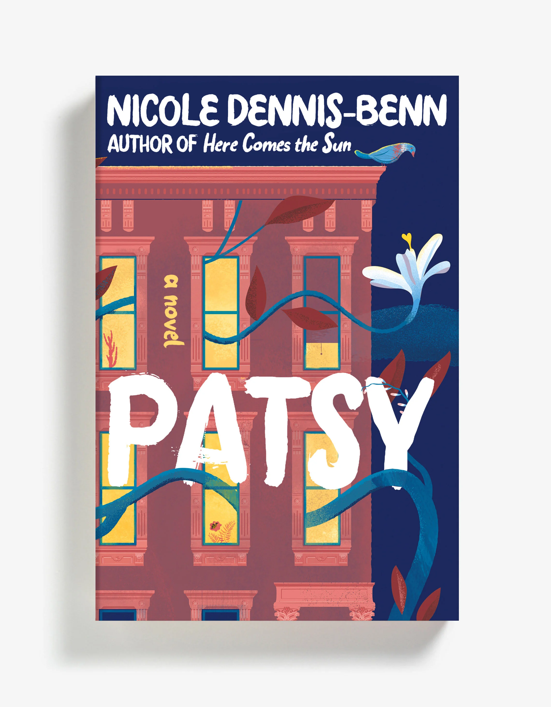
The actual designs ranged from straightforward ideas executed in unexpected ways to conceptual iconography overlaid with bright patterns. I think Sarahmay explained it best: “We chose hand lettering as a nod to Nicole’s last book and vibrant colors in an attempt to convey not only a sense of place (the colorful worlds on Jamaica & Brooklyn) but also the intensity of emotions and experiences explored in the book. The color was not intended to be as much uplifting as it was to be arresting. The complex layered illustrations mimicked the feeling of overwhelm and chaos Patsy is regularly immersed in.”
Ultimately, we decided that locations had the broadest appeal and as mentioned, color was very important. Color allowed us to strike the tone we liked so that it just felt strong without being too heavy handed on the concept. It is vivid, textural, and communicates a tension that is also somehow tender and warm (Anyone out there with a broken heart?). It shows worlds colliding. It reverberates.

Final Cover
The approved cover is successful for me because at first glance, it’s appealing colors and juxtaposition of stamp-style illustrations make me curious. I feel like I’m looking through the palm trees at an exotic world, much like Patsy felt. The harsh edges of the art meshed with the painterly typography makes this cover feel like a tactile piece. What also works, is the restraint. No people, no relationships, no Tru, no Patsy, no lovers, no separation. As a narrative tool, that’s powerful. I look at this cover and love it because of what it doesn’t say.
So, did the approach matter? I’d hear you out if you said “no” but that’s the beautiful thing about the work we do. It’s all about process. The mini-steps and the major leaps. The collaboration and collision of all different processes and parameters. The marks we make on the page and the ones we don’t. If you change any part of that equation the trajectory of your work changes completely. So, while the emotionally charged details make for a great source of inspiration, they will tastefully remain tucked between the boards inside Nicole’s world. Maybe if I have the opportunity to work on her next book, we can do this dance again.