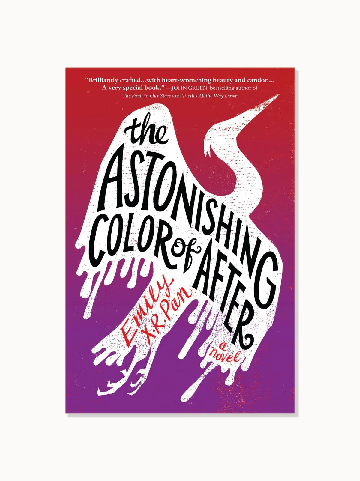
2018 Book Covers We Loved!

It’s been a beautiful year for book cover design and here we look back at all the greatness that 2018 had to offer!
The full list, along with the video highlight, is comprised of a selection of covers reviewed by a panel including book cover designers Nicole Caputo, Cherie Chapman, Holly Dunn, Erin Fitzsimmons, Vyki Hendy and Eric C. Wilder, as well as authors Kris Waldherr (Doomed Queens, The Book of Goddesses, Bad Princess, The History of Lost Dreams) and Janet McNally (Girls in the Moon, The Looking Glass).
Here are book covers we loved that appeared on book shelves in either the U.S. or U.K. in 2018. This list is in no particular order. Creative credits are listed below.
As with any cover design we feature in our publications, we encourage you to head to your local library and/or bookstore to view the work in its full splendor when possible.
Special thanks to She Design Books and The Casual Optimist, as they have been an invaluable resource to when considering our Book Covers We Love lists throughout the year.
THE FULL LIST
VIDEO HIGHLIGHT NOTES:
Vyki Hendy, Cover Designer, Design Editor SPINE Magazine
THERE THERE
Design: Suzanne Dean
This cover blew me away as soon as I saw it and it's stayed with me all year. I love the way the type interacts with the illustration, as well as the homemade printed feel. And it proves that you only need one or two strong colours to produce a visually stunning cover.
Cherie Chapman, Cover Designer
CHILDREN OF BLOOD AND BONE
Design: Richard Deas
I love how this whole cover works as one piece. A strong striking illustration, with a limited colour palette to set the mood, and just how the type sits nicely within the top half. This cover always stuck with me every time I saw it in a book store or online. It is rather stunning.
Nicole Caputo, Creative Director Counterpoint Press, Co-founder of She Designs Books
IN PIECES
Design: Anne Twomey
When I was thinking about the multitude of beautifully designed covers that have illicited a response from me over this past year, In Pieces by Sally Field designed by Anne Twomey kept coming to mind.
The photo by Harry Langdon Jr, taken in the 70s captures Sally’s vulnerability which works perfectly with the title to draw the reader in and to let them know much will be learned by opening the cover. With beautiful restraint, advocating for minimal well placed typography, Anne Twomey created a compelling design that I believe is irresistible to viewers on screen or across a crowded shop.
Janet McNally, Author
THE LOOKING GLASS
Design: Jenna Stempel-Lobell
Yes, I chose my own book cover! I couldn't have picked another top favorite because I love this one too much. It's such a strange and wonderful (but scary) thing: turning your story into an actual book, an object in the world. I always love the work of Jenna Stempel-Lobell (who designed and illustrated the cover of my first book), and her design style worked so well with the delicate illustrations of Hsaio Ron Cheng. I love the colors, the lettering (that's Jenna!), the way it says "ballet" and "fairy tales" without, you know, actually saying it. I even changed the color of a butterfly inside the book from orange to yellow once I saw the cover. ;) It feels like the right cover for this story; the inside matches the outside.
Kris Waldherr, Author
MELMOTH
Design: Peter Dyer
Melmoth is a very loose reworking of Charles Maturin’s 1820 Gothic novel Melmoth The Wanderer. I loved how the cover design utilizes handlettered script and irregularly weighted fonts to reference its nineteenth century inspiration. Yet the black and blue illustration surrounding the bold lettering is strikingly minimal and modern, suggesting that Melmoth isn’t your usual Gothic novel. All in all, the cover has an air of mysterious beauty that makes you want to pick up the book to find out what the deal is.
Eric Wilder, Cover Designer, Publisher Spine Magazine
LIVE BLOG
Design: Nicole Caputo
Of all the covers that graced this year’s bookshelves, It is my opinion that none have been more striking than Nicole Caputo’s design for Megan Boyle’s novel, Live Blog. The color moiré, quasi-lenticular patterning, and embossed printing work in concert to create an electrifying image.
Erin Fitzsimmons, Cover Designer at HarperCollins Children's Books
THE HAZEL WOOD
Design: Jim Tierney
Very few covers stood out and influenced the YA design world in 2018 as much as The Hazel Wood. From its reveal, the cover was everywhere, and for good reasons: the delicate alignment of unusual type and composition, beautiful and disturbing imagery, and of course, GOLD. It feels sophisticated and fresh at the same time, and immediately draws the reader to know more about the story. The book itself was immensely popular and successful this year, and I have to imagine in no small part due to the gorgeous cover. Kudos to the whole team -- Jim Tierney for the incredible art and design and Keith Hayes for art direction and the fabulous printing on the final jackets!
Holly Dunn, Cover Designer, Spine Magazine Podcast Host
BITTER ORANGE
Design: Gill Heeley
This is an example of a cover that perfectly encapsulates the tone of the book. It's as beautiful as Fuller's prose, with its William Morris style pattern and shattered Willow china, but it also hints at the layers of the book and the things hidden within its pages. I love it when a design makes more and more sense as you read the book, and this was definitely the case here. The interest in antiques, wildness of the garden, gothic atmosphere and heat of the summer are all hinted at on the cover.


