2020 AU Presses, Book, Jacket, and Journal Show Selections
For this month's UP Round-up, we have a special announcement! One of my favorite design shows, The AUPresses, Book, Jacket, and Journal Show has announced the selections for this year's show. You can view all of the stunning designs here: design.up.hcommons.org.
From the Association of University Presses:
“The AUPresses Book, Jacket, and Journal Show is a great chance to see how scholarly publishing is influencing—and being influenced by—commercial publication design,” said Joel Coggins, chair of the Book, Jacket, and Journal Show Committee, and design and production manager at University of Pittsburgh Press. “We’re one of the oldest design shows around, and every year we get to see the incredible talent, ingenuity, and knowledge of university press design and production departments on full display. The hard work and expertise of our judges, the committee, and the AUPresses office staff have made another incredible show come together, even under the added stress of the COVID-19 pandemic.”.
Open to AUPresses member publishers worldwide, this year’s competition attracted more than 650 submissions, all published during 2019 with judging by Tom Eykemans (design director at Lucia|Marquand and co-founder of the Seattle Art Book Fair, previously senior designer at the University of Washington Press), Sue Hall (journals designer and art director for Duke University Press from 1995 to 2018), Lucinda Hitchcock (a book designer, writer, typographer, and graphic design professor and department head at the Rhode Island School of Design), and Anne Twomey (creative director of Celadon Books, former vice president and creative director of Grand Central Publishing, and former vice president and executive art director at St. Martin’s Press).
The jurors provided comments about each selection for the show’s print catalog and are expected to gather to discuss their process during the AUPresses virtual annual meeting in June.
This particular design competition is near and dear to my heart, not only because of my affinity for and connection to the University Press community but also because of its influence on my own work. I have every single AUP catalog since my book design career began almost 10 years ago at Columbia University Press. Any time I'm feeling stuck on a project or looking for inspiration, I return to these volumes to see a new typeface in use, see creative chapter openers, or marvel at the unexpected type and image combinations. When I first started working at Columbia, browsing their archives of this show was a fast-track education in university press excellence!
Here are a few designs that really stood out to me from this year's selections that we haven't discussed in our monthly UP round-ups thus far:
Interiors
UNIVERSITY PRESS OF MISSISSIPPI - Cham: The Best Comic Strips and Graphic Novelettes, 1839–1862 by David Kunzle
Design, Production, and Composition: Pete Halverson
The period typefaces here are so lovely and pair nicely with the illustrations. The overall effect makes for such a nice, soft, elegant tone. At 10 x 13.5 inches and 588 pages, a book that large is no easy feat to design and typeset!

PENN STATE UNIVERSITY PRESS - The Shape of Difficulty: A Fan Letter to Unruly Objects by Bret L. Rothstein
Design and Composition: Regina Starace, Production: Jennifer Norton
These chapter-opening spreads make me SWOON! I love the unexpected placement of the chapter numbers and chapter titles, a perfect nod to the content of this book. The blue shade makes an excellent 2nd color, especially paired with the grey screening. I also love seeing how the shapes reference the art within the book. Perfectly quirky and lovely!
THE UNIVERSITY OF CHICAGO PRESS - Conspiracies of Conspiracies: How Delusions Have Overrun America by Thomas Milan Konda
Designer: Isaac Tobin, Production: Lauren Reese, Composition: GCI
I absolutely love the chaotic energy of the title page and how all of this linework interacts with the type. Each chapter opener features a unique shape from this spread paired with the type as a callback to the title page and is a great unifying element in its simplicity and charm. The Lyon text setting is also a nice choice!
UNIVERSITY OF TEXAS PRESS - America’s Most Alarming Writer: Essays on the Life and Work of Charles Bowden Edited by Bill Broyles and Bruce J. Dinges
Design and Composition: Monograph / Matt Avery
The strong split vertical orientation of this design makes such a bold statement. I also love the full bleed black pages with vertical white type, it makes for a dynamic yet still legible layout. That all-black is a risky choice if you don't trust your printers!
Jackets
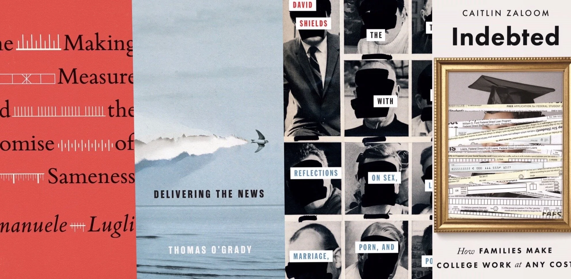
THE UNIVERSITY OF CHICAGO PRESS - The Making of Measure and the Promise of Sameness by Emanuele Lugli
Designer: Isaac Tobin, Art director Jill Shimabukuro
I love the elegant and restrained simplicity of this. It shares so much information in so few symbols and colors. Perfectly contemporary, yet still demonstrates the weight elevation of the topic. Just lovely.
MCGILL-QUEEN’S UNIVERSITY PRESS - Delivering the News by Thomas O’Grady
Designer: David Drummond, Art director: Elena Goranescu
David Drummond is one of my favorite designers and this cover demonstrates nearly all of the reasons why. I love his use of non-digital materials and how incredibly conceptual his work is. His type never shouts or requires any fancy photoshop techniques, it's always simple and restrained and lets the brilliance of his imagery speak for itself. The whole aura and texture of this is perfect.
THE OHIO STATE UNIVERSITY PRESS / MAD CREEK BOOKS - The Trouble with Men: Reflections on Sex, Love, Marriage, Porn, and Power by David Shields
Designer: Jeff Clark, Art Director: Juliet Williams
The bold and messy obfuscation of the faces gives such a mood to this cover, but paired with the same treatment to the author's photo on the back flap, it turns genius. I love it! There's also something so satisfying about the way the words are the perfect number to paste evenly into the grid.
PRINCETON UNIVERSITY PRESS - Indebted: How Families Make College Work at Any Cost by Caitlin Zaloom
Designer: Amanda Weiss, Art director: Maria Lindenfeldar
This is such a clever execution of a concept that is so big and vast that it must be difficult to illustrate. The clean and simple typography does a great job of letting the imagery take center stage in its perfection.
My favorites this year, are, of course, only made by first glance. But like most great design, this year's winners are surely ones I will turn to year after year for inspiration on my shelves discovering a new perspective. Each new look at these catalogs brings new observations of clever design features, grids that soothe the eye, and unexpected color combinations that vibrate. I can't wait to add this year's elegant catalog of winners to my shelf.
Jordan Wannemacher is a book designer based in the NYC area. She was born and art school educated in the Southeast at the Savannah College of Art and Design where she focused on graphic design and creative writing. Currently, she is running Studio Jordan Wannemacher, a boutique book design studio based out of her home in Montclair, New Jersey.