Alban Fischer on Designing Bariloche
Alban Fischer is a book cover designer, poet and founding editor of Trnsfr and Trnsfr Books. Here he takes us through his process for creating the awesome cover for Bariloche.
Bariloche is the story of a garbage collector from Buenos Aires obsessed with jigsaw puzzles and haunted by memories of first love. I was struck by the narrative’s dual focus of, on the one hand, actual deterioration (garbage) as it mirrors the protagonist’s spiritual depletion and physical exhaustion, and, on the other, the lyrical (represented in the rural scenes on the puzzles) as it parallels the protagonist’s idealized memories. I knew I wanted the cover to represent this polarity.
In my first approach, I aimed to distill these themes by utilizing puzzles as a central motif. Here, a puzzle is either in-process, left unfinished, or incomplete. At one point in the novel, Demetrio, the protagonist, is stymied by a missing portion of sky in one puzzle. At another, he finds a porcelain plate in the garbage and attempts to piece it back together, but it is missing a shard, and he abandons the dish, “served to the solitary cold.” Although neither of these moments is pivotal, given Demetrio’s isolation, they carry an emotional weight I hoped to capture here. The rural scene I used is of course meant to represent the mysterious Bariloche, but the author felt this image didn’t quite visualize it accurately, and that this option was overall too pretty.
For the next draft, it seemed fitting to visualize the junk and everyday detritus that constitutes the protagonist’s livelihood. The challenge was how to do this in a way that could be aesthetically acceptable without appearing too studied or refined. Mostly, this involved playing with color, shading, and tone to give this version a moody feel. The extruded type lends a physicality to the title and allows it to recede into the image somewhat, contributing to its thing-ness among the scattered rubbish. I liked this version best at the time, but alas it was not chosen. The author mentioned that he was very much interested in something a bit punk, a bit messy, and I think he had envisioned something that was more identifiably trash.
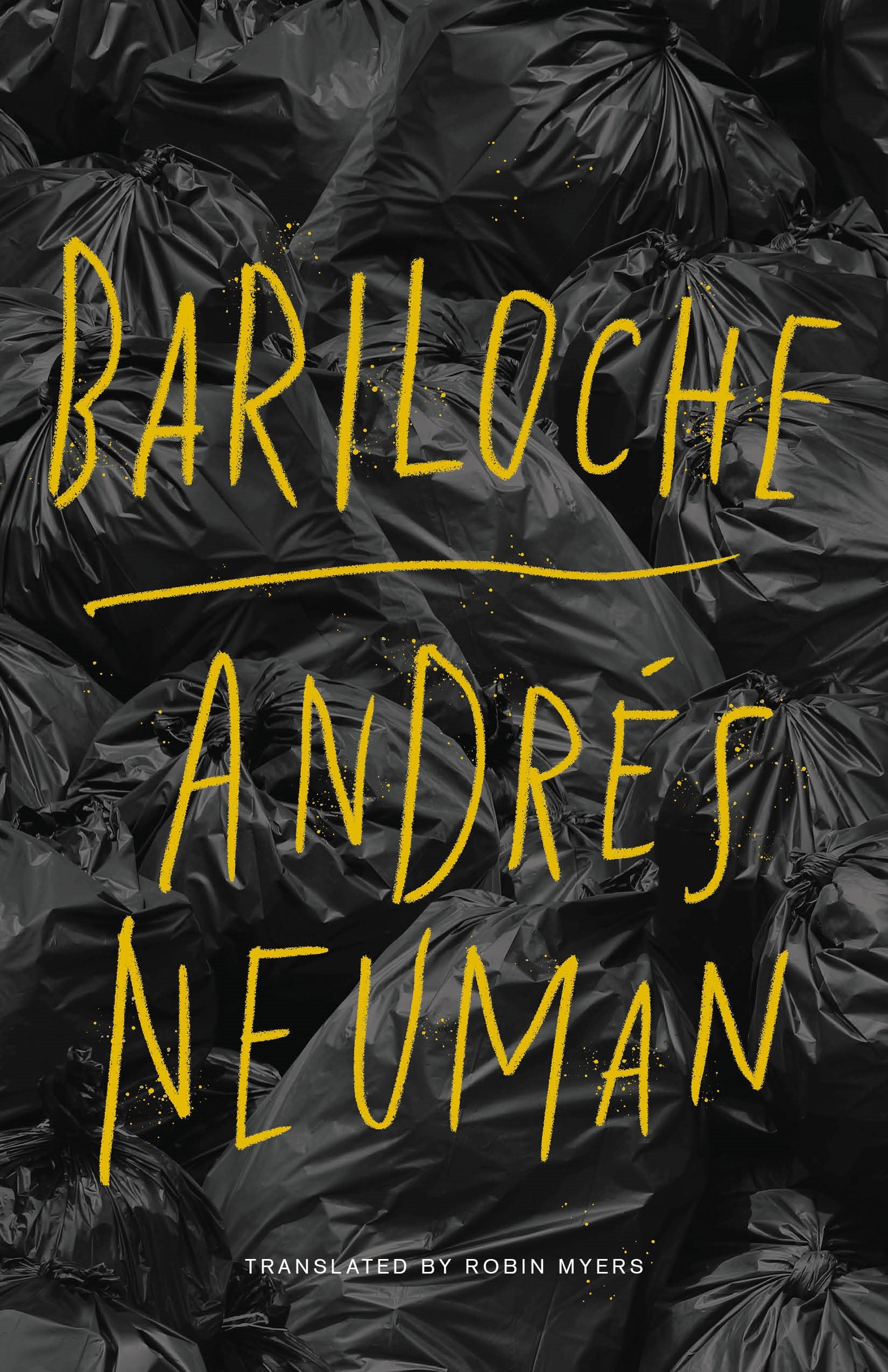
So, for the third option I presented essentially a wallpaper comprised of heaps of trash bags. I’d initially imagined the type in a spraypainted effect on the bags, but somehow this seemed too trope-ish, and to signify punk in too obvious or traditional a way. I experimented with displaced type as well, but wondered if this might have seemed an easy reach. I’d worried, too, with a title like Bariloche, about readability (the cover designer’s perennial nemesis). Ultimately, I felt that a hand-drawn approach could impart a measure of the protagonist’s essential humanity. My instincts must have been decent, as this one ended up being the cover the author liked best.
This novel was a fantastic reading experience and a genuine pleasure to work on.
Final cover
Editor, artworker and lifelong bibliophile.