Amanda Kain on Designing Laura Chinn's Memoir, Acne

Amanda Kain designs and art directs book covers as the Creative Director of Hachette Books & Hachette Go in NYC. Here she give us a peek into her process for designing the wonderfully simple cover for Laura Chinn’s memoir, Acne.
Acne is a memoir from television writer and actor Laura Chinn. Laura is such a great storyteller. She’s insightful, funny, and has lived through some real trauma. All the ingredients for an excellent read.
I loved the book from the moment I heard the title. It felt immediately relatable but also uncomfortable. I wanted to come up with a cover that would garner the same reaction.
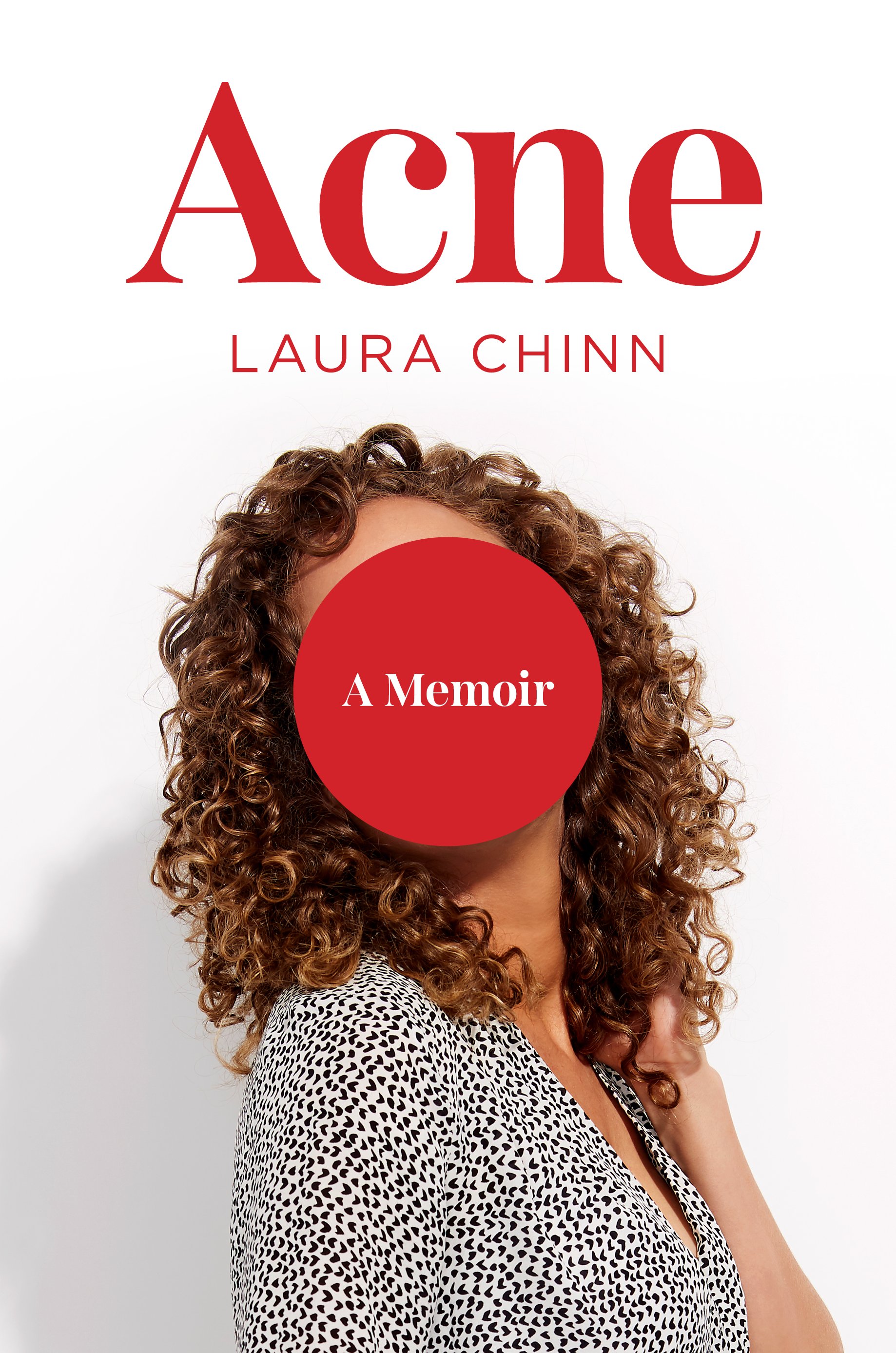
With such a strong title, I wanted to keep the imagery simple. During our publishing team’s concept meeting for this cover, we discussed the idea of using a childhood photo of Laura. I also thought it might be interesting to play with photos of her as she looks now but manipulated in some way. In going through the photos, the idea of acne as a constant companion (no matter how unwelcome) kept coming to mind.
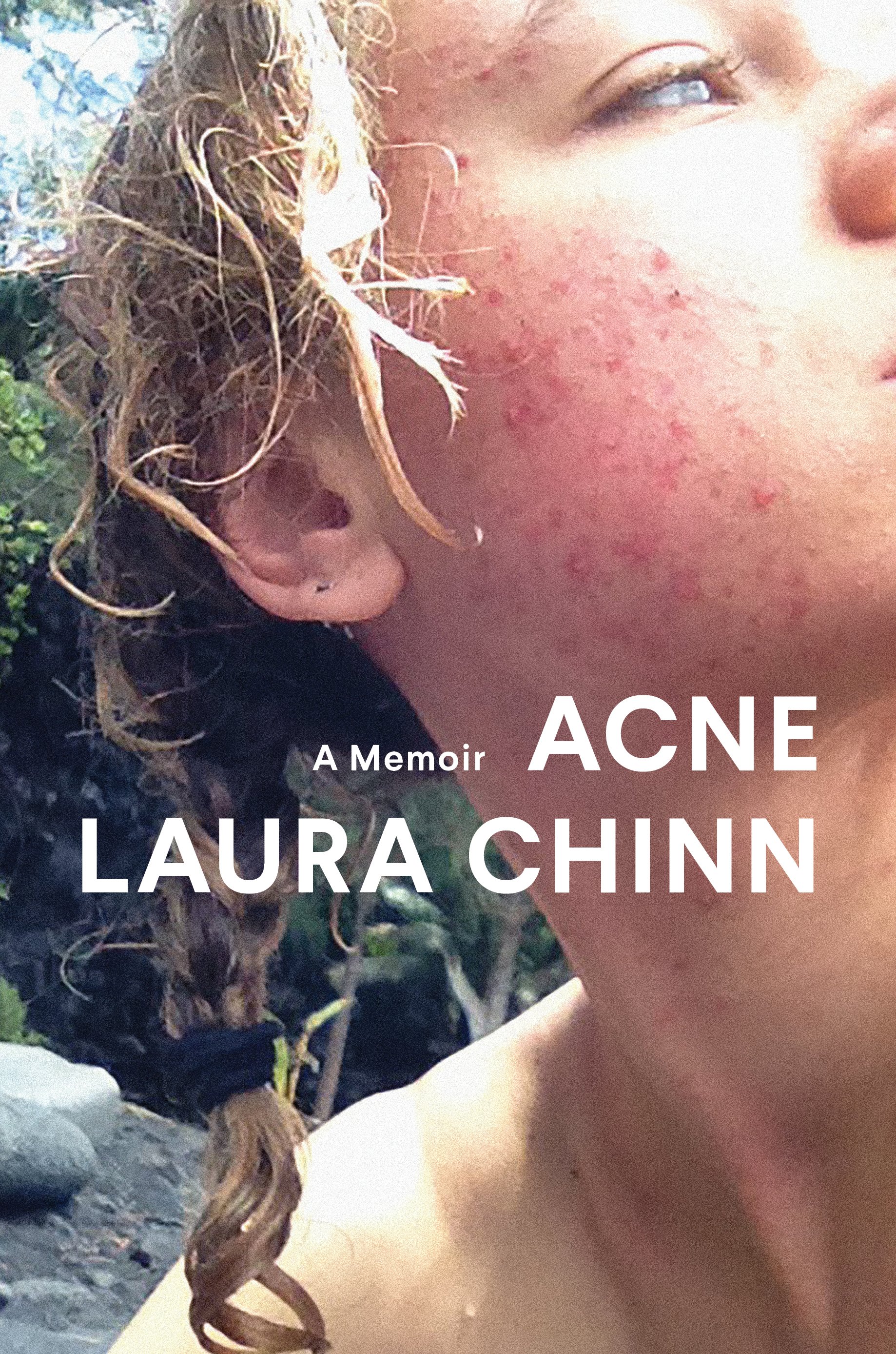
The cover process for this one wasn’t difficult (thankfully!) and a version of our final cover was in this sampling from the first round of comps.
The room was split on the “dots” comp (which was ultimately our final cover direction). Most of the group immediately loved it while a couple of people found it a little unappealing. It made for an interesting conversation—the cover invoked the slightly uncomfortable reaction I was hoping for.
We decided to send the author the dots comp and the comp with the big red dot over her face. The comp with Laura on it was always a close runner-up for me, as the big dot felt comical and intrusive.
Laura really liked both cover options but wrote that she absolutely adored the first one. Coming from someone whose work you admire, reactions like that won’t ever get old. She asked that we tweak the type slightly to make the title more prominent and make her name less prominent. That revision ultimately landed us at our final cover.
Interestingly, in a follow-up Sales meeting, the cover was met with the same split room as we encountered in the jacket meeting. However, after discussing the Sales team’s reactions with the author, Laura decided the cover should hold and our publishing team agreed.
Final design
We printed this jacket with soft touch lamination and a raised spot UV on the dots, so they all have a slight bump and gloss to them. The graphic feel of the jacket has also provided inspiration for our Marketing Associate, Ashley Kiedrowski, who had these great box mailers made.
Editor, artworker and lifelong bibliophile.


