Words from the Weiss: Amanda Weiss Talks Cover Design, Part 1

Detroit-based graphic designer Amanda Weiss has created one of Casual Optimist’s Notable Book Covers of 2017 and has discussed cover design one-on-one with Jhumpa Lahiri herself. One might call her the Beyonce of cover design. And recently, Weiss’s work has only become more dynamic—she has now designed covers for two timely books that address two of our culture’s cornerstones: video games and Queen Bey. Here in the design world, we need Weiss’s wisdom. How does she convey a book’s message without being too literal or too abstract? Simple, Weiss tells us: calculated imitation is key. We must know what to emulate and what to avoid.
In the first of a two-part series, Weiss explains how she drew from existing imagery and trends without completely copying them, for Omise’eke Tinsley’s Beyoncé in Formation. The resulting cover, we think, is an homage to the cultural icon that inspired it.
One evening out of the blue I get an email from Dustin Kilgore, the current art director at University of Texas Press. I’ve worked with UTP before but nothing prepared me for the question he asked me:
“How are you? Do you have room in your schedule for a potential cover design? And lastly, do you like Beyoncé?”
There’s at least one project each year that I can pinpoint as one of my favorites but little did I know it’d come so early in the year.
The book in discussion is titled Beyoncé in Formation: Remixing Black Feminism, written by Omise’eke Tinsley, the Associate Professor of African and African Diaspora Studies at University of Texas Austin. You may subconsciously know of her after she was pushed into the spotlight for her “Beyoncé Feminism, Rihanna Womanism” black feminism class in 2014. This book specifically focuses on the latest Lemonade album, dissecting select tracks and interpreting them in newfound ways. Reading such a personal and engaging text, coupled with the fact Beyoncé was in the title, I was driven to try and create a cover just as flawless as Queen B herself.
Dustin and I agreed that photography of Beyoncé would not be feasible for this project and it would be best to stick to common iconography from the Lemonade album, like the cover for Gaga Feminism. The author was driven towards an illustrative direction such as a drawing that evoked or represented Beyoncé like lemons, bees and crowns. The thematic tone was described as strong, sexy, black, woman.
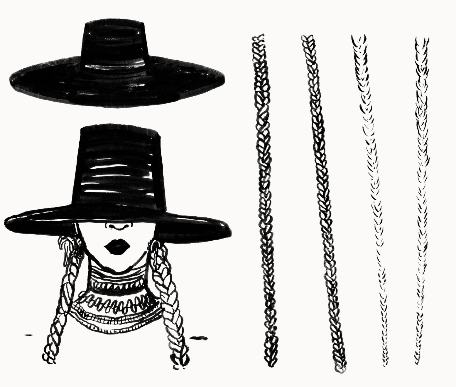
To start the process, I read as much of the manuscript as I could, bouncing back and forth between the text and playing Lemonade’s visual album. This gave me the chance to screenshot any potential iconography or moments to spark inspiration. It was difficult to choose what to focus on. Her stunning box braids? Her killer thigh-high boots? Or maybe the yellow dress from Hold Up? Fortunately I had tons to choose from. Below are some screenshots that I gravitated towards most, as well as visual image research from Beyonce’s website.
It was clear from the beginning that the wide-brimmed black hat was a strong icon from the album’s #1 track Formation and the subsequent music tour around the world. It properly conveyed the sexy mystique of Beyoncé without revealing too much. It was also donated $27,500 to charity. Not bad for a piece of headwear.
This didn’t stop me from exploring other avenues in order to push this project to the max. Sketches revealed typographical approaches and other icons such as microphones, bats, lemons and box braids. It was in this part of the process I learned my drawing skills were limited but nonetheless I pressed on. The book partially focused on the exclusion of femmes in queer spaces and I wanted to make sure to embrace the femininity of Beyoncé in this cover through lips, high heels, lash-heavy eyes, or any other stereotypical feminine symbol.

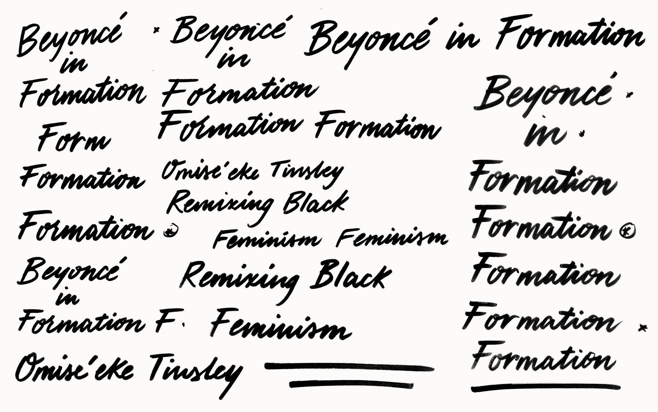
After recently creating some hand-lettered covers for UTP, Dustin and I decided hand-lettering was not off the table and could be an additional direction to explore to keep the cover contemporary and original. I focused on script to give it a sense of femininity but kept the letters quick and angled to feel like a handwritten note.

Opposite of the illustrative and hand-lettered approach, I was also encouraged to explore a direction centered on the iconic Lemonade album cover, with its all-caps, tightly kerned Helvetica. If done well, it could be easily recognizable as an indicator of the Lemonade album. Unfortunately, working without photography, this proved to be difficult.
The first round of covers featured multiple directions, from Beyonce’s hat to her thigh-high boots. I attempted to create an all-type cover featuring the letters of the title “in formation”, but as you can see from the set, it was not the strongest. Concept #4 features a vector illustration heavily inspired by Malika Favre and derived from Beyoncé’s Formation video.


The team at UTP was most drawn to the vector illustration in concept #4, which conveyed a sleek, fashion-forward and modern interpretation of Beyoncé. Unfortunately the Helvetica treatment of #5 wasn’t reading Lemonade album, so we decided to explore the all-caps, centered Helvetica a little further in smaller point sizes to convey a sexy, high fashion vibe. I decided at this point to give the Beyoncé vector some shoulders to ground the illustration, with a beneficial suggestion from Dustin to put some color into the face and hair. This added more dimension and made Beyonce even more recognizable.
The color palette and illustration in #5 resonated the most with the team so we moved forward with this direction. We had some time to push the design further until we sent it to the author, so we decided to experiment. This included making the illustration much larger, in hopes of solving the awkwardness of the type treatment in round 2. We tested didot serifs, different colored backgrounds, and kept in mind production possibilities. Printing on a gold or silver metallic paper would amp up the high-class feel of the cover if we had the budget.
Once it was shared with marketing, the team realized they kept going back to the very first comp with the hand-written typography and hand-drawn Beyoncé illustration and wanted to push this direction further. They enjoyed the strong yellow color but wanted to remove the background stars and add an additional color similar to round 2. I thought this was a smart move. The first comp’s lettering had a watercolor approach and felt too light and airy, so we explored an additional type treatment that was more angular and serious.
One minor tweak to the underlines resulted in the final chosen cover:
Overall this was a great opportunity and while it was a lengthy process, it was well worth the time spent. An article by EW.com recently revealed the cover.
Thanks again to AD Dustin Kilgore for trusting me with this project.
-
Check out part two of our series with Amanda Weiss.
Mary Ryan Karnes is a freelance writer and a Master's candidate in fiction at the University of Southern Mississippi.