Interview with Designer Andy Allen
Allow me to introduce you to Andy Allen. He’s a versatile designer who takes on the challenges of being a freelance graphic designer with vigor, wit and a joie de vivre. His credits to date include national advertising campaigns as well as work on some prominent book cover designs. We talked about how he got his start in the business as well as about some of the unique features on his website. He has a “Killed Covers” section, and a section where he’s redesigned some classic covers just for the fun of it that are not to be missed.
Being a freelancer can be daunting for the uninitiated. How did you get your start as a freelance book designer?
Two or three years after landing a job at an advertising agency in London, I decided I wasn't reading enough so I randomly bought Breakfast At Tiffany's thinking it'd be fun to design my own cover for it. A couple of books & covers later, I realised I really enjoyed the process, so I built up a portfolio of 10 covers and approached art directors in publishing for feedback. I started getting freelance commissions, and worked full-time at Transworld Publishers last year before going freelance. Nowadays I’m either working in-house at advertising agencies on national campaigns, or working in a little studio designing book covers.
An interesting point came up when Andy and I were discussing his contribution to the cover of Carrie Fisher’s memoir The Princess Diarist. Cover design can vary depending upon which side of the pond you are on. Andy did the typography for the UK edition so, I asked him—are there cultural differences between the UK and the US in terms of book cover design?
Of course! There are a lot more factors than just design trends that go into designing covers no matter which side of the pond you’re on, but when you look at a UK and US cover, side-by-side, it can be difficult to identify which one's which.
As a general rule, UK covers usually have more recommendation quotes and/or tie-in lines to help boost sales and US covers often have more room for the image/type to breathe.
In the case of The Princess Diarist, Rachel Willey and Ben Denzer at Penguin in New York had already designed a great cover which used Fisher's signature and a young playful approach to the title. For the UK edition, the editor wanted to use the same image but make the typography more mature-looking. Fisher's name wasn't recognisable enough here (in the UK) to be seen as a signature, so we used Baskerville for her name instead.
So, let’s talk every creative’s favorite thing: process. On your website you have this fabulous Killed Covers section where we are invited to look at the designs that didn’t quite make it.
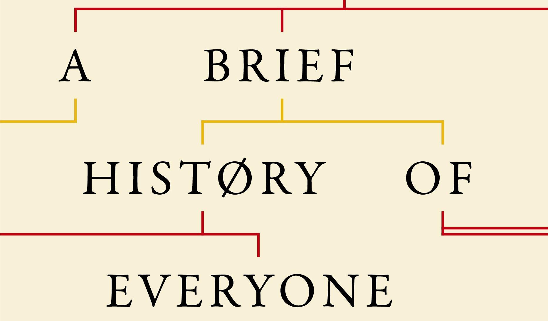
For Killed Covers, you have a version of the cover that would ultimately be Adam Rutherford’s A Brief History of Everyone Who Ever Lived (Orion, 2017). The final version is a remarkably distilled version of the book’s subject matter. How did you go from A to B on this one?


The initial brief from the art director was to hint at the 'people' side of the book – a lot of covers in this category opt for scientific imagery which can be cold-looking. The killed cover used arrows to hint at the population spreading over time. Considering it's quite abstract and doesn't spell out the subject matter, it got quite far before being rejected.
I often try to reduce a design down to its simplest form, so a cover that only uses text and straight lines to create a family tree was my personal favourite.
During the process we also looked into a lot of colour/typeface options, including bold block colours paired with modern sans serifs, but the book's content suited something more classical. The final design was printed directly onto the board, too, so there's a really nice texture to it when it's in your hands.
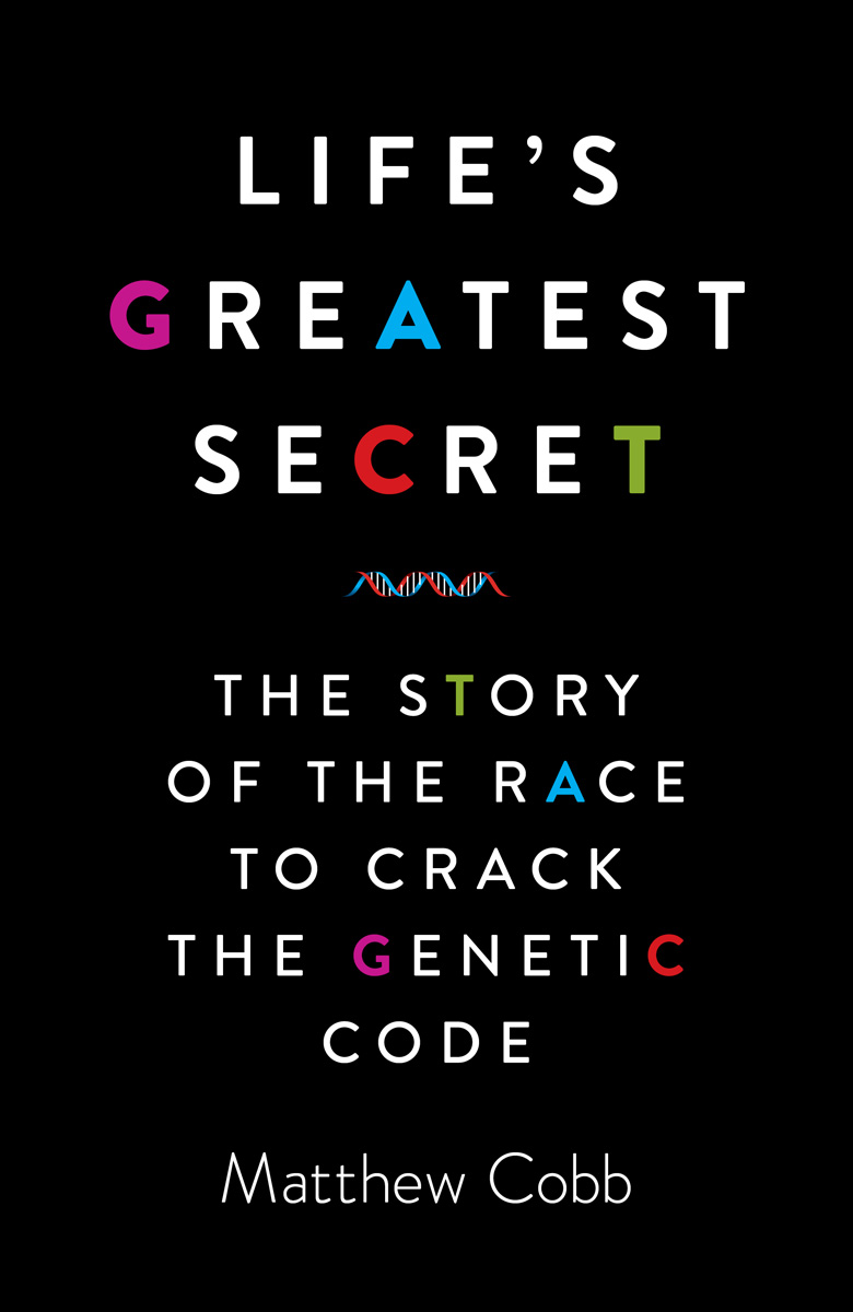
You’ve done a fair amount of nonfiction covers including Lawrence Krauss’s The Greatest Story Ever Told (Simon and Schuster, 2017), and Matthew Cobb’s Life’s Greatest Secret: The Story of the Race to Crack The Genetic Code (Profile Books, 2015) where you used color to indicate the bases of DNA in the lettering. How does whether it's fiction or nonfiction factor into your approach and design decisions?

If it's a non-fiction title, I usually look to work with an idea. I'm always looking for opportunities to add some wit or a 'smile in the mind' to my work, and when this is combined with a strong design it can result in a much more memorable cover.
People browsing for a non-fiction book tend to already be aware of the topic, so it can be challenging to present that in a new way.
With fiction titles, the goal is more about replicating the mood of the story so reading as much of the manuscript as possible is important here. Getting the cover right for fiction also involves more of a balancing act and back-and-forth compared to non-fiction.
With regard to typography: At a time when people have proclaimed the death of cursive writing, something that’s not even taught in many schools, I’m seeing a lot of cursive on book covers. Is there a classical versus nouveau school to typography and if there is, where do you fit in?
Anybody claiming the death of cursive writing must be blind. It might not be a skill that's as widely known as it used to be, but there'll always be a need for high-quality handlettering.
I wouldn't say they are two conflicting schools of thought, either. A lot of great book covers use both or are hybrids between the two. Knowing how to use both gives a designer more tricks up their sleeve.
Hand-rendered typography is something I want to involve in more of my work as it's a great way to make a cover feel more human instead of churned out the back of a computer.
Now I want to turn, ever-so-briefly, to your advertising work where again, your virtuosity really shows up. You’ve done work on the McDonald’s McCafe concept, some really playful, fun stuff for Kellogg’s Nutri-Grain bars and then, shifting gears, work on the International Committee for the Red Cross’s Life and Death Campaign highlighting healthcare for people in areas of conflict. The images there are graphic, the need for awareness, compelling. It reminds me of the Canadian designer Bruce Mau’s statement that design is “not separated or segregated from life but instead is integrated with other messy flows. It engages directly with the world.” (Life Style, Bruce Mau). Did working on a campaign such as the ICRC change how you saw the world? How did working at this juncture of design with a social message inform your work artistically?


I wouldn't say it changed the way I see the world, but the project definitely added more weight to my decision-making. Working in advertising has taught me how to guide someone's eye down the page so that it can (hopefully) be read, understood and remembered quickly. Doing this to shift products can be tricky, but when the poster's purpose is to encourage people to help save lives, it puts your neck on the line. I haven't done a project in a similar vein since, and part of me is quite relieved about it!
Your Self Initiated section on your website is where you put your personal calling card to the classics. I laughed out loud at the H.G. Wells' The Invisible Man cover. What is it about cats? Anyway, it was brilliant! Which one is your favorite and why?
Ha, thanks! As with the other books in that project, I used a different approach to previous editions.
In the case of The Invisible Man, previous covers depict the main character with a bandaged face and sunglasses. Instead, I chose to reference the cat which Griffin does his first invisibility tests on. Using marbled paper helped to hint at the time period, and I used that look & feel to unify the design into a series with 2 other H.G. Wells titles.

If I had to pick a favourite cover, it'd be The 39 Steps. The idea behind it is that it gives a face to the only character in the story who didn't have one – the plane following Hannay throughout his journey is so prominent, but we never meet the pilot.
Something I really enjoy doing is taking reference from design/typography from different eras, and it was a lot of fun to research posters from the First World War and play with how their typefaces can work with photography of pilots.
What Should We Expect To See Next from Andy Allen?
From me, you'll be seeing plenty more book covers! I thrive on variety so I'm always willing to take on new projects with different publishers and art directors from either side of the pond.
Given that, what publishing house or art director would you most like to work with?
I’ve been lucky enough to start a few projects recently with some UK publishers that were on my bucket list, but doing something with Pushkin Press or Vintage would be amazing.
In the States, a lot of independent publishers like New Directions and Verso are consistently putting out great covers. More specifically, I’d love to work on a cover with Janet Hansen or Peter Mendelsund at Knopf.
Thanks Andy! We here at Spine wish Andy all the best in what’s sure to be a great career in design. And do visit his website. There’s so much fun to be had there.
Karen Faris is a Rochester, NY based writer. She can be contacted at karenfarisauthor@gmail.com
Karen Faris is a Rochester, NY based writer. More about her work can be found at www.karenfaris.com