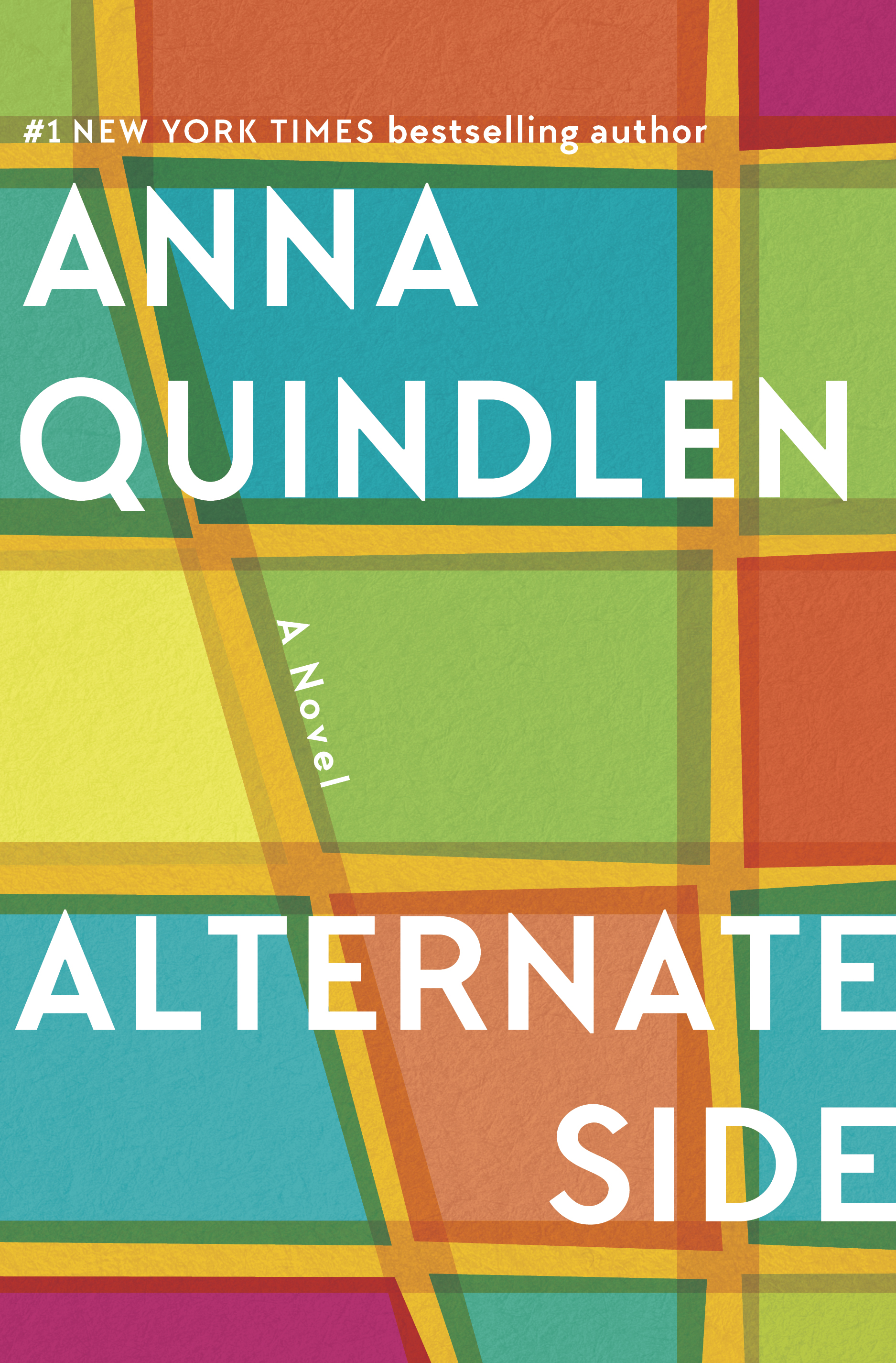
Anna Bauer Carr on Creating Alternate Side

Anna Bauer Carr is an Associate Art Director at Penguin Random House US. Here she explains her process for creating the cover for Alternate Side by Anna Quindlen.
For those fortunate enough to be unfamiliar with the concept of “alternate side parking”, the title of Anna Quindlen’s latest novel refers to New York City’s maddening rules that dictate which side of the street (and at what time) one can park so as not to interfere with street cleaning schedules. The title is also a nod to the opposing sides taken up by the books’ characters: an affluent group of neighbors living in a row of townhouses on an Upper West Side cul-de-sac and the people who work for them.
Anna Quindlen is a Pulitzer prize–winning and bestselling author with an established fan base. Expectations for her cover designs usually run high—with many voices weighing in at every stage and a process that can go on for months. From the start, I was eager to introduce some updated typography and wanted to come up with a fresh and bold design that might draw in new readers, while keeping with a big-book feel. New York City jumps out as the vibrant backdrop to the unfolding of the story’s drama and my art director Paolo Pepe and I agreed it was the logical starting point for the design.
I began researching imagery that would give a sense of place and the unique allure of Manhattan: grand stoops on the Upper West Side, majestic townhouses, architectural details, and a variety of cityscapes and aerial shots. I envisioned these as a backdrop for strong, bold, sans serif or hand-drawn type. A handful of images were quite striking with interesting perspectives, but they felt a little familiar and were lacking the impact we were aiming for.
From there I decided to pursue a more abstract/graphic approach, and had a vision of vibrant colors popping off the shelf. I started with 2 concepts: a grid of streets in Manhattan and a row of townhouses. Initial digital sketches of the townhouses felt a little too whimsical and not compelling enough to me, and though the direction appealed to some members of the team, they were not fully developed. I did like the color/texture/lines that were emerging, though.
The grid, on the other hand, appealed to me more; it worked better as an illustrative backdrop while also symbolizing the dividing lines within the city: Which side are you on? I started with a rough sketch of a cross-section of Manhattan—with Broadway angling up the side as a distinguishing feature—and began translating this digitally, playing around with blocks of color. The initial structure was really busy and felt too much like a map (I definitely didn’t want to get bogged down in accuracy of details)—but there was some promise.
Enlarging the grid, limiting the image to fewer blocks and making it more abstract solved that issue—and provided a much better framework for integrating the type. I worked up a few variations of the grid concept and continued to experiment with the interaction of the colors and how best to divide the blocks.
One version was directly inspired by the geometry of the typeface I’d chosen. I’d explored only a few type options before settling on a version of TT Chocolates, which had the boldness combined with elegance and charm that I wanted. I experimented with integrating the flow and angles of those letter shapes into the grid—the Ns, in particular, created a nice diagonal—with some interesting results.
To contrast with the clean geometric lines of that direction, I continued working on an alternate version with its own distinctive feel. I shifted the city blocks to more off-kilter shapes, and added a subtle texture to each block for depth. I explored different palettes and eventually the colors and structure of the present design began to emerge.
For type placement, the length of author name and title worked nicely against each other for balance, and justifying those elements left/right was a logical solution to play off the title and the opposing factions in the story.
We ended up submitting only one round (2 grids + 1 townhouse concept) to the author, who was immediately taken with the simplified grid version, which required only minimal tweaks. The entire process and steps to full approval was uncharacteristically swift. It came off without a hitch (or so I thought) and I was thrilled.
But it’s never over till it’s over. . . To my dismay, some weeks later the final choice was called into question after some voices expressed a need for a more conventional approach. Covers get killed all the time for varying reasons, but I was crestfallen by this news, as were a few colleagues who had admired the design. So back we went to the initial photographic research and I worked up revisions. Fortunately, the author was firm in her appreciation of the original design and her desire to keep it prevailed.
The jacket printed on soft touch stock, which resulted in just the right lush, vibrant colors I was hoping for (despite the lack of additional color plates) and we embossed the type for a little boost. As a final touch, we were able to add bright end papers, using a cityscape from the first round of research.
I had great fun designing this jacket and am very grateful to have been a part of the team working on another one of Anna Quindlen’s engaging novels. Thanks to all who have been interested in the creative process!
Join us in celebrating the enormous talent that goes into making books. Consider a small donation to our Patreon fund. Your support helps us provide you with an in-depth look at some of the book publishing industry's most creative people.
www.patreon.com/spinemagazine
Editor, artworker and lifelong bibliophile.


